…and what we can learn from them.
- The world’s most successful logos are also the most beautiful — due to using an ancient mathematical principle that leads to great design!
- Using the Golden Ratio ensures that all components of the logo are in proportion, making it more pleasing to the eye.
- Brands with highly recognizable logos often use simple images with well-balanced proportions.
Some of the world’s most recognizable logos aren’t exactly works of art. Some are downright ugly. (IBM, anyone?) Of course, many are quite beautiful and elegant. Yet what they have in common is a simple, compelling image that expresses a brand identity.
Still, humans are predictable: since the Classical era, we’ve gravitated toward basic design principles. The world’s most beautiful logos all embrace this golden aesthetic. Let’s take a tour through history — and hopefully learn how to make our own logos just as stunning!

Many of our core design principles hearken back to ancient Greece (source)
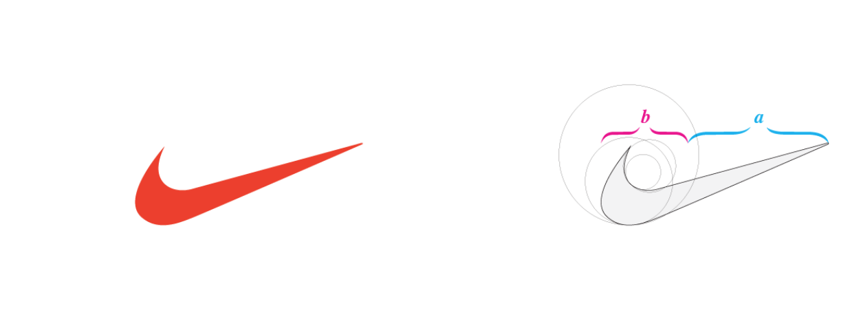
The initial curve is in golden proportion to the stroke of the checkmark (source)
The Nike Swoosh
Imagine the honor of being a design student selected to create a logo concept for a rising sports brand. Carolyn Davidson was paid just $35 when she created the now-famous swoosh. Inspired by the company’s namesake — the Greek goddess of victory who had massive wings — Davidson created an image that resembled both a wing and a checkmark to represent Nike’s success.
The concept was a hit and is now the globally known symbol of a top brand. Don’t worry, Davidson was given shares of the company when it went public, so she did end up being compensated more. What makes the swoosh so appealing is that it is dynamic yet elegant. It is appealing to the eye, partly because it uses the Golden Ratio.
Way back in Ancient Greece, the mathematician Euclid identified the golden ratio as a proportion commonly found in nature. The Golden Ratio is 1.618, the solution to the quadratic equation. This reflects a proportion in which the ratio between two objects is the same ratio as their sum to the larger object.
Multiple studies have shown that people of all different cultures find shapes made with the Golden Ratio to be the most visually pleasing. So, it’s no surprise that Davidson designed the swoosh with this ratio in mind!
Apple has come a long way since its early logo concept, but the Golden Ratio remains a critical element (source)
The Apple
Let’s face it: very few real-life apples look as elegant and smooth as the famous electronics company’s logo. The journey to this logo concept was a bit circuitous: the original design was an illustrated emblem depicting Sir Isaac Newton’s famous discovery of gravity. Steve Jobs rightfully thought that the design was a bit pretentious even if the theme was good. So, Rob Janoff boiled Newton’s story about innovation and discovery into a simple image: the apple.
The Apple logo has had the same basic shape since Janoff created it, although the colors and shading have changed. What makes the Apple so compelling and recognizable is — you guessed it — the Golden Ratio. If you look closely, the logo’s curves reflect invisible circles that are in golden proportions to each other. In other words, this apple is a perfect shape and therefore an apt symbol of Apple’s dedication to high standards and cutting-edge technology.
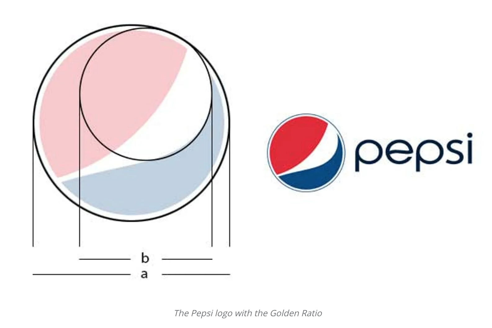
The Pepsi logo features two circles whose diameters reflect the Golden Ratio (source)
The Pepsi Globe
We don’t want to get too into the eternal debate between Coke and Pepsi, but when it comes to logo design, Pepsi is the clear winner. Its famous red and blue globe is highly recognizable even without the brand name. This success is quite remarkable considering that the image now bears no obvious relation to soda at all!
The first version of the glove was introduced in 1945 and resembled a bottle cap. In time, the globe became so well-associated with the brand name and Pepsi eventually dropped the word “Pepsi.” Now that’s good branding.
Yet the modern version of the logo, introduced in 2009, is especially pleasing to the eye. The secret is the Golden Ratio! If you imagine overlapping circles that line up with each curve of the globe, then measure their diameter, you’ll find the golden proportion in their size difference. This gives the Pepsi Globe a dynamic yet elegant look, suggesting a delightful blend of the company’s fun vibe with their classic formula.
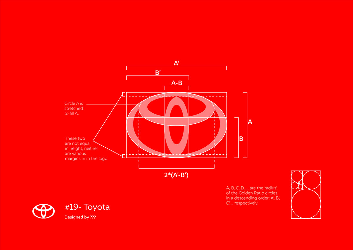
The Toyota Ellipses
Automobile brand logos are among the most mysterious and abstract designs out there. They’re also extremely important: in an era when most modern cars look a lot alike, the logo embedded in the grill or welded to their trunk is the best way to advertise the brand as its customers drive around. While there are many interesting and elegant auto logos, we find Toyota’s to be one of the most recognizable.
This design is a set of overlapping ellipses that Toyota says represents both the unity among its customers and the progressive technology it uses for its vehicles. It looks vaguely like the halo of an eclipsing planet or the ripples from a stone thrown in a pond. When you measure the width of each ellipsis, you see that the proportions among them are in the Golden Ratio. The logo is unique yet well balanced.
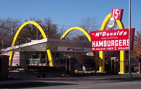
The Golden Arches
Monograms and letter marks tend to be reserved for sophisticated brands where name recognition is everything. (Think Calvin Klein’s or Coco Chanel’s logos.)
Then there’s McDonald’s.
Whoever would have imagined that a burger chain would have one of the world’s most elegant logos? And yet the famous “Golden Arches” retain a whimsical, happy aesthetic that never seems off-brand for a company that used a clown as its mascot. One of the early logos was a cute little chef character, alongside the name McDonald’s. But in 1960, the brand decided to use the letter “M” as its new logo. Instead of using a standard letter, they hinted at the unique arches in the San Bernardino location. And history was made.
Arches are, of course, a long-standing feature of famous architecture. In addition to providing structural support, they reflect the shapes found in nature. As you might have guessed, the Golden Ratio is found in the most structurally sound arches!
If you draw ellipses over the arches in the current McDonald’s logo, you will see that they are drawn in golden proportions. Now, the Golden Arches are one of the most recognizable logos in the world, combining a classic restaurant with a happy color and dynamic design. The message is clear: come to McDonald’s for a fast, fun food experience.
Wrapping Up
As you see, the Golden Ratio can make the difference between a run-of-the-mill logo and one that gives your brand a highly appealing symbol. The Golden Ratio has been known since ancient times to be a beautiful, natural proportion. When you design your logos with this in mind, you create something with universal appeal. Why mess with the classics? Use this basic visual principle to add a balanced dynamism to your logo — and watch your brand’s recognizability rise.