- Gmail changed their logo and users didn’t react well to the change.
- Why did Google decide to change the logo?
- Will Google change the logo back to its old one due to pressure from the public or will they keep the updated one?
Sourced here.
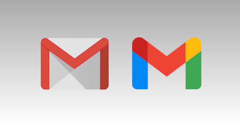
When you’re used to heading towards the same app icon daily and seeing it, it can be challenging when you’re suddenly navigating getting adjusted to a new logo. When it came to long term users of Gmail adjusting to the new logo after the last change being in 2013, Gmail users were more than a tad bit frustrated.
Sourced here.
The updated logo came with the Chrome update in October 2020 and users saw the updated logo with the new update. Although the Gmail interface hasn’t changed, users have still taken a strong dislike to the new logo. It’s now a single ‘M’ with Google’s core brand colors. Now it’s more aligned with Google’s other apps; Google Maps, Chrome, Google Photos, and many others.

Sourced here.
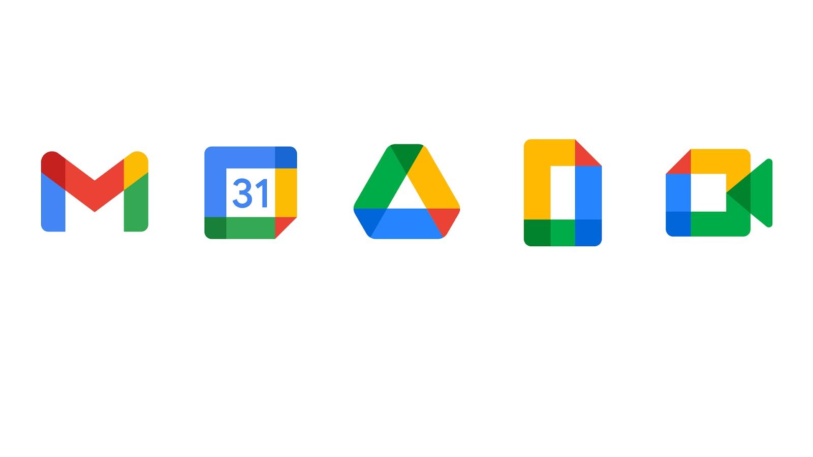
Over the course of the past few months, Google has slowly rolled out changes to all their apps, giving them all the same new look. They’ve received mixed feelings from users for this, many complaining that they now can’t tell the apps apart with the same colors and look. Those that were familiar with the original logo miss the classic red ‘M’; although the color is still involved, it isn’t the primary color used for the logo.
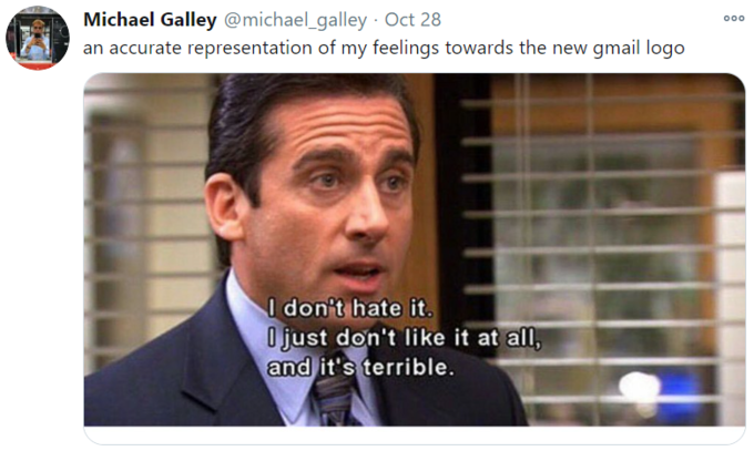
As to be expected, users quickly took to the internet to express their feelings towards the new logo, some even going as far as to create memes mocking the updated logo. Although many strongly disagree with Google’s decision to change the logo from the original, some think that the change was needed. Twitter was filled with users expressing their hatred for the new logo or those defending it and arguing that the new logo was a much-needed change.

Sourced here.
Despite all the backlash and complaints that they’ve received from users about the new logo, it’s unlikely that the company will revert to the original logo. Although we’ve seen many companies in the past revert from redesigns, there are slim chances that the company will decide to go back, especially with the length that the logo has already been out. Google knows that it’s one of the largest and most popular brands and their reputation isn’t in danger from keeping the logo.
Sourced here.
The Gmail logo change is just a small part of Google incorporating and improving their G Suite Software which is now rebranded to Google Workspace. The colors are branded together across the Microsoft office software and keeping a consistent look across all of Google’s apps and ensuring a clean branding.
Sourced here.
Although this change may be old news to some, it’s one that impacted all users of Gmail and, to many has substantially affected their day-to-day routine and is still affecting it. Although unlikely that they’ll decide to change the logo back to the original, Gmail may decide to ask for advice on changes before making them in the future so as not to receive such harsh feedback from users.