
- When you think of major tech brands, you’re probably think of Apple and Google. When you hear the word “chem,” your brain probably goes straight to chemistry. But there are major logo changes happening for companies in these areas that go beyond our first ideas.
- Speaking of first thoughts, sports probably aren’t at the top of your mind during the pandemic, but major athletic events need logo designs, too. We’ll look at one redesign that embraces modern style.
- All three of the companies we’ll look at emphasize new modern elements and bright colors – let’s take a look!
Spring is near and the pandemic seems to be slowing down. With more vaccines and better social distancing practices, companies are looking to move forward with new mergers and branding. Highmetric, Chinachem Group, and the Canada Games all released new logos recently that have made a statement. Let’s check them out!
Companies Embrace New Art
Highmetric
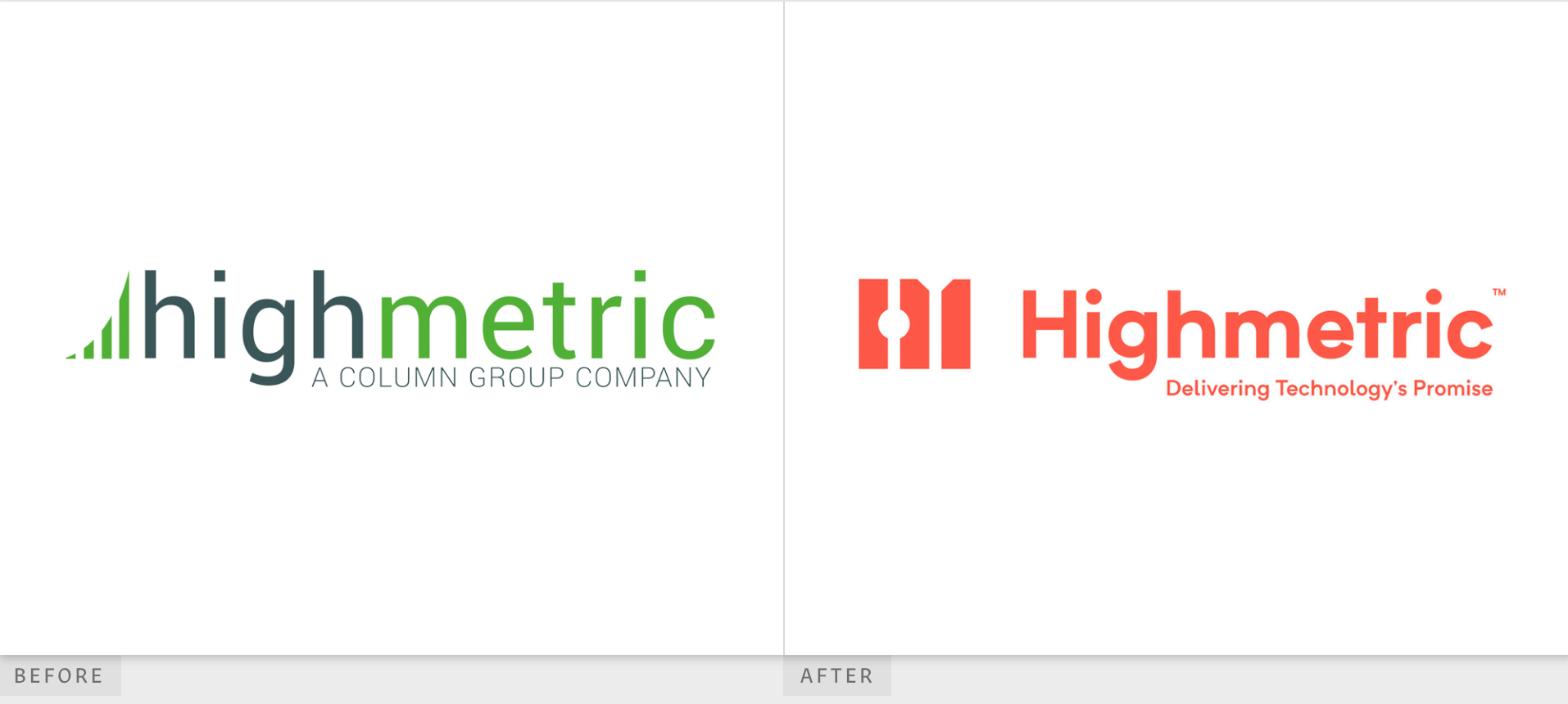
Highmetric, Column Technologies, Column InformationSecurity, Vorto and TradeHelm all merged under the name Highmetric. The newly-merged company works in enterprise service management, identity governance, cloud operations, DevOps, and custom application development. They’ve got what it takes to run that behind-the-scenes tech!
Even companies who work in the background building the foundation of tech solutions need a fantastic logo and brand presence. Highmetric has done just that with it’s sparkling new logo design.
The original Highmetric wordmark was all lowercase and featured a curved icon that looks like the symbol for cell service. Its colors were a muted navy and green, and it featured the tagline, “A Column Group Company,” written in all caps. The color choices seemed more appropriate for an energy or environmental company than for a tech company, but the all lower case, basic sans serif font fits right in with the tech world.
Highmetric’s new logo packs a punch. The bold red-orange color immediately makes a statement. The capital H speaks of confidence and experience, and the tagline, “Delivering Technology’s Promise” also sends a message of certainty.
We’re fans of the new logo’s font, which is still sans serif but is also more modern and easily readable than the previous logo. The new icon looks like a ruler, and in the negative space on the right side it’s easy to see a column, which could be a nod to its original company name. We love the new Highmetric logo!
Chinachem Group
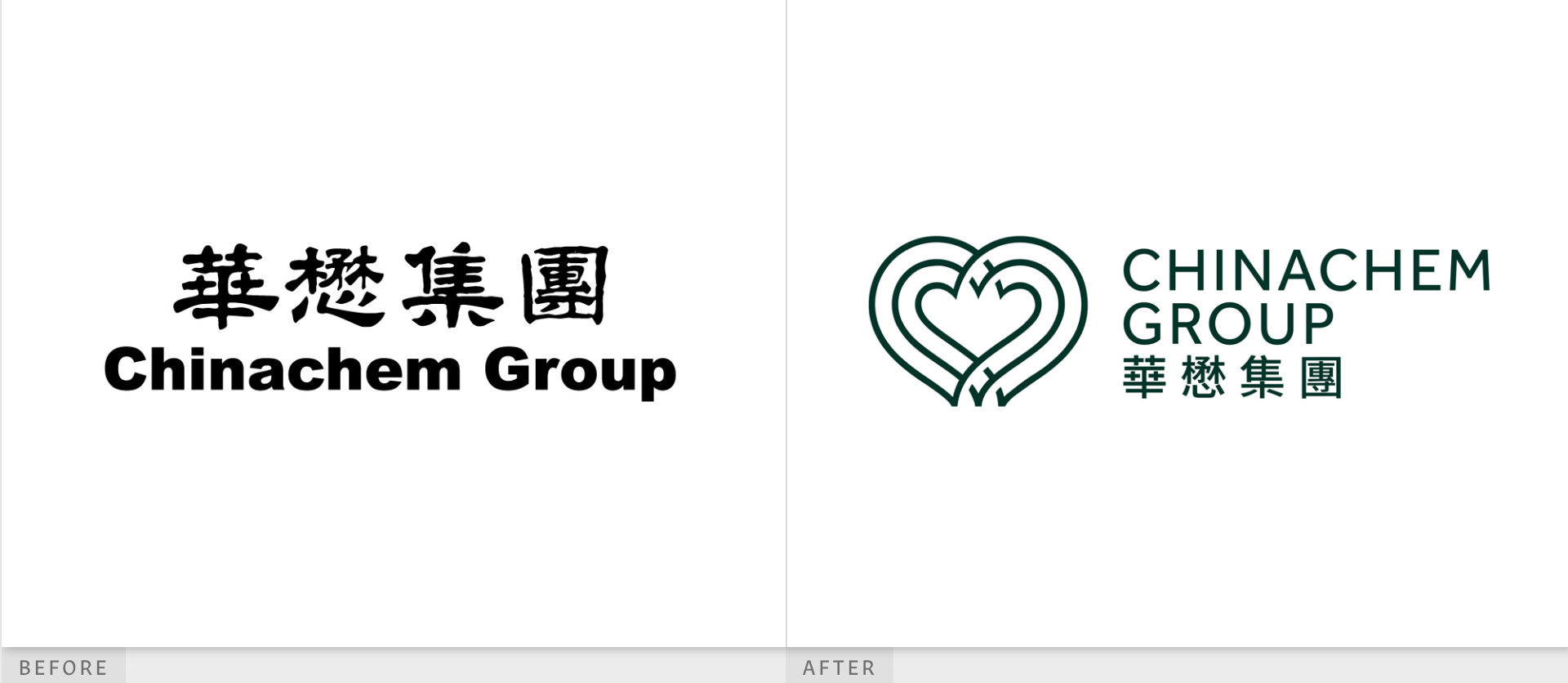
Chinachem Group is a real estate developer that also works in the hospitality and entertainment industry. While Chinachem Group’s new logo came out a few months ago, we still want to take a closer look because it does what we think logo design should do: it gives the brand a stronger identity by revealing more about their work.
The previous Chinachem Group logo was bold, simple, and clear, but it lacked uniqueness. With Chinese characters above the sans serif bold black wordmark, the logo was simple to the point of being boring.
The new Chinachem Group wordmark is anything but boring. It features an icon that’s in the shape of a heart made up of three lines. The significance of the heart is that the brand wanted to show how they invest in places with their heart. The designers used three lines because the company is committed to a “triple bottom line,” which represents how the company aims to have a positive impact on people, prosperity, and the planet.
While the new font is more open and a larger size than the previous wordmark’s font, it seems a little low effort. However, we love that the new logo preserves the Chinese characters. Most of all, we love the dark forest green color, which is a nice change from the previous boring black-and-white logo. The forest green intends to show a commitment to integrity. The new Chinachem Group logo gets an A+ in our books!
Jeux de Canada Games
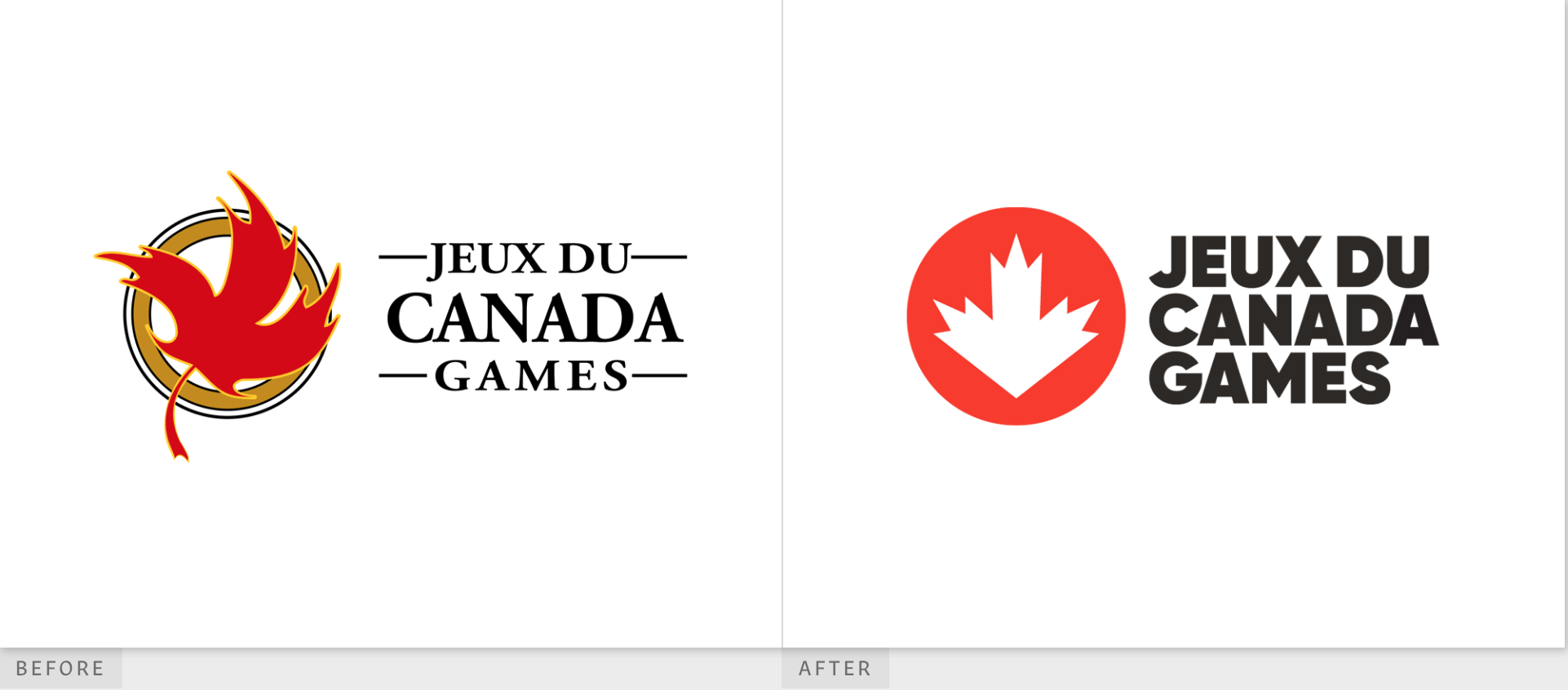
Let’s leave the corporate world and take a look at a major athletic competition in our neighbor to the north: the Canada Games. The Canada Games are the country’s largest amateur multi-sport event. This event is held every two years and brings together able-bodied athletes and athletes with physical and intellectual disabilities.
The previous logo featured a red maple leaf in motion, outlined in bright yellow, set on top of a mustard yellow ring outlined in a dark gray. We think the old logo had too many colors, but the dynamic maple leaf in motion was a great nod to the movement of the athletic event.
The new logo is strikingly modern. While the previous logo used a serif font, the new logo features a bold sans serif font, but it still keeps the use of all capital letters from the previous logo.
The new logo also still features a maple leaf, but this time it’s a static white, angular shape inside a brighter red circle. The bright red is another great modernization that the new logo features in contrast to the previous logo, which, while it still used a bright red, had a more muted tone.
We think the new Canada Games is a fantastic example of how a brand can modernize, although we wish the agency had kept the movement of the maple leaf in the re-design. The striking bold logo gets an A from us!
Bright Bold Logos Pave The Way
All three of the logos we’ve looked at this week have taken advantage of bright colors, and we think this trend will go far. Showing more of the brand’s spirit in the icons also make these logos winners in our books. As the economy improves and the public health crisis of the coronavirus begins to dwindle (we hope!), we look forward to seeing how more brands change their logos for the future.


