
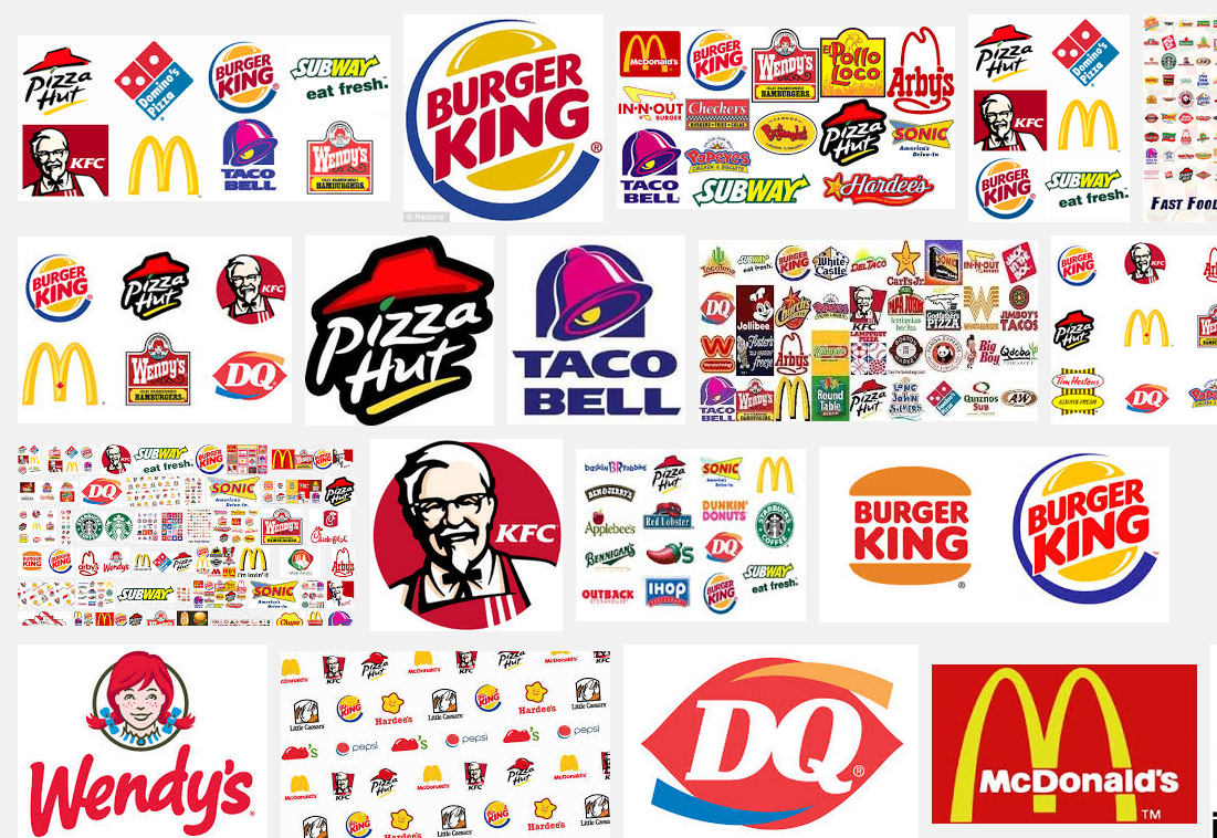
We’ve all become familiar with some of the classic fast food logos that are signature to our country. These food logos have been iconic for years and will still be for years to come and their logos are legendary for those of us that have become accustomed to seeing them. These logos started back in different times and since then have progressed to what we now know them.
- Fast Food Logos Have Become Signature To Our Country
- Some Of The Top Fast Food Logo Redesigns
- The Stories Behind These Logos
This was by a series of updates and redesigns that took place to get to the logos that we see today. Some of these logo redesigns have been an iconic part of our times and others have been recently developed to what we see today. In this article, we’ll take a look at some of the top fast food logos and their most legendary redesigns.

McDonald’s
Although Mcdonald’s is a go-to choice for many Americans, not many know that Ronald McDonald wasn’t always the face of the brand. Speedee Service System was introduced in 1948 by the business’s founders and was meant to symbolize speed for the brand. The cartoon logo looked drastically different from the golden arches that we’ve grown to recognize and love today.
The main theme of Speedee was to show that the restaurant delivered their food fast and efficiently. In 1961, Ray Kroc bought the company and, when giving the logo a redesign he decided to remove Speedee from the logo and that was when the golden arches made their first official appearance to the public. After that, the logo didn’t go undergo many more changes to the same one that we still see today.
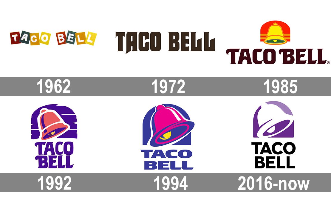
Taco Bell
Taco Bell initially had their logo in a black lettering style for their company name in their original location. After that, between 1984 and 1994, the company used a combination of green, red, orange, and yellow for their branding, using those branding colors for ten years before changing it. In 1995, the logo changed for the third time to a simpler version where the bell was red with the rest of the logo simplified.
The latest update to the logo was made in 2016 and that logo was the simplest option yet. This logo is the one that we today on Taco Bell branding and is modern, sleek, and simple. The logo showcases a classy white bell on a purple background and simple block lettering. Now the new logo is the one that we recognize when going to the iconic fast-food restaurant that’s known around the country.

Subway
Subway is one of the leading fast-food restaurants in the USA with nearly 24,000 locations in the USA, earning them a well-deserved spot as one of the largest fast-food chains. The restaurant is known for its subs and sandwiches, starting as a mere sandwich shop in 1965 and working its way up as one of the most iconic brands to date.
The story of Subway’s logo is fascinating and starts with the logo starting with merely the company name in yellow. The logo was a simple type-based one, with the iconic Subway arrows shooting from the company name’s S and Y. However, in 1968 the logo has already undergone major changes.
The yellow name was replaced for more colors included and now an oval background was included. This logo stayed around until the early 2000s, with only very subtle changes being made to it over the years. The next major logo redesign was in 2016 when the previous design was completely discarded and instead the company name was shown in green and yellow. This is the logo that we see today on Subway’s branding.
Starting a new business? You can run a Hatchwise design contest and receive a brand new logo in as little as 24 hours!
For all your other start-up needs we recommend Flocksy.
Flocksy has Unlimited virtual assistant services, custom video editing, web designers and more to get your business off the ground and skyrocket your branding.
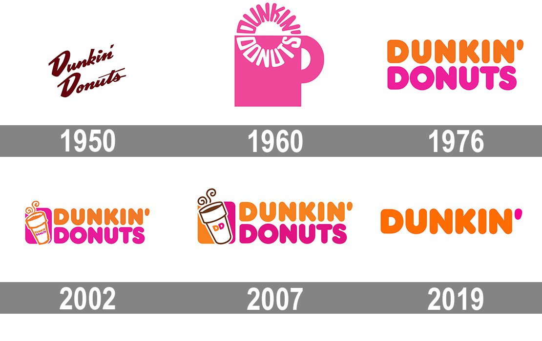
Dunkin’ Donuts
Dunkin’ Donuts; the iconic coffee shop is known for its coffee and amazing breakfast sandwiches. Americans are all too familiar with the iconic logo and their legendary tagline America Runs On Dunkin’. The first logo showed a reflection of the company’s time, the font was jaunty and displayed in a brown similar to a coffee color.
This logo design wasn’t long-lived and the company soon rolled out their first logo redesign, opting for what they assumed to be a happier logo instead. Dunkin’ Donuts mascot Dunkie was shown wearing a hat with the company name on it and lifting a platter of donuts up. The logo was a signature to the brand and had the character for sure.
In 1960 it was decided that the logo would need a more professional and clean look. Although the company kept the coffee and donut idea with their logo, they decided to go with a more condensed look. This logo was more cheerful, opting to include a pink color and a coffee mug with the company name.
In 2019 Dunkin’ underwent its most recent change and its biggest one. They rebranded Dunkin’ and changed their logo to a brand new one. However, this rebrand was only rolled out in North America, although it’s already made appearances in other areas and we expect to see it in more areas soon. This logo is the familiar one branded on every Dunkin’ coffee cup that thousands of Americans hold daily.


