
When you think about what movies were pivotal to your childhood, do you think of movies like Beauty and the Beast, Lion King, or The Little Mermaid?
If you do, then you have Walt Disney to thank and beyond those iconic Disney films, The Walt Disney Company is much more than a childhood movie powerhouse. Today, the brand has become a staple in the entertainment industry and beyond, but just like with any company, it’s important to look at where the company came from.
Founded by Walt Disney himself, Walt had a love for animation and combined his love for that with entrepreneurship, production, and acting to introduce us to one of the most beloved brands in the world.
Since Disney was founded, Disney’s logo has become synonymous with the pillars Walt Disney founded the brand on. The inspiration was pulled right out of one of Disney’s favorite films, Cinderella. Since 1985, this image of Cinderella’s castle has been The Walt Disney Company’s logo and while this logo directly ties back to the film, it also ties back to the real-life replica of the castle that can be found at Walt Disney World’s Magic Kingdom. The castle means so much more than that though. This caste represents the pillars of the brand, how Disney is build on imagination, magic, and creativity for everyone, no matter their age.
Where did the logo begin, and where is it now?
Let’s discuss this famous film studio and production company and see the evolution of its charming logo.
About Disney
Our stories of Walt Disney highlight an animator full of imagination and often neglect to point out an early roadblock Walt faced – that he was let go from early role because his imagination wasn’t big enough. Business schools and motivational speakers love to bring it up, and as strange as it might seem, it wasn’t the only setback the company experienced.
The company started with Walt. Before heading to Hollywood, or “Disney World,” Walt started off in Kansas, at a smaller film studio. He drew several cartoons for various publications but wanted more. He went on to start his own animation company shortly after.
One of Walt’s earliest film studios he is credited with co-founding is the Laugh-O-Gram Studio. It was a silent movie production workshop, but it wasn’t meant to last. Laugh-O-Gram struggled to generate enough revenue to stay open, which left Walt looking for his next opportunity – which just so happened to be Disney Brothers Studio. He took $20, teamed up with his brother, moved to Hollywood and began producing
The public took a liking to one of these film characters, Oswald, so the duo decided to turn this character into the star of a new cartoon. Although audiences loved these short movies and they were quite successful, Walt forgot to copyright his illustrations (something that would never happen again, with Disney copyright still being some of the most robust in the industry).
Consequently, once his contract with the studio expired in February 1928, Walt also lost his rights to the characters Alice and Oswald. He took a lesson from this unfortunate occurrence and became especially cautious about copyrighting everything he created thereafter to prevent the issue from ever happening again. He didn’t give up, however, and just three short years later, it became The Walt Disney Studio and has had unprecedented success since then.
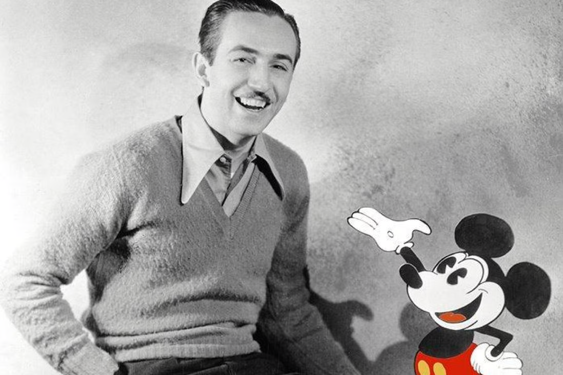
At first, the studio mainly focused on shorter pieces and animated programs. Then, in 1928, Disney introduced the world to a little mouse that quickly became a beloved animated character, even today. Mickey’s first role was in “Steamboat Willie,” and. as time would tell, Mickey became one of the most recognizable cartoons in history. After the company introduced us to Mickey, Disney took this character and used him to gain buzz around feature-length films, which the brand began producing in 1934.
While Mickey wasn’t the star of the company’s first feature-length film, Mickey gave Disney the confidence in its characters. The first feature-length movie that Disney released was Snow White and the Seven Dwarfs.
Their first live-action film, Treasure Island, came out in 1950, and in 1955, Disney opened its first theme park, Disneyland, in California. Fans of the brand were ecstatic about the opportunity to visit the park and are to this day.
Since its inception, Walt Disney has opened several properties and released dozens of films that became childhood and family classics, including The Little Mermaid, Cinderella, and The Jungle Book Beyond creating these family classics, Disney expanded their studio to include other production companies like Pixar and Marvel. The brand also expanded its reach in the television space with partnerships with ESPN and ABC. All these strategic partnerships have launched their success into a whole new stratosphere.
The Disney Parks
To provide these transformational Disney experiences, Disney created Disneyland and Walt Disney World. These two theme parks allow Disney lovers to feel like they are stepping right into their favorite movies.
However, many wonder what are the differences between these two American Disney parks. While they are both theme parks, Walt Disney World is a much larger park and feels more like a “world” of Disney. Disneyland is a one-off amusement park where Disney World includes several parks, golf courses, a shopping area, golf courses, and more. The easiest way to put this into perspective is by looking at how much land each occupies. One occupies 27,000 acres and is twice the size of NYC (we bet you can guess which one), and the other occupies 500 acres.
Disneyland also has only two theme parks within it, Disneyland Park and California Adventure Park, while Disney World has the main park, EPCOT, Disney’s Animal Kingdom, and Disney’s Hollywood Studios. It is also home to various yachting, beach, and golf resorts.
The other primary differences between them, aside from the different rides and attractions, are the castles and Avengers Campus.
As we noted at the start of this article, one of Disney World’s draws is that you can visit Cinderella’s castle (and even eat inside of it). Disney wanted each park to offer a unique experience so rather than replicate this, at Disneyland you can find Sleep Beauty’s castle. And at Disneyland, you’ll find the Avengers Campus will Marvel- themed rides. However, a new Guardians of the Galaxy-themed ride is set to debut in Disney World in 2023.
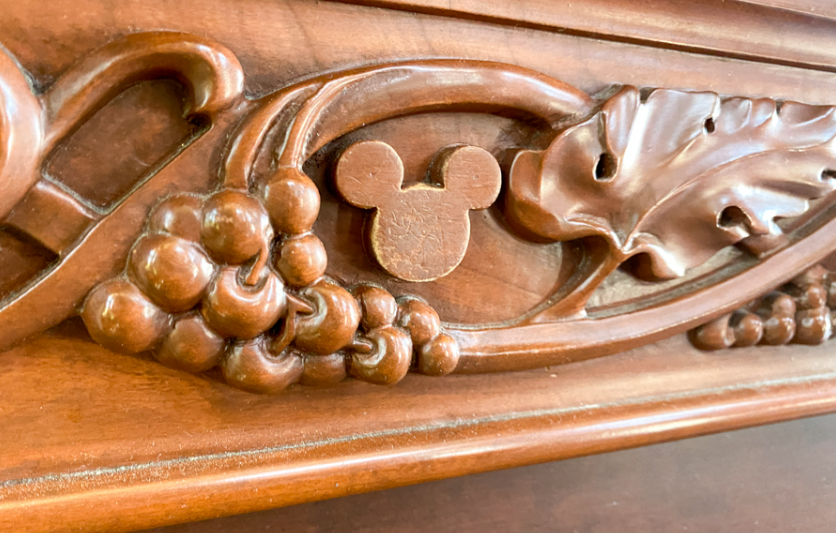
What are the “Hidden Mickeys?”
The Hidden Mickeys are a feature of Walt Disney World. With reportedly about 1,000 images secreted around the resort, the Hidden Mickeys are typically a large circle with two smaller circle ears and aren’t obvious at first glance.
One example of a Hidden Mickey is the purple vein-like leaves in the shape of Mickey’s head inside the “It’s A Small World” ride’s Africa section.
Disney+
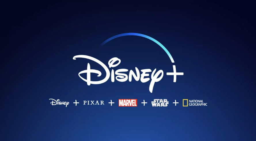
Disney + has nearly every Disney movie and more, including Disney Channel, Marvel, Fox, and vintage TV shows.
With acquisitions growing and more studios becoming a part of the Disney family, you can find that much more entertainment available on the streaming platforms.
They also make Disney original TV shows that exist solely on the streaming service. It works just like any other streaming provider and allows access to its full catalog of movies and TV shows for a monthly subscription fee.
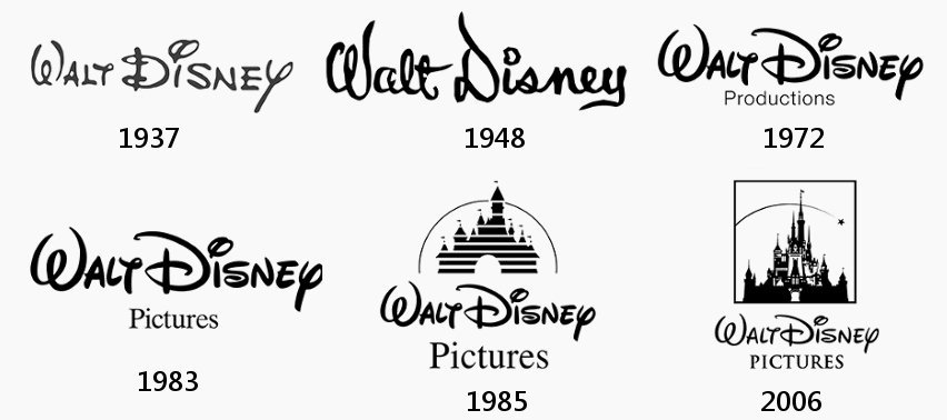
How Disney’s Logo Changed Over the Years
Nowadays we associate Disney’s logo with a castle, but in its early days, the logo featured the brand’s first character, Mickey Mouse. Mickey was the focal point of the logo, rather than the text, and where your eye first goes.
As the logo developed, it went on to include Cinderella’s Castle and an animated shooting star. The logo also progressed from a black-and-white color scheme to a blue one. Another update to the logo came with the text. The text on the wordmark was updated to read “Walt Disney Pictures.”
In a continuing theme, the animated version of the logo is often updated for whatever film it’s coming before.

For instance, the Snow Dogs logo opening from the 20022-film played off of Disney’s logo featuring an arch with icicles and snow In Lilo and Stich, the logo included a UFO-like image over the shooting star arch that eventually shoots off to outer space. Even in the latest versions that have enhanced CGI animation, special touches are added to nod to the film the logo is accompanying, like the pirate flag and mermaids from Pirates of the Caribbean.
The above shares a high-level overview of Disney’s logo, but below we’ll walk you through how the logo progressed since 1923.

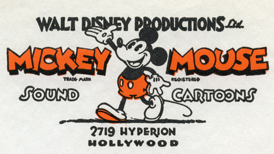
The First Disney Logo (from 1923 – 1937)
The first Disney logo represented the early days of the brand, featuring its first title character, none other than Mickey Mouse.
Mickey Mouse became the staple of friendliness, innovation, and cheer, so this decision was a logical one for the brand. Mickey was certainly the focus of the design, and while there were other elements to the logo, Mickey steals the show – just like he always does.
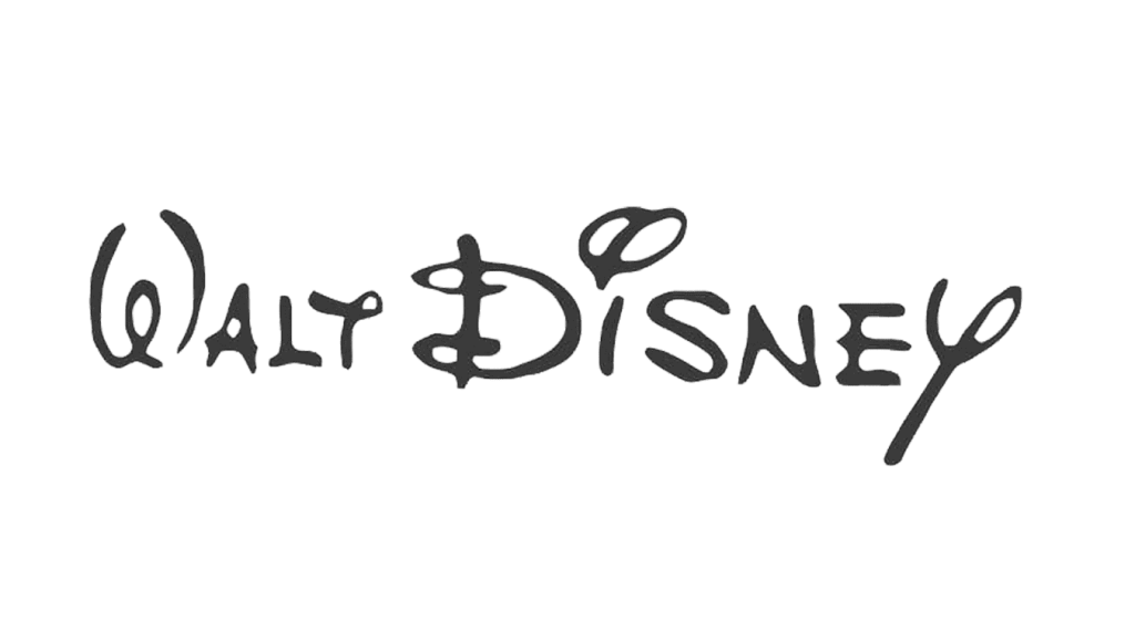
The Second Version of Disney’s Logo (from 1937-1948)
This logo included the cursive handwriting of the founder, Walt Disney. It nicely balanced being artistic and legible.
The one confusing letter would be the T in the word Walt as it looked somewhat similar to the Y in Disney.
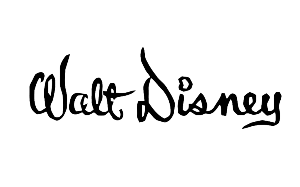
The Third Version of Disney’s Logo (from 1948 – 1972)
For this third iteration, the font was edited. While the font still resembled a script, the font was not a direct replica of Walt’s handwriting.
This version was very difficult to read unless the viewer took their time. It featured cursive-like letters once more, but these ones were extended into taller shapes, which made the word Walt especially challenging to read.
Nevertheless, it looked stylish, and the company used it for several years.
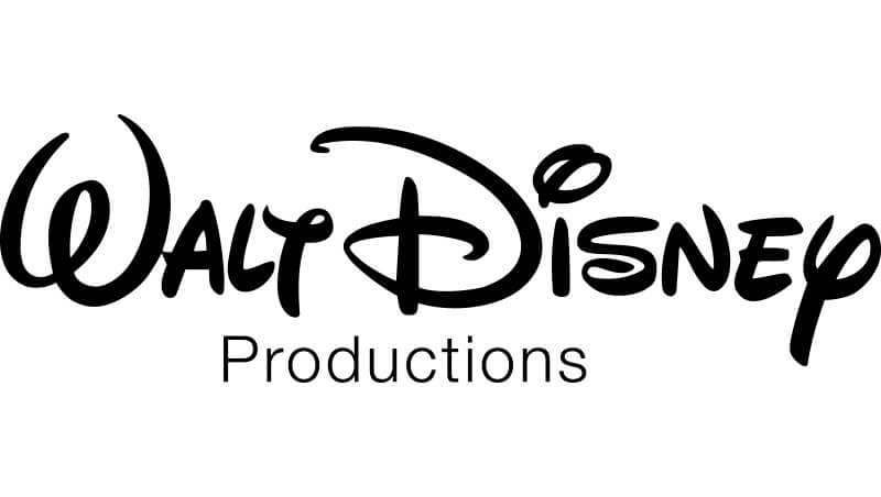
Better Legibility from 1972 to 1983
With this version of the logo, Disney decided to bring back the handwritten font of the founder, added “Productions” in a different, sans serif font, and made the words easier to read.
This logo update helped to make the logo more legible by returning to the original logo’s roots. It’s this type, now recognized as the Disney font that we still see used today.
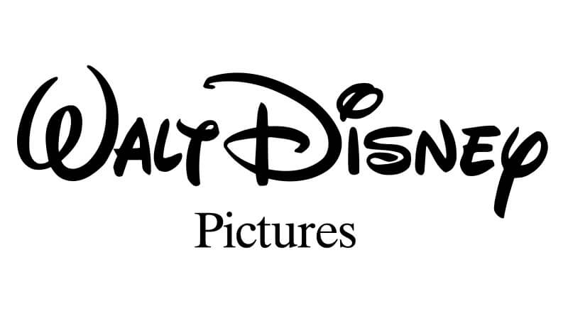
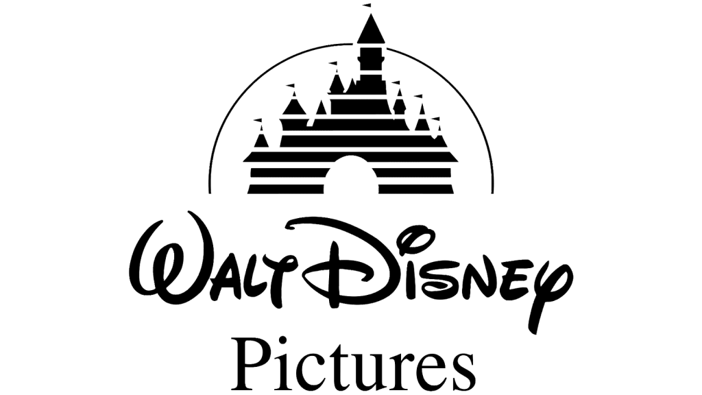
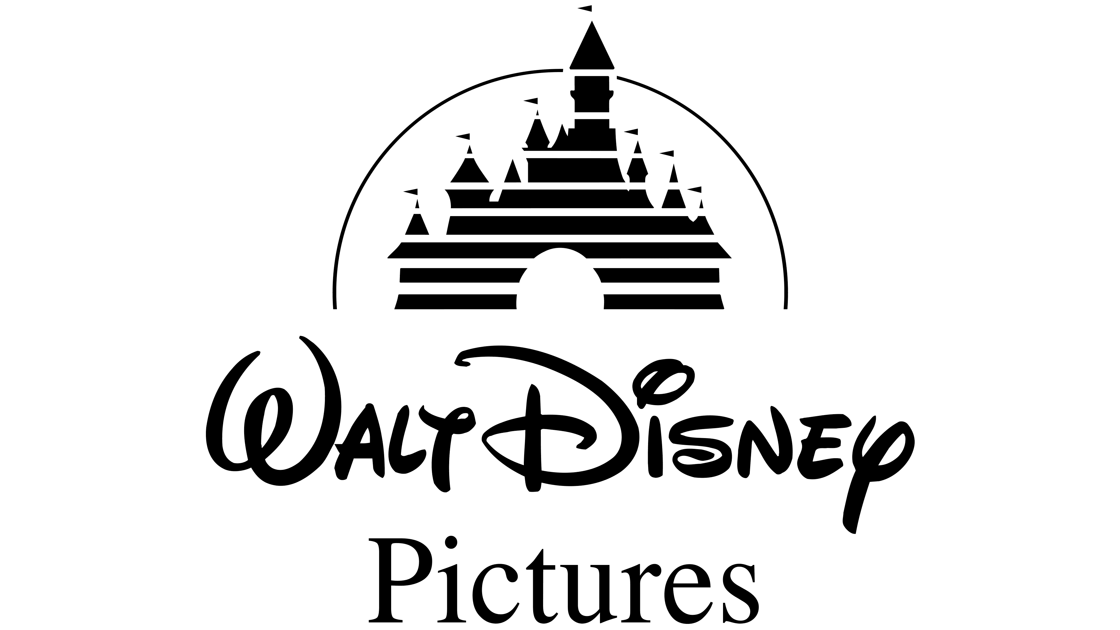
“Pictures” Returns 1983 to 1985
While the lettering “Walt Disney” stayed unchanged and would for the long haul, the word “Productions” was again replaced by “Pictures.” It sat below the main wordmark in a serif type in larger letters.
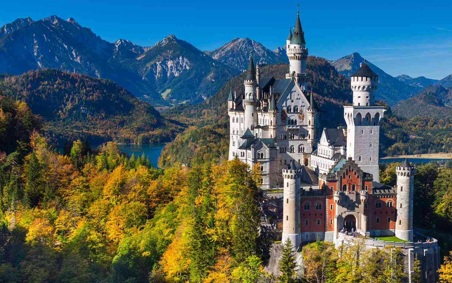
Neuschwanstein Castle
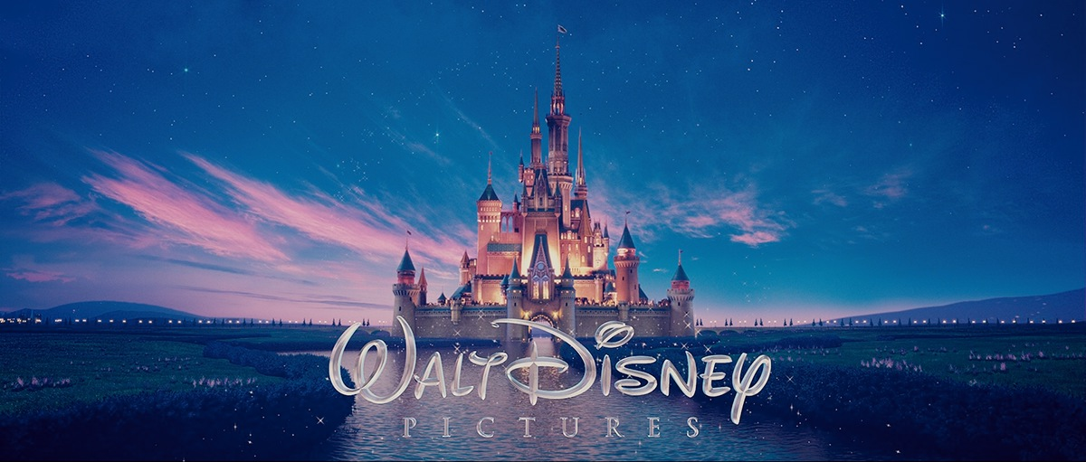
The Castle Appears from 1985 to 2006
Cinderella’s castle debuted in the Disney logo in 1985 and, just like the updated font, would stick around for the long term. It sat above the main “Walt Disney” wordmark and would be a chief part of the animated design as well, where an arch would create a half-circle behind it.
It was a simple design that was separated by horizontal lines that ran through its silhouette and was framed by a single black line arch. For this logo version, Disney’s designers opted to make the “Pictures” wordmark larger than the logos that were released in prior years. This castle was also a strategic decision to help the greater Disney brand because one look at the castle, and most of us associate it with the castle that stands in Magic Kingdom.
The Castle is Refined from 2006 to 2011
Eventually, Cinderella’s castle got more refined and detailed. The representation grew from a simple castle with lines running through it to one with glowing rooms and intricate towers. The arch also got an update to include a star at the very end of it.
It looked especially appealing in the full-color and animated versions as well. Another update was with the text size. The brand name was scaled down to highlight the castle even more. Despite this, the brand name is still clearly written in the design.

Disney’s Logo Today (2011 – Today)
Disney already played around with the sizing of its logo font, but in 2011 another change was made with this. This year, the company decided to only keep the word “Disney” – all other font and wording was removed.
The font remained the same as it was, and the castle continued to be depicted in high detail.
It continues to reflect the magical castle that children and adults currently associate with the brand. The castle was already the inspiration for the castle at Walt Disney World, but it also served as inspiration for the castle that would be build in Paris’ Disney theme park. The edits to the castle took it away from its original Cinderella inspiration, and people began to connect the castle to Peter Pan and other beloved Disney characters and images.
Disney Logo Key Elements
There have been a few key elements to the Disney logo design that have been perfected over the years.
1. The Castle
In looking at the logo’s progression above, it’s easy to see that Disney’s creative team did not have to go far to find inspiration – they found it right at home. Whether it was a princess’s castle, or another film, the logo always tied back to the films we know and love. So, naturally, including the castle in the design was a great move.
We hinted at this earlier, but the castle used in the logo also is the same caste that you’ll find in Disney World.
By marrying the theme of the Disney castle and the actual castles you can visit, the logo pulls double-duty.
As technology has become more sophisticated, the logo adopted those innovations, particularly in the animated logo openings, which has allowed the brand to stay fresh and current.
2. Black & White Coloring

By creating the base logo in a monochromatic black and white, Disney was able to create something they could use anywhere by simply flipping or altering a single color. It made the icon adaptable, modern, and easily marketable. The other main variation of the logo was the classic blue used in its films’ openings.
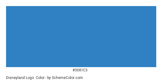
3. Color:
The primary blue color is as follows:

4. The Font
Disney’s logo is unique to the brand and something no other company can replicate. That’s because the logo is not only trademarked but also in Walt’s handwriting.
The swooping curves are playful and creative, evoking a child-like sensibility and charm. A modern font representation of the brand has been created, and many others play off it for humorous pop culture references.
Conclusion
For many of us, Disney gives us a feeling of nostalgia. We grew up with the brand throughout our childhood and now seeing the logo reminds us of those feelings. No matter where you see it, whether that be in Hollywood, where it all started, in a movie theater, or in the Hong Kong Disneyland, the Disney castle and font are instantly recognizable.
Disney has truly incorporated this logo everywhere – on every product, in every television show or film, and at their resorts.
Consumers search for the Disney logo when they make a purchase or choose what to watch, which ties back into the loyalty the brand has built.
What’s more, in its animated, unanimated, and simplified forms, the logo is a universal part of the company’s branding. Their multiple versions of the logo are a great example of how a business can successfully tie its message to multiple logos. It’s an especially good model to follow when you’re considering using several versions of your logo simultaneously.
From its beginnings filled with firings and a handful of failed ventures, Walt Disney’s tenacity and determination went on to create one of the most successful companies in the history of the world.
Well done, Walt


