
- All data points should tie into each other and the overall story.
- Infographics should be cued into their target audience.
- The best infographics have a story at their heart.
If a picture says a thousand words, then an infographic says a million! These engaging combinations of text and illustrations can explore big ideas, collect interesting facts, or give detailed step-by-step instructions for something. In fact, we almost created an infographic on how to create an infographic but decided that would be too meta. So without further ado, read on to learn how to design your own fantastic infographic on just about any topic you can imagine.
Step 1. Decide the purpose of your infographic.
First, let’s review what an infographic actually is. There is usually a mix of data, facts, and captions, but these elements are part of a larger story that you tell through the infographic. A bunch of statistics on a pretty background is not an infographic. Any data you include must be contextualized in the overall topic. That topic should be something that your target audience finds valuable and appealing.
We’ve all seen bad infographics that didn’t add anything new to the world. As with any piece of content, don’t make something just to make something. Your infographic should provide value to your target audience, whomever that is.
An infographic generally meets one or more of these four purposes: (a) to educate, (b) to persuade, (c) to illustrate, and/or (d) to entertain. The purpose you decide upon will guide the overall tone and format of the infographic. For example, an educational infographic may blend statistics and facts into a structured overview of a topic, while an illustrative infographic may show the steps in a process.
Step 2. Craft your story
With your purpose, target audience, and topic in mind, you can develop the story you’ll be telling in your infographic. Unlike a blog or video, you don’t have to portray your story in a linear way (although you can if you wish). Some infographics make more sense in a circular format. Or you can lay out your data points around a central illustration to tie various facts together.
No matter which format you choose, you should still map out a story to guide your infographic design. The classic story structure comprises Exposition, Rising Action, Climax, and Resolution. In marketing, this mirrors the buyer’s journey of Awareness, Consideration, and Decision. This may seem overly linear, but as a designer, you still need a story behind your design. Transposing this classic structure to an infographic, a story may look like:
- Basic Facts
- Intriguing Statistics
- Argument or Comparison
- Wrapping Up / Overview
The thrust of the story depends on your purpose. If you want to educate, your infographic will move from a high-level overview to nitty-gritty details. An illustrative infographic will walk the viewer through a process or workflow. A persuasive infographic will provide key takeaways or try to change the viewer’s mind.
One of the best things about infographics is that you can clearly illustrate bigger relationships among your various data points. It’s tempting to simply list your statistics and add cute icons, but that’s missing the point of an infographic. You can absolutely include pie charts, bar graphs, and line graphs, but remember that your infographic shouldn’t look like a glorified PowerPoint slide.
Look for ways to create “flow” by laying out your infographic in a logical way. Contextualize each graph, illustration, or caption within a greater story.

An example of an educational infographic that features lots of statistics along with iconographic data representation. (Source)
Step 3. Choose your data
Whether you’re sourcing facts and figures from original research, pulling statistics from the web, or a combination of both, remember to keep your story in mind. The data you choose and the graphics you include should create a flow that takes the viewer through this story.
Avoid the “kitchen-sink” approach: more data is not necessarily better. Each data piece should tie into the overall message, so don’t be afraid to omit any statistic or graphic that doesn’t flow with the story. Look for facts and figures that complement each other. For example, if you are creating an infographic about beer consumption in the U.S., you can compare consumers’ preference of domestic beers vs. imports vs. craft beers, but it likely isn’t relevant to include the temperature at which beer is brewed, even if that’s an interesting fact. Instead, you might want to highlight how many microbreweries currently exist in the U.S. or how much consumers spend on beer every year.
When you map out your infographic, think about what each data piece contributes to the story. Is it a general fact that most of your audience will know, but important to the context? Is it a comparison chart that supports your core argument? Is it a fun fact that indicates your story’s relevance or timeliness?
Step 4. Decide how you want to portray your data.
The most effective infographics do more than slap numbers and cute icons together. They leverage their visual elements to provide information in a new way. For example, data is often shown in iconographic representations, such as a certain number of sports teams being represented by a row of basketballs. This makes a greater emotional impact than simply writing out “there are X basketball teams in the U.S.”
Many infographics include Venn diagrams or flowcharts to illustrate relationships among different pieces of data. You can also organize your data points around a central illustration or use graphic indicators such as arrows to show relationships among them.
A word of caution: when organizing your data, limit yourself to two variables per graph or iconographic representation. Otherwise, you risk confusing your viewer. By the same token, don’t include multiple data sources in the same chart if that chart is meant to represent percentages.

A good example of an educational/persuasive infographic. (Source)
Take a look at the example above. This is an educational infographic that shifts into persuasive mode. It begins with an overview of the problem: allergies and asthma. It then places a generally known fact for context (“1 out of 5 Americans suffer from asthma or allergies”) alongside a scary statistic that packs an emotional punch (“1 in 5 American children have severe sensitivity to cockroach allergens”). Then it begins sharing statistics that prove the severity of the problem. The infographic reels you in, making you feel worried about this apparent epidemic of roach and rat infestations, before offering solutions at the bottom of the infographic.
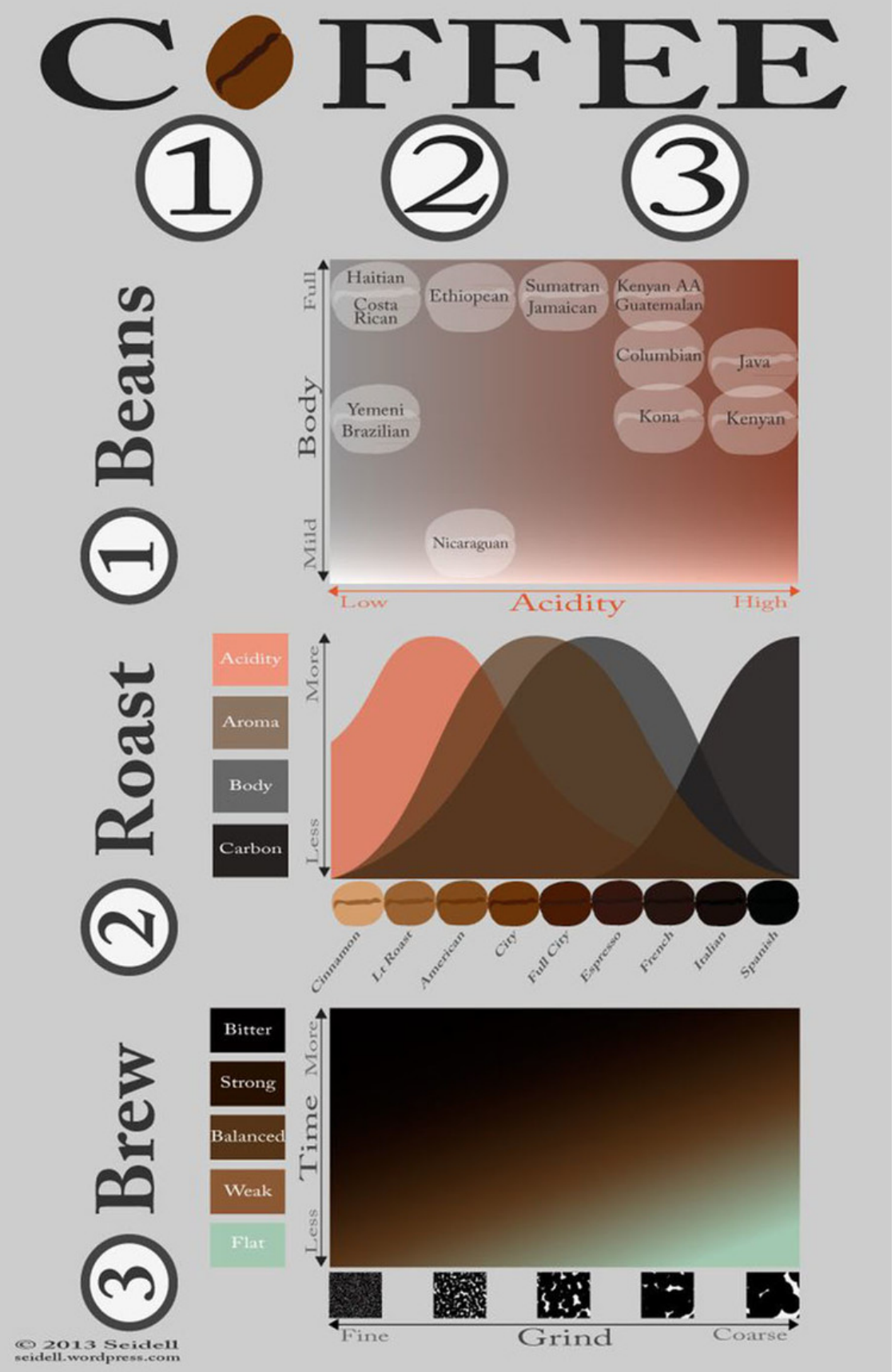
An example of a muddled infographic. It’s difficult to figure out what these charts are trying to say. Each one has multiple variables that could have better expressed individually or by comparing only two variables (e.g. each type of coffee’s acidity level). (Source)
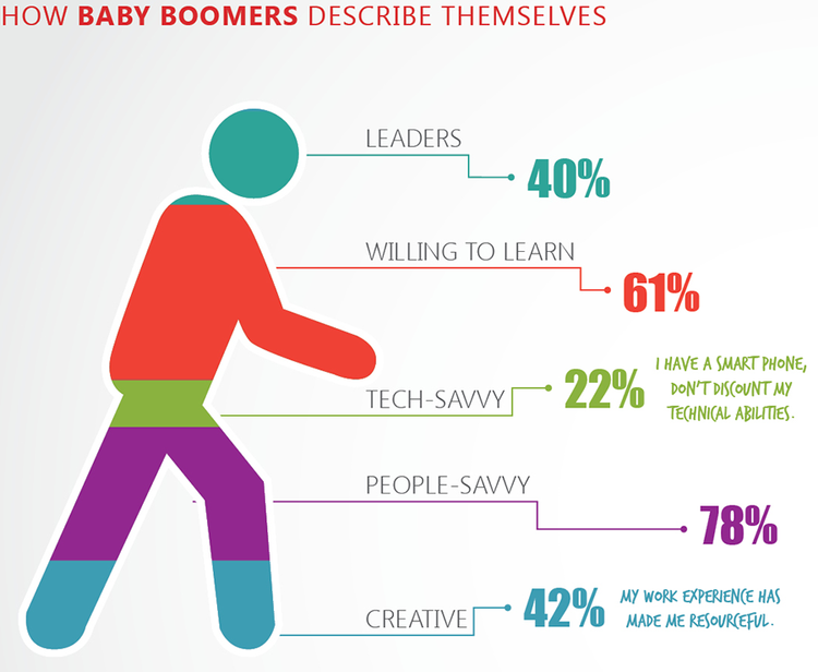
The percentages don’t add up, and there’s no context for the percentages. The colored proportions of the figure don’t match the percentages, either. These statistics are likely from different sources, but without explanation, it’s just confusing. It’s also inconsistent to have quotes for only two stats rather than all of them. (Source)
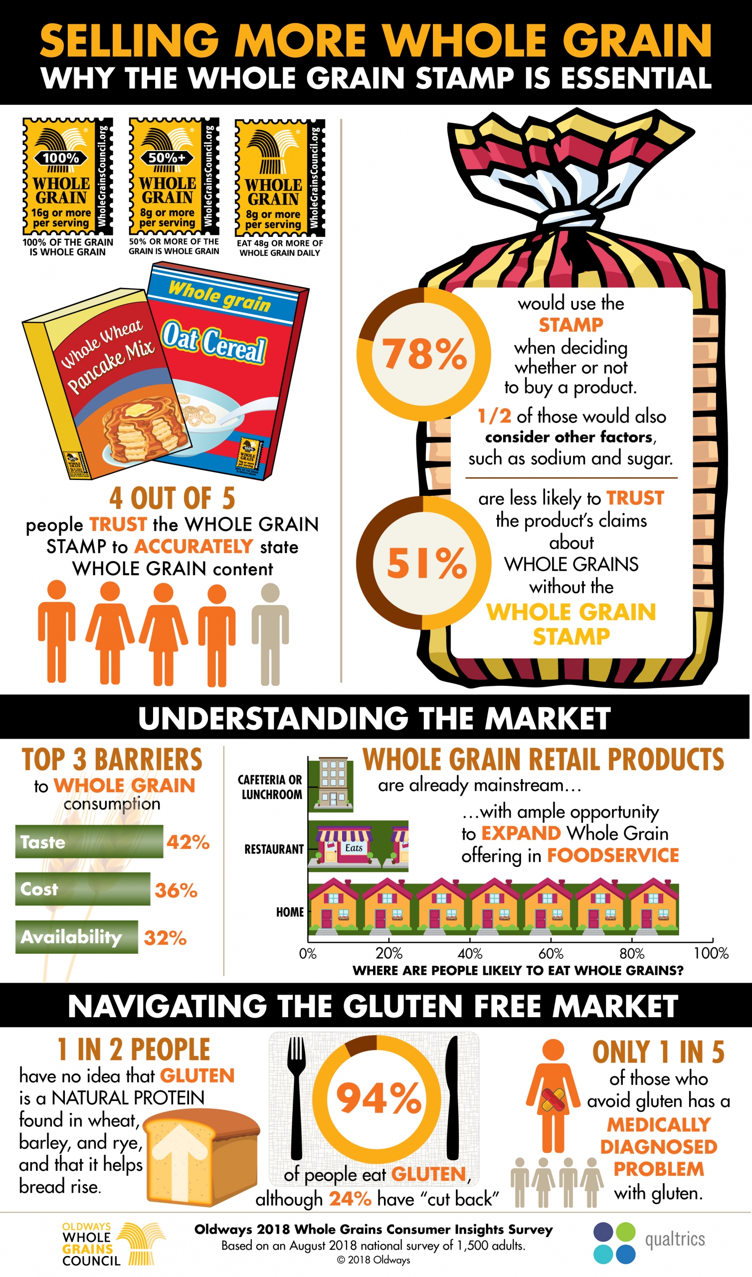
This persuasive infographic features a blend of facts, iconographic representation of data, and statistics. Notice how each percentage is reflected in the design of that element. (Source)
Remember, your infographic should be telling a story. Packing in too much data overwhelms your viewer and muddles your message.
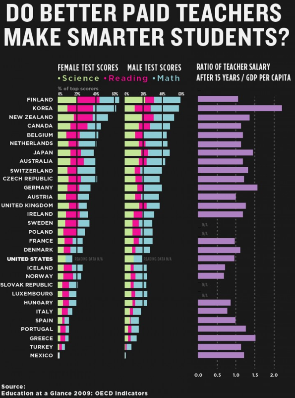
A bad example of an infographic. There is a lot of data portrayed here with very little story or context — and no clear answer to the question in the heading! (Source)
Step 5. Create your theme and color palette.
As with any graphic, abide by best design practices. Your infographic’s overall look-and-feel depends somewhat on your brand, as well as the topic. Educational infographics about a serious matter are usually a bit cleaner and more polished, while entertaining infographics about fun topics can have a more whimsical vibe. However, most viewers do expect infographics to be more colorful and engaging than typical designs.
With that said, do limit the number of colors in your infographic. Choose one or two dominant colors, then use shading and complementary hues to highlight important parts of the infographic. Shading is also an excellent way to communicate information, as in the example below.

A clean educational infographic with a well-refined color palette and legible fonts. (Source)
Be cautious about the imagery you use. In the example above, the overall look-and-feel is nice, but the icons raise some questions. An umbrella is not the obvious icon of choice for a health insurance fact, and the bachelor’s degree iconography has no visual reference to higher education.
Wrapping Up
By following these steps, you can create a stunning infographic that provides value to your audience. Remember, your story is the key element that will give your infographic an engaging flow! All your data points should be well-connected to that story and organized in a logical way. Use colors, font sizes, iconography, and other visual cues to express that logic and communicate your core argument or information. Happy designing!


