
- Originally an Austria-based architect, Milena Vuckovic, has successfully transitioned to graphic design. With 171 repeat clients, she’s clearly delivering on her promises!
- Vuckovic’s logo designs are impressive and have earned her a top-level designation on 99 designs. She’s won 28 contests and has been a runner-up in 42.
- We’ll take a look at five of her logo designs that we love and explain what makes them excellent examples of logo design done well.
In all of Milena Vuckovic’s work, there’s a sense of artistry. No logo is just a representation of a company; each design is a thoughtful and elegant symbol. Although recent trends have prioritized simple designs over more intricate ones, details are still important to many companies. Vuckovic’s designs emphasize how the details work together to create the big picture in a beautiful and sometimes playful way.
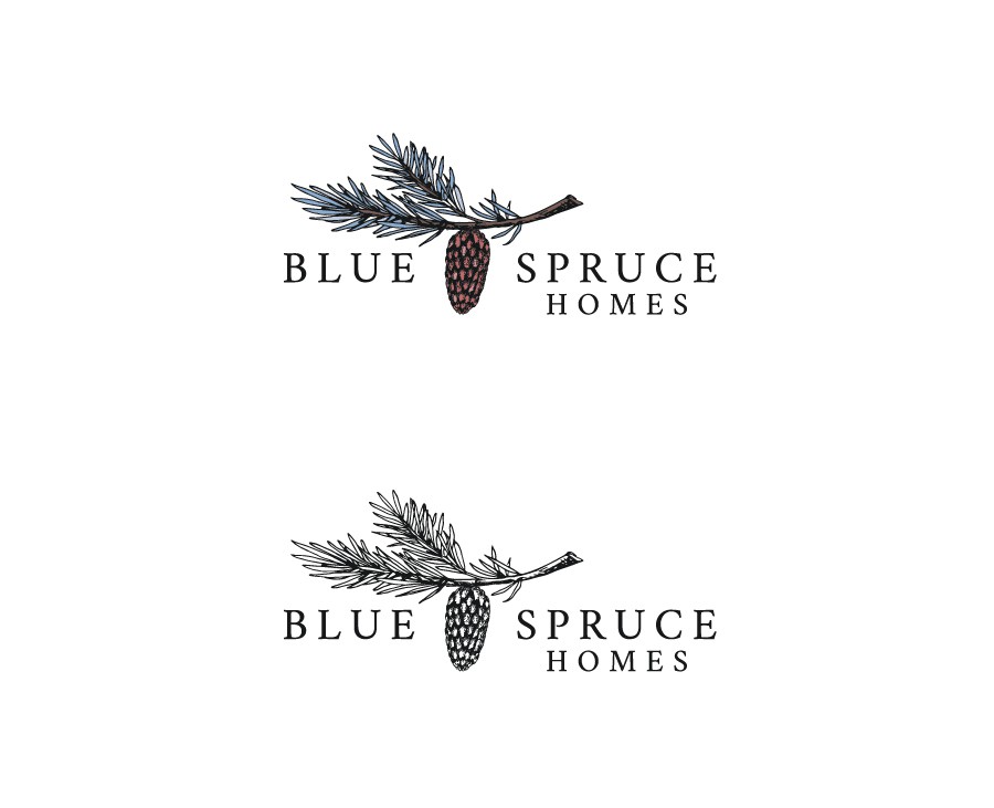
Blue Spruce Homes
The client, Blue Spruce Homes, reached out to Vuckovic to design their new logo in a 1-to-1 project. The result is the beautiful, elegant, and still, simple logo that uses only one font for this home company.
The spacing between the letters indicates roominess and luxury, which a home company would definitely want people to associate with them! The art is detailed and yet simple, and the texture of the pine needles adds interest. Their blue tint is an important detail needed to match the company name. We love this logo for Blue Spruce Homes!
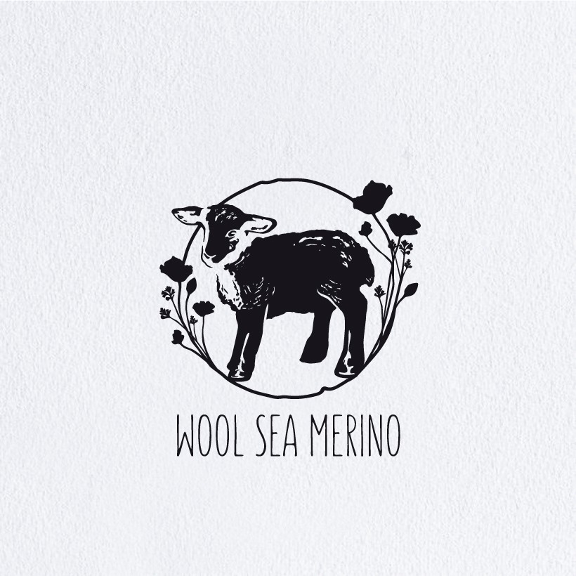
Wool Sea Merino
Another 1-to-1 project design comes to life in a majorly artsy way in the logo Vuckovic created for Wool Sea Merino, a children’s apparel company. The circular shape above the company name is textured and imperfect, which recalls the messiness of childhood. We love the flower silhouettes that grow out from the edges of the circle.
While the dark shapes are clearly flowers, they don’t distract from the heart of the logo: the little lamb. The lamb is also very textured and almost a silhouette, to the point that only one of its eyes has been drawn.
The animal is a wonderful symbol for a children’s clothing company that specializes in wool. The font used for the company name is also very appropriate for a children’s clothing company, as it’s a more modern sans serif, but also more playful. We love this extremely artsy design!
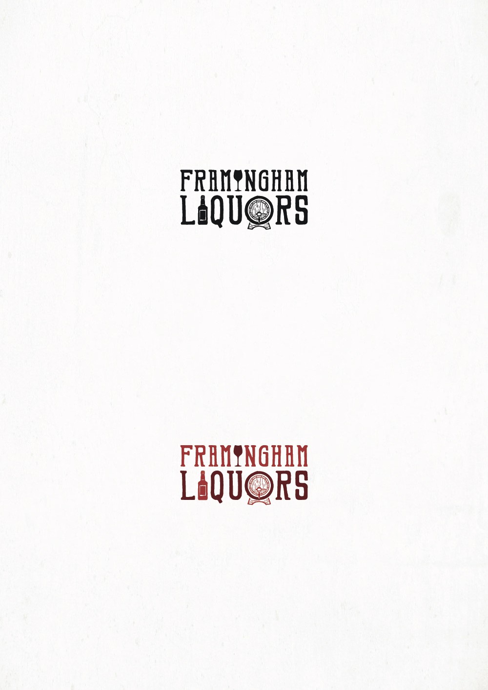
Framingham Liquors
When Framingham Liquors announced their logo design contest, Vuckovic answered the call. She created a very clever design with integrated graphics that bring a boring wordmark to life.
The font she chose isn’t just any old serif; it’s quirky and almost looks like it belongs in a saloon – appropriate for the company! We love the integrated graphics most of all: a wineglass to replace the “i” in Framingham, a liquor bottle to replace the “i” in liquors, and a keg to replace the “o” in that word. The attention to detail in the keg is impressive, as Vuckovic has made it appear aged with her use of lines.
What we love about this logo design the most is the cleverness that’s gone into the final product. It’s the obvious winner in our books!
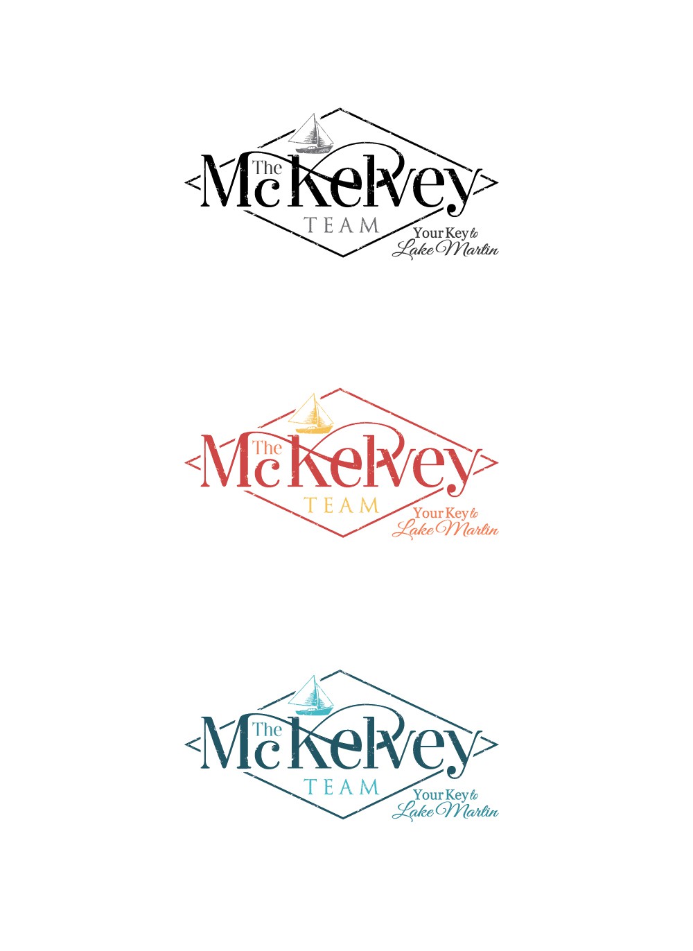
The McKelvey Team
A real estate company that offers properties on Lake Martin launched their logo design contest, and Vuckovic responded with this classic design. The design uses three different fonts, which is the maximum we’d recommend – one for the name of the company, and two in the tagline (“Your key to Lake Martin”).
We love the Vuckovic styled the top of the “M” to loop all the way through the “v” in MckElvey, creating a hint of an infinity symbol. We also love the playful sailboat and the elongated diamond shape. The textures she uses add depth and interest to this logo as well. If we’d launched the contest, this design would have won!
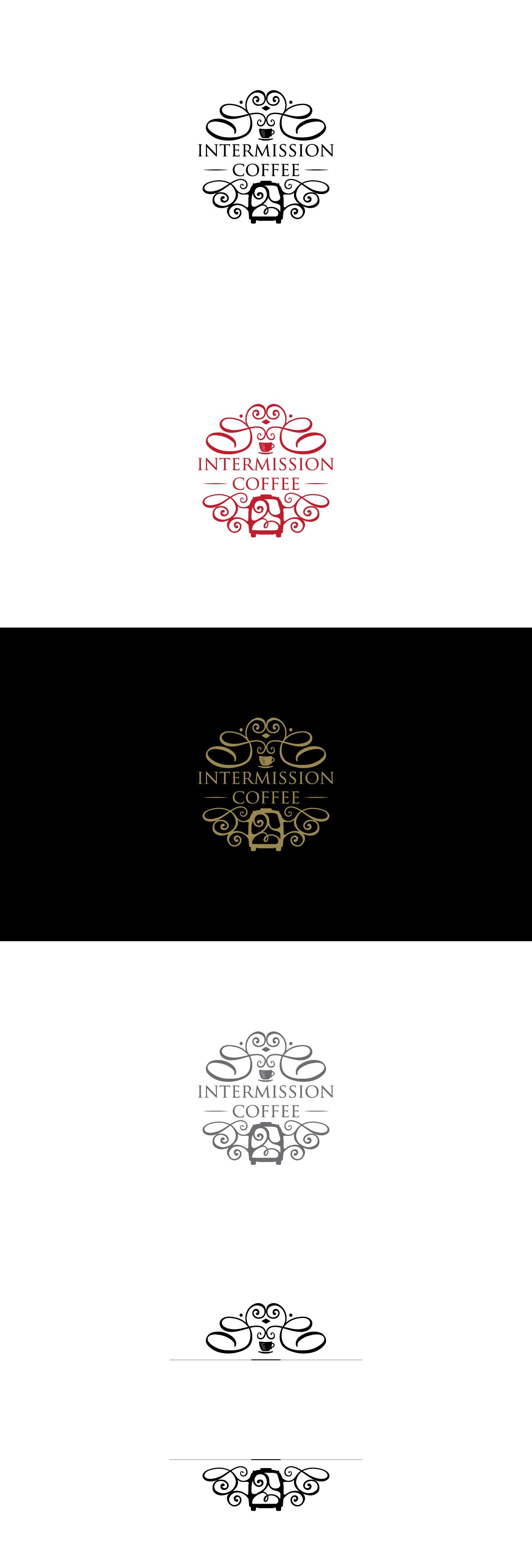
Intermission Coffee
Last but not least, let’s take a look at the whimsical logo design Vuckovic created for Intermission Coffee’s logo design contest. She only used one font, which makes a strong statement and leaves no doubts.
Instead of using a shape to contain the logo, Vuckovic arranged the different elements so that they sketch a circle. The tiny coffee cup floats above a saucer at the top of the logo, and the curling lines above it almost looks like steam. Below the word coffee is the shape of a van, indicating that perhaps this business started up as a food truck-style venture.
We love the whimsical curling lines, the swirls that make us think of the milk mixing in a latte, and the overall artistry of this design. It’s another definite winner in our books!
Vuckovic’s Designs Excite
Vuckovic’s designs for Blue Spruce Homes, Wool Sea Merino, Framingham Liquors, The McKelvey Team, and Intermission Coffee are all delightful to look at and offer a lot to discuss. While some of these designs didn’t win the contests, we think those companies should have chosen Vuckovic’s elegant and interesting designs. Layers, texture, and playful shapes are exciting logo design elements that we love seeing Vuckovic use so well!


