
- In February 2021, we’ve seen several companies rebrand their logos to symbolize how they’re moving forward in the next year of the pandemic.
- Will we see more of the clean lines and muted colors? How about fonts and images?
- Keep reading for more about how an accounting firm, an X, and a luxury goods company are changing their logos for the future.
Three New February 2021 Logos Are Modern – And Traditional?
Adjusting to a world that’s deeply affected by coronavirus has been a major challenge for many brands. Launching a new logo helps companies state who they are and where they’re going as we navigate the uncharted waters of another year of the pandemic.
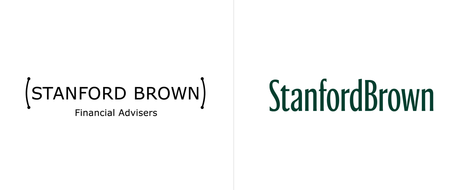
Stanford Brown
Stanford Brown is a financial advisor/private wealth company who prides themselves on their expertise and attention to detail. Their previous logo sent a somewhat uncertain message: why the parentheses? What’s with the dots on the ends? And could the font choice be any more low effort?
We’re not sure why Stanford Brown chose to say, “We’re just in between the parentheses. An aside. Something you shouldn’t be that concerned about,” in their original logo. Perhaps the logo designers thought that by choosing to put the company name in all caps inside the parentheses, those capital letters showed strength. Or maybe they tried to send the message that the clients come first, and Stanford Brown is just helping off to the side.
Whatever the logo designers’ motivation was for the original, we like the new logo much better. Clear, simple, with a font that presents somewhere between serif and sans serif, the new StanfordBrown logo is all about what financial advising firms should be emphasizing: tradition, honor, trust, and respectability. The two names are no longer separated by a space, showing the firm’s unified approach. The new wordmark works for us!
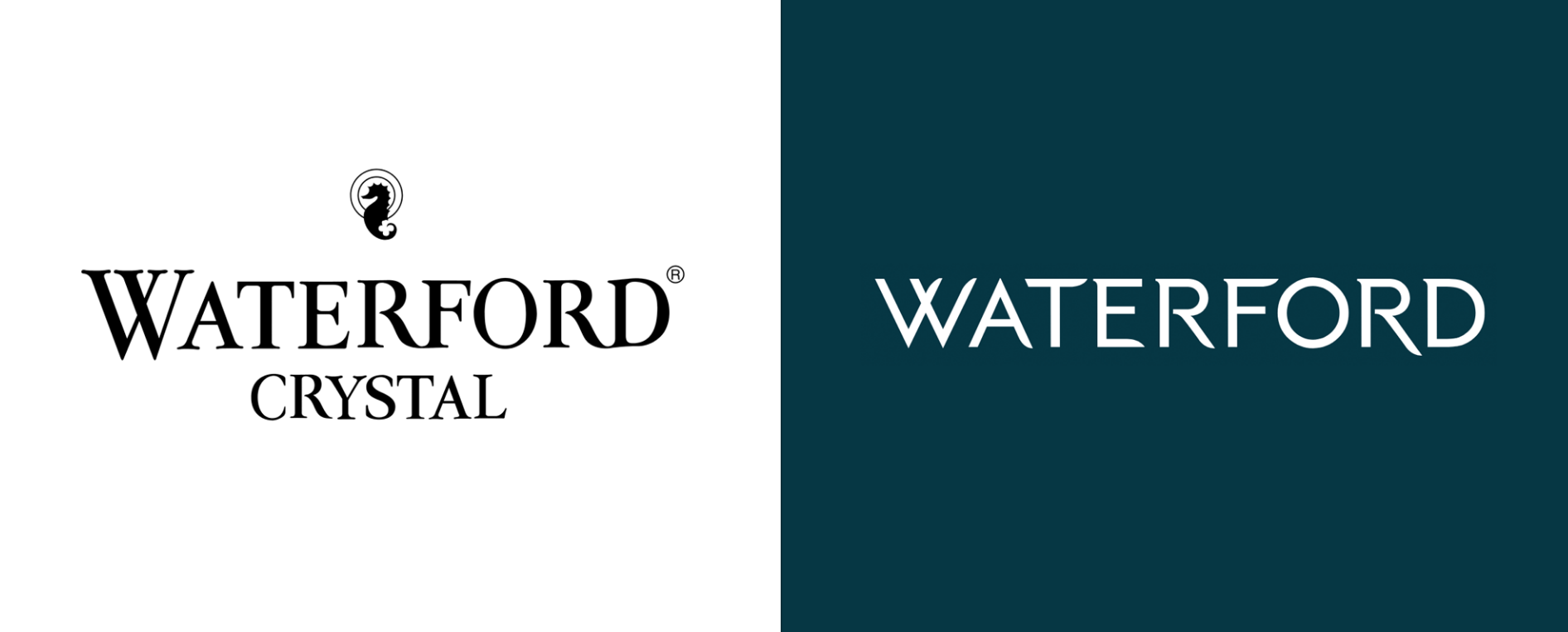
Waterford Crystal
The Irish luxury brand company, Waterford Crystal, which was established in 1783, has decided to modernize its logo for 2021. Following the current trend of simplify, simplify, simplify, the logo designer removed elements and pared down the wordmark.
First, the company icon of a seahorse has been removed from the brand’s main wordmark. Identica, the agency who performed the re-branding, did develop a new, simpler seahorse icon as part of the new brand identity, but it’s missing from the wordmark.
The wordmark didn’t just lose the seahorse icon: it also lost the second half of the company name. Waterford Crystal is now just Waterford, which emphasizes the Irish county where the company began, but not the beautiful products it creates.
The new font is a beautiful modern representation of the company, with the “W” in “Waterford” echoing the original logo’s first letter shape. The branding now presents the logo as a white word on a dark backsplash, which also embraces modernity compared to the traditional black-on-white style of the previous logo. The new font suggests the flow of water and the flow of blown glass.
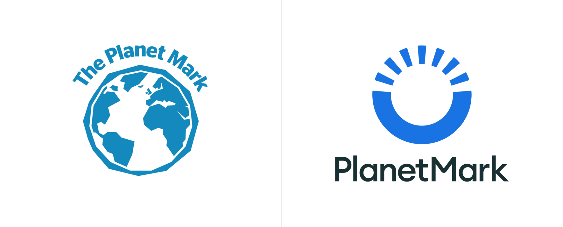
PlanetMark
PlanetMark, a company that offers sustainability certifications to other companies, has a new brand identity as of early February 2021, created by Design by Structure, a London-based studio. Planet Mark saw the need for a new logo as it wants to embrace the urgency of climate change and the need to act now.
The original logo features a simplified blue image of the globe, and curved above it are three words: The Planet Mark. The continents are presented jaggedly, contrasting with the smooth sans serif font of the wordmark.
There’s nothing jagged at all about the February 2021 re-design. It’s all about what’s smooth. The new logo dropped the image of the globe and replaced it with an abstract version. Now it’s a simple circle, the top half made up of seven short lines and the bottom a solid blue semi-circle, almost echoing a smile. The blue of the image is brighter, and underneath it the brand name is now only one word, PlanetMark set in plain black and in a simple, wide, sans serif font.

Wrapping It Up…
StanfordBrown, Waterford Crystal, and PlanetMark’s new logos are all about going into the next year of the pandemic with clarity. When not much is certain in the world, it’s a good idea to be as certain as possible about your identity, and these redesigns do just that. It’s clear that as of early February 2021, brands are moving to cleaner designs all around, but some, like financial institutions, continue to embrace the traditional, which works well in this shaky world.


