
Bosch is a technology company with a long legacy, and the logo history to match.
This engineering company was founded in 1886 and has delivered more than a century of top performance across industries.
Bosch is still a well-respected brand sold worldwide. The Bosch logo has evolved over time while maintaining recognizable branding and a consistent look and feel.
Explore the history of the Bosch logo as well as the Bosch company to see how this logo has stood the test of time.
About Bosch
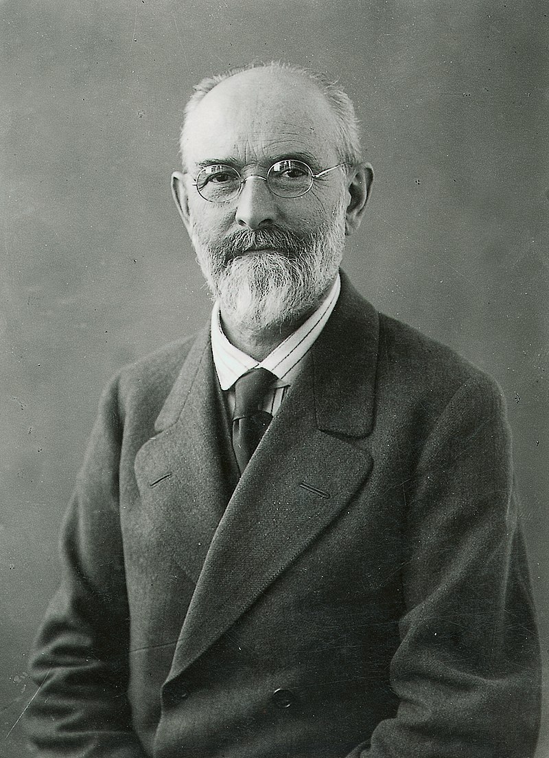
The Robert Bosch GmbH company, also known simply as Bosch, is a German firm founded in 1886. The company takes its name from its founder, the engineer Robert Bosch, who worked with Thomas Edison before starting his own workshop.
Mr. Bosch began the company out of a backyard and it grew as he found success. Bosch expanded internationally in the early 1900s. By the 1910s, Bosch products were available in every continent except Antarctica.
In its early years, Bosch focused on electrical and mechanical devices, especially for automobiles. The company sold its first low-voltage car generator in 1887. Then it expanded into ignition systems, spark plugs, generators, headlights, and other car parts.
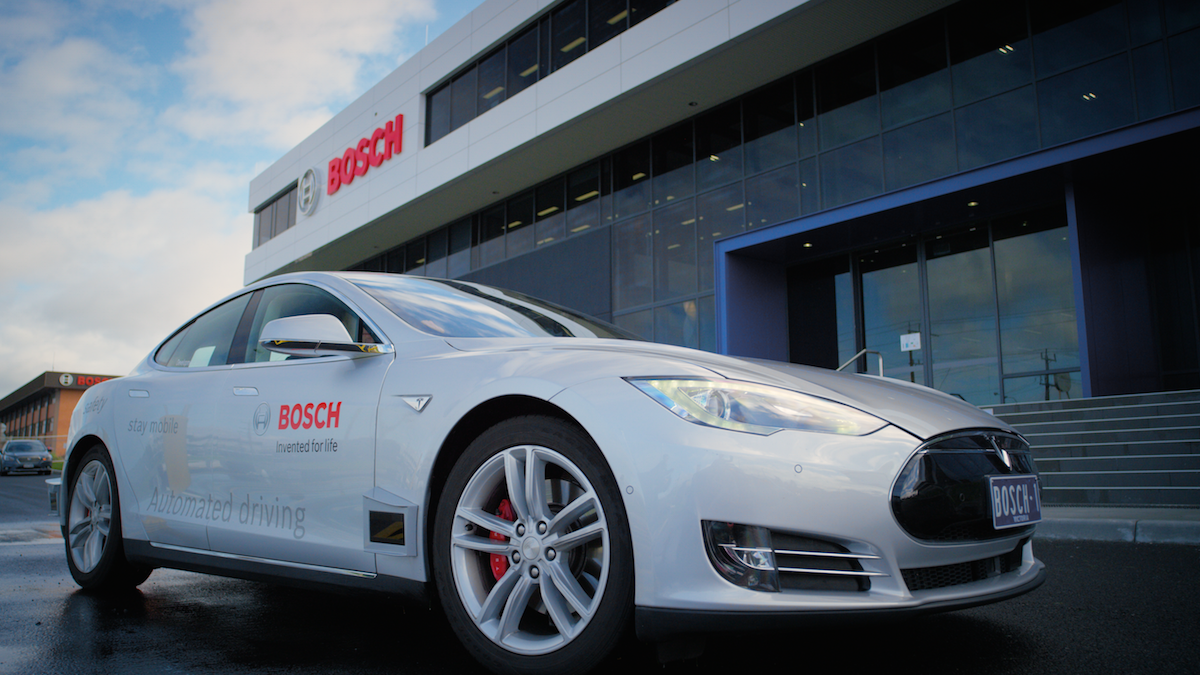
Bosch has been a mainstay of the auto industry ever since. Today, the company is the world’s largest supplier of automotive parts and equipment.
Bosch diversified their products in the 1930s. The company began making gas instruments, electric power tools, radios, home appliances, and more. This move made Bosch a household name.
Founder Robert Bosch has a mixed political legacy. He held many progressive views and took his role as a business leader seriously. He focused on occupational training, workplace safety, and worker’s rights. Bosch was the first German company to introduce the eight-hour workday. He offered apprenticeship programs to recruit and train young workers. He also tried to make broader changes by supporting peace efforts between Germany and France after World War I.
However, Bosch was also a major contributor to the Nazi war effort during World War II. German tanks, airplanes, and automobiles all used Bosch components. Several Bosch facilities used slave labor from concentration camps and captured enemy combatants in this work.
Some historians claim that Robert Bosch supported resistance activity in secret, but the Bosch leadership gave every appearance of cooperating with the regime. Mr. Bosch died in 1942 at age 80.
The company stayed intact after WWII, eventually recovering from the war and the death of its founder. Bosch continued to offer new technological products like public address systems, hydraulic brakes, digital radios, solar panels, software, dishwashers, lithium-ion batteries, computer chips, and more. The company now focuses on transportation, industrial tech, energy, construction, and consumer appliances.
Today, the charitable organization Robert Bosch Shiftung owns the Bosch company. This group spends most of the company’s proceeds on beneficial causes unrelated to Bosch’s products.
The Bosch Logo Over Time
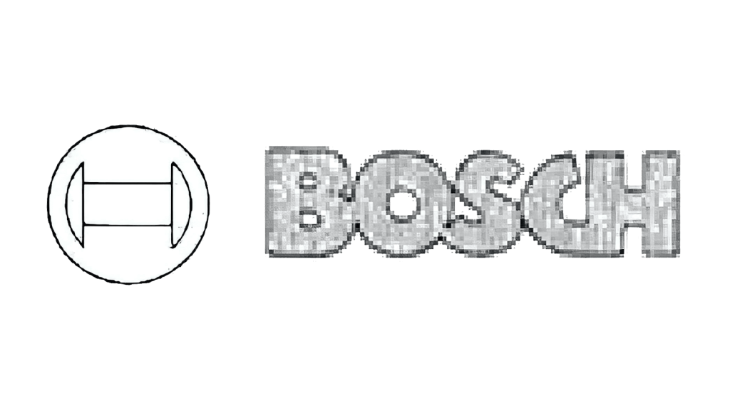
Bosch’s first logo was created in 1900. After more than 120 years in business, the company has updated its branding with the times. However, the Bosch logo has remained remarkably consistent over the decades. The powerful design can be identified at first glance, by people around the world.
The brand’s modern colors, font choices, graphics, and layout are similar to what consumers saw in the 1920s. All the elements in Bosch’s current logo were present in its very first design. This consistency is fitting for a brand known for its engineering, production, and efficiency. The logo reflects Bosch’s commitment to reliable performance.
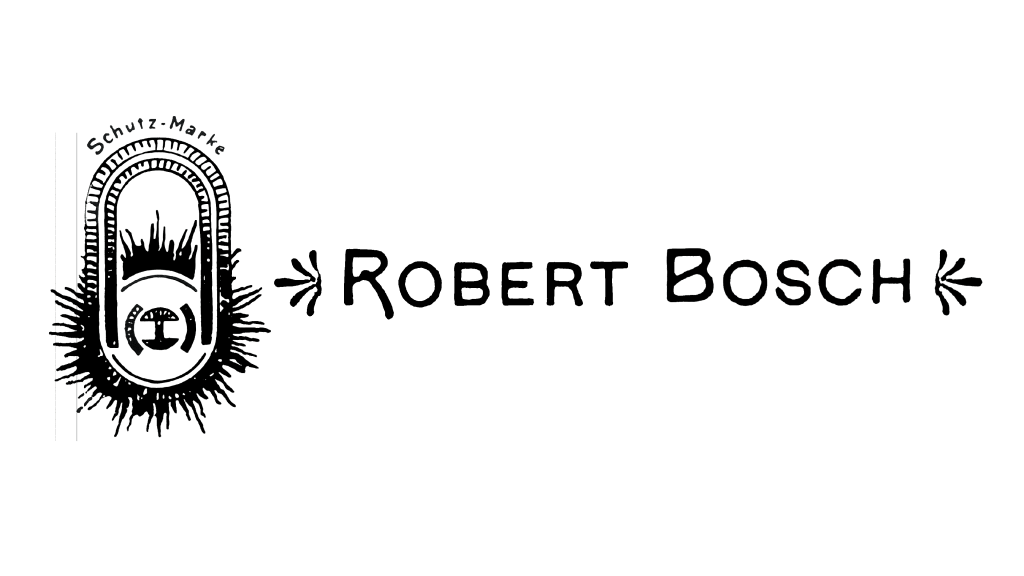
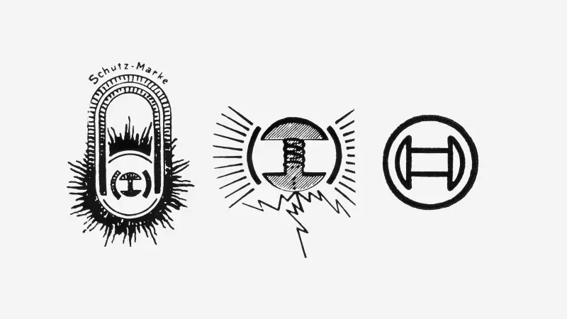
The Original Bosch Logo (1900-1907)
Bosch started using a logo in 1900. Although the company was only 12 years old at this point, Bosch was making a name for itself. Their auto ignition products had become the industry standard and Bosch was now expanding into the international market. It was time for the company to start using a distinctive, recognizable logo.
Bosch’s first logo featured elements from the Art Nouveau design movement, which was widespread in turn-of-the-century Europe. Art Nouveau was known for organic shapes, elements inspired by nature, curves, flourishes, and other decorative additions.
The first Bosch logo included a wordmark of Robert Bosch’s name. Unlike later logo designs, this first iteration used the founder’s first and last name. The wordmark was rendered in all capital letters using a decorative sans-serif font. The first letter of each word was larger than the others, and these characters also used upward-angled crossbars. Delicate leaf-like ornaments sat on each side of the wordmark.
The Bosch logo also included a graphic emblem to the left of the wordmark. This vertically-aligned oval featured a burning magnet, which was the innovation that made Bosch’s first auto generator such a success. The burning magnet was surrounded by an explosion of radiating lines, which gave the impression that the magnet was at work. These lines added a sense of motion and drama to the overall design.
“Schutz-Marke,” which means “Trademark” in German, was written at the top of the oval. The logo used a single-color design since it would have been stamped or engraved onto products. The distinctive design used effective elements from a popular art movement, so it would have made a lasting impression on consumers at the time.
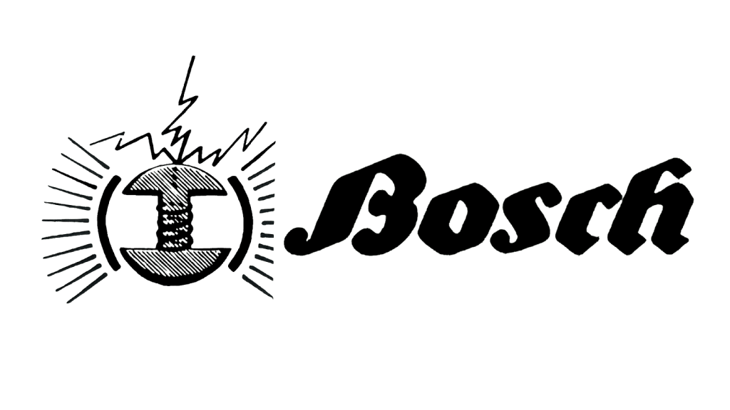
The 1907 Bosch Logo
The Bosch company changed their logo in 1907. This version simplified some elements of the original design but kept others.
The logo represented the company’s first move towards the more streamlined symbol they use today.
Compared to the 1900 logo, the new emblem was noticeably simplified. The company got rid of the oval and pared the emblem down to a circular design. The new version still included the company’s classic burning magnet.
Thick black semicircles to the right and left of the magnet created the illusion of a closed circle. An electrical bolt sparked from the top of the magnet and radiating lines spread from its sides.
All in all, the emblem clearly communicated electrical power.
The 1907 logo also changed the company’s wordmark.
The design was simplified to read only “Bosch.” Although the company name still included the founder’s given name, simplifying the wordmark put the focus on the brand instead of the man.
The new logo also used a different typeface. Instead of the Art Nouveau sans-serif, the 1907 logo featured a bold, thick, italicized blackletter font inspired by Fraktur fonts.
The Fraktur typeface was popular in Germany from the 1500s through the early 1900s, and its use only stopped when it was banned by the Nazis in the 1940s.
Fraktur typefaces are commonly associated with Germany, so using this font added a clear national identity to Bosch products.
The Bosch Logo in 1914
Bosch started using another new logo in 1914. This design came even closer to the company’s current version. German Modernism, which would develop into the Bauhaus and the Avant-Garde art movement, was beginning to impact society. The 1914 Bosch logo featured modern elements that make the design look current more than a century later.
This design continued to minimize and streamline previous versions. The wordmark used the same text as other designs—Bosch—but again, in a new font. The 1914 typeface was a bold, slab sans-serif in all capitals. The characters were all the same height and they were very closely arranged. Kerning was absolutely minimal. In fact, the contours of some letters ran together. The wordmark was monochromatic grey with a thin black outline.
The emblem was also simplified. The magnet graphic was rotated on its side, now sitting horizontally instead of vertically. A thin black line surrounded the emblem. The power lines, electrical lightning bolts, and decorative rays of previous logos were removed. The 1914 logo created a traditional yet modern image that has served the company well.
The Bosch Logo From 1925 to 1981
The company updated its logo again in 1925. This design, which included the brand’s first use of color, introduced the main graphic identity that Bosch still employs today. Bauhaus principles like simplicity, and the marriage of form and function, were obvious in this logo design. Since the Bauhaus promoted the idea that mass production could support individual artistic efforts, this logo was a good fit for a major manufacturing company.
The new emblem was almost identical to the previous version. Its overall design, of a vertical magnet surrounded by a circle, remained the same. The main change was in line weight. The 1925 logo used a thicker, bolder black line than the slim 1914 design. This change made the emblem look purposeful and authoritative.
This logo iteration also updated the Bosch wordmark. The new design used a red sans-serif typeface that offers powerful contrast to the black emblem. The characters were all the same height and again, were rendered in all capitals. The wordmark’s clean design looks completely modern, even though it’s almost a century old.
The Bosch Logo From 1981 to 2002
Bosch updated their logo again in 1981, but the changes were so minimal that most consumers wouldn’t have noticed the difference. The logo had effectively communicated the company’s reliability for decades. By this time, Bosch was a well-known fixture across many industries. The company made a few tweaks to the design but kept the overall look, layout, and feel.
The wordmark saw the biggest changes in the 1981 redesign. This version still used a red sans-serif typeface that presented the company name in all capitals. However, the update changed to a taller font, so each character took up less space. The kerning was also tightened.
The emblem was also slightly adjusted. The company kept the general design of a magnet in a circle. The only minor change came in making the magnet slightly more narrow.
The 1981 redesign used a new font and a different emblem. However, the logo maintained its now-classic color scheme, layout, and wording. Even the new emblem and typeface were almost identical to the previous version. This change highlighted Bosch’s longstanding tradition of performance.
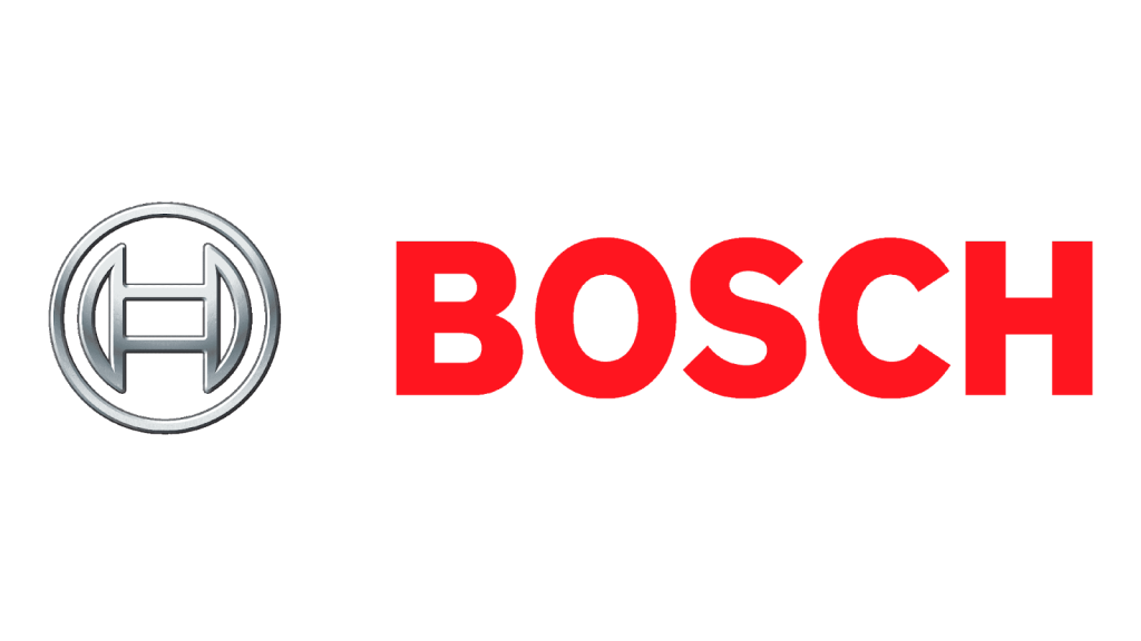
The 2002 Bosch Logo
Bosch started using another new logo in 2002. The red, bold sans-serif wordmark was very similar to the previous version.
The wordmark had become a distinctive brand feature that didn’t make sense to change.
However, Bosch was ready to update the emblem.
The new logo included a three-dimensional graphic. The older logo variants used flat black designs, but the 2002 iteration features shades of grey to create rounded volume.
This design feature was popular in the early 2000s. Many brands made similar changes, all inspired by Apple’s iconic, three-dimensional apple logo.
This of-the-moment design follows Bosch’s tradition of using popular artistic elements in their early logos.
Bosch’s Current Logo
Bosch introduced their current logo in 2018. This design maintains classic brand features like the wordmark’s bold red lettering. The wordmark is virtually unchanged since the 1981 design. This long-term consistency reflects the company’s long history.
The modern logo also merges recent emblem designs. The company returned to a flat design, which is now rendered in deep grey instead of black. These changes are subtle, but they show that Bosch is ready to evolve with the changing market.
The Bosch Logo Main Design Elements
The Bosch logo has been remarkably consistent for more than a century, which has made the brand easily recognizable.
Burning Magnet
Every Bosch logo has featured its iconic burning magnet, which calls back to the company’s first signature product.
Colors
The Bosch color story—black or dark grey, and red—is a striking combination that offers high contrast in almost every situation, making for easy brand recognition.
Font
Bosch has used similar sans-serif fonts since the 1920s, which has given the logo a timeless, classic, yet modern feel.
Lessons From The Bosch Logo
The Bosch company created a solid visual identity in 1913. Since then, the company has seen global expansion, wars, changing technology, and evolving design preferences.
However, their well-designed logo has remained relevant, appealing, and recognizable through all these events. The Bosch logo is a classic blend of form and function, which is why it has stood the test of time.


