
Operating for more than 120 years, Renault Group was founded in 1898 in France. Today, Renault Group still has maintained its French ties with headquarters outside Paris, in Boulogne-Billancourt. The company has grown to become a leading, global automobile manufacturer.
Renault Group, or Renault SA, is universally recognized thanks to its partnership with Nissan and Mitsubishi Motors. Beyond this partnership, Renault comprises four separate brands (Renault, Dacia, Alpine, and Mobilize), where each automobile brand is focused on providing a sustainable and innovative automobile option to Renault’s customers. This customer-focused strategy is one of the reasons why Renault Group has stuck around for so long, as you’ll see later in this blog post.
In the centuries since its initial launch, the Renault company has evolved to become one of the best-known and most respected automakers in France, and throughout the world.
Currently, Renault is France’s largest manufacturer and exporter of automobiles, and the familiar diamond Renault logo has become a household icon easily recognized in most nations.
This well-known stylized diamond has become synonymous with the Renault brand, however, it may surprise many to learn that this classic icon was not adopted until well into the brand’s second decade of business.
Let’s dive into the history of the classic Renault logo, and the story of the iconic car company it represents.
The Renault Story
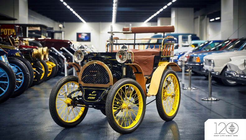
Though officially founded in 1899, the Renault vision was actually launched (quite literally) from the top of rue Lepic, one of the steepest streets in Paris.
Young auto-enthusiast, Louis Renault, took his homemade automobile, dubbed the “Voiturette” to the top of the hill and promised to pilot it down the intense grade successfully using the car’s new innovative direct gearbox.
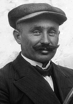
The stunt was a success and resulted in orders for the production and sale of 12 brand-new Voiturettes. When Louis’ Voiturettes sold out, he knew he was onto something. This demand for the Voiturettes led the Renault brothers (Marcel, Fernand, and Louis) to found Renault Frères.
While Louis served as the inspiration in starting the brand, in the company’s early days, Louis served as the designer, rather than providing any strategic direction. The company’s Type A Voiturette went on to win several early car competitions netting the new automaker an impressive 71 orders in its first year alone.
Renault: Off To The Races
An early area of opportunity for the Renault brothers was car races. In 1902, only about four years after the company was founded, Renault Frères created a faster engine. This one was 2-cylinders versus the standard 4-cylinders. This new development helped Marcel win the Paris-Vienna car race that he competed in. From that point forward, the Renault brand was off to the races.
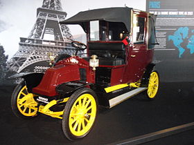
Renault brought home another astounding victory, winning the first French Grand Prix in 1906.
Marcel wasn’t the car driver for this race though, that honor would belong to Ferenc Szisz from Hungary. Ferenc had ties to the company, serving as an engineer designer, so it made sense that he was the one who drove this car to victory. This Renault model was the Renault AK and it was fast, real fast. The Renault AK allowed Ferenc to finish the 1,238-kilometer race in nearly 12 hours.
Renault: The War Effort
By 1914, World War One was in full swing, and both private individuals and private businesses were pressed into action to contribute to the war effort. Renault proudly rose to the challenge and was quickly granted 31 defense contracts by the French Ministry of War.
Renault assisted the war effort with the production of aircraft engines, shells, ambulances, trucks, light- duty tanks, and more. However, the brand is perhaps best known for its production and supply of 1,000 Renault taxicabs used to transport 4,000 French soldiers to the First Battle of the Marne.
History will forever remember the Renault “Taxis de la Marne”.
In the brief period of peace between the first and second world wars, Renault continued to expand its footprint, building additional factories, and incorporating trucks, buses, and tractors into its growing product lineup. World War Two would see many of these factories commandeered or decimated by German forces.
In 1945, following the war, the remaining Renault factories came under the control of the French government and were re-labeled as the Régie Nationale des Usines Renault. It is during this period of recovery that Renault began to focus on the production of appealing and affordable family cars.
Renault: Breaking Records
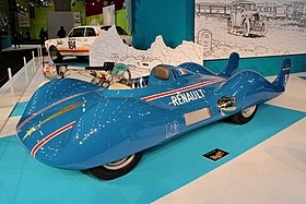
Renault Group did a great job at building a reputation of being a fast car manufacturer, meaning if you wanted a fast car, you should probably explore Renault’s models. Renault continued to solidify this during the Bonnevelle Salt Flats race in 1956. It was during this race that spectators first watched Renault’s Etoile Filante race past four records, all records based on land speed.
Renault: The American Expansion (and Retraction)
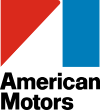
In 1979, Renault contracted with American Motors Corporation (AMC) to cross-market the two brands. AMC would sell Renault vehicles in their American auto showrooms, and Renault would in turn sell AMC vehicles to their European customers. Within a year of the agreement, Renault had gained a controlling interest in AMC.
However, just eight years later, in 1987, Renault chose to withdraw from the American market, inking a buyout agreement with American car company the Chrysler Corporation. While Renault removed its passenger car lineup from the American market, the company continues to hold a controlling interest in Mack Trucks Inc. giving them a foothold in the American heavy-truck industry.
Renault: The Modern Privatized Company
Prior to 1990, Renault Group wanted to always operate as a private company, holding onto its small, home-grown beginnings. Despite this desire, Renault Group couldn’t, until 1990. It was this year that the brand took steps to go to back towards becoming less public. The brand slowly became a limited public company and by 1994, the French government had reduced its ownership share to less than half of the company, and by 1996 Renault would be a fully privatized company once again.
Renault: Back To The Races
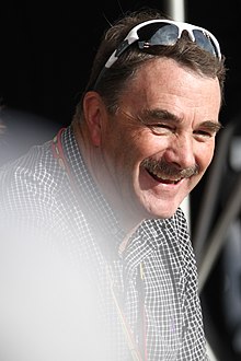
When a customer base knows you as one thing, it’s important to not shift away from that as a brand – which is what Renault continued to do and what has worked for the company. For example, in 1977, Renault developed the first turbocharged engine in the world the RSO1 Formula 1 (F1) racecar. Since then, the brand has become synonymous with victory. A little over a decade later, Nigel Mansell drove this RSO1 F1 model to victory after victory. This year, in 1992, Mansell helped the brand earn the honor of “F1 World Champion Manufacturer.” This honor continued to help the brand dominate this industry even more.
This impressive achievement marked the sixth consecutive year of Renault engines taking the top championship positions in the F1 circuit.
3 years later, in 1995, two different Renault race teams placed in the top three for the French Grand Prix. One year later, in 1996, Renault would occupy the top 4 positions in the same prestigious race.
This winning streak continued and in the early 2000s, in 2005 and 2006, Renault again won two consecutive F1 championships – all thanks to the outstanding and state-of-the-art Renault race cars.
Renault: Global Expansion & Strategic Alliances
From the mid-nineties forward, Renault began a period of rapid global expansion, carving out new markets and crafting alliances that would shape the brand into the modern juggernaut that exists today. In 1995, Renault broke ground on its Samsung Motors, Inc. plant in Busan, South Korea. This factory marked the start of a long and lucrative pairing of Renault’s auto manufacturing and management know-how with Samsung’s technological expertise. This partnership was dually beneficial for both brands. On Renault’s end, since 2000, Renault has kept ownership of Samsung Motors.
1998 saw further expansion with the addition of the Technocentre in Guyancourt, France, an innovative design and engineering center created to bring together all of the key minds responsible for the design of Renault vehicles now and in the future. The same year brought the brand into South America with the opening of The Ayrton Senna manufacturing complex in Curitiba, Brazil.
In 1999, Renault acquired the Dacia plant at Pitești in Romania. The Dacia plant was expanded to include a mechanical plant in 2005, and a logistics center in 2006. This plant helped Renault create its next expertise, Renault Technologie Roumanie (RTR). This expertise quickly became an extension of the greater Renault brand and it served as a regional engineering center outside of France, in Bucharest.
For some brands, one big move a year is enough. For Renault though, that wasn’t the case. That same year, Renault announced a partnership with another car brand, Nissan. This Renault-Nissan alliance allowed for the two brands to mutually benefit from its other shareholders and industry knowledge.
In 2008, Renault reached the Russian market by acquiring a 25% share of the Russian market leader, AVTOVAZ.
After Renault’s alliance with Nissan, the brand went on to create another alliance, this time with Dongfeng, a Chinese car manufacturer. This partnership was called the Dongfeng Renault Automotive Company (DRAC). This allowed for Renault to expand its operations overseas with a new manufacturing plant in Wuhan, China.
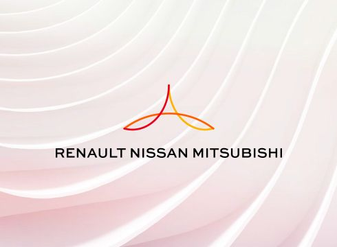
.Another partnership for Renault has happened recently, in 2022. This year, Renault teamed up with Mitsubishi, the Japanese car manufacturer we know and love. This group was called the Renault-Nissan-Mitsubishi alliance, capturing all three companies in one partnership.
The newly formed Renault-Nissan-Mitsubishi announced its 5-year strategic plan to leverage cooperation between the three companies to help set the strategic direction of the highly anticipated and quickly adapting, electric car industry. the brands to help develop the scope of the electric vehicle industry.
How the Renault Logo Came to Be
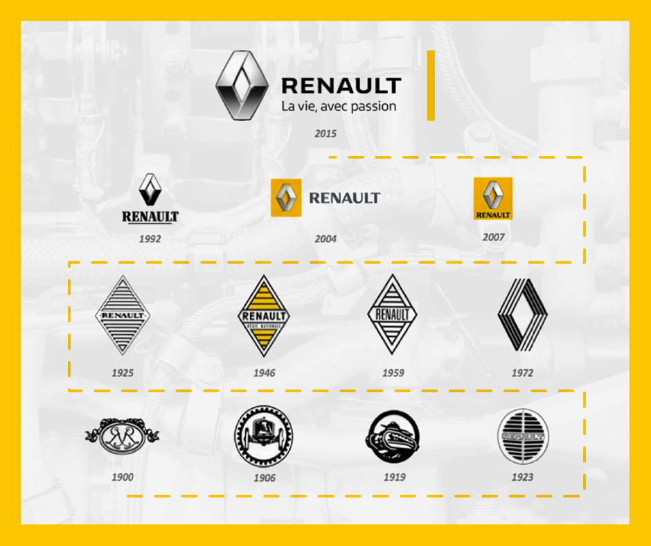
With over a century of automotive innovation, the Renault brand has come a long way since its relatively humble beginnings at the top of a steep slope on a famous French street.
The Renault logo has evolved steadily along with the brand. However, for all of its expansion and change, the familiar diamond shape, adopted in the early decades of the brand’s existence, has remained an integral and instantly recognizable facet of the brand’s identity.
Now that you have a framework of Renault’s evolution as a brand, it’s time to shift gears and look closely at how the brand’s logo has developed since the company’s early days, back in 1899.
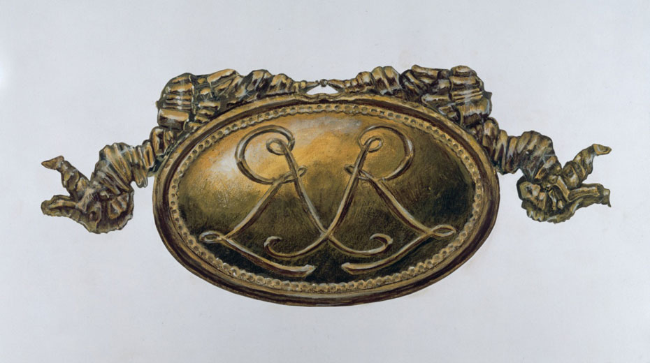
1899 – 1906: The Early Years
The earliest rendition of the Renault logo represented the traditional styling
of the time. A simple bronze-toned Art Nouveau medallion adorned with two ribbons, and intertwined uppercase “R”s depicting the initials of the two founding Renault brothers, Marcel & Fernand. The third Renault brother, Louis Renault’s initials would appear in the wheel hubs of Renaults of this era.
This early logo was used primarily for brand identification on documents and marketing materials but was not affixed to Renault automobiles. During these early years, the only outwardly visible insignia on the Renault automobiles themselves was a discreet imprint of the brand name, Renault-Frères, on the running boards, and the initials of, then-design engineer, Louis Renault, engraved into the wheel hubs.
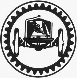
1906 – 1919: Grand Prix Pride
The first redesign of the Renault logo came in 1906. The original medallion emblem was replaced with a stylized image of the Renault AK, placed inside a gear-wheel frame. The Renault AK was the car driven to a championship victory in the 1906 French Grand Prix.
This significant achievement was a huge feather in the cap of the Renault brand and the company proudly displayed its achievement in this race-themed artistic rendering.
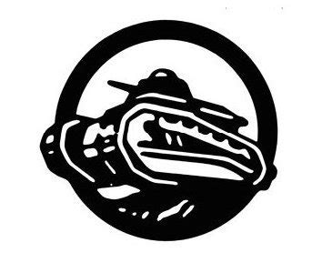
1919 – 1923: The War Effort
At the start of World War One, Renault was pressed into patriotic service to aid the war effort. Renault factories worked to support the troops through the manufacture of artillery, ambulances, aircraft engines, and light-duty tanks.
From 1919 to 1923, the Renault logo was redesigned to represent this shift in priorities, and production. The logo during this period featured the same bold framing of an artistic vehicle rendering. However, the Renault AK was now replaced with the image of a military tank, and the gear wheel was replaced by a more somber and powerful circular frame.
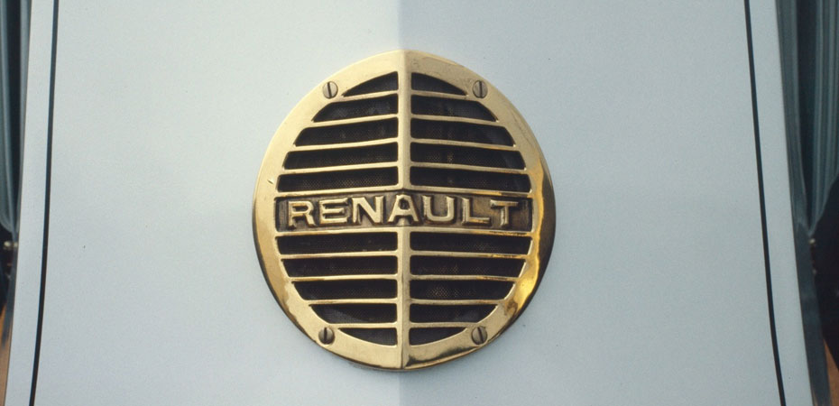
1923 – 1945: The Renault Diamond Takes Shape
1923 marks the first time that a brand emblem would be placed in a prominent position on the Renault vehicles themselves. The first rendition of the Renault vehicle emblem had a simple design. A metal circle surrounds a metal grill, with the name Renault in simple block lettering appearing in a center bar across the grill front.
This initial design was more practical than intentional. At the time of its creation, French regulations required the vehicle horn to be placed behind a protective grill allocated in the center of the front bonnet. The 1923 Renault emblem served this purpose. The circular emblem is bisected by a vertical metal bar allowing it to conform to the unique shape of the Renault hood.
From 1924 to 1929 the emblem underwent several additional small design changes. The original styling remained largely the same, but the contours of the circle slowly began to give way to a more angular shape in an attempt to match the peaked profile of the Renault bonnet.
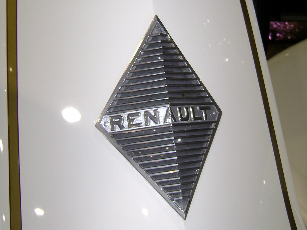
It is during this period that the circular grill bisected by two lines gradually gave way to the classic Renault diamond grill pattern. This geometric diamond shape has become synonymous with the Renault brand and has remained a staple of the logo long after the sharp lines of the Renault vehicles transformed into more modern curves.
This classic Renault logo styling continued for the next decades, undergoing small changes during the 1930s and early 1940s. During these decades, the outer frame was dropped from the design, the Renault name emblazoned across the front became larger and more prominent, and the stripes took on a bolder, more modern styling.
1945- 1958: Modern Styling & A Pop Of Bold Color
1945 saw the first major redesign in decades. The classic Renault diamond was reimagined as a modern shield. Perhaps most significantly, the new design saw the first dashes of color. The main crest shape was now emphasized in gray, and the black diamond and stripes pattern was now set against a bold background of vibrant yellow.
The interior of the emblem gained a new signature, “Regie Nationale Renault France” inscribed in black sans-serif, on a painted gray background plaque.
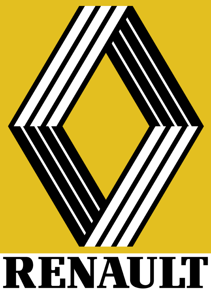
However, this stylized crest design was short-lived, and by 1946 the design was simplified to its original iconic diamond pattern once again. The colorful palette remained, with the classic Renault diamond now rendered in black and white set off against a jubilant yellow background.
1959 – 1967: Refined & Elegant
Since the company was founded in France, it’s not surprising that the diamond we see in the logo was called Pointe de Diamanté. Outside of France we commonly refer to the symbol as a diamond but for Renault, in its founding country, consumers refer to it as that which translates to “diamond tip.”
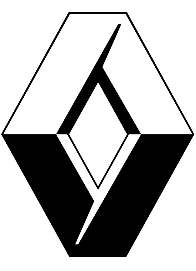
1967 – 1972: Design Controversy
Design ControversyIn keeping with the times, the Renault logo underwent a modern design shakeup in the 1960s, with the classic diamond being re-imagined as a pair of artistically styled geometric triangles rendered in crisp white atop a bright-yellow square, essentially using the negative space to create the signature Renault diamond pattern in sunny yellow.
This modernized logo quickly sparked controversy, and a lawsuit, as it was deemed to be too similar to the Kent logo, which made use of the same stylized white triangle geometry.
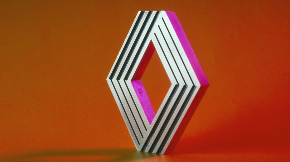
1972 – 1992: Artistic Redu
Renault created an Arts & Industry division during this period that included contributors like the renowned painter and visual artist Victor Vasarely. Vasarely, together with his son, Yvaral, created a brand-new artistic revamp of the Renault diamond logo. The result was a futuristic, metallic three-dimensional emblem with a series of sharp angular lines creating the diamond pattern. The name Renault was removed from the center and the diamond stood alone for the first time.
The 1980s saw minor changes. The contours and angles were accentuated with white for a sleeker look. The bright sunshine yellow background was darkened to more of a mustard hue, and when present, the typeface was executed in a thick black serif font.
The 1980s saw minor changes. The contours and angles were accentuated with white for a sleeker look. The bright sunshine yellow background was darkened to more of a mustard hue, and when present, the typeface was executed in a thick black serif font.
1992 – 2004: Renault 3D
The Renault name reappeared in a bold sans serif font beneath the emblem in 1992, The diamond pattern itself was simplified from a series of lines making up each side to a stylized arrangement of four geometric shapes, arranged in a diamond pattern. The upper quadrants feature white coloring, while the lower quadrants are rendered in black.
In the early 2000s, the diamond quadrants were placed inside a yellow background for emphasis. This version of the logo would become the core foundation of the familiar Renault logo used today.
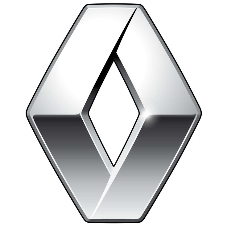
2004 – 2015: A Bold Metallic Makeover
From 2004 to roughly 2015, the Renault logo underwent several small refinements with a big impact. The white and black graphic diamond shapes were rendered in silver for a sleek futuristic look. The Renault name and wordmark were redesigned by artist Eric de Berranger, using a variety of both thin and thick lines with a more powerful and elegant typeface.
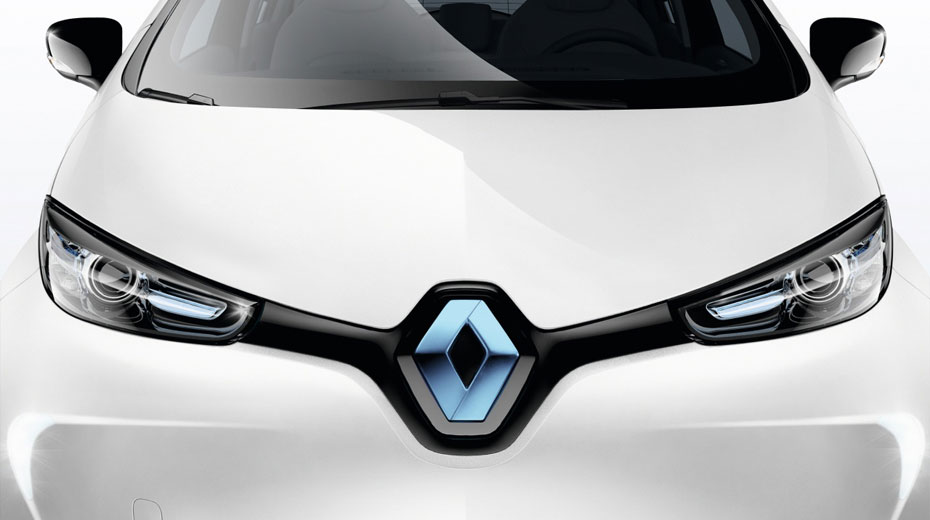
2015 – Today: Passionate, Powerful, & Prominent
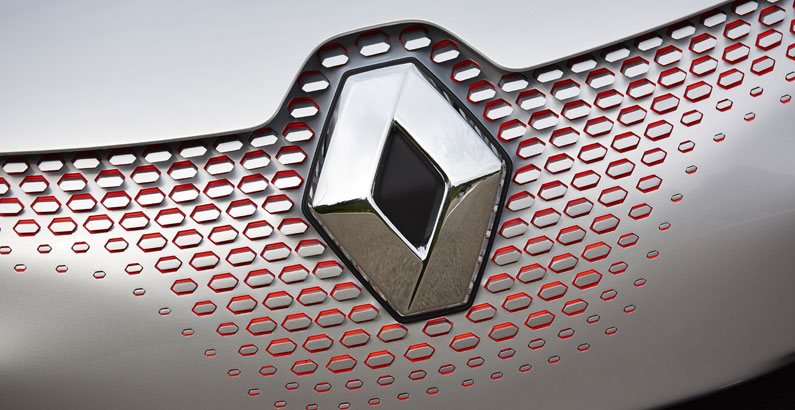
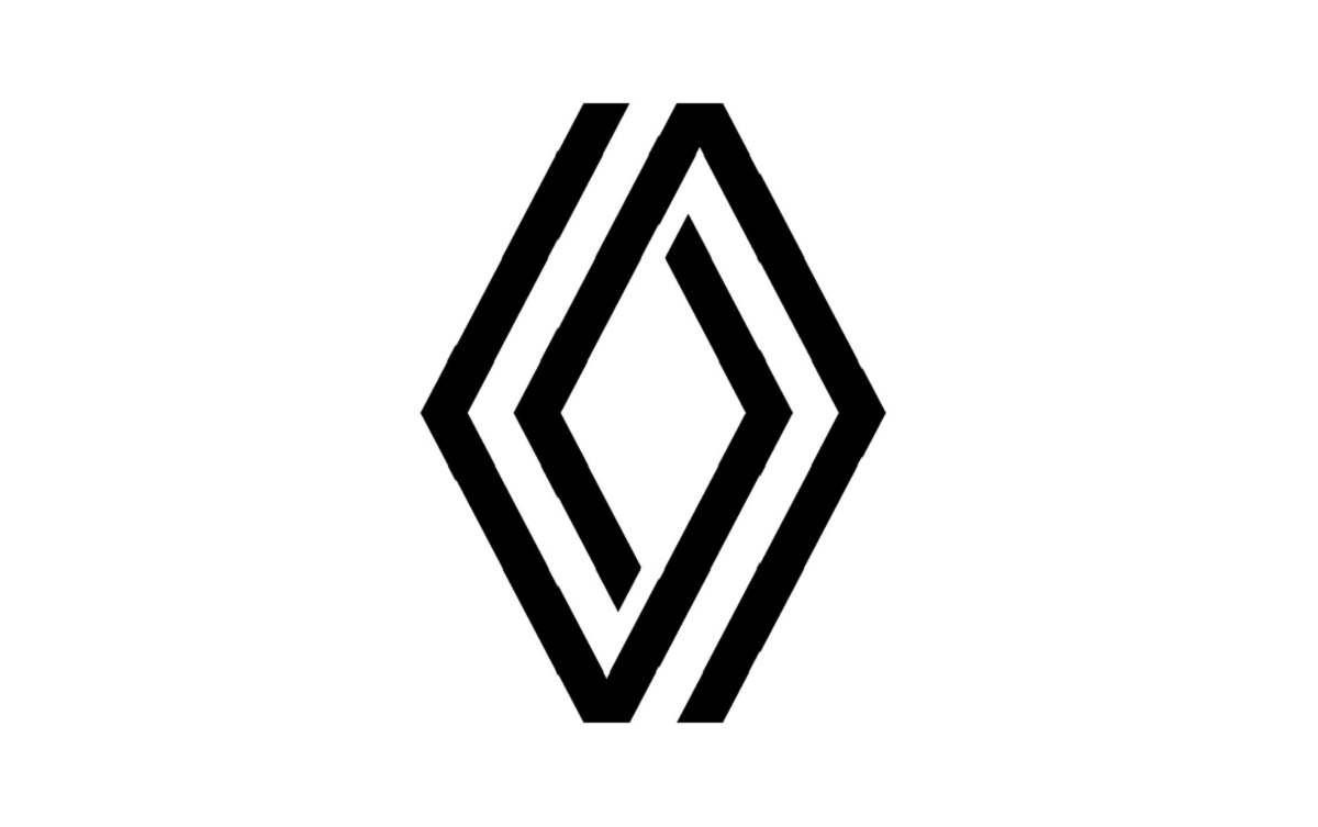
From 2015 forward, all Renault models featured a much larger, vertical silver diamond logo placed in a prominent position on the front grill. During this stage, the logo featured a graphite-colored “V” designed into the stylized silver diamond to symbolize victory.
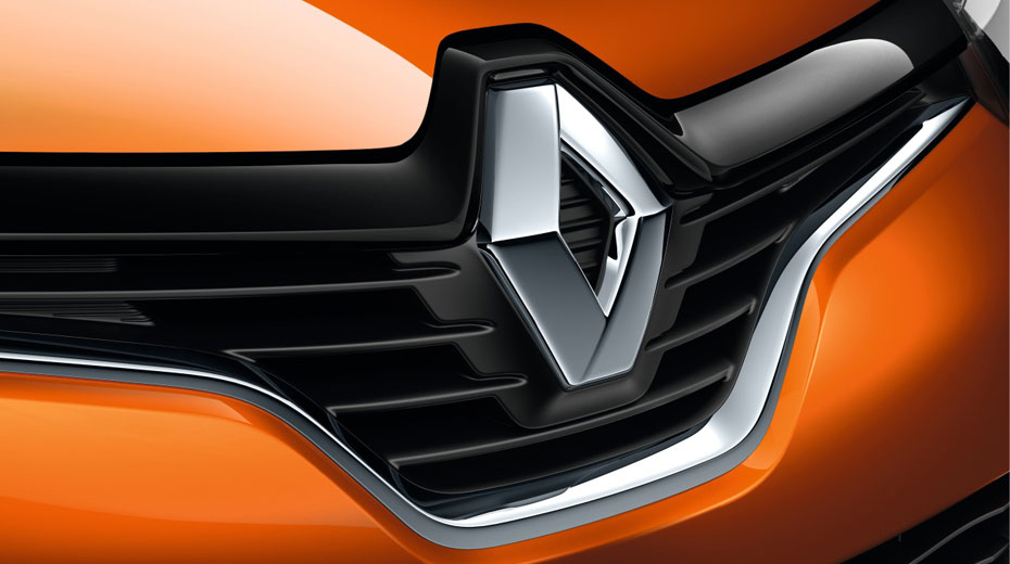
In 2021, the logo went through its most recent changes. The current emblem is rendered in monochrome silver, and the diamond has been recreated in a minimalist design composed of two thick stylized interwoven lines.
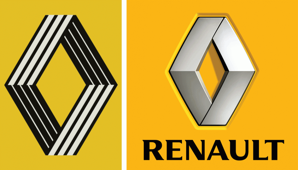
The company has recently unveiled another new rendition but has yet to make the new design official. The new design was created by designer Gilles Vidal and consists of the classic Renault diamond pattern made up of a series of maze-like black lines.
This new rendering is expected to be unveiled on the new Renault 5 models scheduled for release in 2025.
Breaking Down The Core Elements Of The Renault Logo
Throughout the many reimaginings and refinements of the Renault logo, several core elements have remained standard.
Symbolism

The geometric diamond pattern has become synonymous with the Renault brand. Given the diamond symbol on Renault’s logo, the brand has been dubbed “the diamond brand” by many of its enthusiasts.
While the diamond shape was not always a part of the Renault brand, it has been an unwavering staple of the design since 1923.
Originally adopted due to the practical need to fit the emblem atop Renault’s peaked bonnet, the diamond has come to symbolize quality and is now clearly recognized as an integral component of the brand identity.
Color Palette
The earliest Renault logo and emblems were crafted in the traditional bronze metallics of the time. In later years, those metallic tones would give way to industrial black against a crisp white background. The 1940s ushered in a more modern taste, and pops of color were introduced to accent the solid black design.
The brand’s color palette was largely decided during this period. A bold bright yellow background was chosen to symbolize optimism and excitement, and the diamond pattern and typeface were often rendered in black or gray and accented with white for a more prominent design. While these colors are often re-arranged, they remain a common fixture of the Renault logo design.
The modern lineup of Renault automobiles features a simplified monochrome silver emblem for a sleek look, however, the bold color elements of the Renault color palette can still be found in Renault marketing materials, documentation, and signage.
Font

The Renault name and signature line, when present, has been created in a variety of typefaces and fonts over the brand’s evolution. However, the brand does tend to favor bold, black or gray, sans serif font, and often renders the Renault name in large uppercase letters for a strong effect.
The Renault logo, marketing materials, and signage often make use of a proprietary typeface designed for the brand by the British design firm, Wolff Olins. This typeface is named Renault for the brand and has been developed into a typeface family that includes Renault MN Bold, Renault Identite, and Renault Life Bold which have all been used in the Renault logo design at various points in history.
Final Thoughts
The Renault brand is one of those iconic names that has stood strong through the tests of time. The brand has weathered more than a century of societal changes, from the impacts of two world wars to the modern disruptors shifting the automotive industry toward electric-powered cars. Renault has stayed on track and can often be found leading the innovation at every turn.
As the brand has evolved, the Renault logo has shown the same ability to roll with the changes while holding strong to the core elements that truly define the brand’s signature style. From the earliest introduction of the diamond brand logo to the upcoming new design being prepped for the 2025 Renault electric vehicle line-up, there is no doubt that the Renault style will be evident at the first glance.


