
If you are in the market for a new automobile, what car dealerships do you stop by? Is it Toyota? How about Honda? Or how about a luxury brand like BMW?
One of the many car manufacturers out there is Nissan and it’s a car company you’ll likely come across in your search. Nissan appeals to a wide demographic with its ownership of not only Nissan, but Datsun and Infiniti as well, and it’s a company that is worth exploring during your next car search.
Nissan has been around since 1933 and its logo has become one of the most widely recognized car logos in the world. If you’re eager to learn how Nissan (and Nissan’s iconic logo) came to be, then you came to the right blog post. Keep reading below to learn all of that and more!
Meet Nissan

Nissan entered the automobile industry in December 1993. Founded in Japan, the brand operates under the formal name, Nissan Motor Company, and encompasses both Datsun and Infiniti, in addition to Nissan itself. Throughout the years, Nissan has tried its hands on a variety of specialties within the automobile space, and today, the brand has grown to be the third-largest automobile manufacturer in Japan and the sixth-largest in the world. In addition to that accolade, Nissan is credited with selling the greatest number of vehicles to Russia, China, and Mexico.
Nissan’s Evolution
1928: Nissan is founded
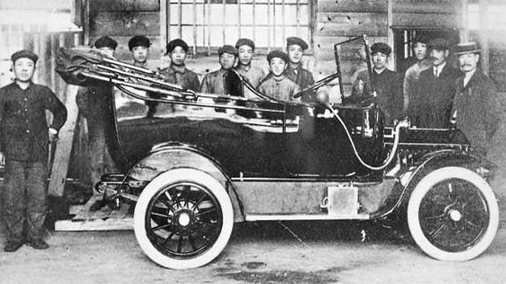
Before Nissan was a publicly recognized company, it was first founded in 1928 in Tokyo. A few years later, in 1933, Nissan entered the Tokyo Stock Market, bringing the company public. When it entered the Tokyo Stock Market, Nissan entered as an automobile part company.

1937: Nissan releases the Datsun Type 15
When Nissan first launched, the company divided its time between aviation and automobile vehicles. In 1937 though, Nissan distinguished itself as an automobile company and released the Datsun Type 15. This vehicle was the first vehicle of its kind and was the first automobile to be mass-produced in Japan.
1958: Nissan enters the United States market
After working on its vehicles in Japan, Nissan launched in the United States in 1958. The first vehicle that was released was the Datsun 1000 sedan. The only issue with this release was that Nissan did not have a manufacturing facility in the United States so any Nissan vehicles that were sold overseas, had to be imported and shipped there.
1966: Nissan opens a manufacturing facility in the United States
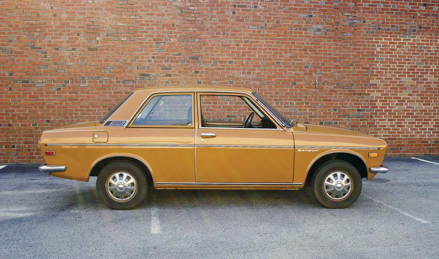
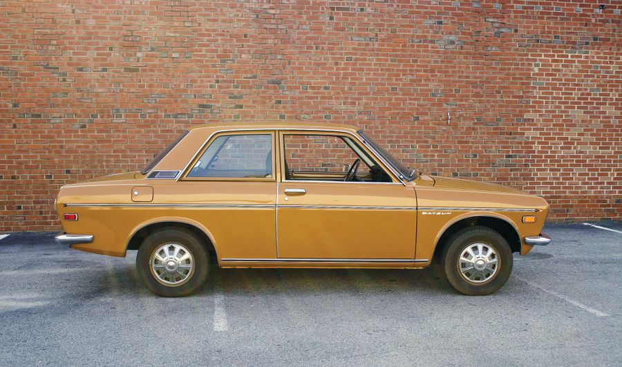
To respond to increased demand in the United States, Nissan opened a manufacturing facility in the States in 1966. This allowed the company to expand its operations and growth. With this expansion, Nissan released its first vehicle that catered to the American demographic in 1968, the Datsun 510. This vehicle came in a 5-door station wagon, 4-door sedan, and 2-door coupe model options.
1971: Nissan grows in the American market
With Nissan’s arrival in the American market, Nissan continued growing. In 1971, more than 250,000 Nissan automobiles were sold annually in the States and a few years later, in 1973, Nissan became the top vehicle importer to the United States.
The 1980s – 2000s: Nissan expands its product models
In 1980, Nissan released its first truck in addition to its already widely popular models. During these decades, Nissan focused on releasing new sedans, trucks, and SUVS and it was in 1992 that Nissan first released its first Altima vehicle design, a car that many Americans still seek out today.
In addition to these models, Nissan also focused on updating the engine power of its models. Other new models included a full-size truck and a full-hybrid model.
2010s – Today: Nissan stays competitive

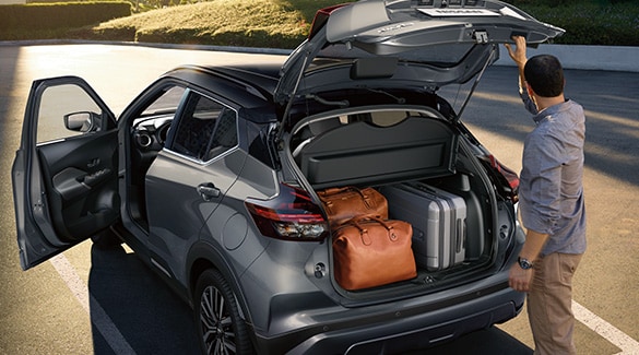
With electric vehicles growing more and more in popularity, Nissan developed a model that offered drivers a sustainable option, the Nissan Leaf. This model was launched in 2010, was powered entirely on electricity, and was the first zero-emission vehicle consumers could widely purchase. Another model that was a direct response to what Nissan’s customers wanted was the Nissan Kicks. This crossover SUV comes equipped with modern features and provides endless opportunities for customization.
Roadblocks Along the Way
Nissan’s biggest roadblock is not something uncommon in the automobile industry – it’s dealing with customers with established brand loyalty. Customers are loyal to certain car brands, there is no getting around that. Their family member may have a tie to a certain company (or has only purchased one type of vehicle), or they may like the look of one company or have some other reason that causes them to be loyal to a certain car brand. Turning these customers into Nissan customers is no easy feat. Despite this roadblock though, Nissan was able to keep growing by offering a wide array of models, building out partnerships, and listening to its customers. Even with customers that are loyal to another car brand, Nissan’s logo and brand name are still widely recognized across the globe.
The Meaning of Nissan’s Logo and Nissan’s Logo History
Nissan was not a company that decided to stick with only a few logos through the years. Nissan’s logo design was constantly being updated to reflect how the Nissan brand is an innovative one. Inspiration for the logo was originally found in the brand’s birthplace, Japan, and as the logo developed through the years, this Japanese symbolism was never lost.
Below we take a closer look at how this logo design evolved since 1933 when the first logo design was released.
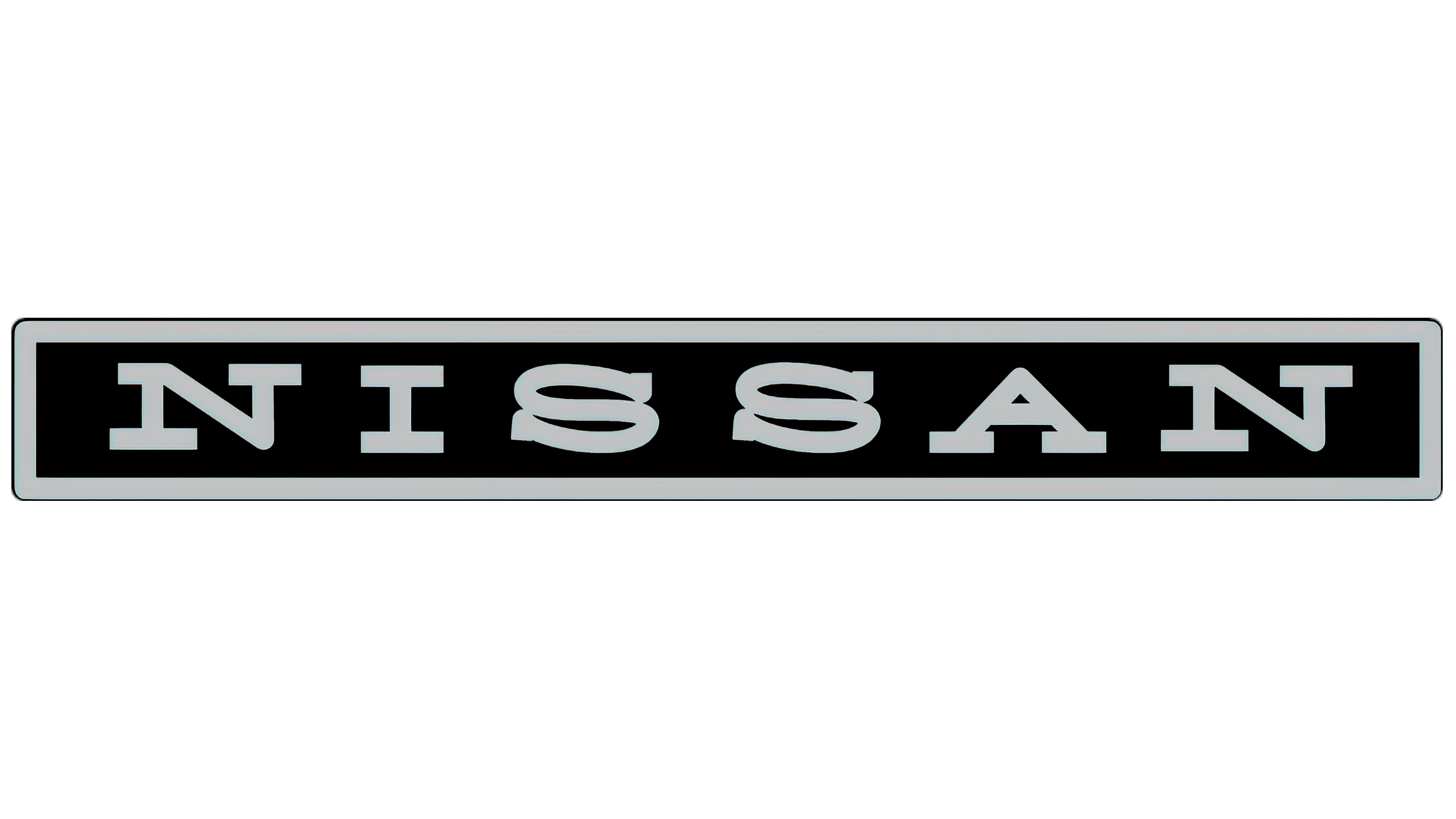
1933 – 1940: The first version of the Nissan logo
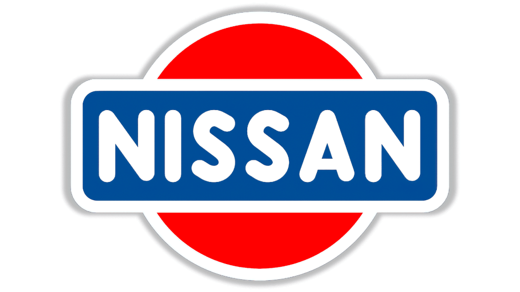
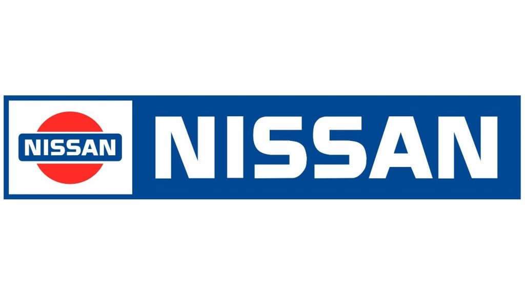
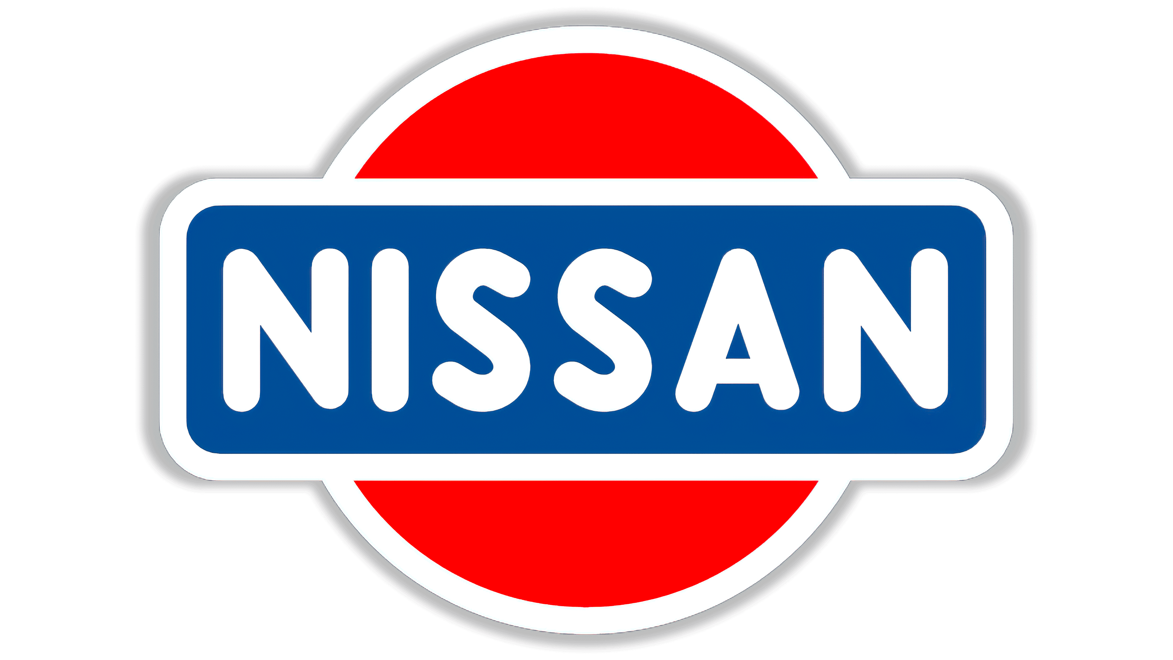
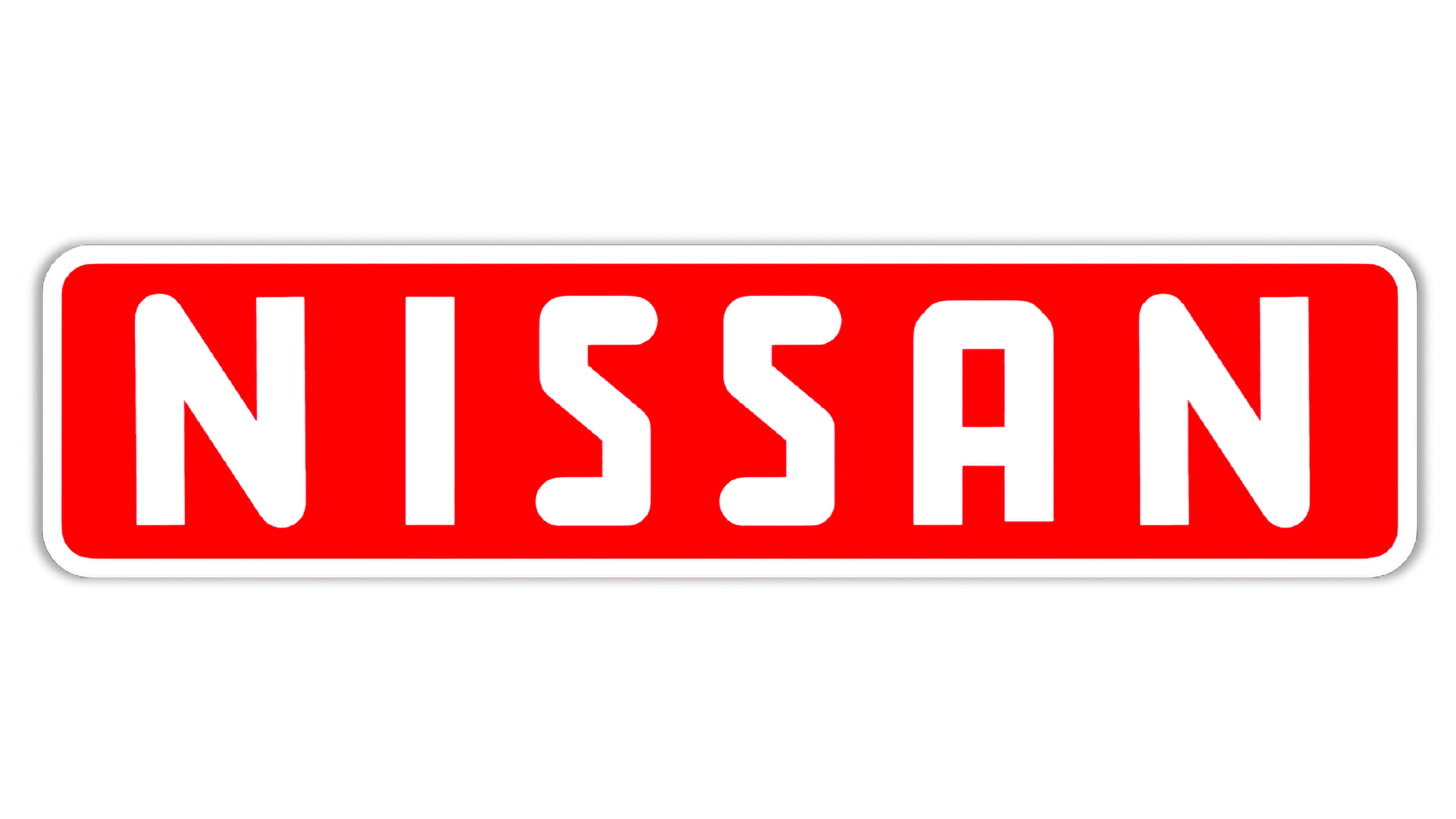
When Nissan was founded, this logo version was the logo that was first unveiled. This logo design incorporated a red, white, and blue color scheme, and the brand name, “Nissan,” was displayed boldly, in uppercase letters, across the circle symbol in a rectangle shape.
1940 – 1950: The second version of the Nissan logo
For this second iteration, Nissan updated the shape of the logo and the font choice. Instead of the bold, upper-case font used previously, this logo design opted for a script font that resembled handwriting.
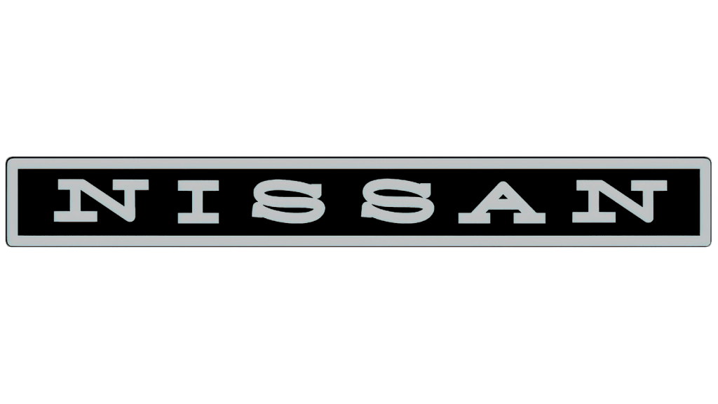
1950 – 1959: The third version of the Nissan logo
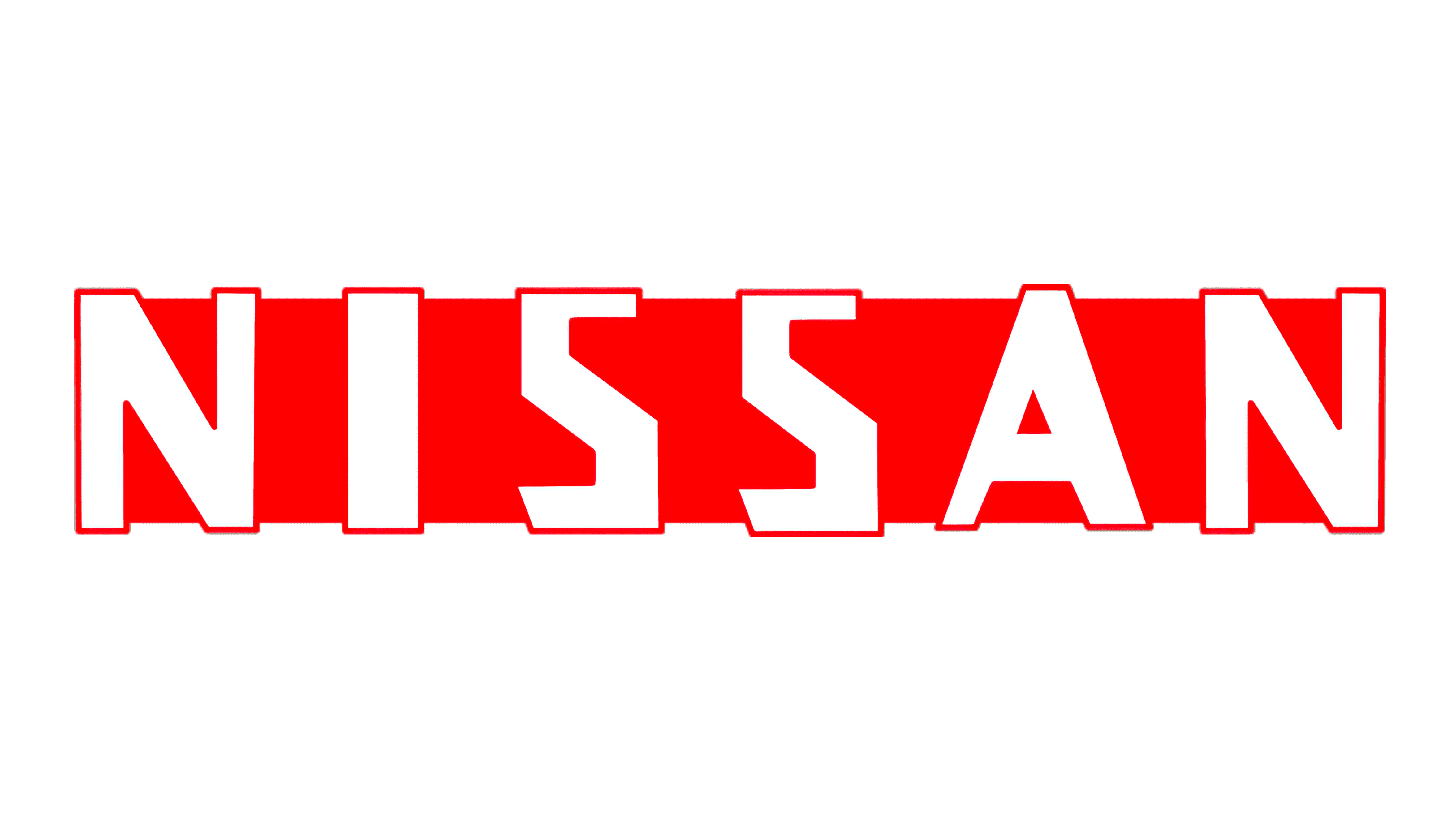
In 1959, Nissan decided to make its logo simpler. To do this, Nissan played around with the shape of the logo and made the design a rectangle that simply consisted of the brand name. This logo kept the same color scheme as the prior logo, using red and white.
1959-1960: The fourth version of the Nissan logo
This logo update was only a small one, consisting of sharper corners and the removal of the logo’s outline. This update was made to help convey that the brand was focused on two things: power and progress.
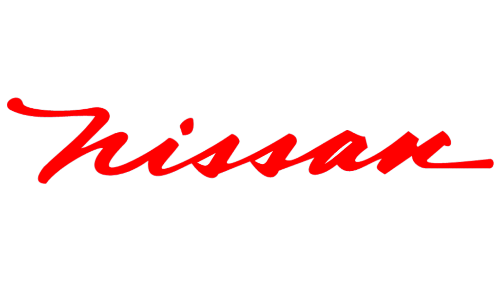
1960 – 1967: The fifth version of the Nissan logo
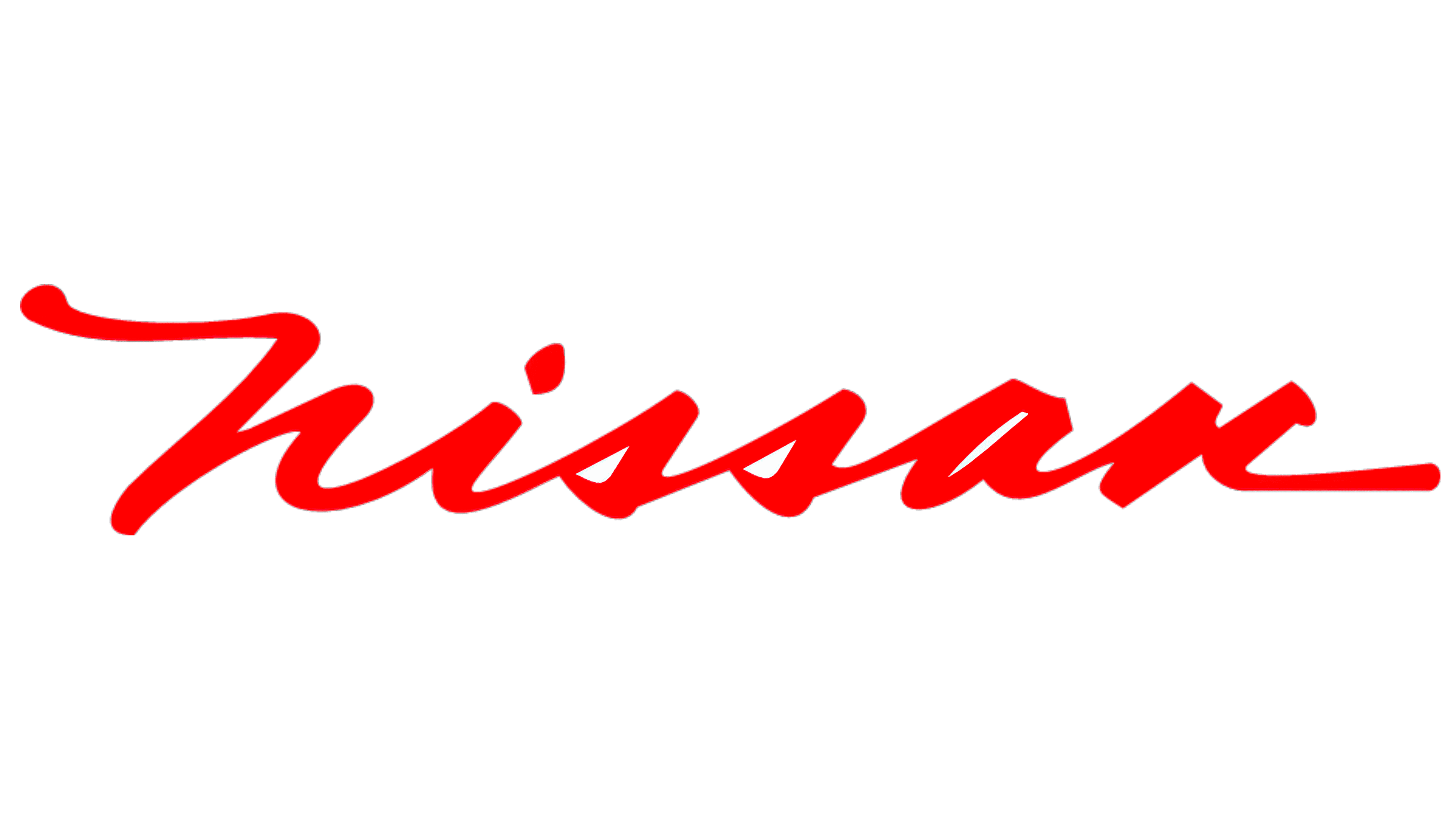
The fourth iteration of Nissan’s logo did not last long. In 1960, a new logo was unveiled and this one felt different that the past iterations. This version included a new typography that was a cursive font, giving the logo a more modern feel. This logo also introduced a new color to the design, silver. While silver wasn’t always present, it was used when the logo was placed on an automobile.
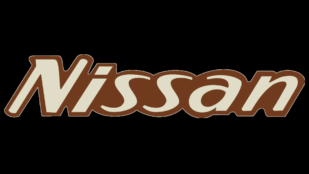
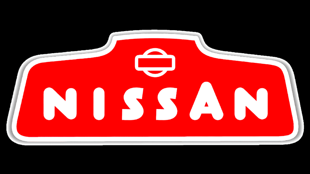
1967-1970: The sixth version of the Nissan logo
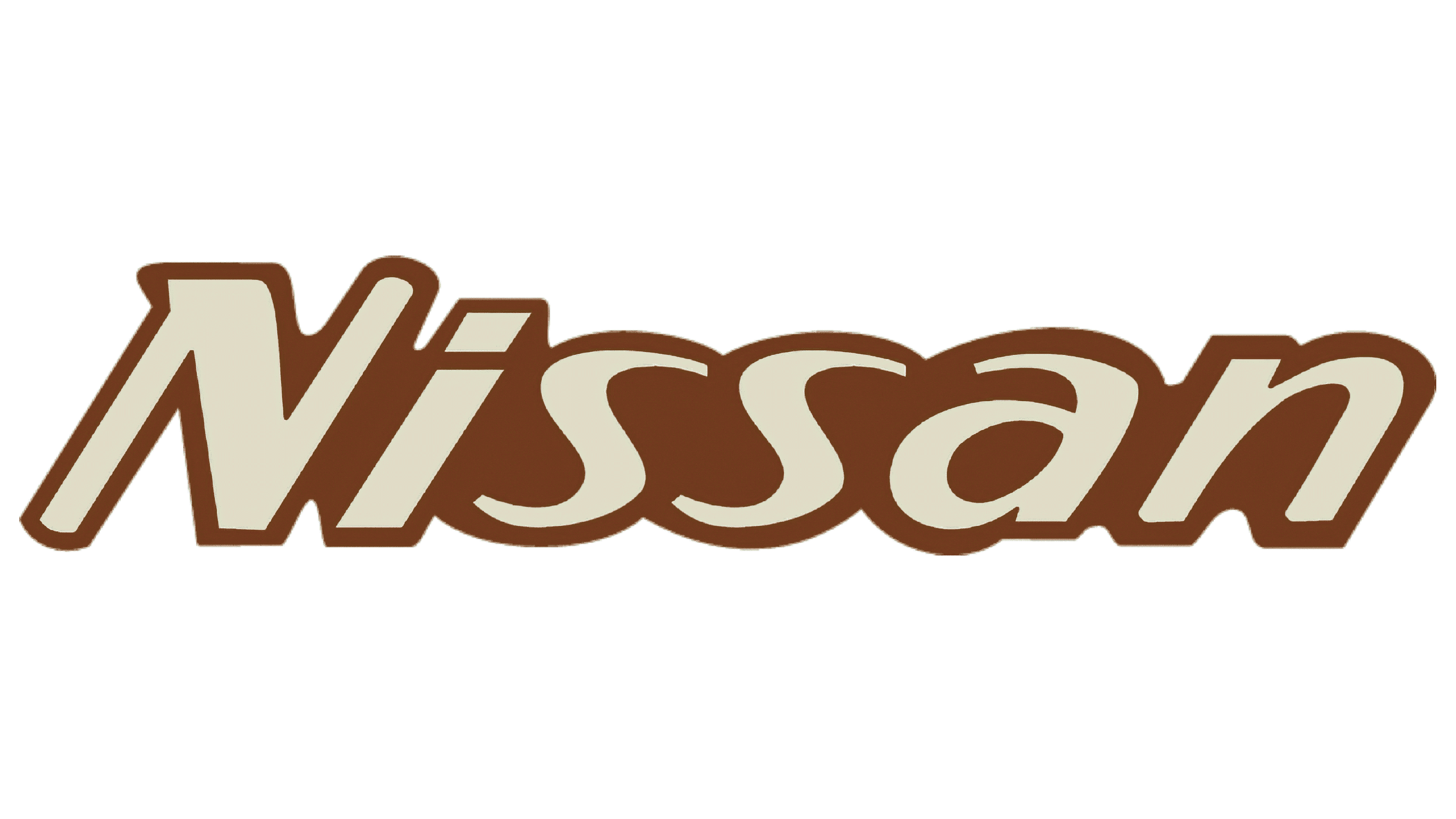
In 1967, Nissan played around with its logo again, this time introducing an entirely new color to the design – brown. Beyond the color addition, Nissan also incorporated a new font with this design, one that was a rounded italic typography.
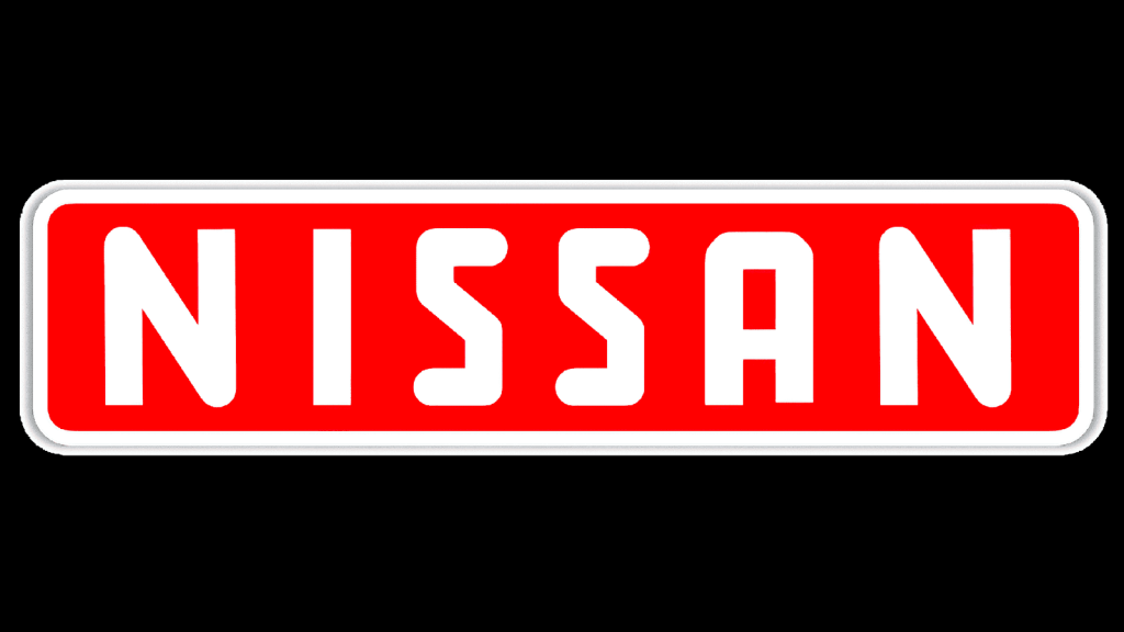
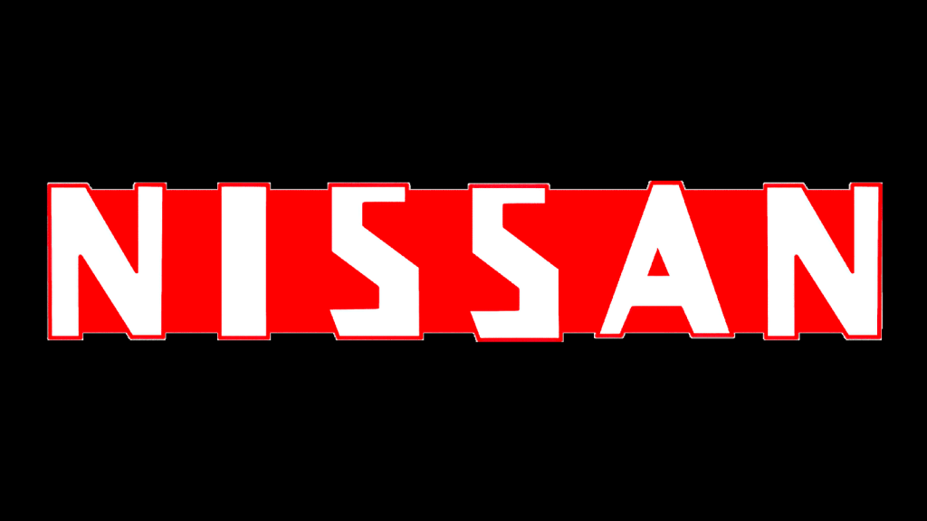
1970-1983: The seventh version of the Nissan logo
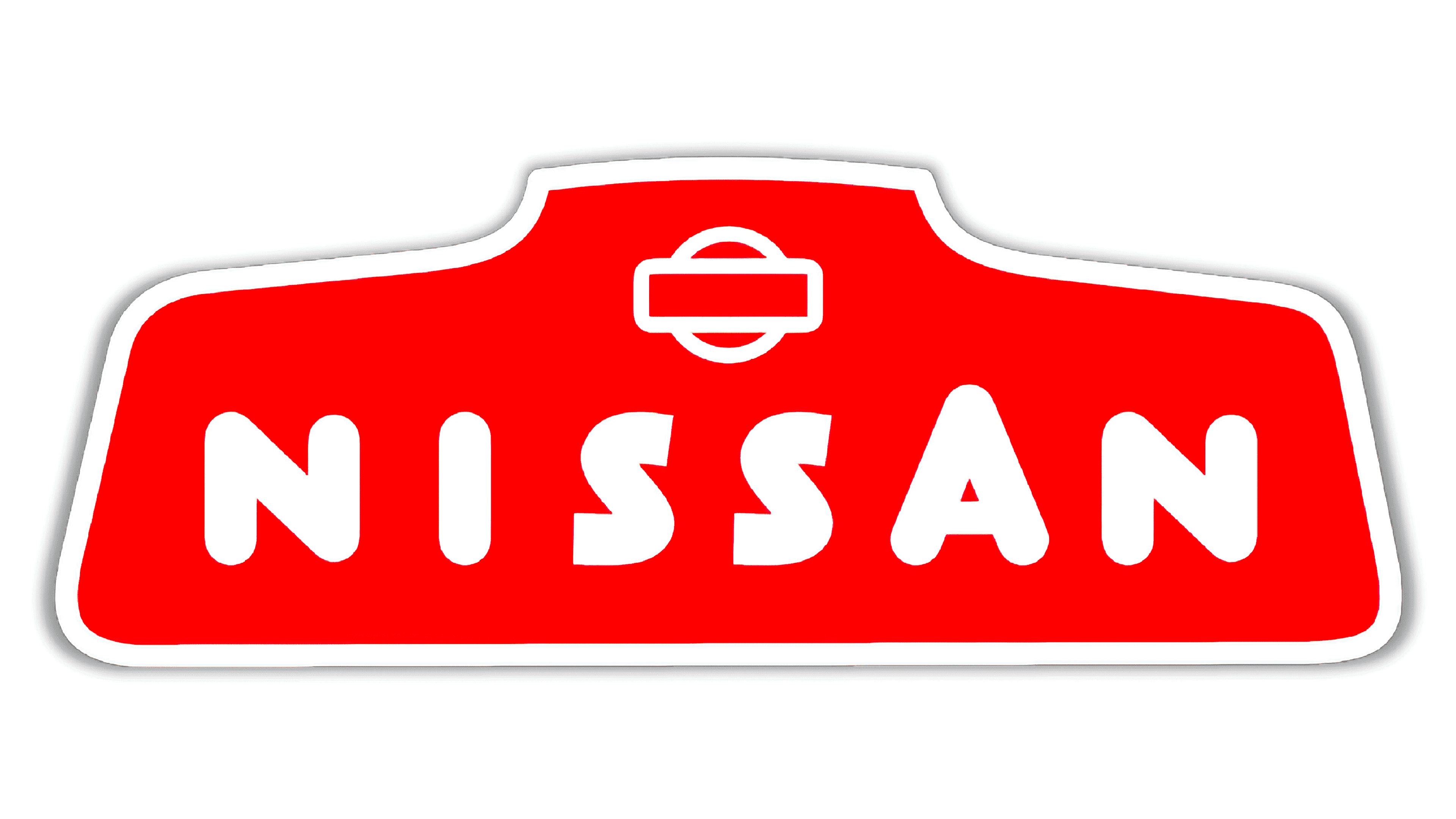
For the most recent logo designs, Nissan played around with a few new features. However, in 1970, Nissan returned to its rectangle design and used the rectangle to outline the “Nissan” name yet again. The logo font was also updated to be an uppercase, serif font that boldly displayed the brand name.
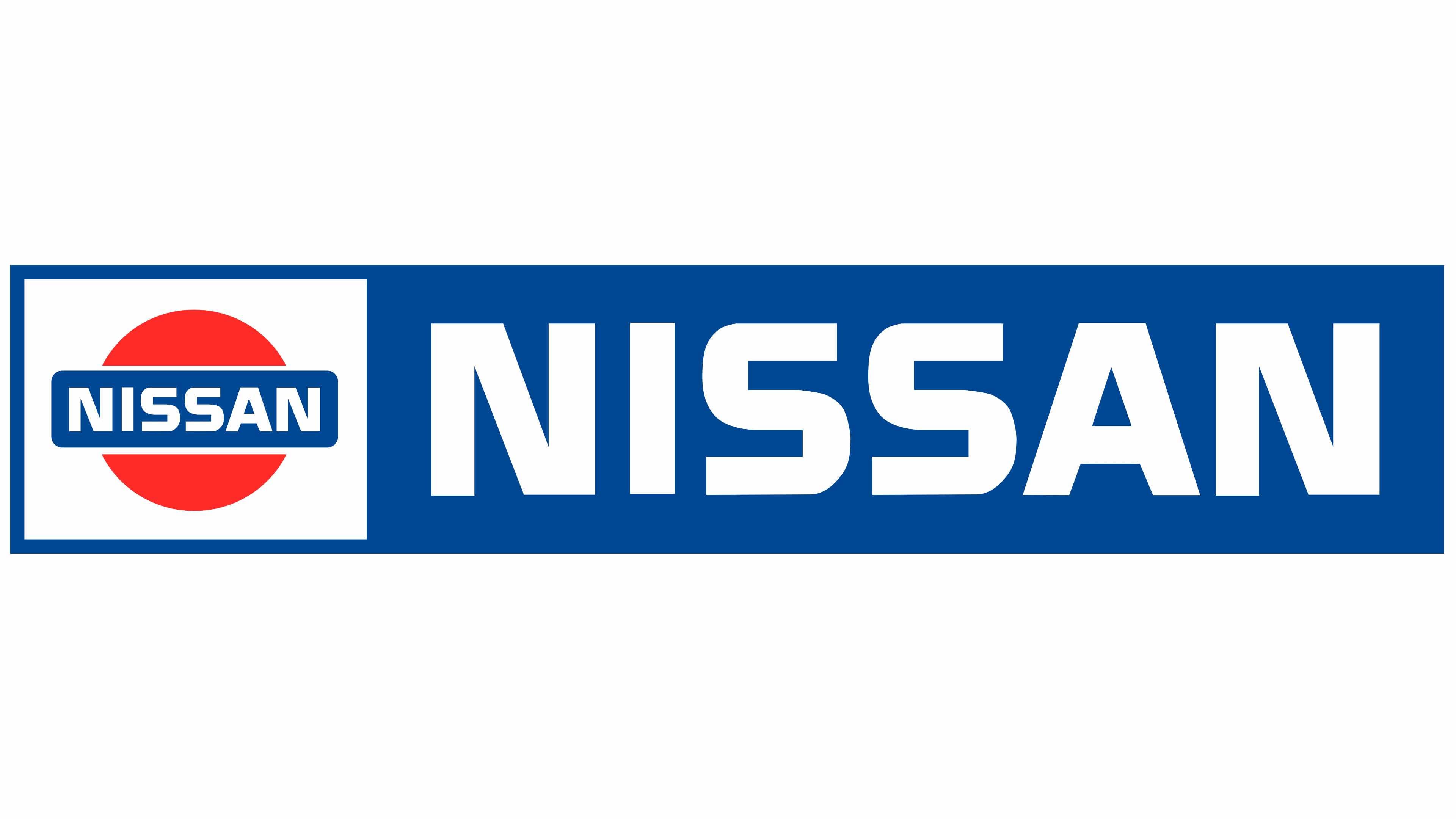
1983 – 2001: The eighth version of the Nissan logo
This eighth logo version lasted for nearly twenty years and represents the elements that were found in earlier versions of the brand’s logo. In this version, the design includes two separate pieces – the Nissan circle symbol on the left and the Nissan name inside a rectangle on the right. This logo version also included an original font that helped make the overall design stand out.
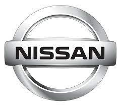
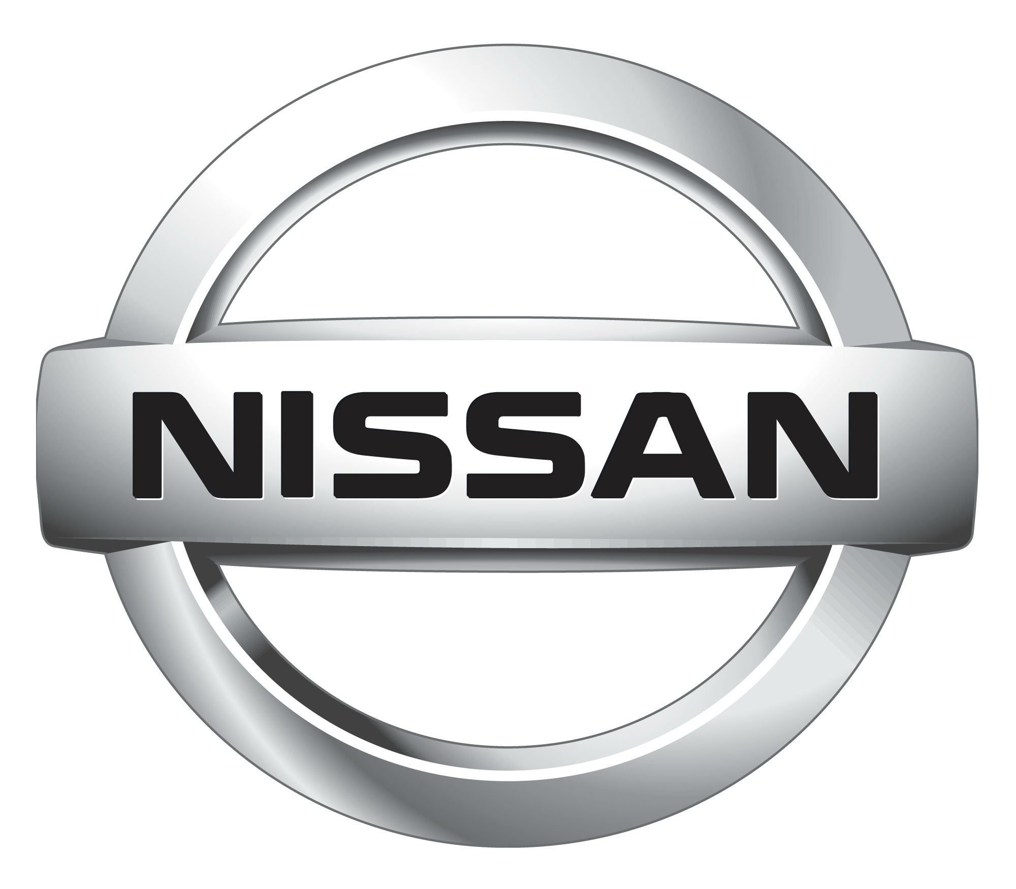
2001 – 2020: The ninth version of the Nissan logo
While the last logo version paid tribute to the earlier Nissan logo design with the design elements and color scheme, this logo also does the same, but with a modern touch. This logo iteration included the silver color again to help the logo stand out. Additionally, Nissan played around with the spacing of the wordmark letters to help make the brand name look more prominent.
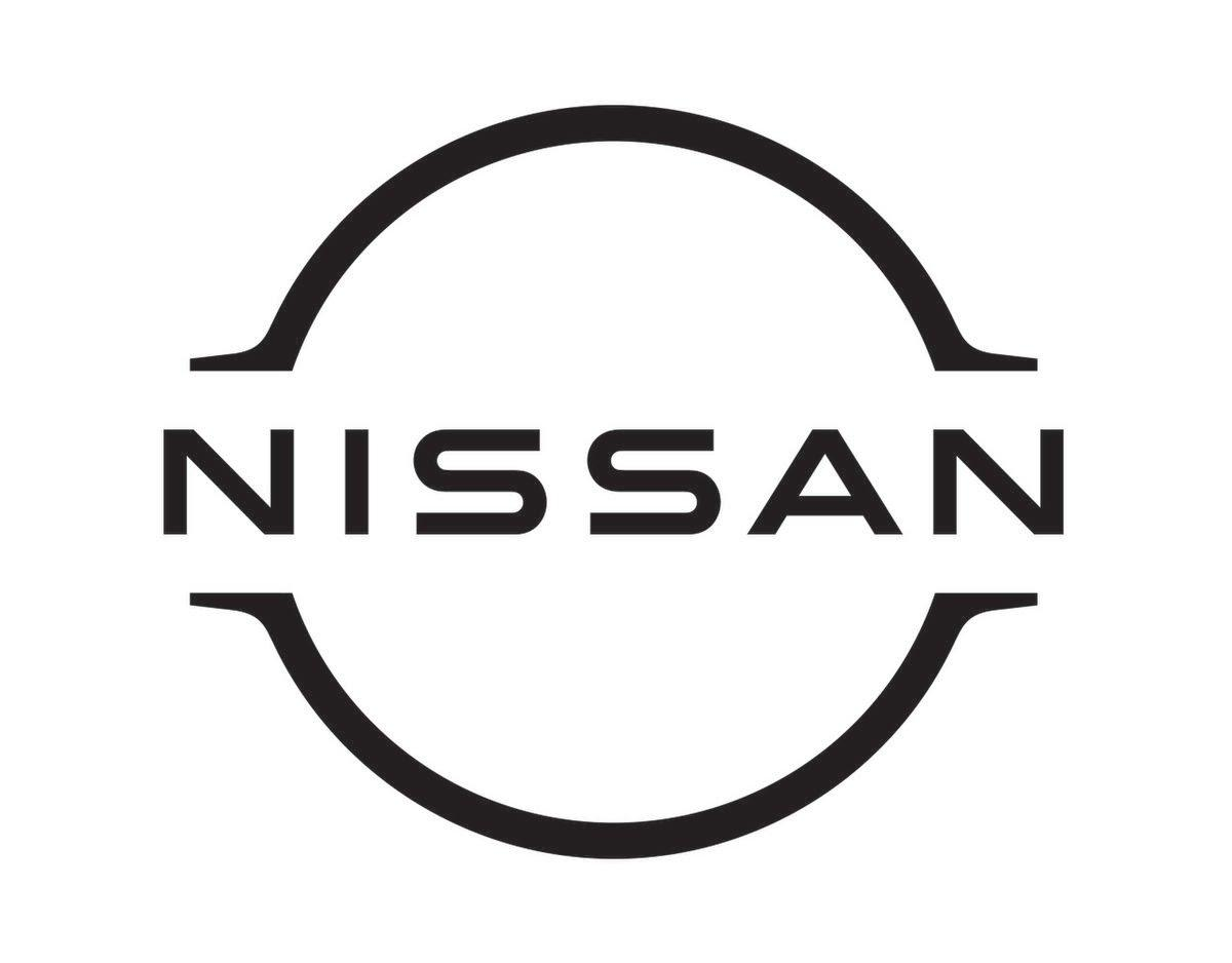
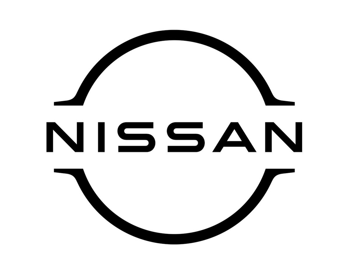
2020 – Today: The tenth (and current) version of the Nissan logo
This version of Nissan’s logo is the version you know and love today. This logo iteration still uses many of the features from the original logo design, but with a few updates. Two arches were added on either side of the Nissan wordmark, which is an entirely new Nissan symbol. By adding this new symbol, Nissan hopes to elevate the Nissan brand to become a more luxurious brand than it was before.

Nissan’s logo font:
Throughout Nissan’s logo evolution, Nissan’s font choice has always changed. At times the brand opted for a rounded, more circular typography, at other times a more script-based typography, and at other times, a more italic font. Today, Nissan opts for a logo font that is a geometric sans-serif typography. The “Nissan” name has always been pivotal to the logo’s design and this current font choice, boldly depicts this brand name.
Nissan’s logo color:
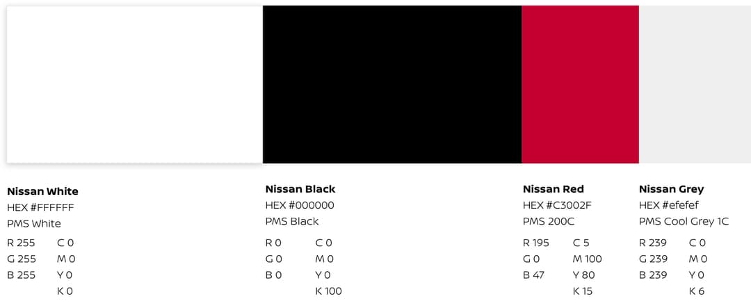
Nissan is not a brand that has stayed away from colors through the years. At times the logo design was blue and red, at other times the design used its color scheme to make the logo 3D, and other times the logo neglected all colors and stuck to black and white. Today’s version of Nissan’s logo sticks to the black, white, and silver color scheme.
Nissan’s logo symbols:
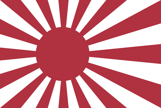
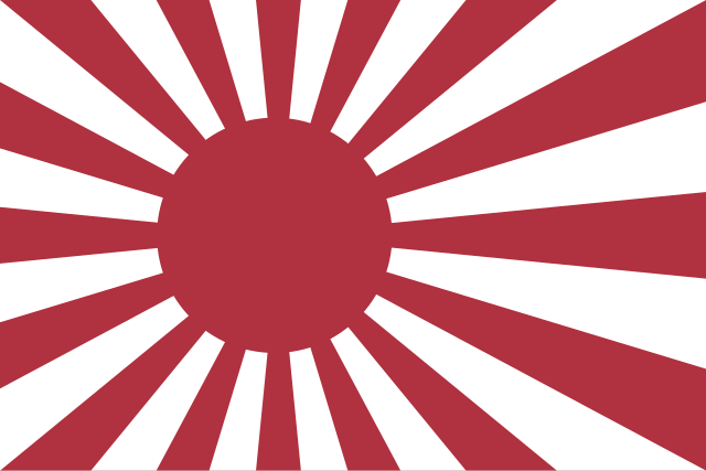
The symbol that Nissan uses for its logo design represents the country where the brand was founded, Japan. The symbol on the logo is an image of the rising red sun, which is a popular Japanese emblem. While this circle design was the focal point of the logo design at times, since the 1950s, Nissan has strategically made the brand name the focal point, instead of the circle symbol. The symbol is still present in logos since the 1950s, however, the logo design leads with the wordmark, rather than the symbol.
Nissan Today
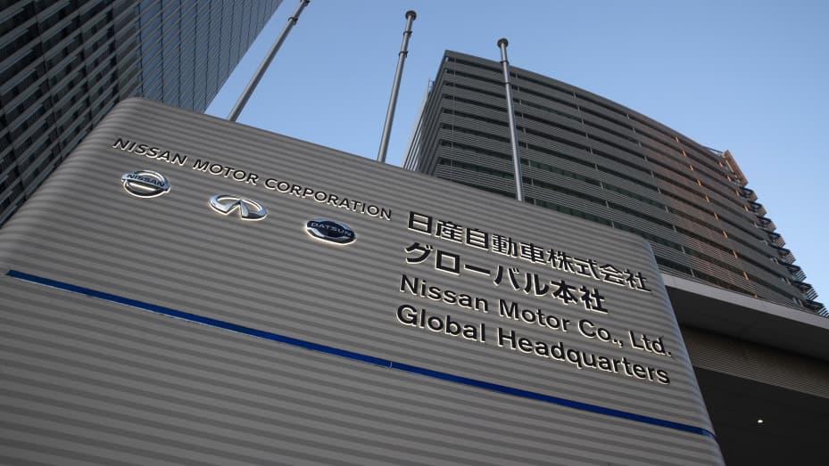
Today, Nissan still operates their global headquarters in the same country where it was founded, in Yokohama, Japan. The Nissan Motor Corporation umbrella has evolved to also include Datsun and Infiniti automobiles and since 1999, Nissan has been in partnership with Renault and Mitsubishi as well. This partnership flourished and in 2013, Nissan held a 15% non-voting interest in Renault, and in 2016, Nissan held a 34% controlling interest in Mitsubishi. Not too long ago, in 2018, Nissan was the largest electric automobile manufacturer in the world, selling more than 320,000 electric automobiles annually across the world.
Lessons Learned from Nissan
Within the automobile industry, competition is in abundance. Nissan was a brand that recognized this and responded with a logo design that is memorable, unique, scalable, and bold. Throughout the years, Nissan went through several redesigns, and that is the biggest lesson we can all learn from the brand.
When it comes to your logo’s design, don’t be afraid to update your logo. Sometimes brands can keep their same logo for years, but that’s often not the case – and it wasn’t the case for Nissan. If you want to play around with different fonts or different colors, test it out. Try out different elements until you land on a logo that captures everything you want your logo to capture for your brand.
To learn more about how you can create a timeless and effective logo design, head over to any of Logo Design Magazine’s articles! No matter what article you end up on, you’ll leave with some new knowledge on how you can create a logo as memorable as Nissan’s!


