
Most of the logo redesigns for big companies are subtle changes that customers don’t notice immediately. Think of Coca-Cola or some of the other brands that have made subtle touch-ups to their logos in the past. Their logos, for the most part, stay consistent with what you first knew them as. They’re easy to recognize and familiar.
Then there are some of the bigger changes and these are the changes that were huge for the company’s audience. Think Facebook, Slack, or Google’s logo updates. They change their logo so much that it’s nearly unrecognizable at first. These logo redesigns are iconic and they’re what we’ll be discussing today.
The Most Drastic Logo Redesigns Of All Time
Sourced here
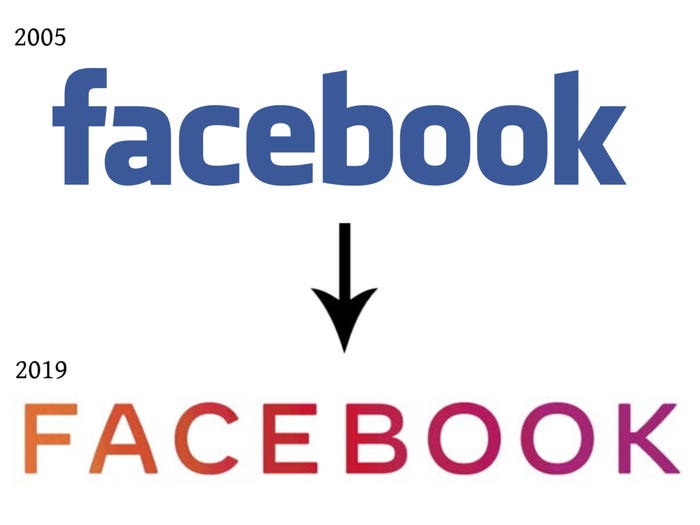
User’s heads were turned in 2019 when Facebook decided to update their logo from the iconic blue that’s been with them since 2005. This change was one that not only surprised users, but the feelings were mixed on the new logo. Some thought that the change was needed, while others liked the familiar original logo better.
“We’re updating our company branding to be clearer about the products that come from Facebook,” said Antonio Lucio, Facebook’s chief marketing officer. “We’re introducing a new company logo and further distinguishing the Facebook company from the Facebook app, which will keep its own branding.”
Sourced here.
Netflix
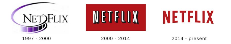
Thinking back to the times when Netflix was merely a mail subscription service almost seems like a joke now that they’re the leading service provider of streaming media technology. Few remember that back in the old days, Netflix’s logo looked very different from what it is today.
The logo has evolved a lot since its original logo in 1997, but the one that was used on the company’s envelopes was dark and was supposed to give a movie theater feel to the envelopes it was displayed on. The new logo was clean, crisp, and modern for the company. This change was a huge one for the company and its users, although it was a positive one and impacted the company significantly.
Sourced here
Pepsi
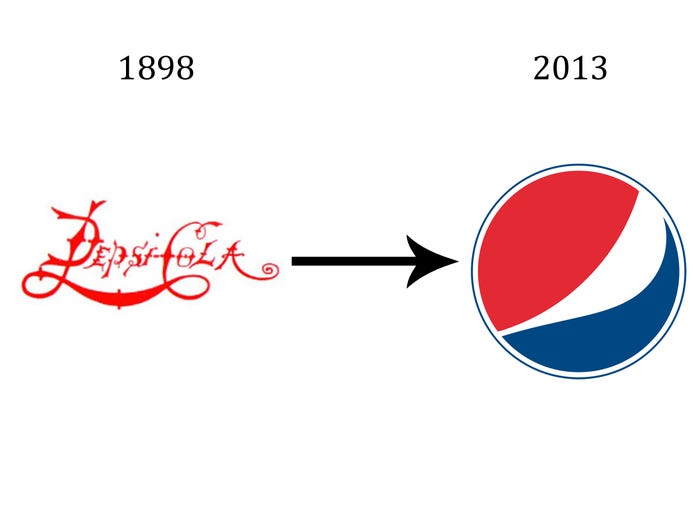
Pepsi decided to take the same journey that countless companies before them and after them took; deciding to opt-out from including letters in their logo and going with one recognizable symbol for their logo instead. This logo redesign was a big one for the company since the wording was completely removed and changed to the same iconic logo that you recognize today on Pepsi products. The company hasn’t changed its logo again from its redesign in 2013.
Sourced here
Pizza Hut
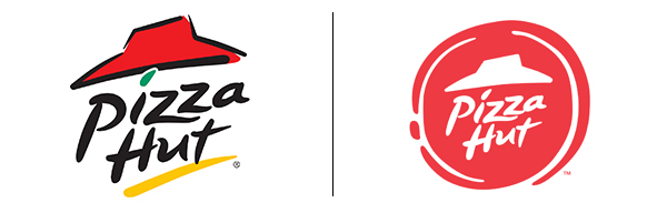
Another legendary logo redesign was Pizza Hut’s when the company decided to give their logo a refresh. The new Pizza Hut logo managed to honor their past and hold onto some of the original logo while still adding a modern look to it. They kept the slanted roof aspect to it, keeping the familiar tradition that customers love. The company decided to cut down on the amount of color and only keep a solid red to it to evoke feelings of hunger. The new logo was also updated to be more modern, with a sleek and flat look to it.
Sourced here
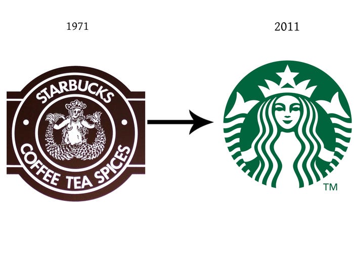
Starbucks
Another company that experienced small updates over time before achieving the iconic logo that we know today is Starbucks. This is another example of logos that deliberately decided to take away their wording. Not only did they decide to do away with the wording, but the color was also changed as well. Other small updates were made to the logo to achieve the familiar logo that we see today.


