
If you look at most car companies, many have been around for almost a decade, and Volkswagen is no exception. Founded in 1937 by the German National Socialist Party, under Adolf Hitler’s leadership, Volkswagen started off as a state-owned company in Wolfsburg, Germany. Today, the company is the globe’s largest automaker and one of the most successful automobile companies.
Through the years, the brand has seen many updates to its marketing and logo design. While there have been several changes, many held a similar theme.
Let’s take a look at the brand’s history and how they have arrived at the logo we see today.
About Volkswagen
Immediately after its opening, Volkswagen received its original name, which consists of two pillars- “volks,” meaning people, and “wagen,” meaning car. It’s truly the “people’s car.”
But where did this well-known brand come from?
If someone asked you to name off 10 different car brands, chances are you would have no problem doing that. We see cars on the road, we see them in parking lots, and we search through all these brands when we are on the hunt for a new car. One car that would probably make your list of 10 cars is Volkswagen, and that’s because Volkswagen has done a terrific job at building brand loyalty and recognition.
With so much brand loyalty and recognition that leaves us to wonder, “How did Volkswagen start off to get to this point?” And that question is what we will explore at the start of this article.
Volkswagen was founded almost 90 years ago in Germany. While its official founding year is 1937, the brand was first dreamed up back in 1933. It was during that year that Adolf Hitler came up with this car concept. While in Berlin, he began to think about how there was a gap in the automobile market that could bridge the need for transportation with leisure. This idea stuck with him so he brought on Ferdinand Porsche to partner with him on this.
Because Porsche was an Australian citizen, Hitler wanted him to change his nationality. Porsche obliged and it wasn’t long before he was officially a citizen of Hitler’s party and was able to get to work on developing this vehicle, in Germany. With this citizenship switch, Germany would get the credit for creating the vehicle, rather than Austria.
Of course, just like with most things, it’s hard to bring an idea to conception with only one or two people. That was the case for Hitler’s Volkswagen idea and so the two brought in Bela Barenvi to help draw a blueprint of this new automobile in 1934. Bela had experience in the industry and worked well with Hitler and Porsche.
Once the first Volkswagen vehicle was released, it was time for the brand to unveil their first logo. This logo tied back to Hitler’s party and was an image of the Nazi flag. This logo did not last long, and was significantly altered after World War II.
During WWII, many factories were destroyed, including those that manufactured Volkswagen. When WWII concluded, Hitler was no longer in charge of his Volkswagen company. Instead, the reigns of Volkswagen went to the British, who now led Volkswagen’s operations. With this, changes were made to the brand and the company was reintroduced to the public. Following the war, Volkswagen turned to debris from the war to manufacture more than 2,000 cars.
Britain increased vehicle manufacturing the following year, and production reached 10,000 automobiles. With Britain’s leadership, Volkswagen was now “Volkswagen,” rather than the longer name it once occupied.
However, the British army wanted to release leadership and management to another auto manufacturer after the war ended. Still, popular car makers, including Ford and Fiat, didn’t want to accept the company in exchange for nothing. Given this, the ownership of Volkswagen was given back to Germany. Under Germany’s leadership, the Volkswagen models were released in a variety of new colors, the exterior and interior were updated, and the vehicles looked more modern and sleeker. At this point in Volkswagen’s history, the brand understood their manufacturing capabilities and what the public wanted. With this knowledge, Volkswagen was ready to explore to expand their sales to neighboring countries across Europe.
Volkswagen also started recruiting new employees who would help the company achieve this new vision.
As we noted earlier, Volkswagen started as a state-owned automobile manufacturer that sold its cars locally. It wasn’t until 1949 that Volkswagen first began to sell its automobiles overseas to the United States. Given Volkswagen’s initial ties to the Nazi party, sales started off slow in the States. Eventually, a partnership was formed between the two countries and Volkswagen’s first American office was established in 1955. The focus of this location was to look at how to increase sales and standardize models across America. The answer they found was with the release of the Type 1 Volkswagen Beetle. This model was easier to produce faster, because of its smaller size, and it helped the brand top $1 million in one year, in 1955.
Volkswagen’s American office was just the beginning though. Two years later, in 1957, the company established a second location, on the Golden Mile. Unlike the American location’s narrow focus, this plant was tasked with providing a showroom, service, repairs, and administration to those looking to purchase a car from Volkswagen.
While Volkswagen’s start isn’t one that is beloved, the brand was able to prosper post WWII after refocusing on the mission and shifting ownership. As a result, Volkswagen helped to stabilize the country and restore it post-war.. The new jobs improved their living standards and these new jobs continued to flourish as the company continued to grow with locations across the world.
1960 was a big year for the brand. Many logos and companies we highlight solely focus on updating their logos. For Volkswagen, the brand’s name was also updated this year to become Volkswagenwerk AG. Even with a new name, sales took off and continued to increase throughout the 1970s thanks to a stellar advertising campaign.
What was once associated with war, the Volkswagen name and vision changed. It was clear during this time that Volkswagen needed to bring people together, rather than remind people about how the brand was initially started. It was during this time that Volkswagen began to think through their product line and launched the beloved Beetle and T1 bus vehicles. These two automobiles were successful in this mission quickly became a universal sign of peace.
With its international presence, focus on innovation and design, and a longstanding promise to value, the brand failed to slow down throughout the 1970s. The world also loved the smaller size of the Beetle model and by 1972, Volkswagen not only beat the extremely popular, Ford Model T, in sales, but the brand took the world record for most automobiles produced that are all one model. This was only the beginning with the brand’s speedy production. Th next year, in 1973, Volkswagen produced even more vehicles, more than 16 million cars!
From there, the company has shown impressive progress and growth, becoming so much more than the manufacturing plant of the Beetle. Now, you’ll see various models, including a new push for electric vehicles that keep up with the growing demand and need for more fuel-efficient, environmentally-friendly cars.
Volkswagen’s Logo Over Time
The changes to the Volkswagen logo have been subtle for the most part, though it has departed significantly from the original logo. While this brand may have launched during the beginning of WWII, it’s grown since then, and its logo shows the distance the company has put between itself and those rocky beginnings.

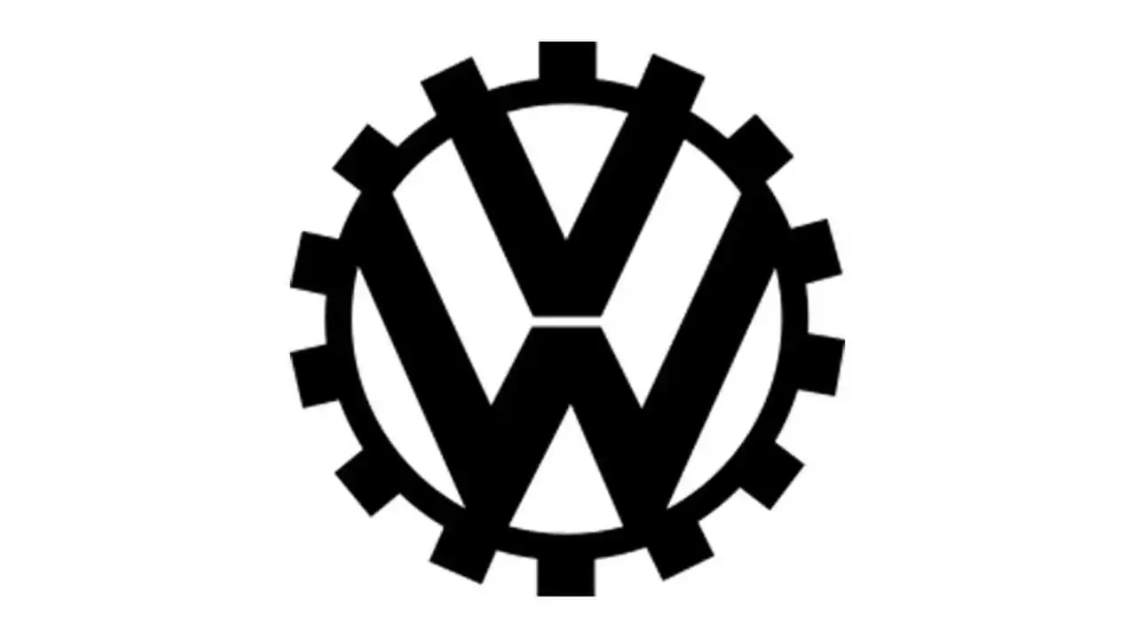
The Original Logo (1937)
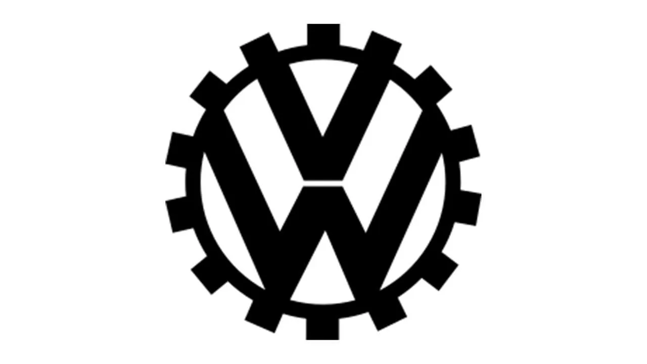
The original Volkswagen symbol was a much more complex version of the icon we know today. The letters “V” and “W” still appeared within the logo, with the same positioning of one above the other in a circular frame. It was monochromatic, constructed in simple black and white.
However, there were many components surrounding the circle that represented a cogwheel and a version of the swastika. This logo was created for the original purpose of the cars, which were commissioned by Hilter.
The Volkswagen Logo from 1939 to 1945
Three years after the initial logo was unveiled, Volkswagen decided to revamp their logo in 1939.
The Nazi symbolism was removed, and the images were simplified. The cogwheel remained, along with the two stacked letters within the circle. This Volkswagen logo evoked a masculine, bold vibe and continued the monochrome look.
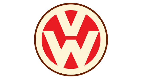
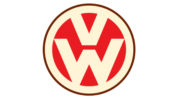
Volkswagen Adds Color (1945-1960)
In 1945, another update to the original Volkswagen logo showcased more color and personality. The icon had a retro appeal and included the soft colors of cream and brown paired with a vibrant red. The cogwheel disappeared, but the central letters remained. Going forward, the design would honor those stacked letters throughout all its iterations, and the changes would be mainly to the color and overall shape.

1948 – 1960 The Color is Removed
This new logo is a continuation of the old one but was changed with the automotive industry’s growth in Germany. The developers went back to monochrome, again making it black and white. They also thickened the border by connecting the lowest points of the “W” to the inner white circle and moved the “V” closer to the “W.”

A Square Change 1960-1967
In 1960, Volkswagen’s logo got even more straightforward. A new version of the icon appeared in the same black and white coloring with a square placed around the circular emblem. The square was said to demonstrate stability as the company became an international player and continued to grow.
The monochromatic palette of the Volkswagen logo of this era sought to showcase the power of the brand, one with lasting strength. However, the icon itself would only last seven years.

The Volkswagen Logo from 1967 to 1978
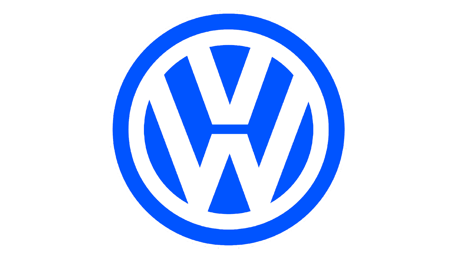
The square disappeared again, and the original Volkswagen logo circle returned. This new version was similar to the one from 1945. However, the minimalist design now included a color update to blue and white.
The Logo from 1978 to 1989
In 1978, the company changed it again to another version of blue and white. This time they went with a bolder and brighter shade of blue and a solid white.
This logo also showed a slightly modified double framing element around the letters. The “V” from the iconic VW symbol was also a little smaller in this iteration.
1989’s Volkswagen Logo
After Volkswagen’s prior logo was the face of the company for more than 10 years, the brand decided it was time for a refresh in 1989. It went back to the much lighter version of the blue and white coloring, and the proportions changed slightly. This change was said to be designed to make the logo appear cleaner and more elegant.

A Darker Update from 1995 to 2000
For a few years, Volkswagen also decided to change the color of the logo to a deeper shade. It was still blue but became a much darker color.

1999 – 2000 Some 3D Elements are Added
The logo didn’t change much or look especially different, but some modifications allowed it to appear more three-dimensional for a stylish approach. The big change here was the addition of darker shades that made the white elements stand out more. The letters also looked more elegant with thinner lines in the center.

The Three Dimensional Logo from 2000 to 2012
In 2000, the Volkswagen logo evolution went the modern route. The company wanted to refresh its image for the new millennium. The modifications showed significant gradient use and helped the logo to look more three-dimensional and dynamic.
A silver tone was added to the white coloring in the palette, and the blue became deeper and a little darker than in the previous version.
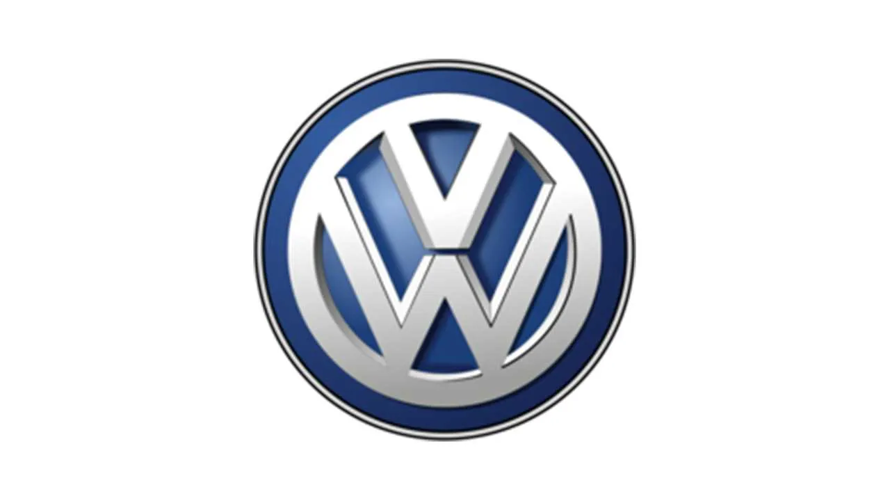
2012’s Punch Up to the 3D
In 2012, another version of this logo was introduced, which upped the 3D effect even more. The size was reduced slightly, and the lines of the letters got sharper and bolder for a crisp, professional look. The design tried to convey modernism and progress.

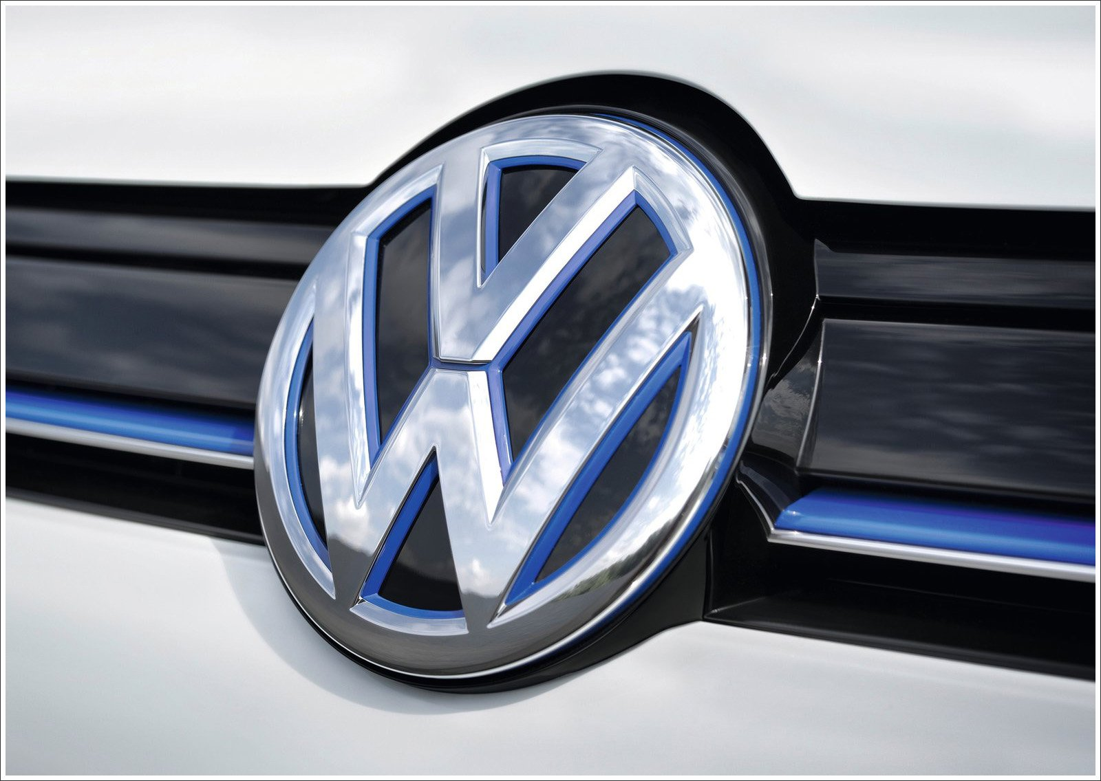
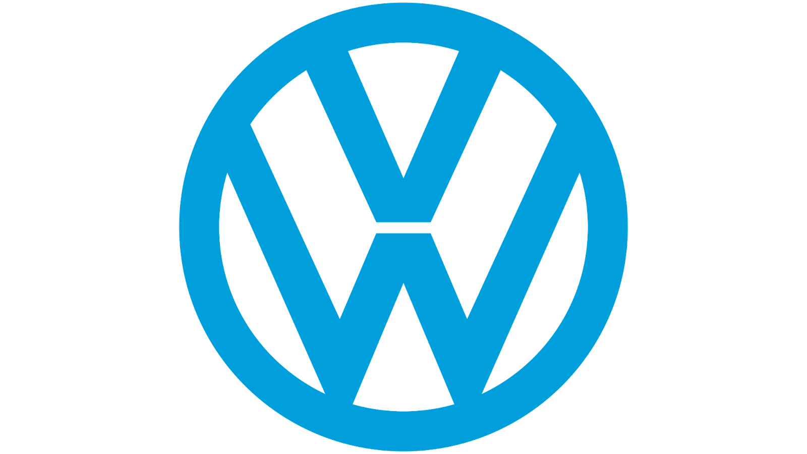
The Current Volkswagen Logo Ups the Saturation (2019 – Present)
In 2019, Volkswagen decided to eliminate the 3D aspects. The image evolved again to create something sleeker with slim lines and a simple color palette. This year was pivotal for Volkswagen as it tried to keep up with competitors in the industry that were releasing electric cars. Like its competitors, Volkswagen decided to also release these new cars and felt like they needed a logo that could be released alongside this new product line. This new logo showed consumers the brand was continuing to evolve.
Simple, sophisticated, and a little futuristic, this two-dimensional design was planned to be a stylish yet simple version of the icon that’s perfect for the new age of Volkswagen cars and the penchant for flat 2D logos in the current era.
Rather than release this logo all at once, Volkswagen decided to gradually introduce this logo to the public, starting with the 2019 Frankfurt Motor Show. This logo also had three color schemes that the brand could choose to use based on the purpose. These colors are white on top of blue, blue on top of white, and black on top of white.
Volkswagen Logo Key Elements
While there have been several changes to the logo over the years, there have been consistent elements that the company has chosen to continue using throughout its history.

1. The VW
Even from the first iteration, the initials VW have been in the logo design. This abbreviation of Volkswagen is synonymous with the brand, and it’s unlikely we’ll see a departure from using these letters any time soon.
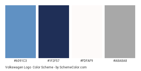
2. The Blue & White Colors
During the second section of the logo’s life, the blue and white coloring became a considerable part of its design. While other colors have been used, we’ve seen some versions of blue and white since 1967. The current blue and white colors are typically variations of the following:
- Silver lake blue
Hex: #6091C3
RGB: (96, 145, 195)
- Space cadet blue
Hex: #1F2F57
RGB: (31, 47, 87)
- Snow
Hex: #FDFAF9
RGB: (31, 47, 87)
- Dark gray
Hex: #1F2F57
RGB: (31, 47, 87)

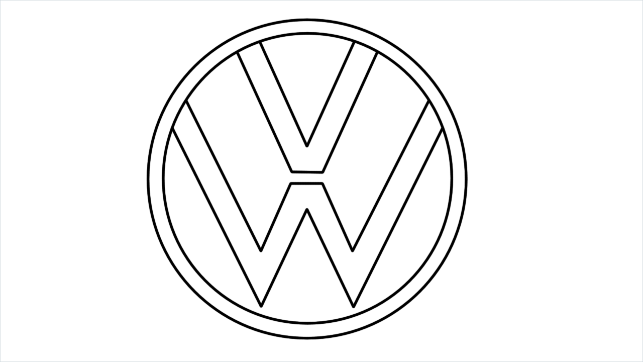
3. The Circle
The circle shape of the logo has been a huge part of its design for decades. In some form or another, the VW letters contained in a circular shape have always been present. While it has seen a cog and a square alongside it, the circle is at the core of the logo.
Conclusion
The Volkswagen logo has been pretty consistent throughout its history. While there were significant changes during its first few years, the icon has remained relatively unchanged since 1967, maybe even 1945.
Today, the logo is a testament to the company’s staying power and the strength of the Volkswagen brand. Though it started under the pressure of the Second World War and its dictator, the brand has grown significantly since then and left its wartime associations in the past, even so far as becoming a symbol of peace and love accepted and used by “hippies” throughout the late 60s and 70s.
Many competitors can take some pointers from Volkswagen’s evolution, but regardless of what industry you work in, we all can learn something from the brand.


