
- If you’re looking for a funny video, or if you want to learn how to fix something simple around the house, it’s a strong possibility that you’ll head to YouTube to find your answers.
- YouTube dominates the online video marketplace, and to become the major player it is, the company had to have a strong marketing game.
- The YouTube logo has had many changes over the years – some subtle and some striking – that have led to its current sleek design.
New videos are added to the YouTube streaming platform every day, which means you could get lost for hours down a YouTube rabbit hole and still not see everything there is to see. But no matter how much time you spend immersed in videos, you’ll always know you’re on YouTube because of the company’s strong branding.
While YouTube’s overall branding strategy is important, let’s take a look at one important part of that marketing effort: the YouTube logo. In this article, we’ll explore the evolution of the YouTube logo over the years. From the first YouTube logos, to the next stages of the design, to today’s universally recognizable logo, we’ll discuss them all!

The Original YouTube
When YouTube launched in 2005, the original logo was a simple, bold statement. It featured a sans serif font, just like almost all other tech companies at the time were using. Sans serif fonts send a message of modernity, simplicity, and openness, and YouTube wanted to be perceived as an open platform.
“You” was written with the “Y” capitalized, in black on a white background. But the word “Tube” was what really stood out. Encased in a red rectangular, shiny (because of the gradient red color) “Tube,” the white word featured a capital T. The bold contrast made an impression, and the tube was supposed to resemble the shape of a TV. The name came from the vacuum tubes that TVs used to have.
This logo stood out and immediately became associated with endless hours of entertainment.

The Next Stage
After six years, YouTube decided it was time for a change. In 2012, the company made a couple important changes. The red “tube” lost most of its shiny gradient and became a darker, matte shade. While the font of the wordmark stayed the same, the darker color indicated that the company took itself more seriously.

A Tiny Adjustment
In just a couple years, in 2013, YouTube changed its mind about their decision to use a darker red. They switched the tube back to a lighter red, but diminished the gradient effect even more, making the “TV” screen rectangle look even flatter.
Switching It Back
It seems like the expiration date for the YouTube logo is only two years. In 2015 the company went back to a darker red for the tube. Nothing else changed as far as spacing and font, but the gradient entirely disappeared in this re-design. The darker shade of red emphasized the company’s seriousness and growth.
Evolving In A Big Way
Two years passed – again! – before the logo changed. In 2017, however, there was a lot more going on than an adjustment to the color.
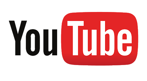
YouTube decided it was time for a total revamp of the logo. The tube that was supposed to mimic a TV screen disappeared entirely. Goodbye TV screen: hello play button! The bright red rounded rectangle with a white triangle inside that YouTube has used as an icon for years now has become the star feature of its logo.
The play button icon is on the left of the bold, black, sans serif YouTube wordmark, with no space between the first and second word.
Font and Color
The YouTube art department didn’t just decide to remove the TV screen and insert the play icon when they changed the logo in 2017. Logo design focuses heavily on attention to every last detail, and the YouTube art department experts considered every tiny aspect of the logo before its release.
The team decided that it was time to modernize the YouTube font. The original font was from 1903; however, it had been adjusted by previous designers. Interestingly, the “u” in “You” and the “u” in “Tube” were not actually the same u. The new design changed this so that both letters were absolutely identical. After careful consideration, the team decided to design their own font that stayed close to the original but was better adapted for digital devices.
The play button icon also wasn’t perfectly symmetrical, as the four corners weren’t rounded the same way. While an ordinary YouTube viewer would probably never notice this detail, the logo design team at YouTube certainly did and fixed it.
While the shape of the play button icon is important, it’s not the only factor. The team decided to re-think the color as well, and they ultimately chose #FF0000. This basic, striking red was chosen because the team wanted to find a red that ties to video.
Wrapping Up
A brand that knows its identity, YouTube has made mostly subtle changes to its logo over the years. But as shown by the 2017 logo re-design, YouTube can also make major changes that help it adapt to fit into a changing world.
While the average viewer might not notice all the changes to the YouTube logo over the years, logo designers know the importance of using a sharp eye to analyze the work of the most successful companies out there. By learning from the best, logo designers can take away key lessons about brand identity and small but important changes, and apply them to their own work.


