
ABC stands for the American Broadcasting Company, a major television network in the United States. ABC has been around since the 1940s and is home to some of the most iconic shows in television history, such as The Brady Bunch, Happy Days, and Modern Family.
The brand stands out in the industry due to its long history of providing quality programming, its wide variety of genres, and its commitment to diversity. ABC has always been a leader in the industry, producing content that appeals to a wide range of viewers. The network has also been a pioneer in breaking down barriers and creating opportunities for diverse voices and perspectives in the entertainment industry.

To this day, ABC still remains a significant player in the television industry, and its commitment to quality programming and diversity makes it stand out from the crowd.
Many aspects have contributed to the brand’s success and how they’ve made its mark in the industry. The most significant of these is the brand’s logo. This logo has been essential to creating the iconic brand and making it stand apart from the competition. The logo has drastically affected the brand’s marketing and helped it meet success. However, the logo that many of our readers associate with the brand isn’t the logo that was always used. The logo has a long history behind it and has had many changes to reach the appearance that we associate with the brand today.
In this article, we’ll go over all the essential aspects of the iconic brand and the history of the iconic logo that has contributed to the brand’s success.

1945––1952: The First Logo
The company’s first logo comprised letters with the company name in bold black. It featured capital letters for the first letter of each word and lowercase letters for the remaining letters. The black font was set against a white background, creating a simple yet eye-catching design. The logo was executed in a traditional font, giving it a professional and stylish look that stood out while appearing classic and modern.
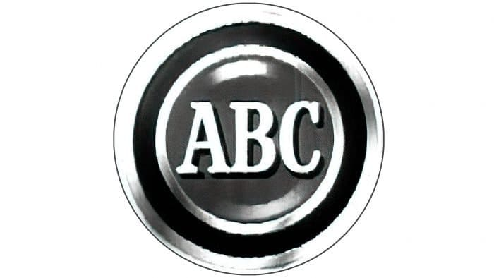
1952––1953: A Change
The following logo opted to remove the typeface used in the previous logo and instead use a more visually centered design. This time the logo mainly featured a circle with three different layers, and inside the circle, there stood the initials ABC. This was a black and white logo with aspects of grey included. The logo was featured on a white background and had almost a vintage appeal to it. It showed white on the outer ring, then an inner ring of black, and the center ring was grey. The capital acronym was established in the center of the design and looked classy while creating a signature look.
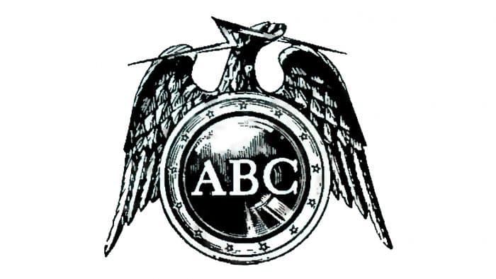
1953––1956: Wings Are Added
Only a year after the previous logo was created, the company decided it was time for a change and opted to make some significant changes to the design. The company kept the main idea of the previous logo with the capital letters in the center of a circle. However, this time, the circle had stars evenly spaced in the outer ring, and the design opted only to include a white logo with black shading. The most significant change to the design was the inclusion of a bird outside of the circle. The bird’s wings were shown on either side of the circle, and directly above the circle was the bird’s head, with what appeared to be a lightning strike in its mouth.
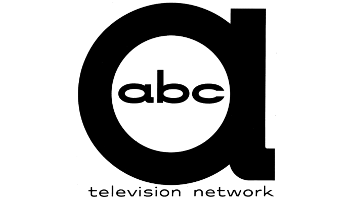
1956––1962: A Redesign
The following logo came three years later, and the company decided it was time for a complete design overhaul. They were ready for a change, and the designer knew exactly what was needed. They attempted to create a more modern and simplistic logo by making a sleek and stylish look for the emblem. This new logo showed a bold lowercase ‘a’ with the ‘ABC’ inscription inside all lowercase letters. All the letters were black on a white background, standing out and adding a unique look to the design. This logo was simple while also appearing stylish and classy.
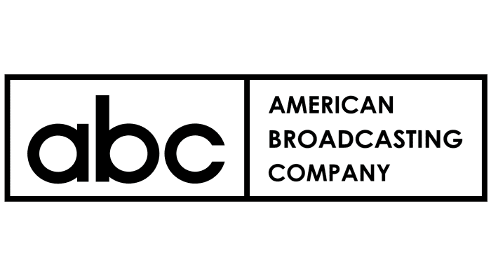
1958––1962: A Two-Part Design
During this time, a two-part verbal sign was used as the company’s logo. The sign was a rectangle with the letters’ ABC’ in lowercase on the left, and on the right side, it said the company’s name in full. The name was shown in all capital letters, and the entire design was black on a white background. The design was simple and small enough to fit in many locations easily.
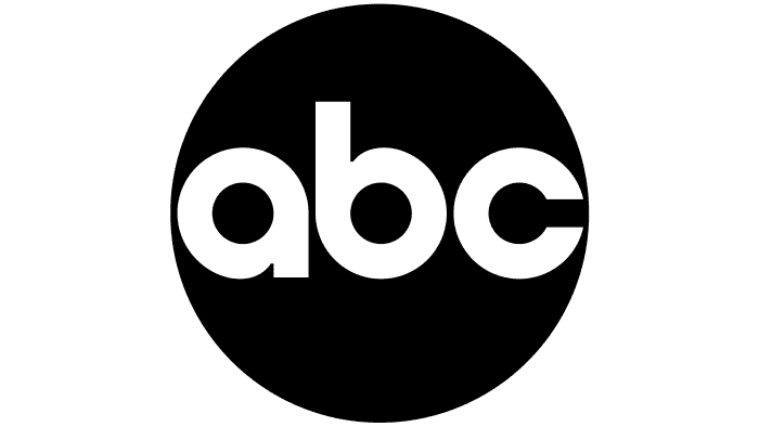
1962––Present: The Logo Today
In 1962 the ABC logo emerged that would be used to this day, stylish and classy while appearing sleek. This design was a significant part of the company’s history because it marked a turning point. This was when the logo, developed by graphic artist Paul Rand, changed significantly.
The Shape
The ABC logo is a simple yet powerful design consisting of three overlapping circles. These circles symbolize the three main networks that make up the ABC brand: ABC, ABC News, and ABC Studios. The overlapping circles also create a sense of unity and togetherness, representing the strength of the ABC brand.
This logo shape is essential for advertising as it is easily recognizable and memorable to viewers. The simplicity of the design also makes it versatile, allowing it to be used in various contexts, such as on television, on the web, and in print.
The ABC logo shape is a timeless classic that has become synonymous with the ABC brand, making it a practical and recognizable tool for advertising.
The Font
The font a logo uses is significant and impacts the brand and its success significantly. Regarding ABC, the logo is a classic minimalist design, using a bold, sans-serif font known as Univers.
Univers has a strong, modern look that works well in black and white, making it the perfect choice for the ABC logo. Its simplicity and clarity make it an essential part of the design, creating a timeless look that will remain recognizable for years.
Why The Logo Stands Out
The ABC logo is a timeless classic that stands apart from other logos due to its simplicity. The emblem consists of bold black lettering against a white background, creating a stark, eye-catching, memorable contrast. The font used in the logo is a classic serif font, which gives it a timeless, traditional feel. The logo’s simplicity also makes it versatile and easy to incorporate into various designs. The ABC logo is an excellent example of how a simple design can be effective and timeless.
The Designer
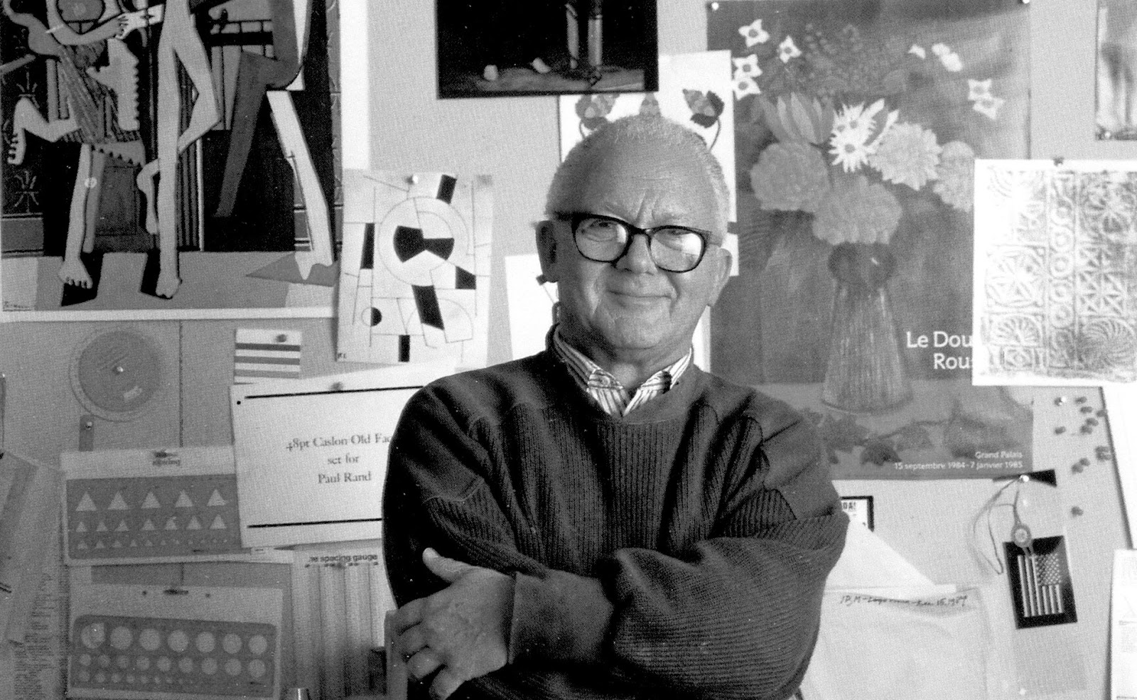
When we think about the logo designer, it tells us a great deal about the passion and attention to detail in the logo. Paul Rand was a renowned graphic designer for his iconic design of the ABC logo.
He was commissioned to create the logo in 1962, and his design featured the three letters in black and white in a minimalist style. Rand used his creative genius to create a timeless logo that has become one of the most recognizable logos in the world.
His design has been used for over 50 years and is still seen as a masterpiece of modern design.
The History Of ABC
ABC is a company that has been around for over 20 years and started as a small business providing services to local businesses and quickly grew into a larger organization.
Today, ABC is one of the leading business solutions providers, offering a wide range of services, such as consulting, software development, and IT support.
With a team of experienced professionals, ABC is dedicated to helping businesses of all sizes succeed in their goals. The company is committed to providing the highest quality of service and support to its customers and continues to expand its services to meet the needs of its clients.
ABC is proud to be a leader in the industry and is committed to continuing to provide the best solutions to its customers.
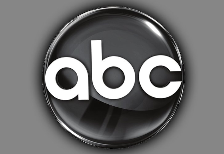
Other Versions Of The Logo
The ABC logo has been used in various versions over the years. One of the most iconic versions is the black and white logo, which has been used for decades. However, ABC has also used other logo versions with different colors.
For example, ABC has used a red and white version of the logo to promote its Christmas specials. They have also used a blue and white version of the logo for their sports programming.
Additionally, ABC has used a green and white version of the logo for its environmental programming. Each logo version helps promote the different types of programming that ABC offers.
Where The Logo Is Shown
The ABC logo is a widely recognized symbol that can be seen on many different products and services. It is most commonly seen on television and radio broadcasts, as well as on the ABC website and mobile apps. The logo is also used on merchandise such as t-shirts, mugs, and other items. It is also often used in print advertising and promotional materials. The ABC logo is a recognizable symbol that is synonymous with quality entertainment and news.
Why The Logo Is Important For ABC
A strong logo that stands out from the competition is essential for any company, and ABC is no exception. A logo is not only a symbol of the company but also a representation of its values, mission, and identity. ABC’s logo has been a significant part of the company’s success, as it has helped to distinguish ABC from its competitors and has been used to create a strong brand identity.
The logo has created a recognizable image and a sense of trust among customers. This has increased sales and brand loyalty, as customers are more likely to purchase from a company they recognize and trust. In addition, the logo has been used to create a sense of unity among employees and customers, as it serves as a reminder of the company’s core values and mission.
ABC’s strong logo has been a significant factor in the company’s success and has helped to ensure that ABC stands out from the competition.
Summing Things Up
ABC is a renowned American broadcasting company that has used marketing methods and appearances to create an iconic emblem that has helped it to stand out from its competitors. The company’s logo is the most iconic aspect of ABC, and it has gone through many changes over the years to become the classic symbol we recognize today.
From its inception, ABC has worked hard to create a logo that stands out and represents the brand in a positive light. ABC has created an iconic logo synonymous with the brand through its marketing efforts. The logo is a testament to the company’s success and has helped to make ABC a household name.
The company’s logo has undergone several changes over the years, and the most recent and significant change was in 2021. This was due to the need to adapt to digital devices in different formats as technology and the company grew. The logo is an essential part of the brand, so the company had to ensure that it was updated with technological advances and the internet.
By discussing each of the changes the company went through, as well as aspects of the current logo, we can get a better understanding of what the company is and how it is seen today. We examine each of these concepts thoroughly above.


