
If you had to guess what the first soda brand was, we’d guess Dr Pepper wouldn’t be your first guess. Even if Dr Pepper isn’t as popular as some of its competitors, Dr Pepper has one thing these other brands do not – it is the oldest soft drink and syrup manufacturer in the United States.
What is almost as impressive as being around longer than any other soft drink company is that even with a smaller market share, Dr Pepper has managed to stay relevant.
Whether some people simply crave the taste of a Dr Pepper, or its logo is one that stands out from competitors, something works for the brand. If you’re looking to learn more about building brand loyalty through a logo, then you came to the right blog post. That’s Dr Pepper’s story, and their story is one we’ll cover throughout this blog post.
Meet Dr Pepper
While Charles Alderton may be an unfamiliar name, his name is one that is associated with Dr Pepper’s founding. Over 125 years ago, Charles was working as a pharmacist in Waco and came up with this beverage that was unlike any other at the time.
While Charles invented the soda, the drug store’s owner, Wade Morrison, was the person who named the soda and sought out the drink’s patent.
Following Dr Pepper’s discovery, Coca-Cola was invented the following year, and Pepsi was founded and named in 1898. Like these iconic brands, Dr Pepper has also built a devoted customer base. In the next sections, we’ll walk you through more of how this brand evolved alongside its logo.
The Evolution of Dr. Pepper
1885-1904: The early days of Dr Pepper
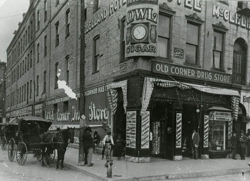
Dr Pepper was founded in Waco, Texas, in 1885 at Morrison’s Old Corner Drug Store. Before Dr Pepper was founded, there was no other soft drink manufacturer that existed in America. While working as a pharmacist, Charles Alderton played around with carbonation to create different soft drinks and syrups. As he started crafting different recipes, he began to try to create a drink that embodied the smell and spirit of the drug store, which he loved.
Before introducing his new soda to the public, Alderton went through a series of testing to see how people liked it. The owner of Morrison’s Old Corner Drug Store loved it and decided to sell it at his drug store, later getting the soda a patent and naming the soda the name we still use today “Dr Pepper.” The soda caught on and grew in popularity fast. As the soda grew, Morrison and Robert Lazenby, a chemist focused on the beverage industry, thought the taste of the soda needed to be fine-tuned, which they began to work on. As they developed this taste, the duo formed a company under a different name, until this later became the scaled-up operation we know today.
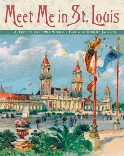
After rolling out the soda in the drug store and to the public, and after focusing on defining the soda’s flavor, Dr Pepper was rolled out on a global scale at the World Fair Exposition in 1904. Twenty million people attended the fair this year, and Dr Pepper quickly became a global phenomenon.
The 1920s-1950s: Dr Pepper grows its operations
While the company was founded in Waco, Texas, Dr Pepper’s operations were moved to Dallas in 1923. During the 1920s, Dr Pepper began to think of its company as more than a product – it began to think of it as an entire brand, which needed a thorough, corresponding brand strategy.
The first piece of its strategy was a brand slogan, “King of Beverages,” that was introduced from 1910-1914. From there, Dr Pepper unveiled a trademark character in the early 1920s. After that, the brand’s marketing strategy only grew. Commercials for the brand were run, ad campaigns were created, and a new slogan was introduced in the 1950s with “The friendly Pepper-Upper.”
1970-today: Dr Pepper takes steps to distinguish itself as a brand
With other soft drink companies like Coca-Cola and Pepsi were increasing their market shares, the brand referred to itself as “the most misunderstood soft drink” and took steps to focus on the uniqueness of the brand with additional campaigns with slogans like “Be a Pepper,” and “Be You.”
While 1970 was decades ago, the brand still is focused on distinguishing itself as a different soft drink. If you’re interested in learning more about this, an overview of Dr Pepper in recent years will come later in the article in a subsequent section.
Roadblocks Along the Way
The biggest roadblock Dr Pepper has encountered is one we’ll highlight throughout this article. Dr Pepper’s challenge has been to maintain enough market share to rival competitors, Coca-Cola and PepsiCo.
While Dr Pepper may not be the soft drink leader, the brand has consistently maintained its third-place position in this category.
The Story Behind Dr Pepper’s Logo and Dr Pepper’s Logo Evolution
Since Dr Pepper was founded, the brand has always had a corresponding logo tied to it. As you’ll see in the logo history below, for the most part, the logo was printed in Dr Pepper’s iconic color, cherry red. Since its inception, Dr Pepper has had 14 logos, which we’ll describe in more detail below.
1885-1911: The first version of the Dr Pepper logo
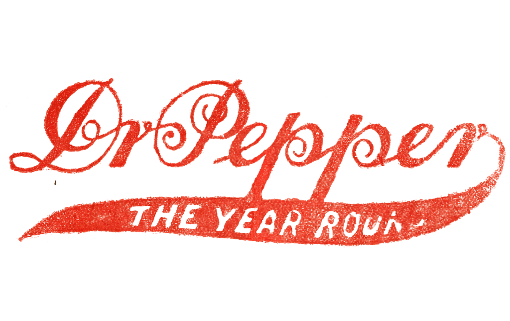
The first Dr Pepper logo featured the brand’s wordmark written in a cursive font with the brand’s initial slogan, “The Year Round.” The logo was printed in a cherry-red color tying back to the flavors and coloring of the soda. This font includes exaggerated swirly lines, tying into the playfulness that comes with a new, innovative beverage.
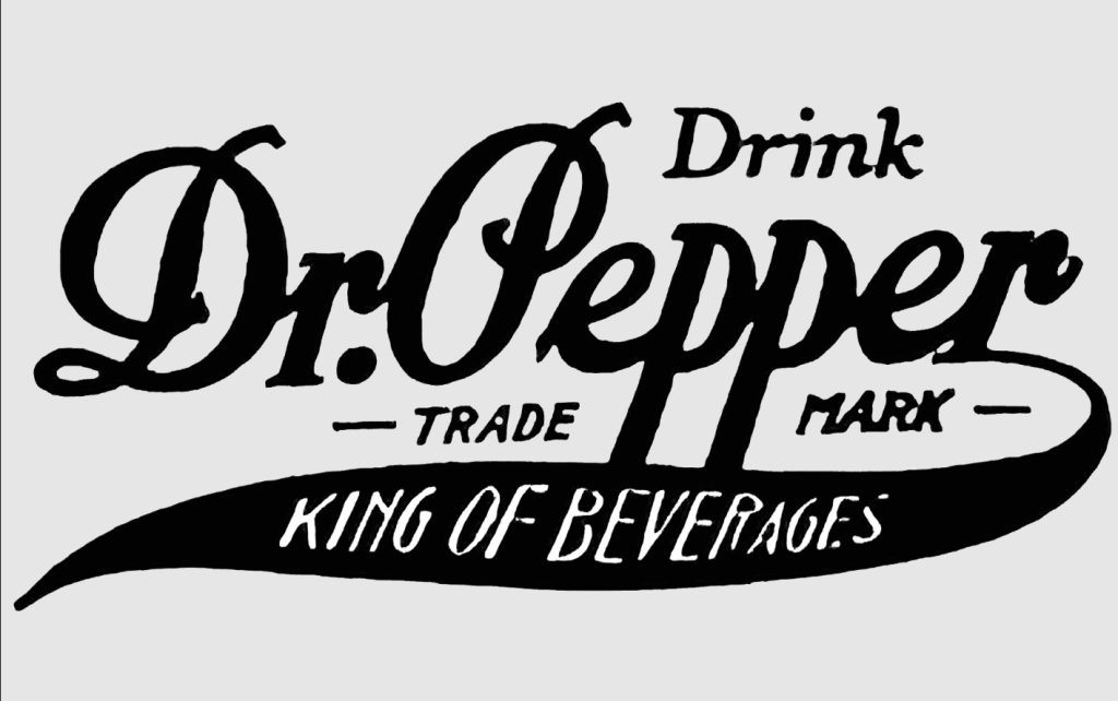
1911-1934: The second version of the Dr Pepper logo
The first iteration of Dr Pepper’s logo lasted for almost twenty-five years until this logo version was unveiled. For this version, the logo was printed in black, and the red coloring was removed. The slogan was also updated to read “King of Beverages,” and the word “Trademark” was added to emphasize that the soda was trademarked. This logo still featured whimsical cursive lettering while remaining a clean and dignified design.
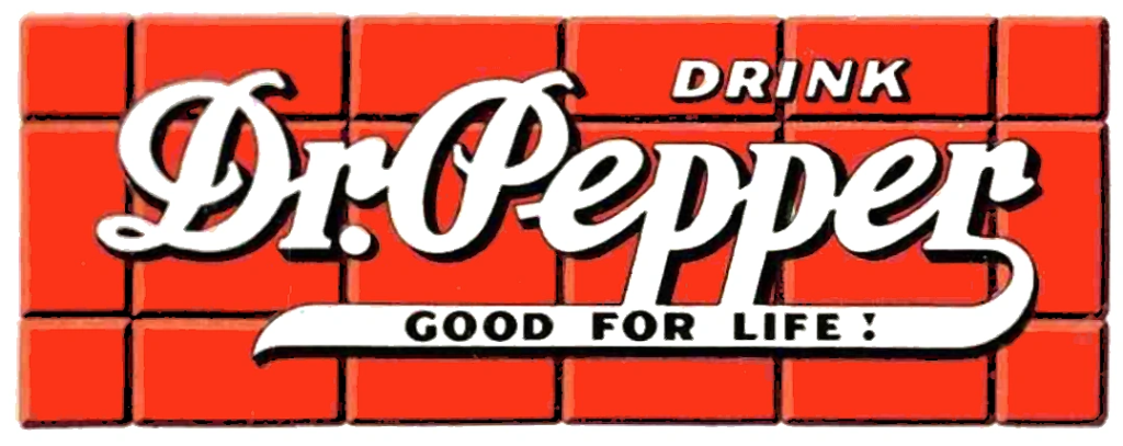
1934-1954: The third version of the Dr Pepper logo
In 1934, Dr Pepper decided to unveil a new logo design again. This version included more components than past logos. The red coloring was reintroduced, this time utilized for the background. The background was updated to resemble a red brick wall, and the font was printed in white. The font was like the past logo iteration, and the only additional update was another slogan again, this time reading “Good for Life.”
1954-1958: The fourth version of the Dr Pepper logo
In 1954, Dr Pepper introduced us to a new direction the brand was taking. The font was no longer cursive, instead being a bold, block, thick font. The period after “Dr” was also removed for this version. The font was italicized, and without the extra elements the past versions included, this logo was cleaner and more scalable than before.
1958-1960: The fifth version of the Dr Pepper logo
In 1958, Dr Pepper’s logo was updated again. This time the wordmark was stacked instead of being written in a horizontal line. This font was still a block serif font, but this time the font was thinner and had playful elements. The third “P” in “Pepper” is also not perfectly aligned with the other letters, symbolizing the fun aspects of this brand, with the third “P” almost jumping ahead of the other letters.
1960-1963: The sixth version of the Dr Pepper logo
This logo iteration only experienced slight updates. For this version, the two colors were reversed, with the cherry-red color being the background color and the white color being the font. This time the font was slightly brighter, further accentuating this cherry red color.
1963-1967: The seventh version of the Dr Pepper logo
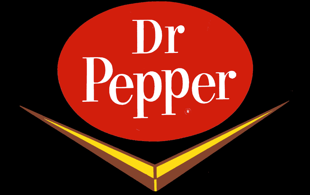
For this seventh iteration, the Dr Pepper logo got another update to its design. The oval emblem remained, yet this emblem included a more muted red. This logo also incorporated an added symbol, a yellow check mark, linear design that was placed below the oval.
1967-1971: The eighth version of the Dr Pepper logo
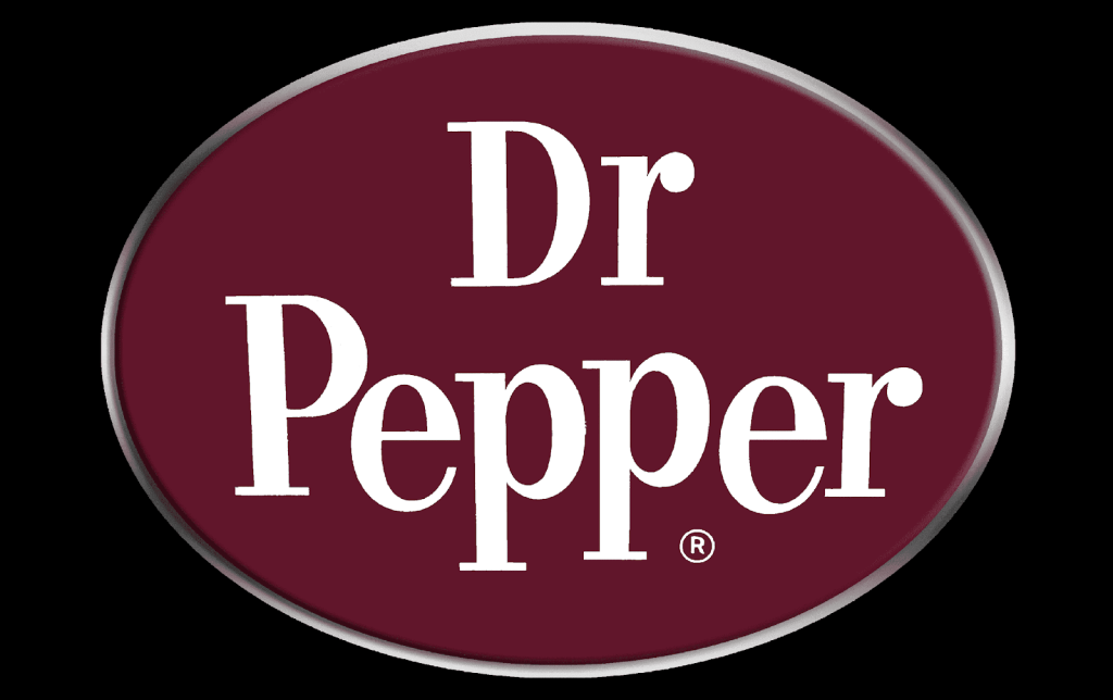
In 1967, Dr Pepper went through yet another redesign. This version removed the yellow accent and returned to the sole oval emblem. This color was darkened again, this time resembling a maroon. This version also featured a thin silver border around the oval, adding to the design. These features helped return the design to a professional logo design.
1971-1984: The ninth version of the Dr Pepper logo
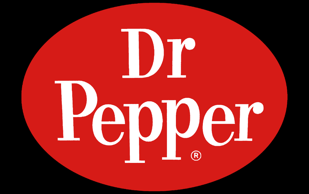
After introducing us to the maroon shade, Dr Pepper brought back the bright, cherry-red coloring and thicker font. Beyond the color choice, the font choice was also updated to become a bolder, italicized, sans-serif font.
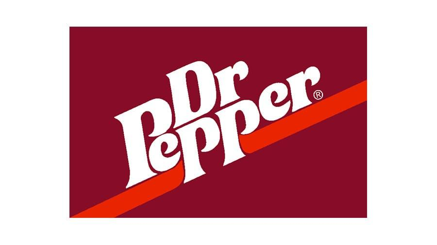
When Dr Pepper decided to go through another redesign, this time, the brand decided to only make a minimal update. The only edit that was made to this logo was the removal of the cherry red oval that sat on the left-hand side of the prior design.
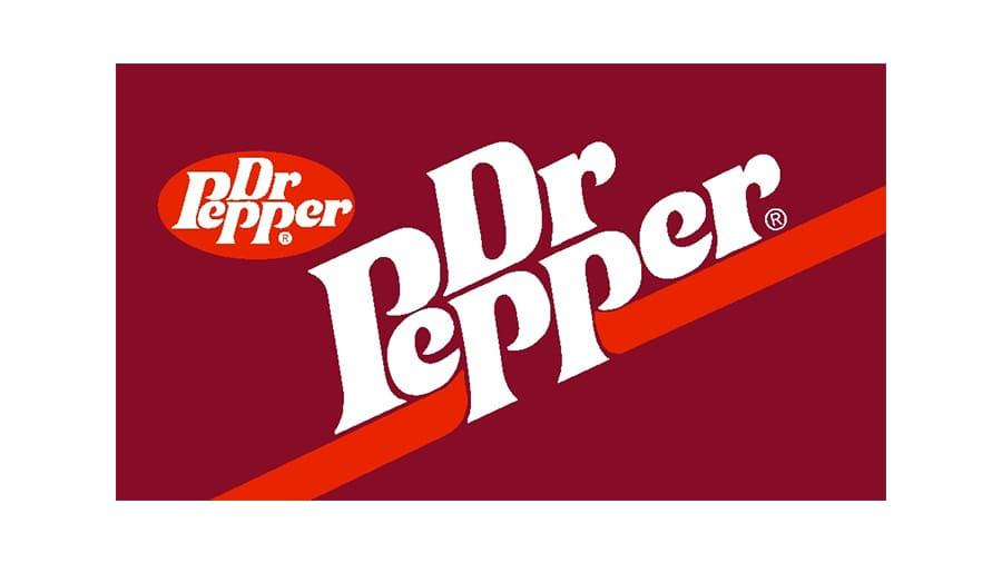
1984-1990: The tenth version of the Dr Pepper logo
In 1984, Dr Pepper added more features to its logo design, complicating the logo a bit more. Instead of choosing between two red hues, this logo design incorporated both the maroon shade and the cherry red. The bold lettering was still included in a white color. The logo design sat in a rectangle that also included a diagonal line for the brand name to sit on top of. To stay consistent with past versions, the designers elected to include the oval design on the left-hand side, allowing for the brand name to be displayed twice on one logo. These features helped make the logo unique while also allowing for it to be highly versatile.
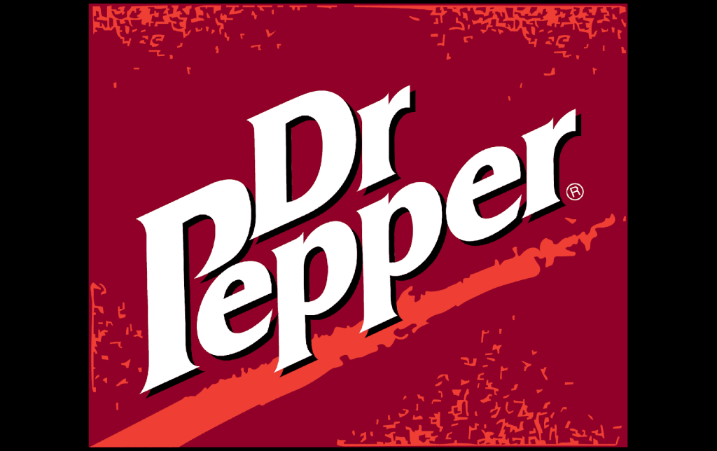
1997-2005: The twelfth version of the Dr Pepper logo
The prior version of Dr Pepper’s logo lasted through much of the 90s. In 1997, Dr Pepper decided to redesign its logo again. This one turned the rectangle into a square and added small cherry red accents on top of the maroon coloring, resembling confetti. The diagonal line that the wordmark sat on was jagged, and the designers added a black outline and shadowed around the lettering. This update helped make the logo more stylish and helped it to stand out against its competitors.
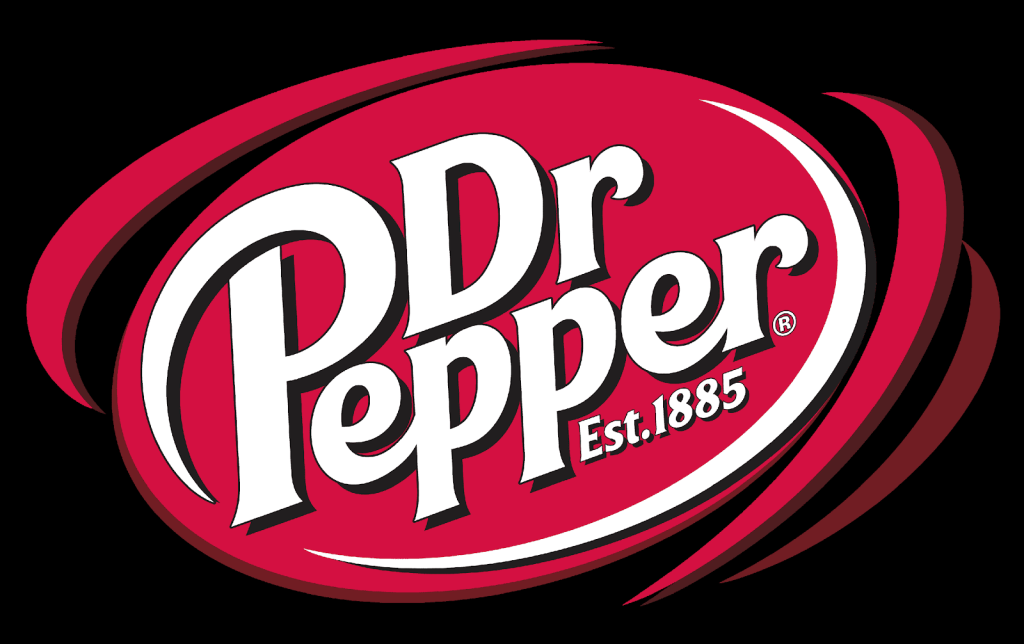
2005-2015: The thirteenth version of the Dr Pepper logo
After almost ten years of using the prior logo, Dr Pepper decided to reintroduce a new design. This design included a stylized oval that was accentuated by additional lines curving around the outside of the design. These lines helped to highlight the Dr Pepper wordmark even more. The lettering for this design was also updated. Now the “P” in Pepper was the focal point with the word “Dr” sitting beside it, next to the top half of the “P.” This logo also incorporated the year the brand was founded, in 1885.
2015-Today: The fourteenth (and current) version of the Dr Pepper logo
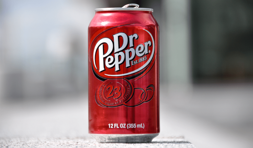
Rather than starting from scratch, the brand simply swapped the colors, so now the cherry red filled the wordmark, and white was the background color. This logo is highly versatile, so whether it is a soda bottle, a t-shirt, or a billboard, the logo can easily be scaled.
Dr Pepper’s logo font:
While Dr Pepper’s font has changed over the years, it has always been unique to the brand. The current lettering is printed in a bold sans-serif typography that is italicized. What makes this font unique is that typically, sans-serif fonts do not have exaggerated and/or elongated lines to their letters, which Dr Pepper’s font does.
Dr Pepper’s logo color:

The most prominent color in Dr Pepper’s logo is the color that is often associated with the brand, the cherry red color. This color is fitting, especially since the flavor of the soda has fruity notes.
Even when the logo displayed a different shade of red, whether that was maroon or another hue, this color was still representative of the product and the Dr Pepper taste. The other colors that are used with the logo are often white or black, which are intentional color choices to help highlight the logo design.
Dr Pepper’s logo symbols:
Throughout Dr Pepper’s logo history, no logo design ever featured a symbol. There were accents added, like a horizontal line, an oval shape, or red dots, but those were all used to accentuate the logo itself.
The combined features of the logo design, though, have helped to create a symbol for the brand, which the Dr Pepper logo has become.
Dr Pepper Today
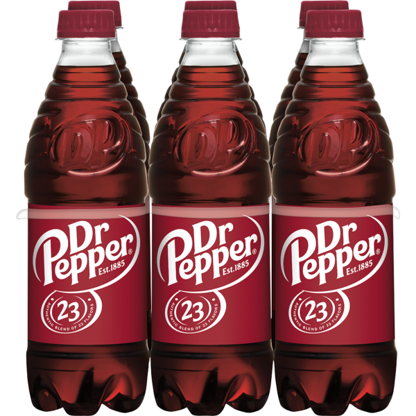
Dr Pepper is a soda with no rules and a soda that is its own category of soft drink. Rather than sticking to one flavor, the brand includes 23 unique flavors. While Coca-Cola and Pepsi also have additional flavors, those flavors are hard to compare to Dr Pepper’s because Dr Pepper is building off a unique flavor profile.

If you look strictly at the stock market and the financials for this industry, yes, Dr Pepper is not in first or second place. However, Dr Pepper has found a way to continue to grow and increase its dollar share in the stock market by 9% from 2003 to 2021.
It’s important to keep in mind that Dr Pepper’s competitors didn’t see this same growth. PepsiCo, for example, had its shares fall by 1% during this time. Its unique flavor may be what has helped to distinguish itself from its competitors and maintain a strong market share, but the verdict on why is still out.
Today, Dr Pepper is owned by Keurig Dr Pepper and has its headquarters in Plano, Texas. With 21,000 employees working as part of this group, Keurig Dr Pepper owns more than simply Dr Pepper; Snapple Group, Keruig Green Mountain, Inc., and Bai Brands all fall under this group.
Lessons Learned from Dr Pepper
After looking at Dr Pepper’s logo evolution, it’s clear that this is a brand that wasn’t scared to unveil new logos regularly. Whenever the brand felt like it needed a new logo design, Dr Pepper went to work on designing a new logo.
This shows us that it’s okay to keep redesigning our logos until we uncover a design that not only sticks but is one that we love. With this, though, it’s important to keep at least one consistent element to help build brand loyalty.
For Dr Pepper, this was the brand’s color choice. Dr Pepper always stayed consistent with its color scheme, always having a shade of red, whether that was cherry red or maroon. This helped its loyal customers know what to look for as they stayed loyal through the brand’s evolution.
Dr Pepper’s logo story is a unique one. It’s a story of a company that was never really a leader in its industry but a company that was able to stay relevant. If you’re interested in reading more stories about the logos of underdog companies and industry leaders, head on over to Logo Design Magazine for information on this and so much more.


