
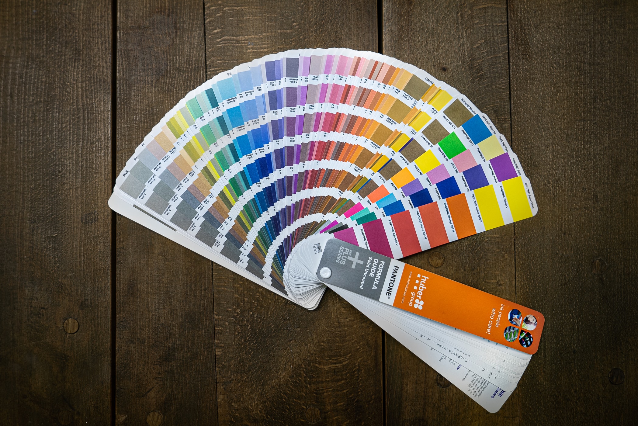
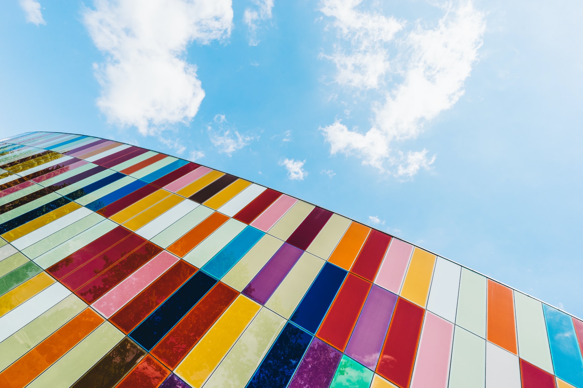
The biggest companies out there have spent hours pouring into the exact shade of the colors used in their branding. There’s a good reason for it: research shows that it takes about .05 seconds for people to form an opinion about a brand based on logo alone. That’s huge, and of course, it means that every aspect of the logo, especially the colors, is extremely important.
Choose Your Colors Carefully
- Choosing the colors for a logo is one of the most important decisions both a business and a logo designer will make. By studying color psychology and color pairings, you can make a better decision about your logo colors.
- Color psychology is a fascinating field that every logo designer should study, whether in an online design course or on their own. Using color pairings theory helps guide the designer when more than one color is in play.
- We’ll dive into the different ways colors can be used in logo design to convey a specific message and to unify brand identity.

Color Psychology Makes An Impact
People have associations for each color of the rainbow. Marketing teams will spend hours poring over the specific shades of a color to decide which shade will work best for the brand. Instead of breaking down the color wheel into its shades, we’ll take a look at the color associations for each of the main rainbow colors.

Raving About Red
Many major brands (Coca-Cola, Netflix, YouTube, and more) choose red as their primary logo color. Red stands out (think bull fighting in Spain!) and shouts, “Look at me!.” Common associations with the color red include passion, love, anger, violence, aggression, and blood.
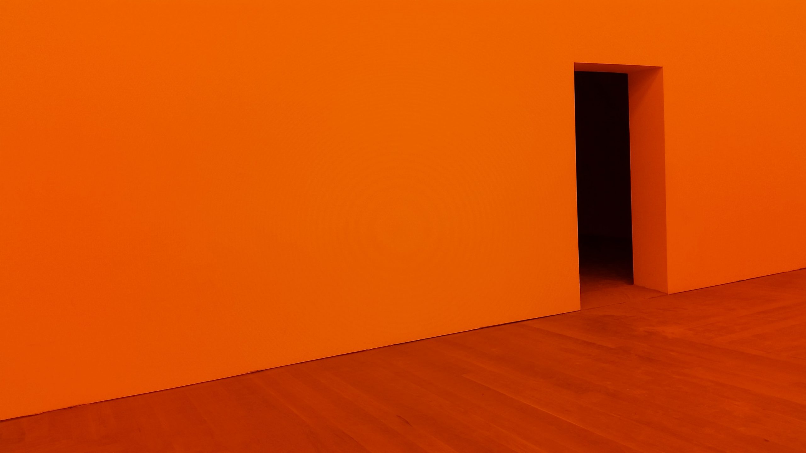
Open To Orange
While orange is a less common color used in branding, it’s still the choice of major players like Home Depot, Fanta, and SoundCloud. Orange can create feelings of health, energy, warmth, excitement, and even fire.
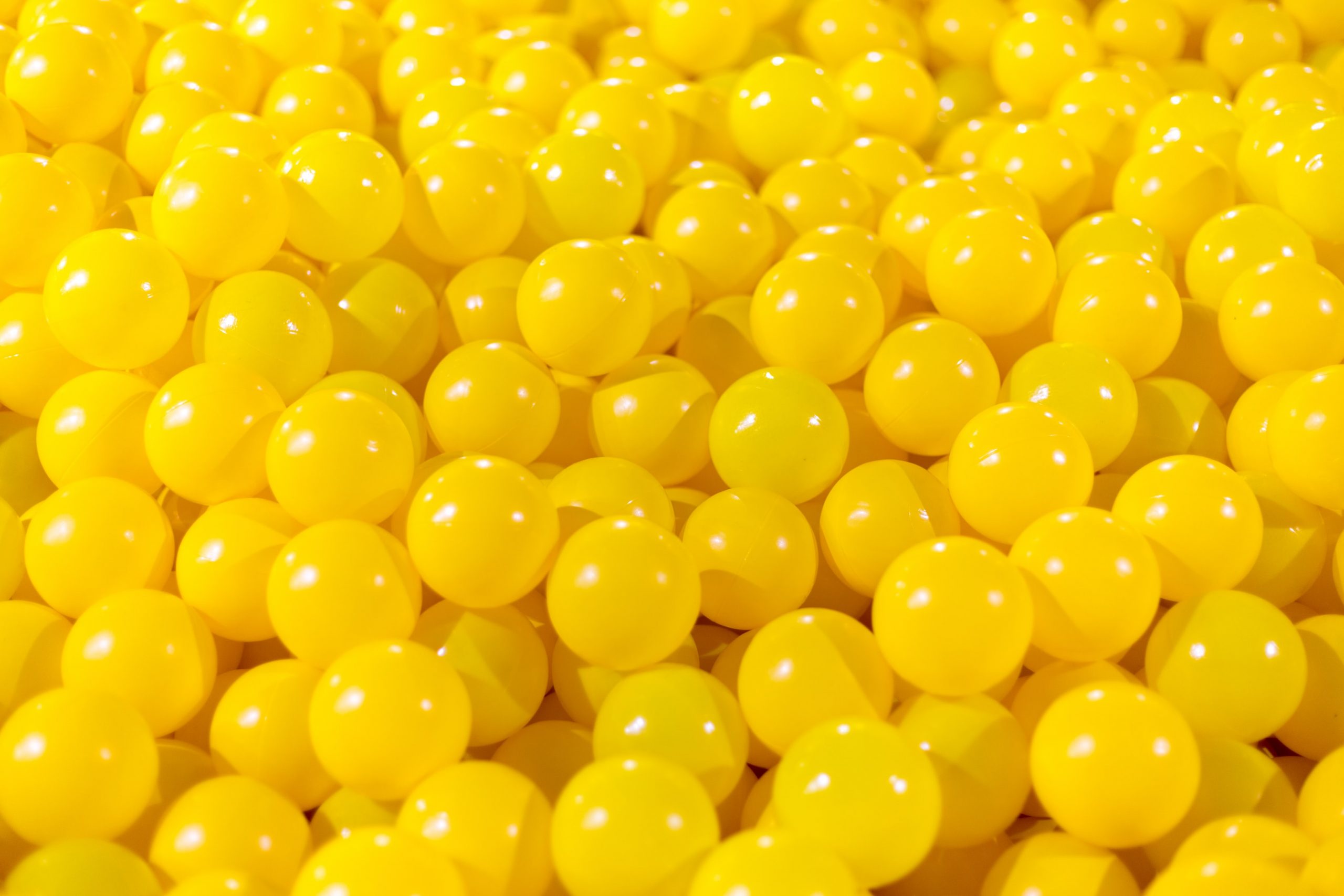
Yearning For Yellow
Yellow is another less common brand color, especially when used on its own. This light color creates issues with readability, so many brands stay clear of it for that reason alone. However, companies like Shell and DHL still use yellow as a primary color in their branding. Yellow is typically connected with happiness, sunshine, optimism, and caution.

Glowing About Green
Most people could do with a little more green in their life, whether that’s green money, time spent in the green of the outdoors, or both. Green is an extremely popular color choice for logos. Starbucks, Whole Foods, and Android are just three of the major players who use shades of green in their branding.
Naturally, many eco-friendly companies also use green to create the connection between their brand and the work they do for the environment. In addition to being associated with nature, green is also commonly connected with luck, wealth, relaxation, conservation, and sometimes envy.

Blown Away By Blue
Blue is a very important color used by brands like Facebook, Ford, and Samsung jus tot name a few. Blue is a popular favorite color, and inspires feelings of friendliness, confidence, calm, enthusiasm, and creativity.
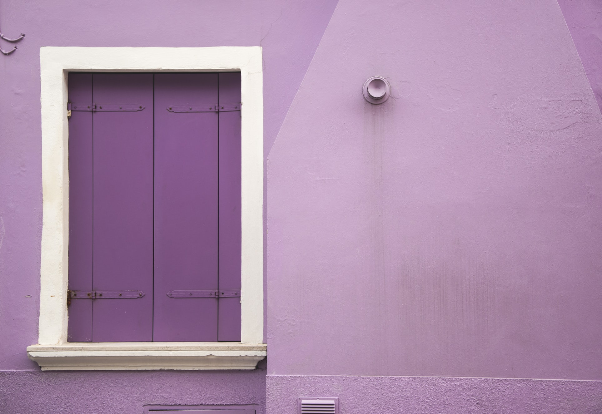
Patiently Purple
Hallmark, HGTV, and Yahoo! are just three companies who have chosen purple as their primary logo color. There’s a lot of reasons to choose purple, as it can create associations of royalty, creativity, mystery, and magic. Purple can also be very soothing, which is important in today’s hectic world!
Color Pairings
Most of the brands we’ve listed in this article so far have chosen to use only one color in their branding; however, many brands choose to use two, three, or even four colors in their branding. Let’s take a look at what the most common color pairings are to help you decide what route to take in your logo design.

Monochromatic
You might think that monochromatic means just black and white, but that’s not the case. When a brand chooses to use different shades or hues of the same (single, one) color, that’s a monochromatic logo design.
Analogous
Analogous color schemes are extremely popular because of the harmony they are created. To use an analogous color scheme, the logo designer should choose colors that are adjacent to the primary color and work well with it in the whole design.

Triadic
Tri means three, so you can guess what this color pairing means. Brands that use triadic color schemes choose three colors that are equally spaced around the color wheel, like the three primary colors. Triadic logo schemes are high in intensity.
Complementary
Complementary colors are direct opposites, and yet they work well together. Purple and yellow, for instance, are complementary colors that brands (like Taco Bell) choose to use. Logo designers who want to create a strong contrast and vibrancy will choose complementary color schemes.

Split Complementary
Last but not least, a split complementary color scheme pairs one color with two colors that are adjacent to its complement. For example, logo that has a primary color of yellow will use blue and red as its secondary colors, since they are adjacent to purple, the complement of yellow. Burger King is a great example of a split complementary logo.
Test Multiple Color Pairings
Choosing a color for your logo design is an extremely important decision. Before you make your final choice, it’s important to test out multiple combinations. Think about the brand’s messaging and consider which color matches it best. Experiment with different color pairings before you create your final product. Take the time to explore the color wheel!


