
Geometry isn’t just for math majors; it’s for designers and marketers too. In fact, design and visual identity are based solely on geometry and shapes.
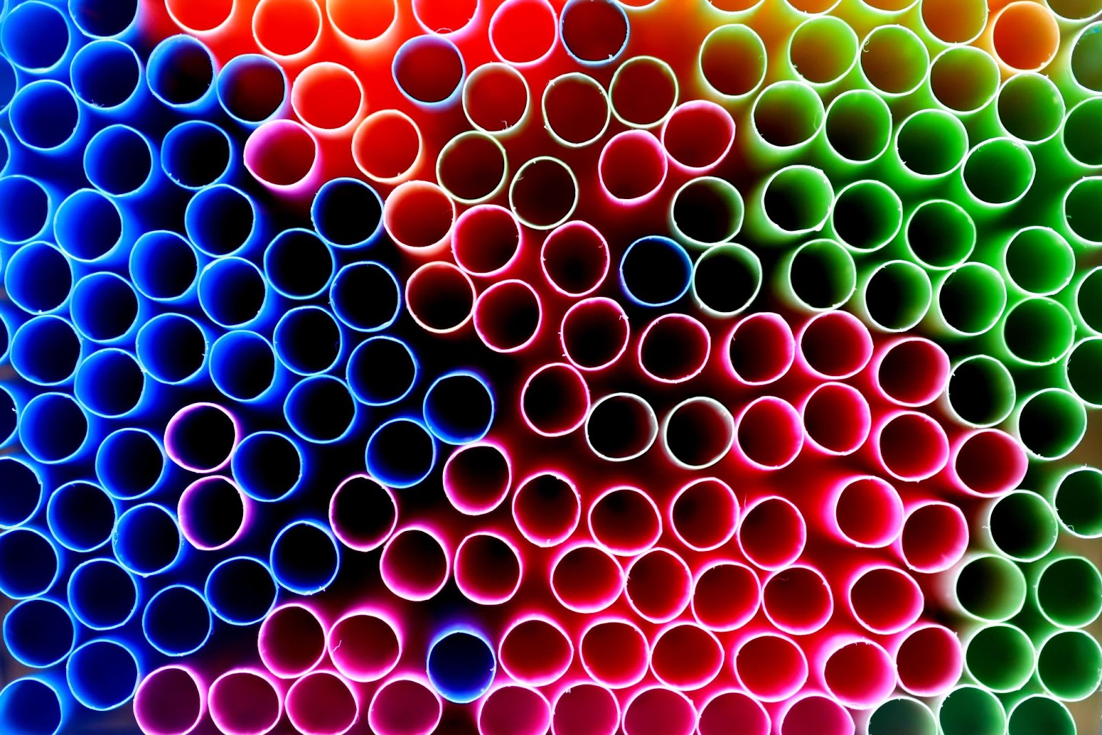
Whether it’s an obvious circle, such as the Starbucks logo, or a more hidden shape inside a design, it’s clear that the majority of designs and marketing materials use shapes to display a brand’s visual identity.
These shapes are almost always the logo’s main element and have a substantial impact on consumers and how marketing material is perceived. This is because logos that rely on geometric shapes tend to have the most significant impact on consumers and stay in their memory for the longest time.
These types of logos are typically simple and don’t include too many elements, making a memorable impact that consumers can easily identify.
So, what shape is the most common for brand logos? Circles are the most common shape for brands’ marketing material and the most easily identifiable. Circles symbolize mobility and aspirations and are known to be the “softest” type of shape.
Let’s take a look at some of the most famous logos with circles.
Target
The famous American company Target is known for the iconic red bullseye that has become symbolic of the company. Of course, the bullseye is circular, using three circles inside one another to represent the company name: Target.
The logo features a solid red dot played inside a transparent background and enclosed in a thick circular frame. Although there’s nothing truly special about this logo, it stands out for its simplicity and iconic elements that have become symbolic of the company. The logo is stylish, and simplistic, and stands apart from the competition for its slick and memorable appearance.
LinkedIn is a social media platform that connects entrepreneurs, companies, and employees in a professional yet accessible atmosphere. However, when users use this social media brand, they attempt to find the recognizable blue icon that represents the brand.
The LinkedIn logo is simplistic and easy to understand; it features a blue circle with “in” in the middle in white. The logo is on a clean white background, ensuring the blue stands out and catches the eye. The circle is the main concept of the logo and ultimately creates an engaging and memorable icon for the social media brand.
CBS

CBS, the American television and radio network, is known for its sleek black logo. The logo is bold and iconic, featuring a large black circle with a small black circle inside, placed on a white element.
Together, these elements make up an abstract eye, creating a recognizable and memorable symbol that is smooth and sleek.
AT&T
One of the most memorable and recognizable circular logos is the AT&T Inc. logo, the American multinational telecommunications conglomerate that has become synonymous with smartphones worldwide.
The brand opted to have a blue sphere become the symbol of their company in the early 1980s and has continued to be the icon that represents the brand around the globe. The logo is a blue sphere featured next to the company name in black, all shown on a clean white background.
The sphere demonstrates the brand’s loyalty to its customers and devotion to providing only the best services.
Safari

Few know Safari, the search engine with a circular logo. This logo shows a blue compass with red and gray arrows and white lines on the perimeter’s edges.
Although the colors and ideas are simplistic, the circular logo leaves an impression and shows value to customers. The iconic symbol has been with the company for decades, creating a legendary logo that can stand the test of time using geometry in the form of circles.
7 Up
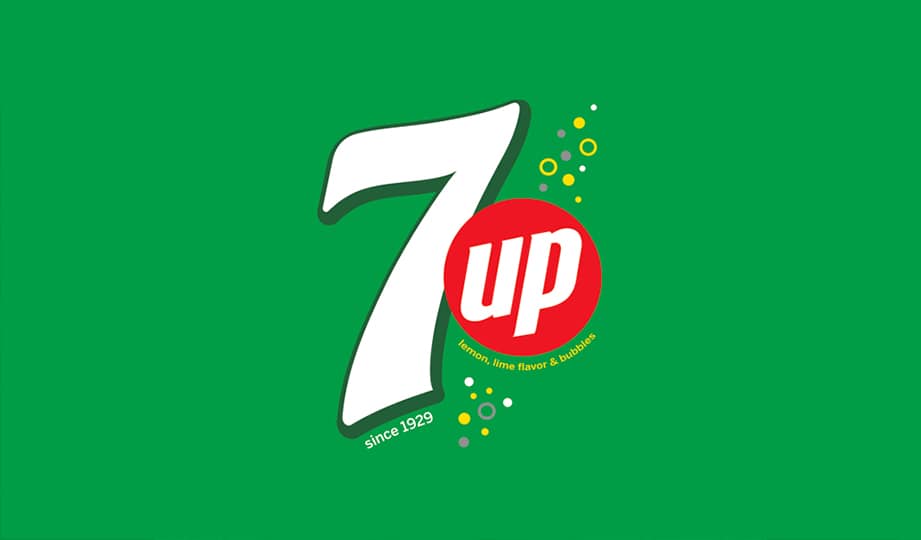
The seven7-up logo is one that, although not entirely based on a circle, has several elements within it that are circular. This logo is fun and different from 7 Up’s competition, showcasing unique and fun color choices and shapes to establish the brand.
The logo features a large 7-inch white with a thick green outline. To the right, there’s a smaller red circle with the word “up” in white. Surrounding the red circle are various small, white circles that are either outlined or solid. The yellow and green within the logo symbolize lemon and lime, which is the flavoring of the drinks.
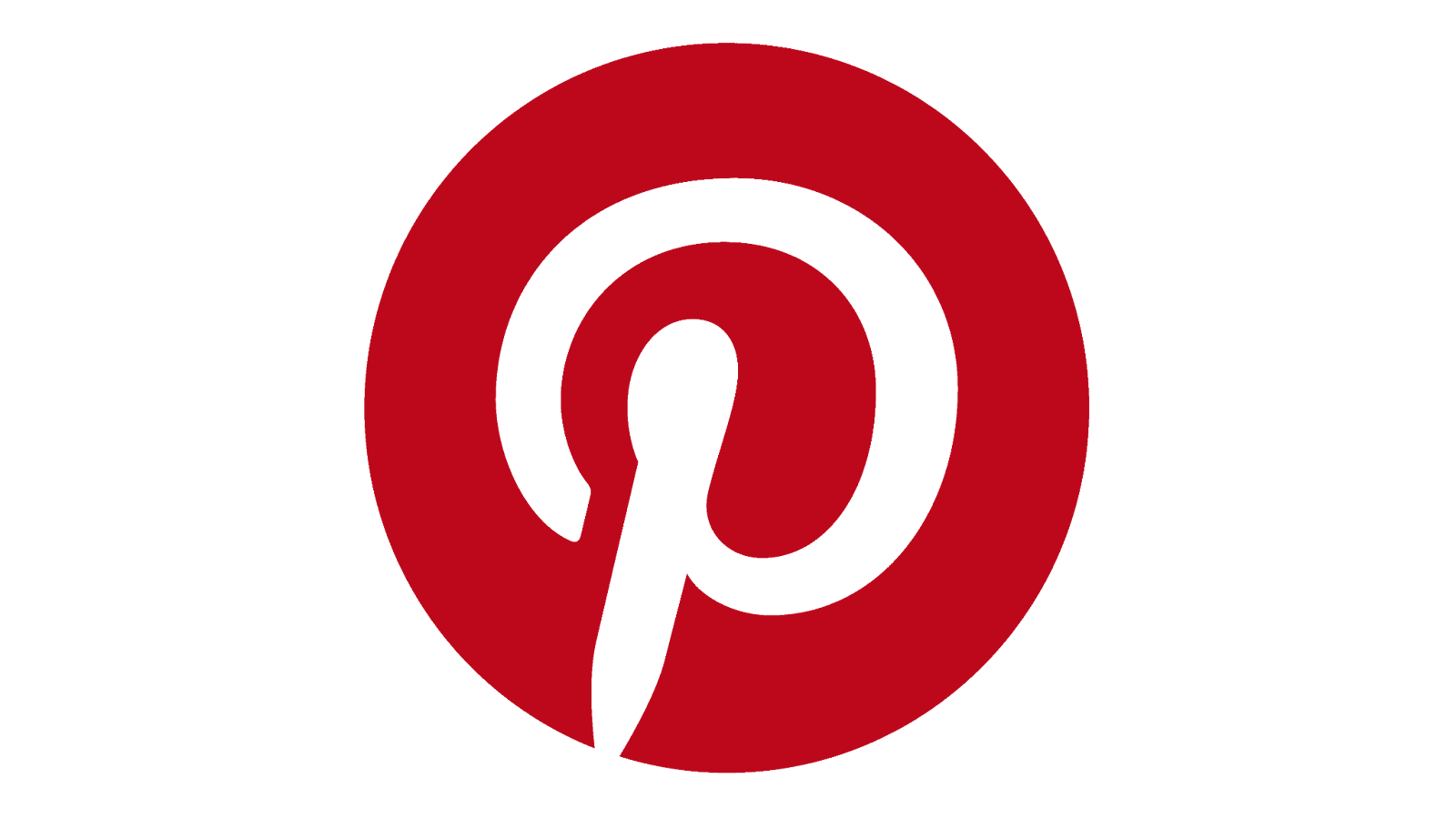
Pinterest, the platform known for allowing users to share photos and images, has a visual identity based entirely on a red circle. The circle is the main element of the logo, featuring a dark crimson red with a stylized white letter “P” in the middle.
This elegant and classy letter, combined with the strong, bold red that stands out against a white background, creates a striking emblem. The Pinterest logo combines critical design elements, including a striking circle, to create a stunning logo that does its job and has stood the test of time.
Xbox

Another classic sphere logo is Xbox, the famous gaming console that is the first in a series released by Microsoft. Every classic brand needs a classic logo, and Xbox is no exception, featuring a sphere with an “X” in it. The “X” is shown in neon green, and when the console is on, the letter ignites with light.
In the full design, the sphere features the company name below it in bold black letters on a white background. The circular shape is critical for the logo concept, as it reestablishes the idea of a fun and simplistic logo curated to create a family-friendly brand.
Starbucks
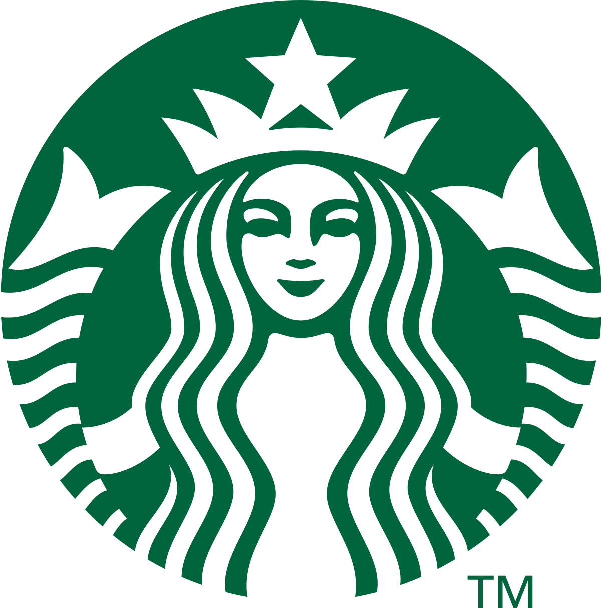
There is one logo that all our readers will probably know and know well. That would be the iconic Starbucks logo, which features a green disc with a mermaid, complete with a crown and a star atop her head.
This logo has made its way worldwide, appearing on merchandise, advertisements, and everything in between. This iconic logo is based on the green circle, which signifies unity, wholeness, and completeness.
Lipton
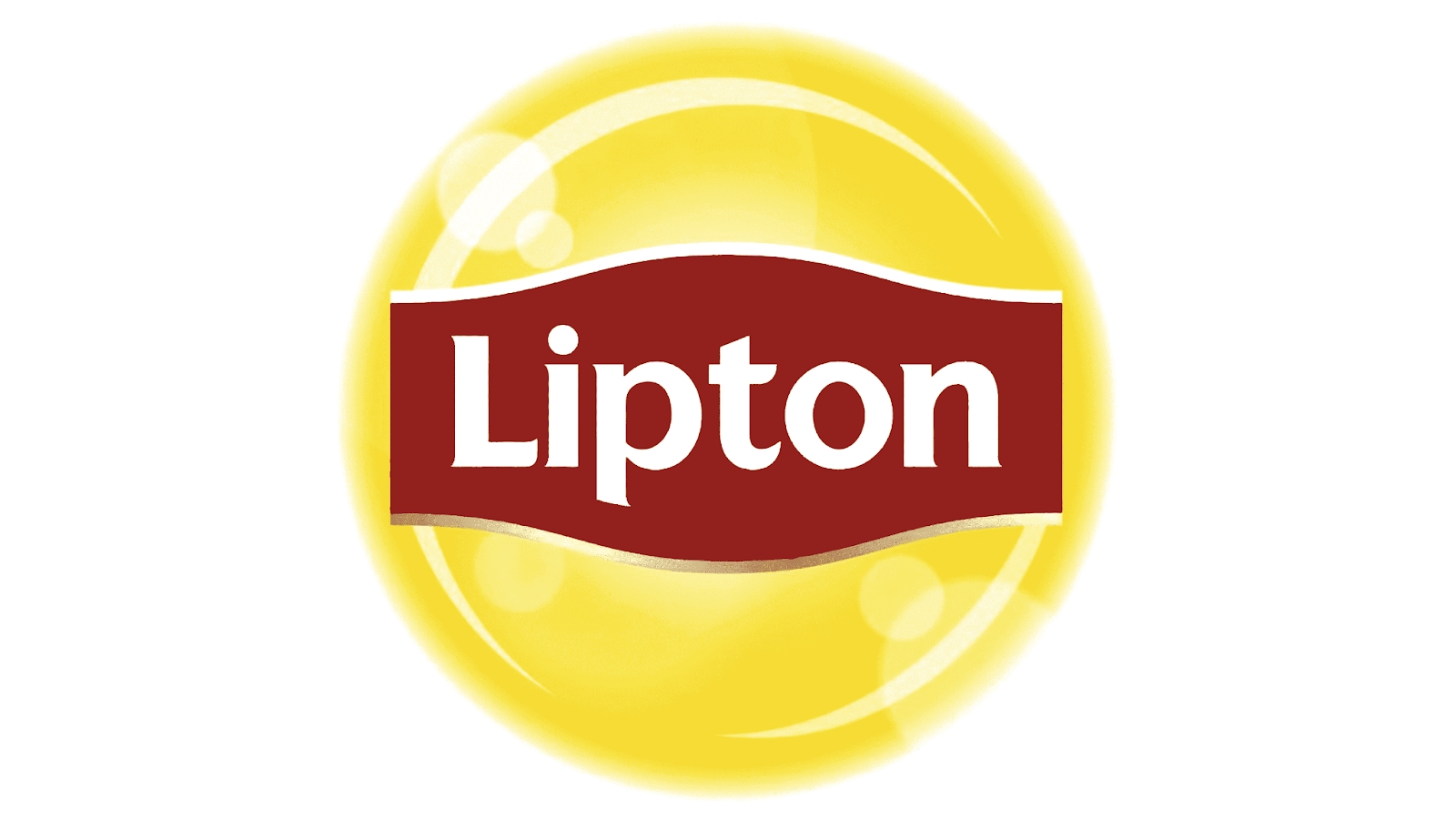
You may be familiar with the tea company Lipton, which has been associated not only with the famous tea they offer consumers but also with the bright yellow logo displayed on their branding.
The logo features a dark red badge inside the yellow circle with white letters in a simple font. The circle is smooth and sleek, creating a simple yet stylized look for the brand. We can gather that the brand chose a circle for its brand to reflect wholeness, reflecting Lipton’s commitment to providing quality tea experiences to customers.
Wikipedia
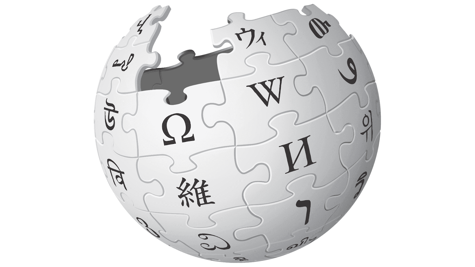
Wikipedia, the most famous online encyclopedia, is another brand that opted for a circular logo. The brand represented itself with a three-dimensional sphere formed by puzzle pieces coming together.
Wikipedia decided to take the design to the next level by including small details along the puzzle pieces, showcasing details from different alphabets written on individual puzzle pieces. The circular concept allows the brand to create an emblem that reflects the expertise and confidence of the company and its purpose.
Pepsi
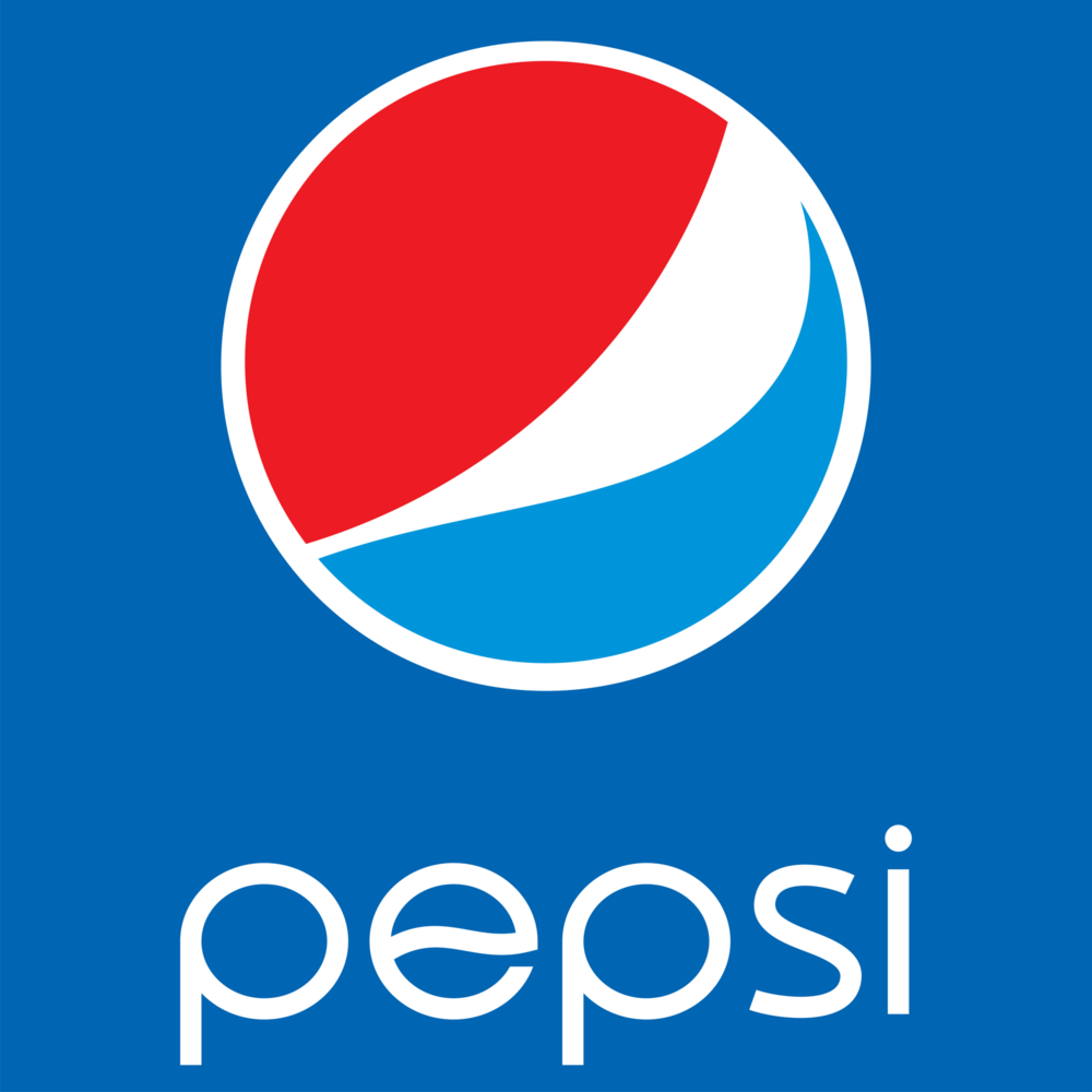
Identifying one of the most famous circular logos when sipping a Pepsi is easy. PepsiCo is one of the largest food and beverage manufacturers worldwide, and its emblem is more than just a circle; it’s become the icon associated with one of the most famous brands of all time.
The logo is perceived as a blue, red, and white globe. The design uses curves and layers to create an eye-catching design associated with the refreshing and high-quality drinks that Pepsi offers customers.
MasterCard
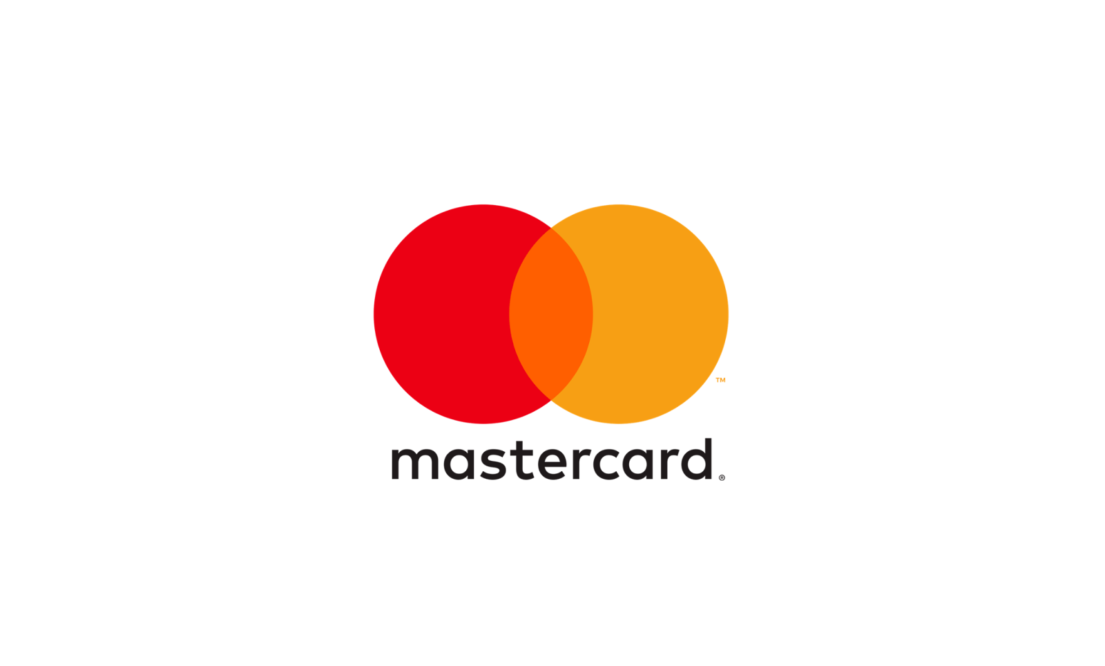
The international payment system MasterCard is another brand that has quickly become recognizable thanks to its identifying symbol, which features two circles. MasterCard didn’t think that their brand just needed one circle; rather, they opted for two.
The logo, which can be seen displayed on credit cards and advertising material alike, showcases two circles that overlap each other. The circles are red and yellow, allowing the colors to add meaning to the design.

Although we now know this platform as X, it was originally known as Twitter and had a different logo that represented it. The Twitter logo was iconic and well known for its light blue logo, which featured a small white bird in the center.
The blue circle encompasses the bird and stands out, creating a striking design that has stood out against the competition. This platform is based on community and sharing, so it was only fitting that the design reflected that with a symbol of unity and community action.
White Claw
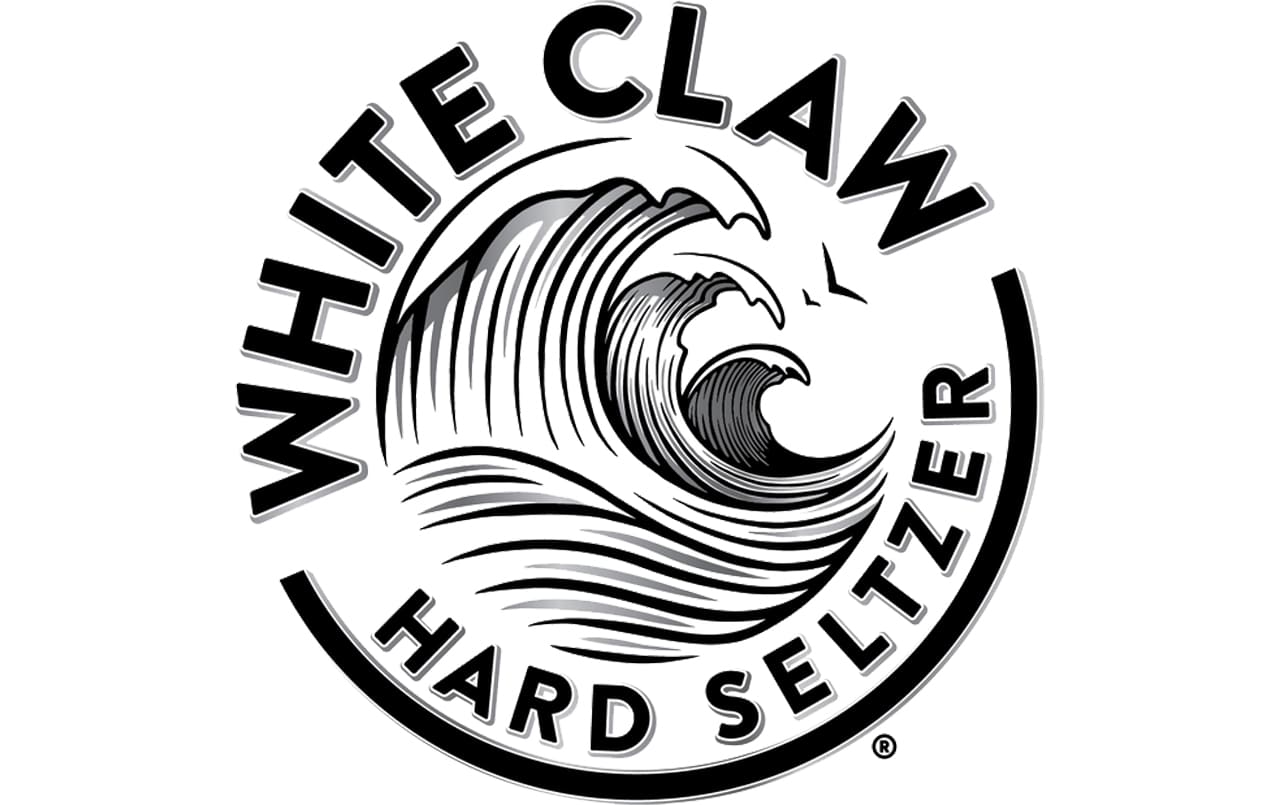
The alcoholic beverage company White Claw uses a circle as its visual identity. This logo can be seen on drink cans and marketing material around the globe, and it’s eye-catching and enticing.
The logo features a black hard line circle along the bottom, and the rest of the circle comprises the company name, which is shown in large black letters. In the circle’s center is a wave in grey, and the remainder of the company name is in black.
The logo is strikingly bold, stands out, and uses letters to create a circular design.
Tide
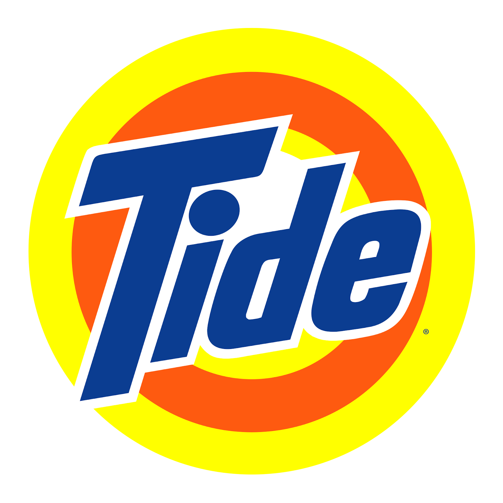
When you’re headed to do your laundry, there’s no brand you’ll reach for faster than Tide, the well-known laundry detergent provider. The Tide logo mainly relies on a circle for its design, actually opting to use multiple circles layered within each other.
The logo features a yellow core layer, with an orange circle around that and a yellow outer layer. In the center of the design, the company name is written in dark blue, which is outlined in white.
Texaco
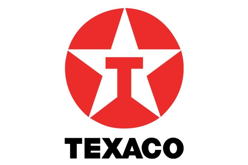
The American oil corporation Texaco is based on a solid red circle with a white five-point star in the middle. The company name is shown in big, black letters below the circle, stunningly completing the design.
The star is a classic symbol of Texas, so it’s only natural that it’s a key element of the design. Inside the star is a red capitalized T, which is the same color as the bold circle.
The red and white color palette is essential to this design, using the circle to emphasize the brand and all it encompasses.
Hoover
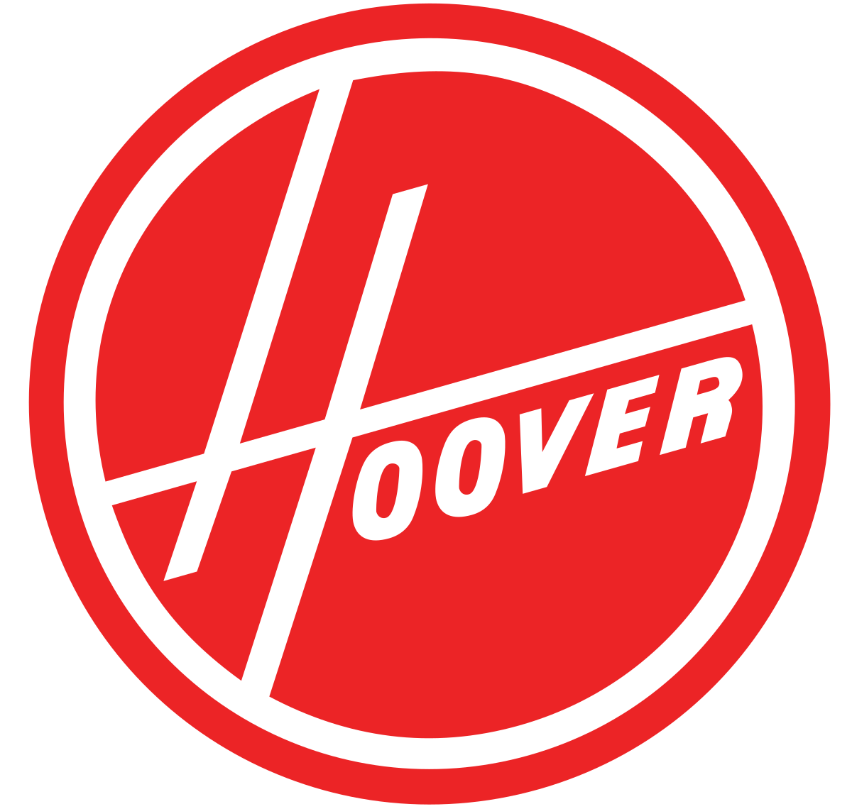
Hoover, the famous brand known for home appliances, is fairly legendary regarding logos. This brand came out at the start of the industry and opted for a bright red to display its brand.
The Hoover logo is primarily a red circle, with a bold white internal line and the company name in white, stylized letters.
The main element of this logo that stands out is the “H,” which features long lines coming long upward and horizontally.


