- Neatlines is a freelance logo designer who often works through 99designs, where he’s rated as a top-level designer. He’s won 47 contests, was the runner-up for 100, has completed 191 short and direct 1:1 projects for clients, and has 36 repeat clients.
- Neatlines creates designs for everything you can imagine, from logos to t-shirts and product labels to characters.
- We’ll take a look at four of Neatlines’ impressive designs that show exactly why he’s been so successful on 99designs.
A beautiful treehouse. A warm breakfast. A hot cup of tea. A tree cutting service. Companies offering all of these trusted Neatlines, a logo designer on 99 designs.
Logo design requires attention to detail and creativity. It’s also essential to understand your client’s vision for the design. When it comes to creating designs that are bold and interesting, Neatlines does a fantastic job of balancing color, fonts, details, and the big picture.
The Treehouse
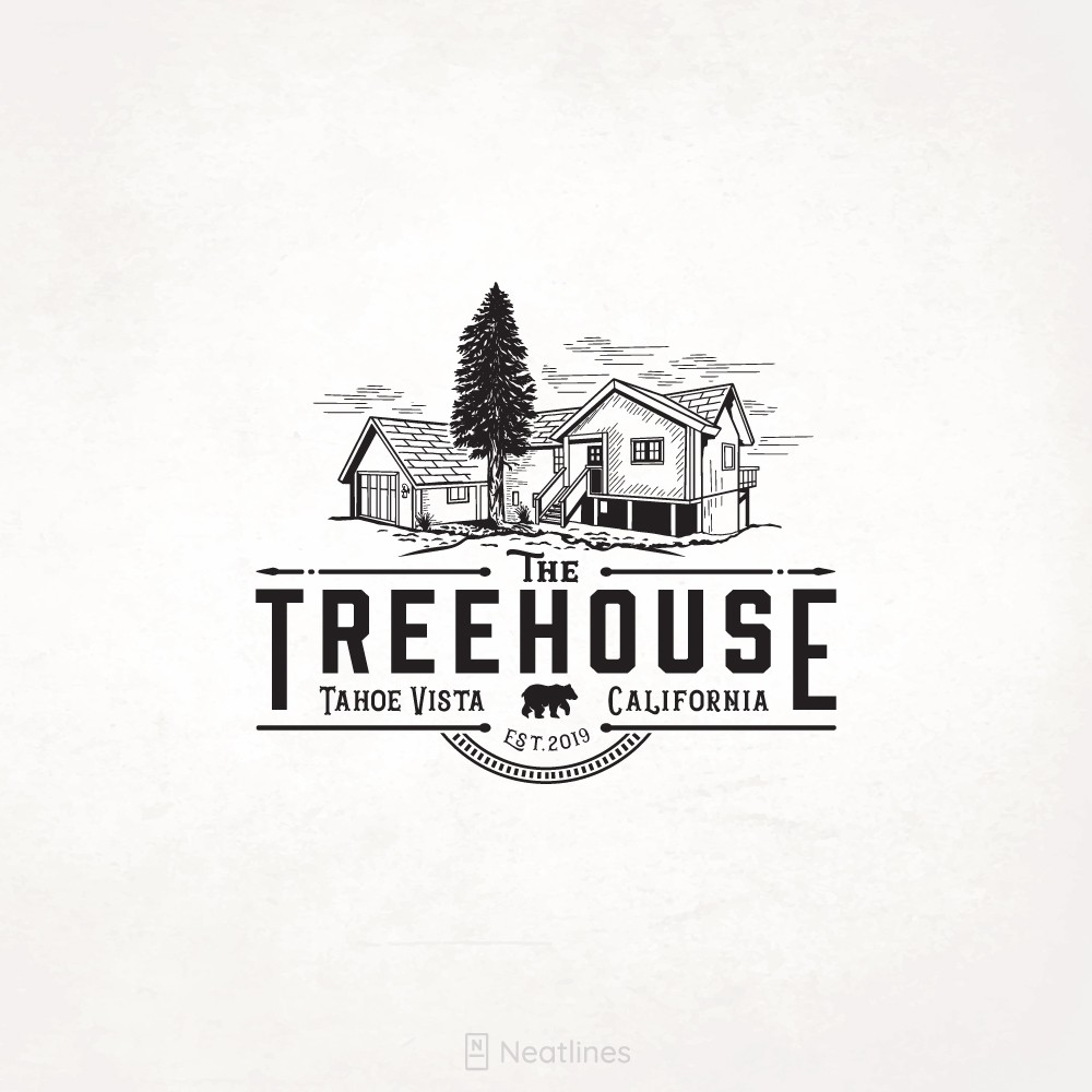
Neatlines’ beautiful artwork for The Treehouse Apartments’ logo shows his attention to detail. The texturing of the sky is mimicked in the texturing of the building itself. No detail is ignored, as even the lines that box in the name of the company aren’t just straight lines. With arrows at the end and a dot in the middle, these lines point us out and away, encouraging us to embrace the California spirit and keep seeking.
We love that the design also features the iconic California state bear. The font cohices are a win in our book too, as only two fonts are used. The balance of serif and sans serif is interesting without being too busy. The Treehouse logo is definitely a winner!
Egg & Cheese Cafe
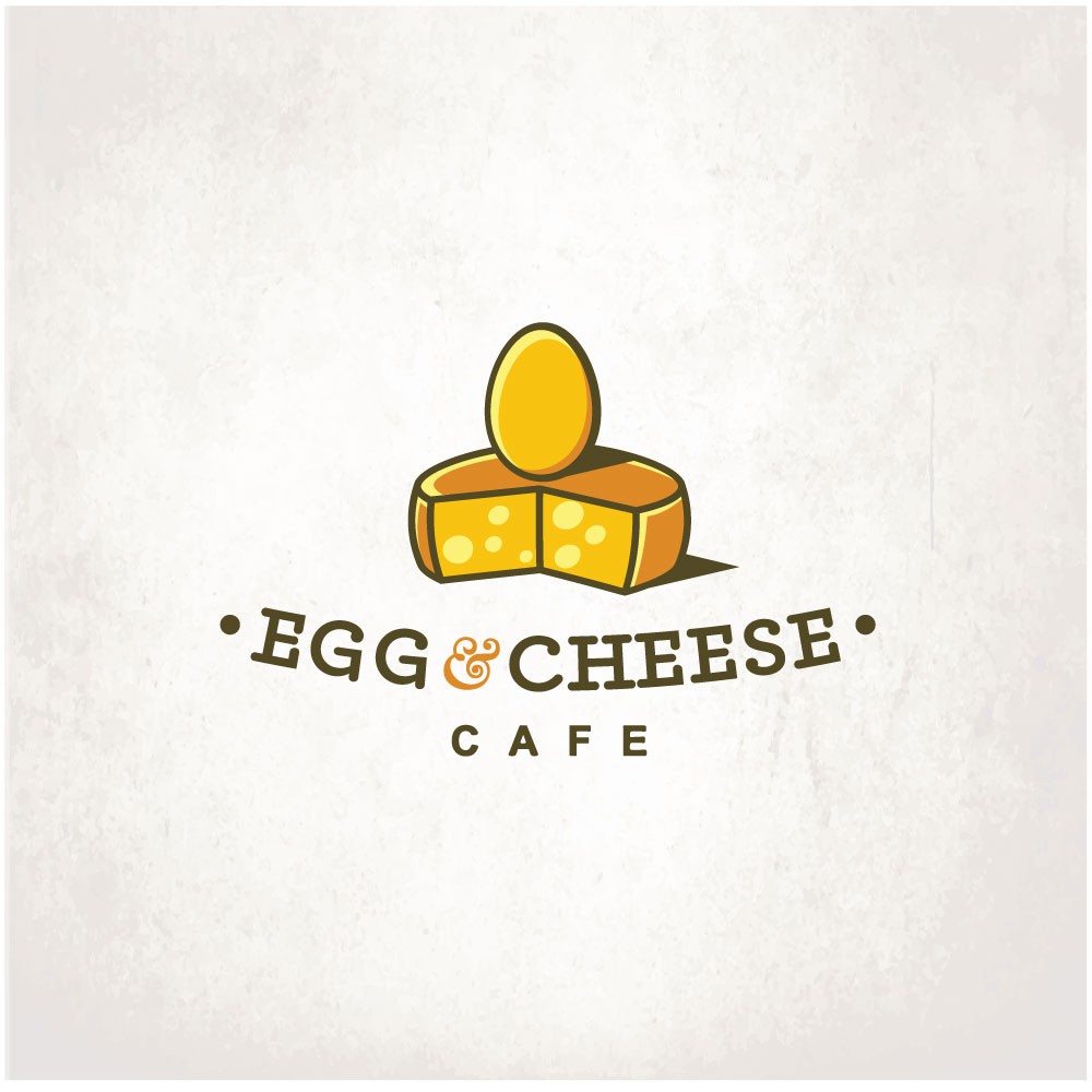
While Neatlines’ design for the Egg & Cheese Café didn’t win the contest, there’s still a lot to like in this simple yet interesting logo. Neatlines again contrasts a serif and a sans serif font, with the serif font used for the dominant wording and the most important part of the logo – the restaurant name.
We love the intricate curlicued ampersand that links egg and cheese, but most of all, we love how Neatlines depicted the two foods. The colors are warm, bright, sunny, and as close to cold as they can be without actually being metallic. The shading is impressive as well and adds dimensions to the image. This logo makes us want to go grab breakfast at Egg & Cheese!
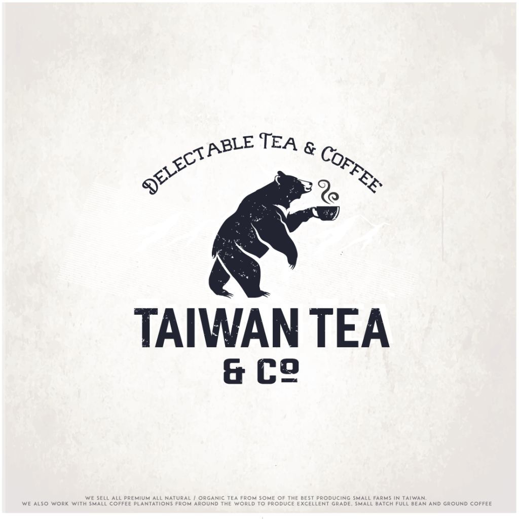
Taiwan Tea & Co
Let’s take a look at one of Neatlines’ logo design contest winners: the logo for Taiwan Tea & Co. A quick check of the company’s website reveals that this logo is used on all of their products, and we can see why! The happy bear enjoying his tea has an interesting texture and a relaxed posture. Most people want to feel relaxed when drinking their tea!
The swirls of steam coming off the tea cup also add interest to the logo. We like how Neatlines has once again contrasted a serif font (used for the tagline “Delectable Tea & Coffee”) with a sans serif font (used for the company name). The printing of the company name is also interesting because it’s textured exactly the same way as the bear.
We love all the interesting quirks of this design, and we know just why it won the contest. If we ran the Taiwan Tea & Co, we would use this logo on all of our products, too!
American Arborist Tree Services
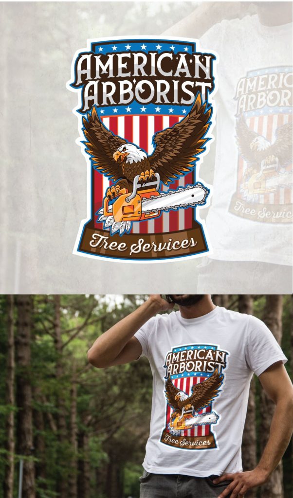
While this one isn’t strictly a logo design, we still wanted to take a look at the t-shirt design Neatlines created for American Arborist. The company requested Neatlines specifically to come up with the design, and he delivered!
What we like about this design is that while there’s a lot to look at, it’s also pretty simple. A deconstructed American flag makes up the background, and the eagle holding a chain saw clearly symbolizes the company. The bottom border of the design resembles a tree on its side, as it’s a brown bar, but it’s translucent so you can still see the stripes of the flag underneath it. We like this visually interesting detail!
Neatlines used two serif fonts in this design, and the name of the company is clearly readable. This bold design balances does a great job of balancing simplicity and complexity!
Balance, Texture, And Of Course, Neat Lines
We love Neatlines’ work for The Treehouse, Egg & Cheese Café, Taiwan Tea & Co., American Arborist Tree Services, and the other logos he’s produced. His designs for the four of these companies do a fantastic job of balancing font, color, contrast, and texture. Because of his intense attention to detail, Neatlines produces top quality work. We can see why he’s a top level designer on 99 designs!

