
You don’t have to be a farmer or work in agriculture to know the John Deere brand. If you stop by any Home Depot or Lowe’s, you’ll find John Deere’s products lining the shelves awaiting your purchasing consideration.
What you may not know though is just how long John Deere has been around. John Deere was founded in 1837 and since then, the brand has stayed relevant, by consistently responding to what its customers needed, and by remaining at the forefront of innovation.
John Deere’s story is a unique one and one worth learning more about. To learn more about how this iconic brand evolved and how John Deere’s logo was a pivotal part of the company’s evolution keep reading below.
Meet John Deere
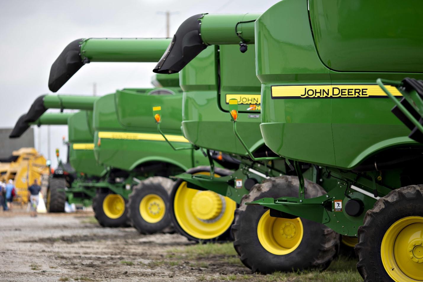
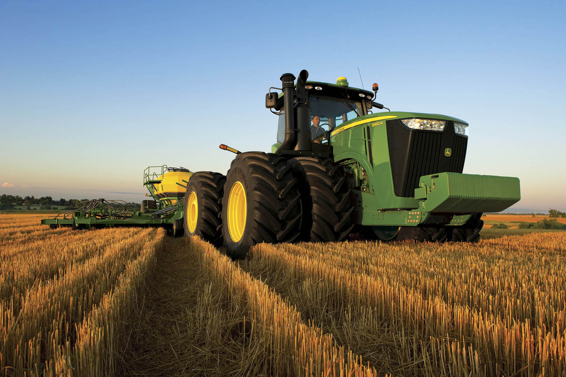
If you have never heard of John Deere, let us introduce you to the brand. John Deere was founded in 1837 in the Midwest, specifically in Moline, Illinois. John Deere has become a household, and business name, when it comes to heavy-duty agricultural, logging, and construction machinery. That means if you need a tractor, bulldozer, baler, harvester, plow, or anything else along those lines, John Deere is likely a company you’ll investigate purchasing your machinery from.
John Deere has grown to become a global leader in this machinery and equipment, making its products available to customers on every continent. While today the company is a global operation, John Deere comes from humble beginnings.
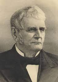
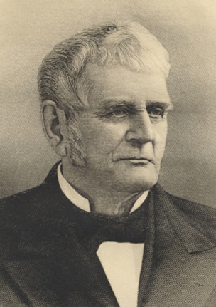
John Deere was born in 1804 in Vermont. As a child, John worked in a blacksmith shop, where he learned about this craft. After relocating to Illinois, John opened a blacksmith shop of his own and went from creating shovels to creating steel plows. That was just the beginning of John Deere, and that steel plow is what helped propel John Deere to become a global enterprise.
John Deere’s Evolution
John Deere is a company that was founded in 1837 in Moline, Illinois. The best way to learn about John Deere’s evolution as a brand is by looking at the different leaders of the brand through the years and looking at what their vision entailed.
1836: The early days of John Deere
Working outside, tilling prairie, and soil, John Deere saw a need for a steel plow to help with this process. His invention worked and this steel plow is what the early days of John Deere were founded on.
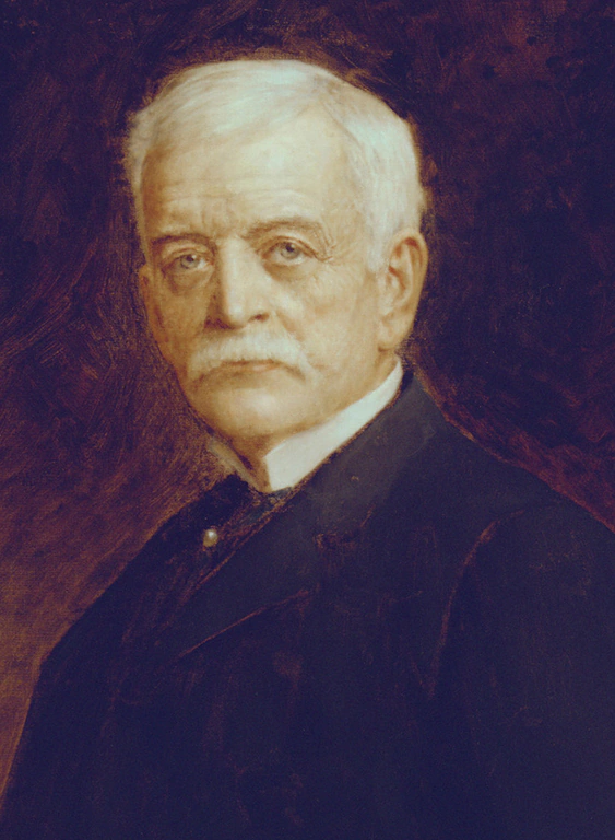
1886: Charles Deere takes over
As the second son of John Deere, Charles was tasked with taking over the company after his father passed away. Under Charles’ leadership, a sales branch was opened in Kansas City, the company’s first branch of this kind. This was part of Charles’ plan to expand the sale of new products to farmers across the country.

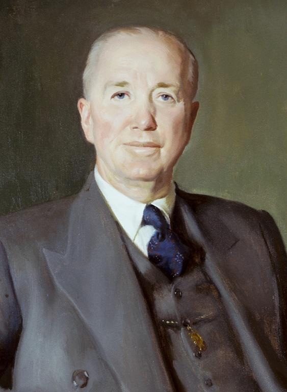
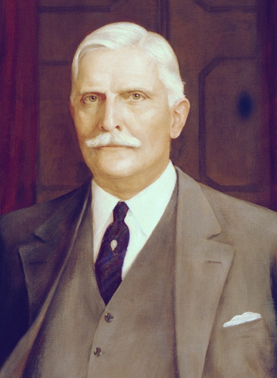
1907: William Butterworth becomes the new leader
Charles passed away in 1907 but before he passed, he led John Deere to be one of the top manufacturers in the United States. Even though William had a different last name, he was part of the Deere family and was Charles’ son-in-law. He started as an assistant with John Deere and worked his way up. Upon taking on the leadership of the company, William brought all the factories and sales teams under one roof, and he released a new product, a harvester, in 1912.
1928: After William retires, Charles Deere Wiman takes over
William was Charles’ uncle and Charles was John Deere’s grandson, so this transition was another natural one. During Charles’ leadership, he led the team through the Great Depression, working hard to keep John Deere profitable and afloat. During Charles’ leadership two new tractor models were released, but what he is credited most for during his tenure is keeping John Deere going during one of the most troubling times the company has ever seen.

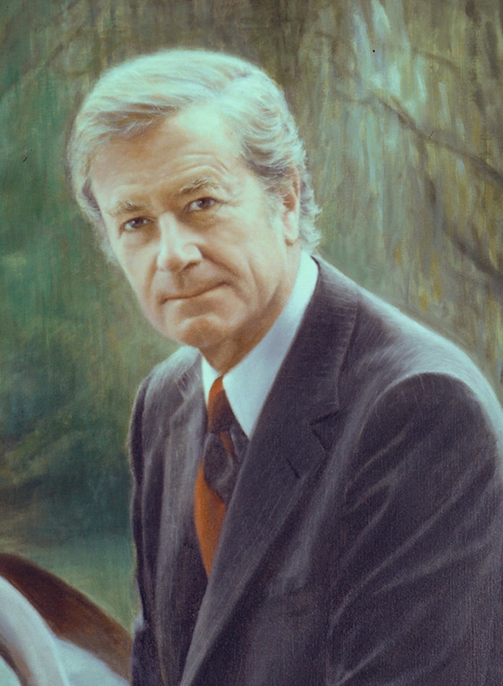
1955: William Hewitt becomes the new director
William was only at the company for two short years before he was promoted to his director role, taking over from his father-in-law. It was under William’s leadership that John Deere first became a global competitor, with an international presence. To kick this off, William purchased a German tractor competitor and purchased land in Mexico.
Also, during William’s leadership, John Deere became Deere & Company. This new name of the company allowed the brand to showcase that it creates more equipment than just plows. This new name was a timely transition because farmers had an increased need for a wide range of agricultural machinery outside of plow equipment. Farmers were looking for tractors, balers, harvesters, and other equipment that could help them increase profitability by tackling their large-scale farming enterprises more seamlessly.

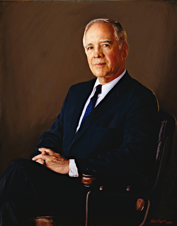
1982: Robert Hanson becomes the first leader who is not a “Deere”
Unlike Robert’s predecessors, Robert has no ties to the John Deere family. During Robert’s leadership, he navigated the company through recessions, still bringing John Deere to exceed the company’s sales goals. Robert is also credited with expanding John Deere into the healthcare industry with John Deere Health Care, Inc.
1990: Hans Becherer takes over
After being elected chairman of John Deere, Hans took over the leadership of the company. Hans was focused heavily on innovation and spent his leadership years expanding the company’s global reach, streamlining operations, and introducing new equipment and models.

2009 – Today: John Deere’s leadership today
Robert remained the CEO until 2009 when he retired. After he retired, Samuel Allen came on board as the new CEO. Following Samuel, John May became CEO in 2019 and is the current CEO of John Deere today.

2000: Robert Lane steps into a leadership role
As John Deere looked at how it could grow, the company determined it needed a leader who could help grow the brand even more on a global scale. Robert was brought in to do just that. Robert implemented a shareholder value-added model, updated and improved John Deere’s factories across the globe, and focused on the customer experience, no matter where the customer resided.
Roadblocks Along the Way
As John Deere responded to changing customer needs, those responses came at a cost. For instance, John Deere had to expand its offerings to products for small, medium, and everyday farming needs, which meant the company had to create a “flexible manufacturing” production system. By doing this, John Deere wasn’t singling out an entire demographic of customers and was expanding its reach. The cost of this though was a large one and to set up this operation, John Deere had to put forth $1.5 billion. While this roadblock ended up working out in John Deere’s favor, if it didn’t, the company would have been out $1.5 billion and the company likely wouldn’t have survived that strategic decision.
We’re glad that wasn’t the case though and instead, this move made John Deere the largest farm equipment manufacturer across the United States!
The Meaning of John Deere’s Logo and John Deere’s Logo History
John Deere’s iconic logo is almost as recognizable as the tractors that John Deere produces. That’s because John Deere’s logo is the perfect representation of the brand’s product offerings and from the color scheme to the emblem to the symbol, there’s no mistaking what brand this logo goes with.
Since the company was founded in 1876, the brand’s logo design went through several redesigns, all of which are outlined below.
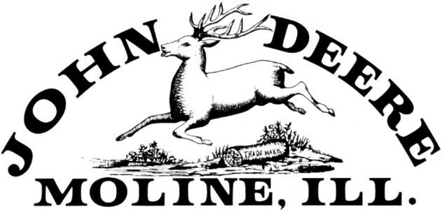
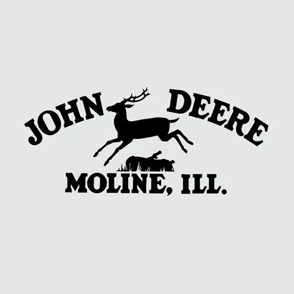
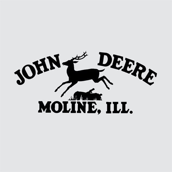
1876 – 1910: The first version of the John Deere logo
Like many companies that were founded in the 1800s, John Deere first existed without a logo. It wasn’t until 1876 that John Deere officially registered and released its first logo. This logo unveiling was a timely release as the company was growing in popularity, producing more than 60,000 plows each year.
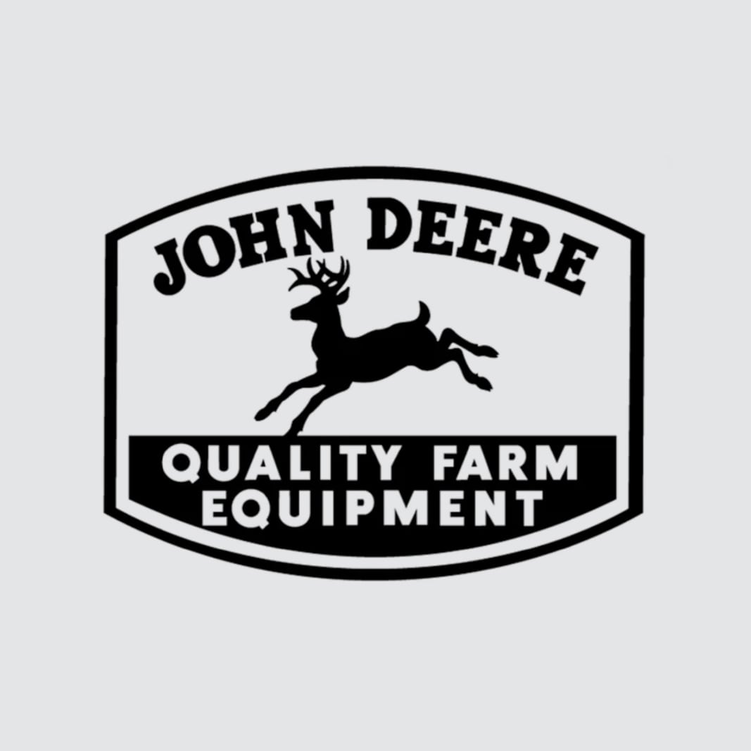
1910 – 1936: The second version of the John Deere logo
At first glance, it’s hard to notice any major changes with this second logo design, but the updates are there. John Deere decided to make the logo sharper with new a slogan and a bolder font.
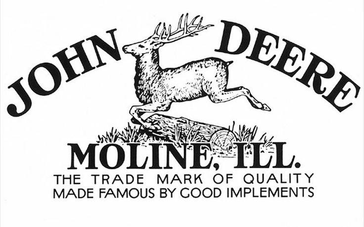
1936 – 1937: The third version of the John Deere logo
While John Deere’s customers did not have any issues with the prior logo design, John Deere wanted to easily print the logo on its products, which the past logo made difficult. This version includes an updated, simple image of a deer. In addition to this change, this version includes a new border that frames the design.
1937 – 1950: The fourth version of the John Deere logo
One year after this new logo design, John Deere decided to make another edit to its logo. This time, John Deere removed the border and the brand’s slogan, and changed the font typography and placement. This was to streamline the logo even more so that the logo could become even more powerful.
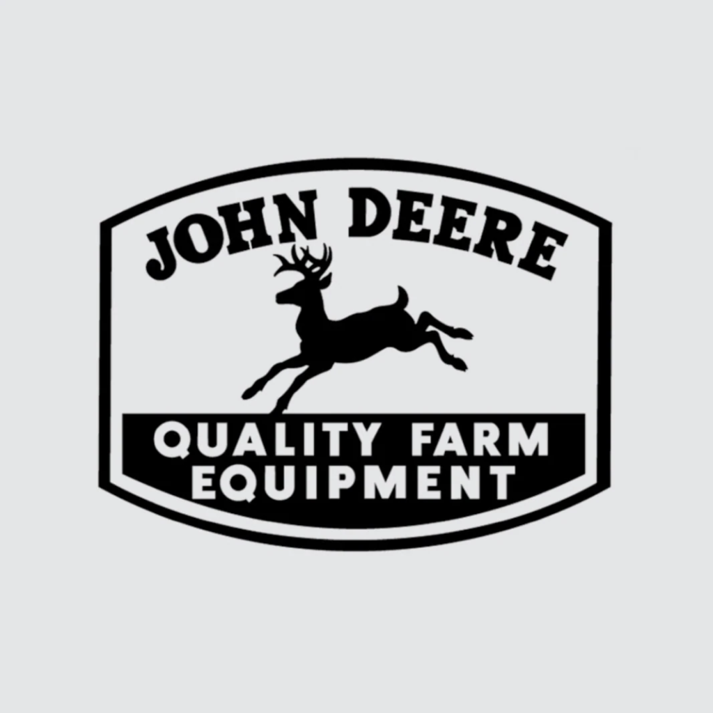
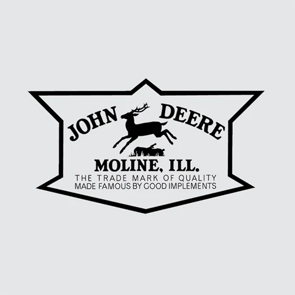
1950 – 1956: The fifth version of the John Deere logo
While the past iterations of John Deere’s logo only featured minor updates, in 1950, the design team decided to unveil a logo that incorporated more drastic changes. Some new features included with this logo design included the removal of the log image, a new 4-sided border, a new overall shape of the logo, and a brand-new slogan.
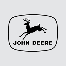
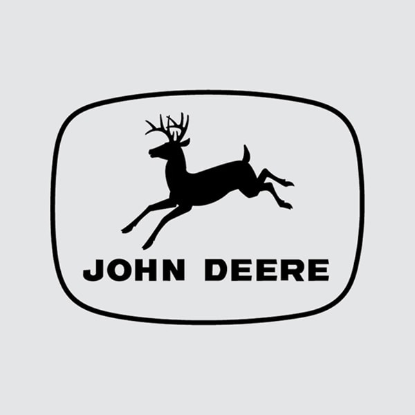
1956 – 1968: The sixth version of the John Deere logo
Six years after this drastic new redesign, John Deere went through another drastic logo update. Even more features were removed from this logo design and the logo simply included an outline of a deer and the brand name. The typography was updated to a sans-serif font and the outline of the logo became an oval-like shape.
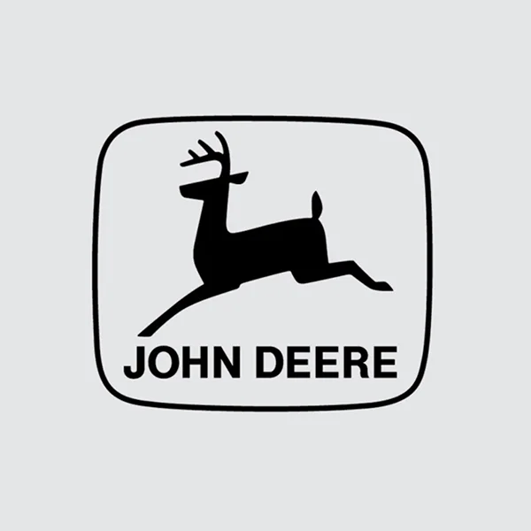
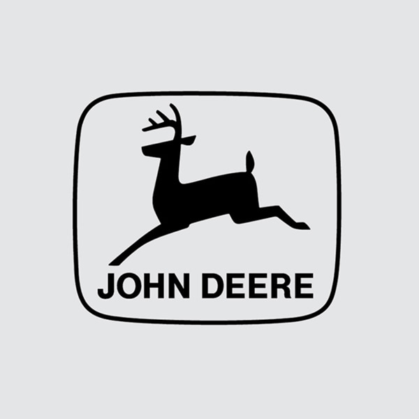
1968 – 2000: The seventh version of the John Deere logo
This iteration took the clean elements of the logo design before it but made it more modern. Instead of four legs, the John Deere deer had two legs, the lines were straighter and sharper, and the logo was more legible overall.
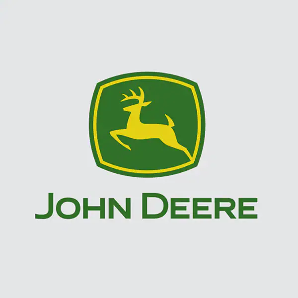
2000 – Today: The eighth (and current) version of the John Deere logo
In 2000 John Deere introduced color and introduced the logo we associate with the brand today. Instead of black and white, John Deere’s logo became green, yellow, and white. The other significant update with this design is that the deer are jumping up and down, versus horizontally.
John Deere’s logo font:
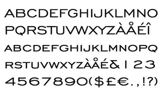
Throughout the years, John Deere played around with different font choices. The earlier versions of the logo used an extra-bold, serif font, which was later replaced with a sans serif font. Today, the font is like the font, Trade Gothic Bold Extended. Ensuring that the font was legible was always of top importance to John Deere which is why no matter what version you are looking at, the John Deere name can always easily be read.

John Deere’s logo color:
For much of John Deere’s logo designs, the only colors used were black and white. Since 2000, the colors of the brand have been green, yellow, and white though. These choices convey what the brand is focused on, agricultural and landscaping machinery. By choosing these colors, John Deere can articulate its mission to consumers.
John Deere’s logo symbols:
Before breaking down what comprises John Deere’s logo, the logo itself is a symbol and forms a shape. By outlining the logo design, John Deere is providing emphasis on what is within the border’s walls and draws our eye to what the brand wants us to see. Within the emblem, John Deere has always used the same symbol – a deer that is leaping. The deer is not only part of the brand name, but it also helps to convey John Deere’s mission of achieving progress and prosperity through its products.
John Deere Today
Despite being around since the 1800s, John Deere has managed to remain a household name all these years later. What started as a small business operating in the middle of the country has grown today to be a global operation that is recognized by consumers all over the world.
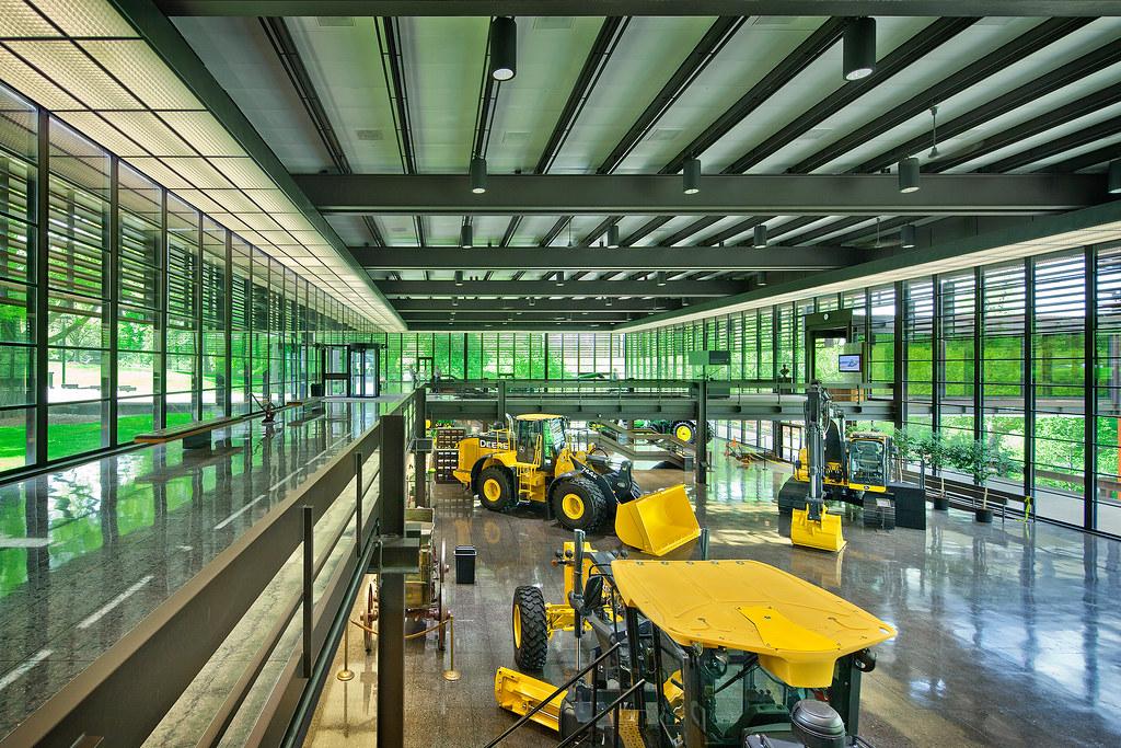
The agriculture machinery space is still where John Deere thrives, but its product line goes well beyond that. Today, John Deere is also a leading manufacturer of industrial equipment like tractors, plows, bulldozers, chainsaws, forklifts, and so much more. John Deere’s global headquarters remains in the United States, but the company sells its products across the globe to a wide array of countries including Argentina, South Africa, and Canada.
Part of the reason why John Deere is such a widely respected corporation with strong brand recognition is because of its logo, which we’ll dive into more in a moment. John Deere’s logo has stood the test of time and today it is a logo that is trademarked and copyrighted, meaning if you want to use the brand’s logo, you’ll have to run it by the company first.
John Deere’s head office is still in Moline, Illinois with manufacturing plants located in Europe, Asia, North America, and South America. Today, John Deere is led by John May and generates annual revenue of $40 billion. John Deere is recognized as a Fortune 100 company and sells its machinery and equipment to more than 130 countries.
Lessons Learned from John Deere
When a company has been around for as long as John Deere, there are lessons we can all take away from the brand. For John Deere, when it came to changing its logo, the brand never lost customers, because they were conscious of one thing – the symbol that their customers resonated with the brand, the deer. No matter what redesign the brand went through, John Deere always kept its deer silhouette at the forefront of the design. By doing this, customers would always know that the brand was “John Deere,” even with an updated color scheme and new font choice.
Beyond that, John Deere’s logo has stood the test of time for a few other reasons. One of those reasons is that the logo is highly scalable. The emblem outline allows for it to easily be printed across a variety of channels and to be scaled up and down. And secondly, the logo is memorable and unique. None of John Deere’s competitors have a similar logo and because of that, it’s easy to know what tractor belongs to this iconic brand.


