
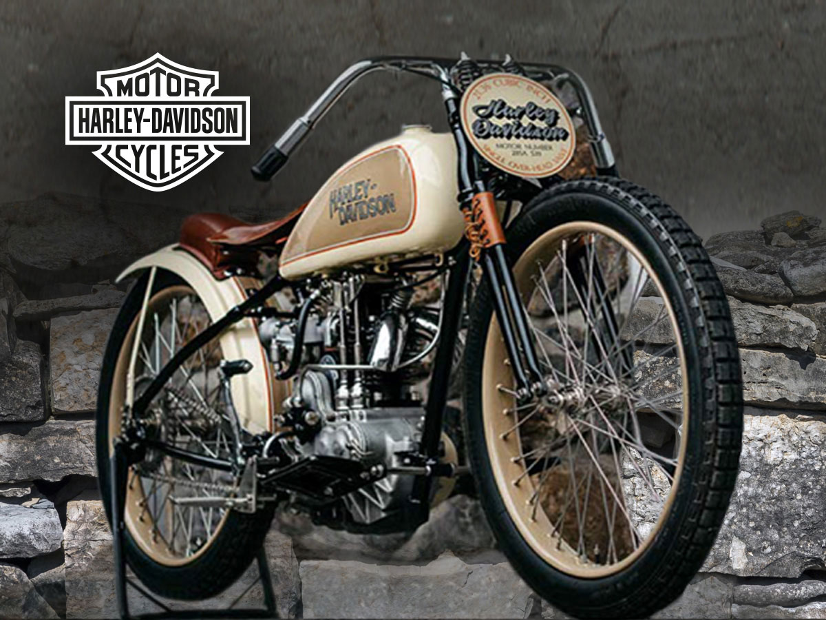
If you haven’t heard of Harley Davidson, you’ve been living under a rock. This iconic brand is one of the most well-known worldwide, popular for its famous motorcycles that have dominated the nation. Outside of recognizing the company’s name, there’s no doubt that you can instantly identify the company’s legendary logo.
After all, the logo is iconic and known for standing out amongst its competition. Regardless of whether or not you ride a motorcycle, there’s no doubt that you can easily recognize the Harley Davidson logo, which proves how famous the logo is and the impact it has had on people. However, the logo hasn’t always been the iconic emblem we associate with today’s brand.
It’s gone through many changes to the point that we now recognize it, and it’s become such a legendary component of the brand.
In this article, we’ll take a look at the history of the logo, the meaning behind it, and the history of the company. We’ll also look at the iconic skull logo, the company’s most legendary logo to date.
The Harley Davidson Logo
1910––1953: The First Logo
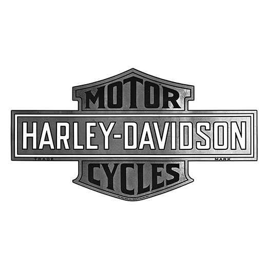
The first logo is when the famous “Bar & Shield” design was first created, and the history of the renowned logo started. This logo was introduced seven years after the company’s foundation and was the first concrete symbol that customers could put a name with for the company.
The logo showed a shield-shaped background, and then a bar was located horizontally across it with the company’s wordmark. The symbol was black and white with grey shading, creating a vintage-looking sign. All the letters were uppercase, building a strong and classic style that would resonate with the company’s audience.
1953––1963: The First Major Redesign
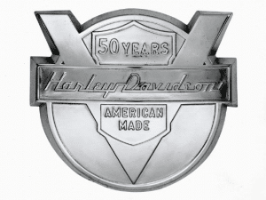
On its 50th anniversary, the company got its first significant redesign in 1953. This updated logo featured a circle, and an engraved V shape was in the middle. The bar was still kept in this design and was shown in the middle of the V shape with the company name in an italicized font.
Now, the name was no longer in all uppercase; this time, only the first letter of each word was capitalized, and the following ones were lowercase. This new redesign featured “50 years” at the top and “American Made” at the bottom. A stylish medallion was created of this logo that stood out with the logo, celebrating the company’s 50th anniversary.
1965––2003: Back to the Original
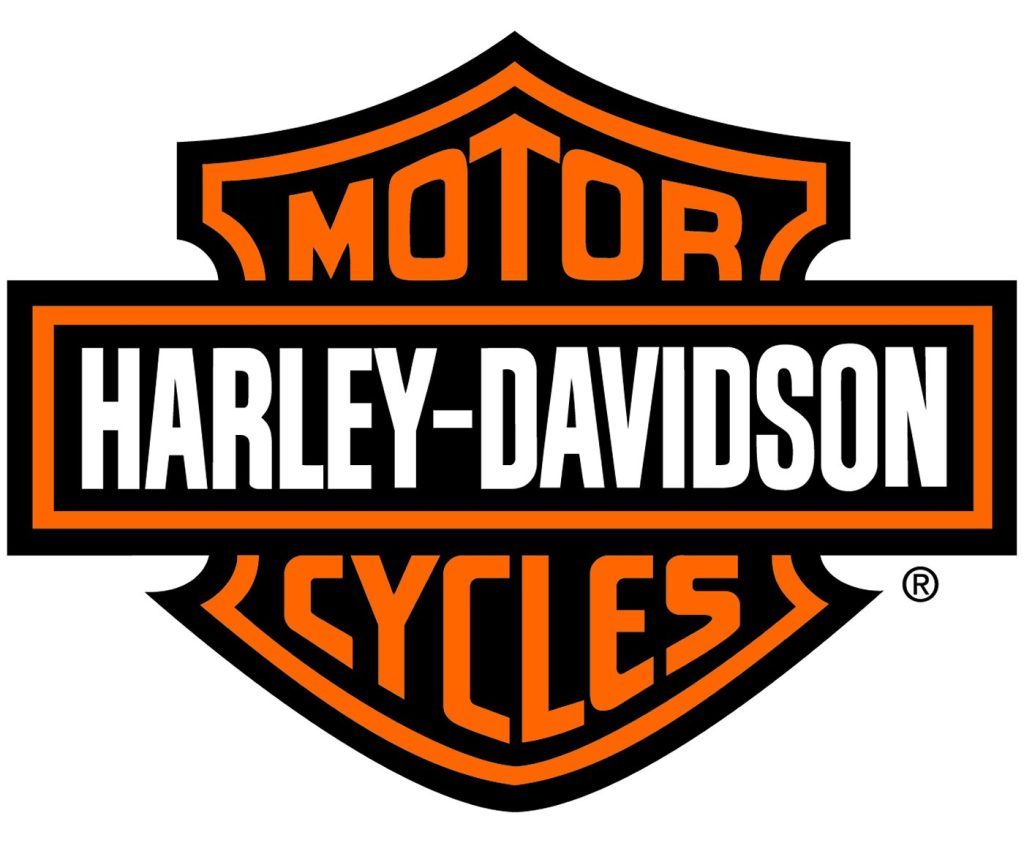
The redesign only lasted a little over a decade before the company decided to return to the original logo.
However, they made a few updates to the logo, modernizing it and switching to a monochrome color palette. This new logo was powerful, showing the name in black and white with orange for the name.
This logo is the one you still see today and is the most iconic one for the company. This logo was the key to a new era for the company and was the start of massive growth, driving more sales.
The Skull Logo
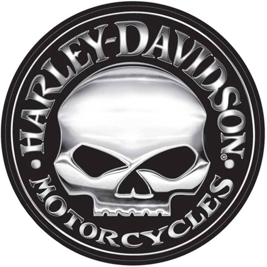
You probably recognize the iconic Harley Davidson Skull logo, and although it is not an official brand logo, it is one of the most famous logo designs. No one knows where the logo originated from, and there have been many debates on a Harley-Davidson forum about where the logo came from.
Many users seem to speculate that the logo was designed by Willie G Davidson, son of the former Harley president and the grandson of the original co-founder of the company. Users date the first use of this logo back to the early 1930s, but it’s unsure when the logo first appeared.
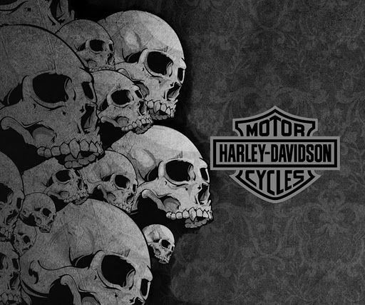
The logo features a circle with a skull in the center, with the lower half of the mouth missing. The design is entirely black and white, with an inner black cycle and the skull and lettering in a grayish white. The lettering is in a circle, with the company name in large uppercase letters and “motorcycles” shown at the bottom of the circle. The overall design is sleek and minimalistic while conveying a sense of masculinity and dominance. Since the logo originated, it has had many variations, the majority being fan art.
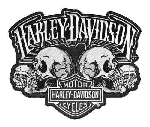
Why a skull? The skull symbolizes a biker’s commitment to riding until their death. Since Harley is a motorcycle company, this only seems fitting, and although the company itself hasn’t commented on where the skull came from, they do have a skull collection on their website. This collection has over fifty products that the logo appears on. No one knows if the company or a fan created this logo, but they know it’s become legendary and an iconic part of the company.
The History of Harley Davidson
Besides the iconic logo’s interesting history, the company has a fascinating history. After all, the idea of a company being named after two friends have become associated with motorcycles worldwide.
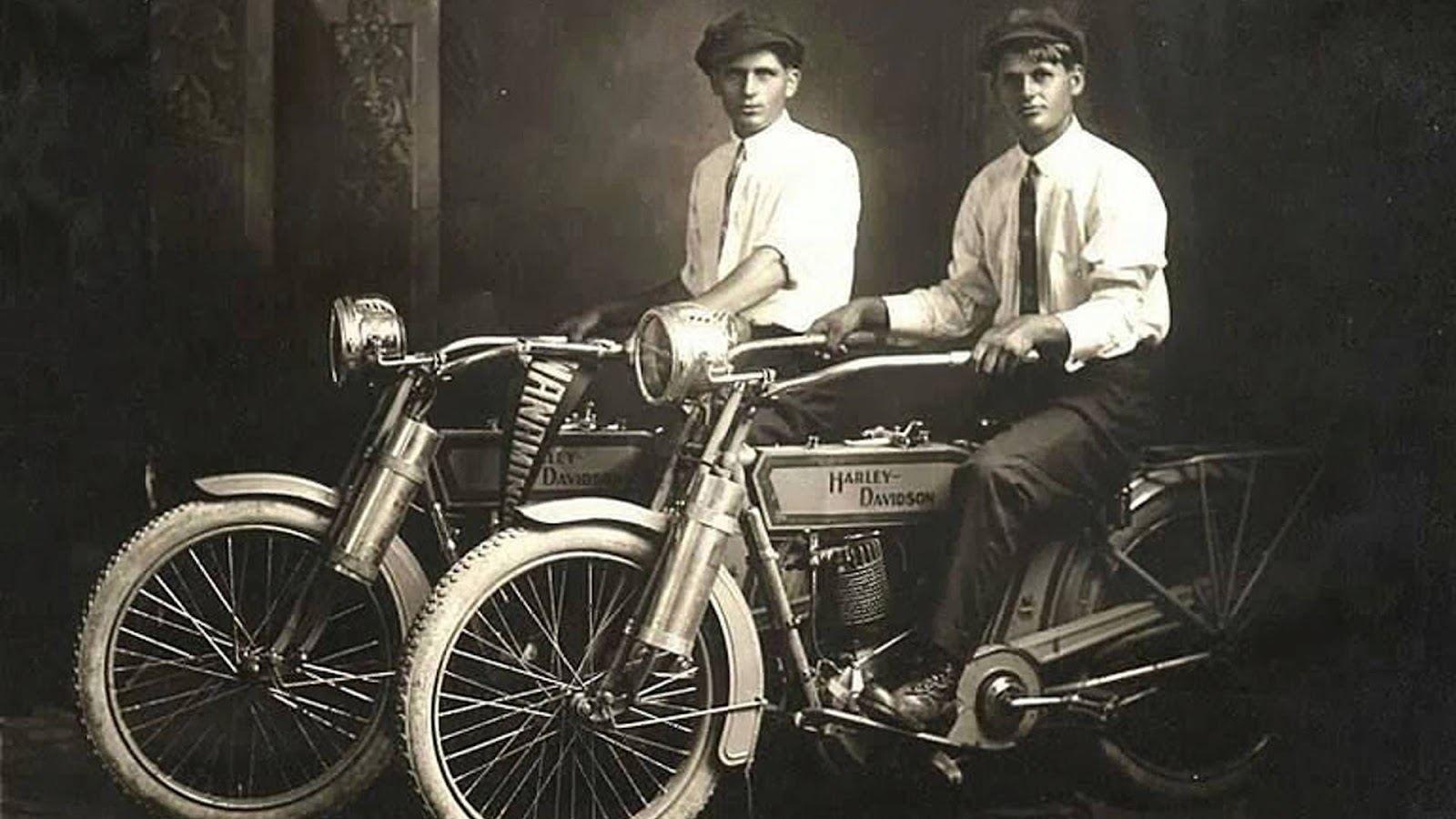
Let’s look at the story behind this famous company and how it has reached the success we see today. It all began in the 1890s when two men, William Harley and Arthur Davidson, interested in design and mechanics, became close friends.
Davidson worked in a bicycle factory, and Harley had a career as a draftsman. At the turn of the new century, in 1901, the two men were going to a vaudeville show to see the performer Anna Held. The one act that caught these men’s attention at the show was when Held rode on a three-wheeler propelled only by a single-cylinder engine.
This one act sparked Harley and Davidson’s imagination, and they were fascinated by the idea of single-cylinder engines. The men started to experiment with single-cylinder engines and adapted them to bicycles. A few of their enterprising friends helped them, giving their input and encouraging words on their work.
This resulted in a bicycle with a small engine attached to it and a belt drive. However, the men were disappointed with this result as it didn’t fulfill their vision. It was underpowered and didn’t run properly. Two years later, they started again, using a bigger engine and frame specifically designed to fit together for better results.
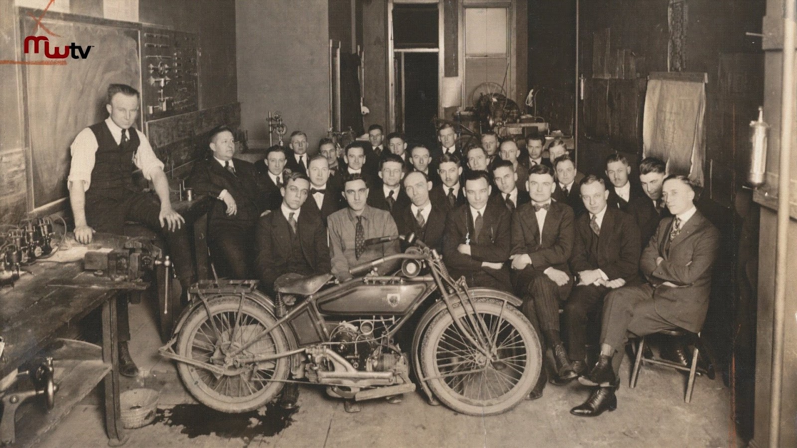
They saw progress with these new updates but were still encountering problems. Davidson brought his brother in, who was a machinist, to help. His brother, Walter Davidson, quit his job to join the two friends in their new company. Walter was an essential component of the machine working and stayed with the company after, continuing to work.
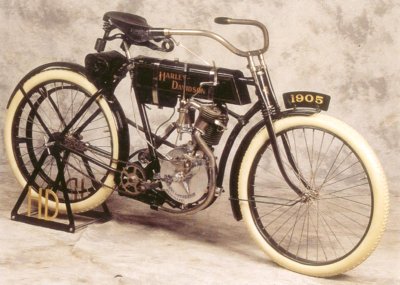
This seemed to be the missing essential piece of the puzzle, as the company was founded shortly after in 1903. They grew steadily and were operating first out of Davidson’s father’s basement, and then shortly after, it was operated out of a small shed in his backyard.
This was considered the first Harley-Davidson factory and where the company sold their first official motorcycle. Although it was to their friend, it was still a step toward growth for the company and progress in the right direction.
A year later, the factory had more than doubled and was still meeting success. 1907, the company was incorporated, and the first stock was disbursed.
William A Davidson officially joined the company as Works manager during this time. Demand was quickly growing for the young company, and even while the company was building its second factory, they were preparing to build its third. The company had taken off with wings, and they were soaring.
Conclusion
Harley Davidson is a well-known company that has completely revolutionized how the world sees motorcycles and bicyclists. It’s easy to recognize and associate the iconic logo with the brand, thanks to the famous logo that has long been associated with it. The logo has an interesting history, having only had one substantial redesign, and the rest were merely touch-ups to the original logo.
However, the white, black, and orange badge logo is what we now associate with the brand and has been an iconic element of the company. The sleek design stands out, creating a strong and bold association with the brand.
We also discussed the history of the company and how the company got its name not just from two friends who invented the business but from three men with the last name Davidson and one with the last name Harley. Without these men and the iconic logo, this company would not have reached today’s popularity


