
Art is subjective. No one has the last word on what counts as true art and what’s just an attempt. Logo design is no different than any other type of art. There is no one perfect way to design a logo, just like there’s no one way to draw a portrait. While judging art isn’t easy, it’s a lot more straightforward to judge the success of a logo. What flopped and what skyrocketed? What has people saying, “That worked so well!” and what makes people cringe and look away? Crafting a successful logo isn’t easy, but to make things simpler, it’s a good idea to take note of what’s out there. What do strong logos have in common? What fonts, colors, and shapes are dominating the scene? If you want to know what techniques we think will succeed in the year 2021, take a look at our recent article for our predictions.
The Top 5 Logo Design Trends of 2021
We’re all glad 2020 is behind us, and most of us are anxiously hoping that 2021 will be very, very different than the year we just experienced. We’re studying the news and our social media feeds to see just what’s out there and just what’s changing.
As new businesses are launched and old companies go through rebranding, graphic designers show up with plans for new website designs and of course, for new logos.
But just how will the logos launched in 2021 be different from 2020 and previous years?
We’ve consulted the experts and come up with five types of logos that we believe use techniques that will become the hallmark of 2021 logo styles.
Mirror Mirror
Humans love symmetry. There’s something so pleasing to the eye when we see an image that’s perfectly balanced. Whether it’s a simple symbol or an intricate image, when both sides mirror each other, it’s visually stunning.
Perhaps it’s because we live in an unpredictable world, as 2020 taught us so well, that we love the predictability of a perfectly symmetrical logo. It’s calming, even soothing to see an image that’s balanced down to every last detail.
Companies that use symmetrical logos are making a statement about their preference for logic, order, and neatness. In 2021, we can expect to see a reliance on symmetry to help bring some order back to this unbalanced world.
What’s The Word?
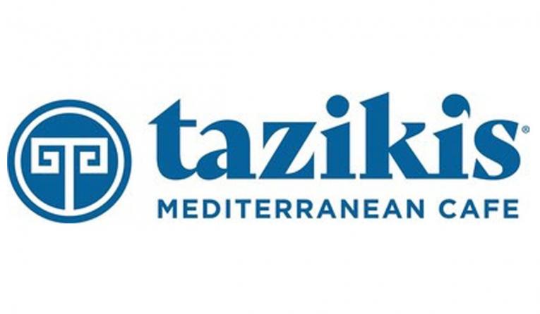
The restaurant’s clever change of the “dot” in the “i” to an apostrophe makes this logo stand out, as does the symmetry in the logo.
Many companies use wordmarks as their logos because they’re extremely practical. They give the customer the full name of the company and also provide the viewer with something concrete to latch on to. Wordmarks take the name of a business and, through their font, reveal more about what the business is like.
Does the business want to be perceived as traditional? A serif font with perhaps extra decorations will do. Or does the company want to be seen as friendly, open, and approachable? In that case, a fanciful font can work well.
Wordmarks have lots of power and potential. They’re versatile and if done right, they can be iconic. In 2021, we’re going to see lots of carefully thought-out wordmark logos.
An A+ In Geometry
Kia’s 2021 wordmark logo is made up entirely of geometric shapes.
Geometric shapes – simple triangles, circles, half-circles, squares, etc. – have been en vogue for a while now in the design world, and there’s a reason for that. These shapes are the building blocks of all the more complex logos we see.
By paring down an image to its geometrical foundation, designers show that the company understands the base, the very core of what goes into their business. There’s a lot of talk out there, but finding a company who understands all aspects and can deliver on their promises is rare.
Basic geometric shapes are familiar to all of us. Giving customers a familiar image to connect to is a tried-and-true design technique. In 2021, we’ll see more logos that rely on geometrical shapes as we look for the familiar in a strange new world.
Symbolically Stated
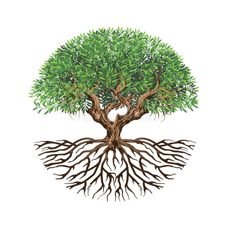
The use of symbolism is a key tool in the logo designer’s toolbox. Logos that make a use of classic symbolism – for example, a leaf in the logo of an environmental company or a paw print in the logo of a veterinarian’s clinic – help customers immediately make that connection.
Symbolism can, does, and should go beyond the basics. If you consult ancient Greek and Roman mythology, you know that a bow and arrow symbolize more than the hunt: stylized correctly, they can make us think of Cupid and love.
In 2021, we predict that logo designers will use symbolism to draw connections between companies and physical objects, but also between companies and ideals. Love, growth, trust, and justice can all be communicated through age-old symbols.
50 Shades Of Warm And Cool
GM’s new 2021 logo uses a very cool analogous color scheme.
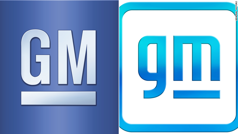
Last but not least, no discussion of logo design would be complete without considering color. While contrast has ruled design trends of the past, it hasn’t been the trend in recent years.
In fact, in 2021, we predict that the recent trend that emphasizes analogous color schemes will continue. Our world is visually stimulating to a fault. In fact, it’s really just overwhelming. Between our televisions, work computers, home computers, tablets, and of course, our ever-present phones, we’re always visually stimulated.
Logo designers know the importance of making sure that stimulation doesn’t go too far. By choosing analogous colors, designers can make sure the logo creates an interesting experience for the viewer without making their eyes feel tired.
There’s nothing wrong with little pops of contrasting color. However, the trend in 2021 is to move towards analogous color schemes that provide a cohesive and pleasing aspect of the logo.
In Conclusion…
If 2020 taught us anything, it’s that it’s impossible to predict the future. We may never know what tomorrow will bring. However, based off recent brand relaunches and our research into the field, we feel pretty confident saying that a return to the familiar will be a dominating force in 2021 logo design. We’ll see an emphasis on emphasis on symmetry, clever wordmarks, geometrical shapes, a return to classic symbolism, and an embrace of pleasing color schemes. Who knows – we might even see a logo that incorporates all five!


