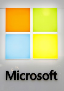
For the first time in 25 years Microsoft has changed it’s logo.
A rather subtle change, compared to that of the Olympic’s new one.
Less streamline, more squared.
Same colors, however, maybe a bit less bold.
Still the same black lettering, just in straight font, instead of italic.
Altogether, I rather like the new one, and, after 25 years, I would say it was time for a change.


