
“Unprecedented” was the People’s Choice for the 2020 Word of the Year on Dictionary.com. It makes a lot of sense: so much of the year was different, strange, and unfortunately, disappointing. The year ruined so many activities, from special events like graduations and birthdays to church gatherings and holiday celebrations.
But did 2020 ruin other areas of life, like professional fields such as graphic design? Was logo design impacted by the strange year at all? In our latest article, we take a look at how logo design has evolved in past years, and how the recent trends intensified during 2020. We also take a close look at another factor, caused by the events of 2020, that has impacted logo design. Ultimately, it’s up to you to form your own opinion on whether logo design is capable of being ruined or if it’s just entering a new stage. Our latest article explores the information you need to form your opinion.
Did 2020 Really Ruin Logo Design?
Some days, maybe even most days, it feels like the coronavirus ruined everything. The significant impact of the virus on public health has been devastating. The pandemic has affected society in many other ways, too.
From graduations to birthday parties and everything in between, so many events have been cancelled, changed, or postponed. Conferences, festivals, and vacations were all canceled because of the COVID-19 pandemic.
The pandemic hasn’t just affected special events. It’s even had an impact on creative fields, too. Logo design has been affected by 2020 in a major way. But has it been ruined?
We’ll leave that up to you. First, we’ll explain the foundations of logo design, then we’ll look at just how logo design has changed this past year, and lastly, we’ll look at one specific example of a brand whose logo changed dramatically during 2020.
Traditionally, logos serve the purpose of giving customers an easy, exciting way to identify a company. A logo is also an opportunity for a company to establish its identity and to showcase its values. It’s a chance for companies to say, “Look, this is who we are.”
- Is the company traditional? Modern?
- What do they sell or offer?
- How does the company view itself?
- How do they want to be perceived?
All of these questions need to be answered during the process of developing or redesigning the logo.
Of course, font and color are the two key factors in logo design. When we look at how logo design has changed in the past year, we see a dramatic increase of what was already trending in recent years.
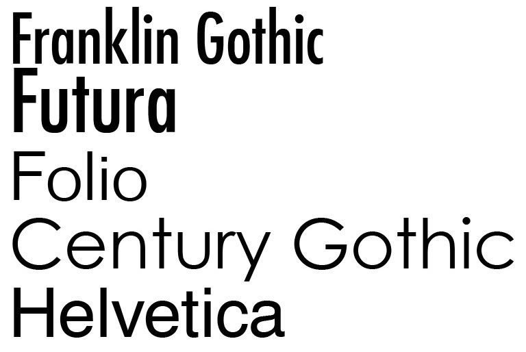
What is that trend? To modernize logos, many companies (in fact, the majority) have swapped out their slightly decorative, formal serif fonts for informal sans serif fonts. Other changes, such as removing colors and design elements have also occurred, but the change in font from serif to sans serif has been important.
Sans serif means modern. Cutting-edge. Friendly. Consumer-focused. Right?
Or does it just mean that the company is jumping on the bandwagon that’s running over traditional logo design?
There’s a lot to be said for sans serif fonts and for simplifying logos. For many companies, it makes sense.
However, it’s not the only option. Logos don’t have to be streamlined and minimalist. If a company offers a traditional product or service, there is nothing wrong with using a serif logo and decorative element to show that traditionalism. Bright colors (meaning more than one) have also been a hallmark of many brands throughout the years.
And yet, many companies are stepping away from using these different colors, serif fonts, and shapes in their logos. It turns out that it’s not just because they want to seem modern.
The facts are grim, and they’re due to 2020. By using fewer colors and simpler logos, companies can save on printing costs.
Yikes.
It’s sad, but it’s true. Because of the major economic impact of the events of 2020, companies need to find ways to cut their expenses, and that includes trimming their printing costs.
When a company changes from a serif font to a sans serif font, or when it stops using bright colors in its logo design, it could either be because they want to modernize or because they want to save money. Or it could be both.
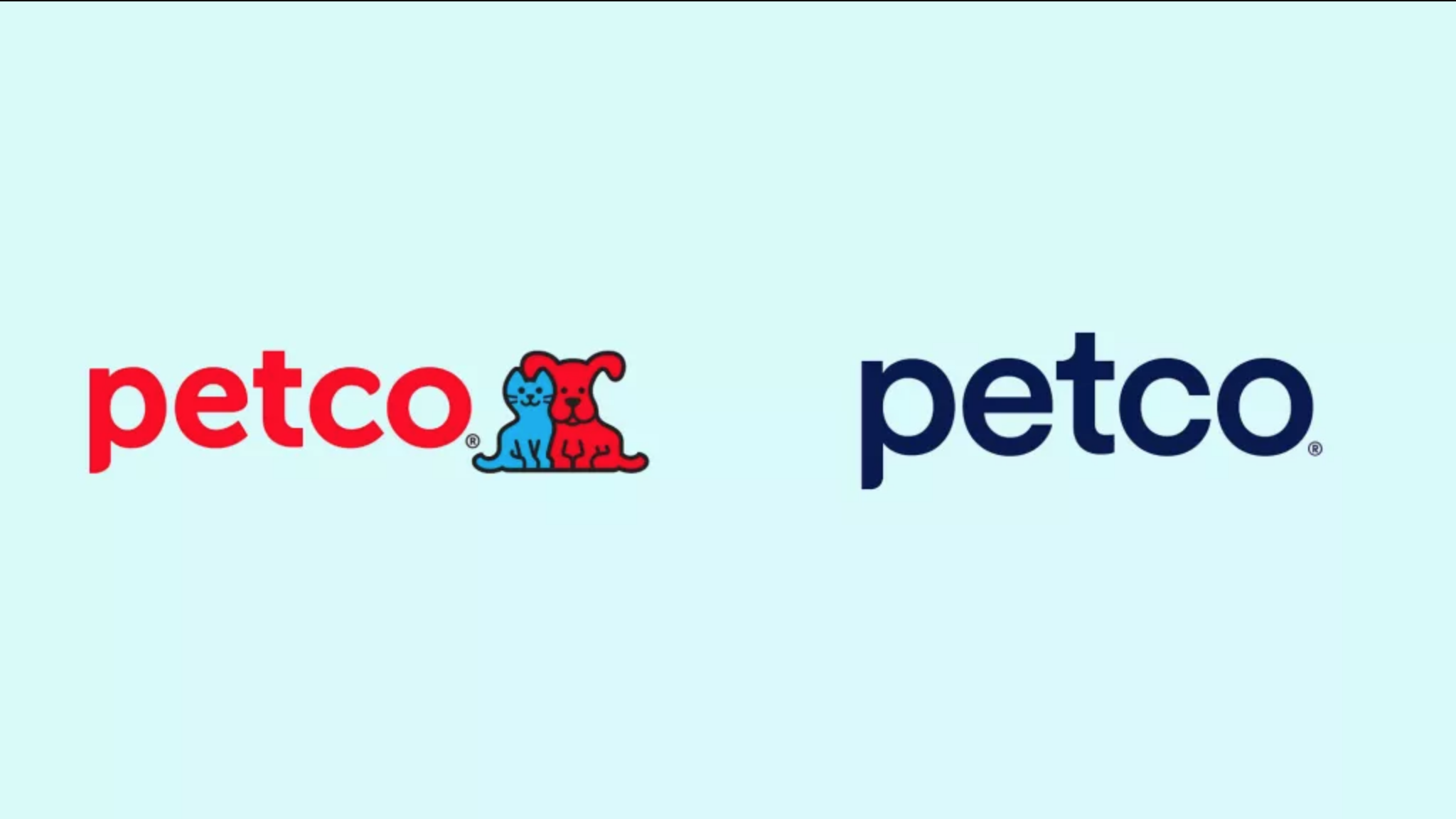
Let’s take a look at one specific example: Petco. In 2020, Petco changed its logo from the years-old traditional logo of a bright red wordmark featuring a blue cat and a red dog side-by-side. The new logo is a plain navy blue “Petco” wordmark with no cute dog and cat.
Customers were outraged, and one poll of 102 people showed that 78% want the company to change its logo back to the original and less minimalist design.
Petco is just one example of a company that changed its logo in 2020 to a more simple design. We won’t know for certain how many companies are changing their logos to cut costs, but we do know that it can always be explained as an attempt to be more modern.
What do you think? Are you a fan of sleek, minimalist logos, or do you like more decorative logos that highlight what the company is truly about?


