
Logos are the silent narrators of a brand’s narrative, encapsulating its essence and evolution within a single, visually striking image. In the fast-food industry, known for its ever-shifting tastes and trends, one logo has managed to endure and adapt seamlessly to the changing appetites of generations: the iconic Jack in the Box logo.
For countless decades, this cheerful and somewhat mischievous character has maintained a steadfast presence on street corners and highways, its infectious grin beckoning hungry passersby with the tantalizing promise of mouthwatering burgers and tacos.
Today, we journey through time, delving into the transformations the Jack in the Box logo has undergone over the years.
About Jack in the Box
Jack in the Box transcends the traditional definition of a fast-food chain; it stands as a pioneer in the industry, celebrated for its unwavering commitment to innovation and a menu that continually pushes the boundaries of flavor.

Established in 1951 by the visionary Robert O. Peterson, this California-born company rapidly etched its name into the annals of convenience dining. Renowned for its delectable hamburgers and the iconic Jack in the Box taco, the brand became synonymous with quick and satisfying meals.
What truly distinguishes Jack in the Box is its unyielding spirit of culinary exploration. Here, experimentation reigns supreme, giving rise to beloved menu items like the legendary Teriyaki Bowl and the much-anticipated late-night Munchie Meals.
With an unswerving commitment to freshness and an audacious spirit when redefining the culinary landscape, Jack in the Box has solidified its position as an adored institution for those seeking a fast, flavorful, and occasionally pleasantly unexpected dining adventure.
Exploring the Evolution of the Jack in the Box Logo Through Time
Logos transcend mere symbols; they are a brand’s visual identity, encapsulating its history, core values, and remarkable evolution. In this realm of iconic brand imagery, one emblem stands out as both timeless and cherished – that of Jack in the Box, the fast-food juggernaut that has been a steadfast presence in American dining culture since its inception in 1951.
As the years have rolled by, this whimsical and unmistakable logo has gracefully weathered numerous transformations, with each iteration telling a unique and compelling story about the company’s enduring growth and its uncanny ability to adapt to the ever-changing tides of time.
With every shift in design, the Jack in the Box logo reflects the brand’s commitment to culinary innovation and mirrors its unyielding dedication to remaining a beloved and contemporary fixture in the hearts of its patrons.
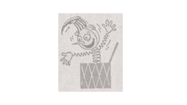
1951 – 1962
The journey started in 1951 when Robert O. Peterson unveiled the first Jack in the Box restaurant in San Diego, California. In those early days, the restaurant’s logo was a beacon of classic charm and vitality, setting the perfect stage for the brand’s burgeoning identity. At the heart of this inaugural emblem was a delightful nod to the past – a vintage jack-in-the-box toy, complete with a beaming clown visage and a whimsically cone-shaped hat. This design was a testament to the brand’s unwavering commitment to fostering a warm, inviting atmosphere that catered to families and promised memorable dining experiences.
In this initial era, the logo symbolized the brand’s core values – the art of delighting patrons with the thrill of a surprise, the warmth of a smile, and, of course, the savory delight of a well-crafted meal. It embodied the brand’s essence, promising food and a genuine and cherished experience.
1962 – 1971
In the swinging ’60s, Jack in the Box embraced a new era with a logo that exemplified modernity and simplicity. The beloved clown face persisted, but it underwent a sleek transformation that resonated with the evolving design sensibilities of the time. The circular logo features the jack-in-the-box puppet with a refined and minimalist appearance characterized by fewer intricate details.
This streamlined approach gave the emblem a cleaner and more contemporary aesthetic, aligning perfectly with the era’s zeitgeist. The puppet’s head confidently adorned the top of the Box, and the brand’s name was prominently displayed on the box itself. This design evolution was not merely a cosmetic change but a strategic response to the changing times, emphasizing Jack in the Box’s commitment to staying relevant and appealing to a broader and more diverse audience. It was a visual testament to the brand’s ability to adapt while preserving its core values of delight and culinary excellence.
1971 – 1978
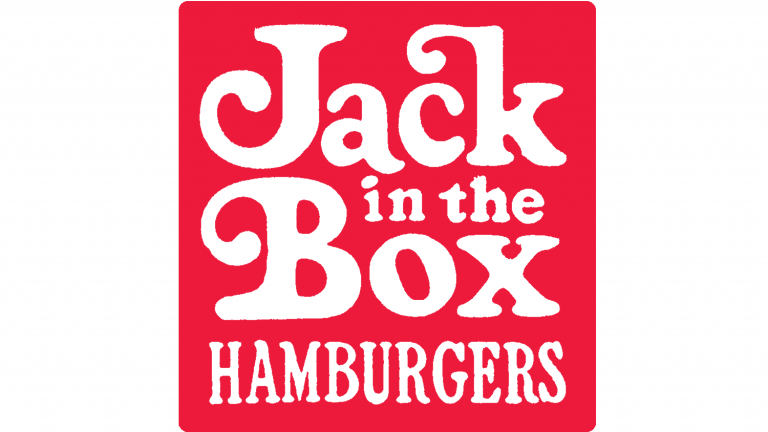
In the early ’70s, Jack in the Box transformed its iconic signage significantly, marking a departure from its previous design while embracing a fresh and contemporary look.
This redesign was driven by a commitment to simplicity, a lighter aesthetic, and improved clarity, resulting in the departure of the beloved clown mascot that had graced the brand’s imagery for years.
The color palette underwent a striking shift, replacing the traditional black with a vibrant and attention-grabbing red, instantly infusing energy into the logo.
The typography received a modern update, with the addition of the word “Hamburgers” alongside the brand name, presented in white with a subtle curvature to the letters.
The capital letters “J” and “B,” along with the lowercase “k,” incorporated whimsical, curling elements reminiscent of the tips of a clown’s cap adorned with a jingling bell.
All these elements found their place within a bold red square, cleverly structured to resemble a box, resulting in a visual identity that was not only distinct but also highly memorable, setting the stage for the brand’s continued evolution.
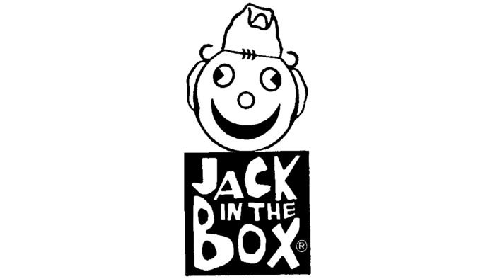
1978 – 1980
As part of the ambitious rebranding initiative, a pivotal decision was made to abbreviate the name, ushering in a fresh era for the emblem. This transformation encompassed various aspects, including a significant redesign of the logo. The once sharp and angular corners of the Box underwent a delightful metamorphosis, becoming gracefully rounded, infusing a sense of approachability and friendliness into the design.
The brand’s name, “Jack in the Box,” now gracefully transitioned to the exterior of this enclosure, embracing a more open and inviting aesthetic. The letters that formed “Jack in the Box” underwent a playful makeover, adopting a bubbly appearance that evoked the cheerful spirit of balloons, rendered in a vibrant shade of red. These whimsical letters added a touch of playfulness and exuded joy and enthusiasm, aligning perfectly with the brand’s commitment to delivering delightful dining experiences.
One of the most notable and charming additions to the emblem was introducing a clown’s head, a symbol of joy and entertainment. This playful portrayal was crafted from two distinct elements: a substantial spherical shape with a truncated upper section, which served as the foundation of the clown’s head, and a geometric form reminiscent of a paper boat, ingeniously fashioned to function as a clown’s cap. This creative fusion of elements paid homage to the brand’s playful heritage and introduced a fresh and contemporary feature.
Nestled just below the whimsical clown’s head was a trio of bold dots strategically positioned to emulate the iconic bow often associated with clowns. These dots added a charming and delightful touch to the logo, subtly reinforcing the brand’s commitment to delivering moments of joy and surprise to its patrons.
1980 – 1985
1980 marked a pivotal moment in the history of Jack in the Box’s iconic emblem. The winds of change brought forth a transformation with the bold reorientation of the emblem’s core elements, effectively reimagining its entire aesthetic. At the heart lay the iconic red square, synonymous with Jack in the Box over the years.
However, it underwent a radical shift. The red square rotated and now sat at a 45-degree angle. This striking adjustment breathed new life into the emblem, injecting it with dynamism and forward-looking vision. The previously dominant white imagery gracefully stepped aside for a tri-level arrangement of crisp, pristine white lettering.
This strategic choice conveyed a sense of sophistication and cleanliness and ensured that the brand’s name took center stage, becoming the focal point of the emblem. The typeface retained the timeless charm of its predecessor with an enhancement. Each letter, from “Jack” to “Box,” was generously enlarged, creating a bold and assertive presence.
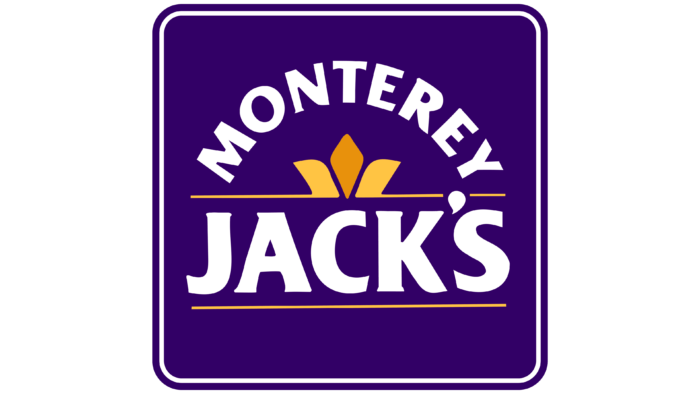
1980 – 1985
Jack in the Box’s visual identity took a daring turn with a radical departure that, although innovative, proved short-lived, lasting only a year. This logo was introduced during the restaurant chain’s brief stint as “Monterey Jack’s.” At the heart of this logo was a badge designed as a fleur-de-lis, which comprised three distinct segments, commanding attention at the center of the logo, positioned between the arched inscription of “Monterey” and the horizontally aligned “Jack’s.”
Flanking this classical coat of arms, two slender stripes extended to the right and left. Completing the logo was a richly hued background, a striking purple-blue square adorned with a double border, a visual departure from the brand’s previous aesthetics.
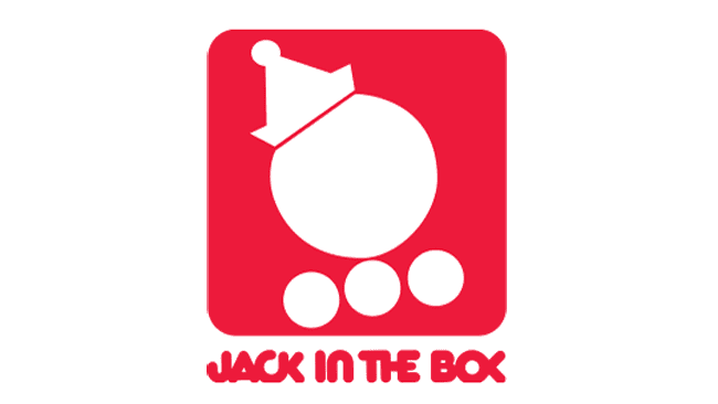
1986 – 2009
Following an unsuccessful attempt at rebranding and logo redesign, the chain decided to revert to its former name and beloved old logo.
This classic emblem featured a timeless red square, its corners gently rounded to exude a welcoming and friendly vibe.
Inside this square resided the restaurant’s name, boldly spelled in white uppercase lettering.
True to tradition, the iconic geometric figure, placed diagonally with a subtle incline, remained a pivotal element.
Nestled in the lower left corner, it assumed a rhombus-like appearance.
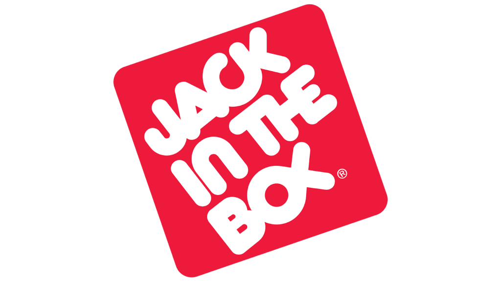
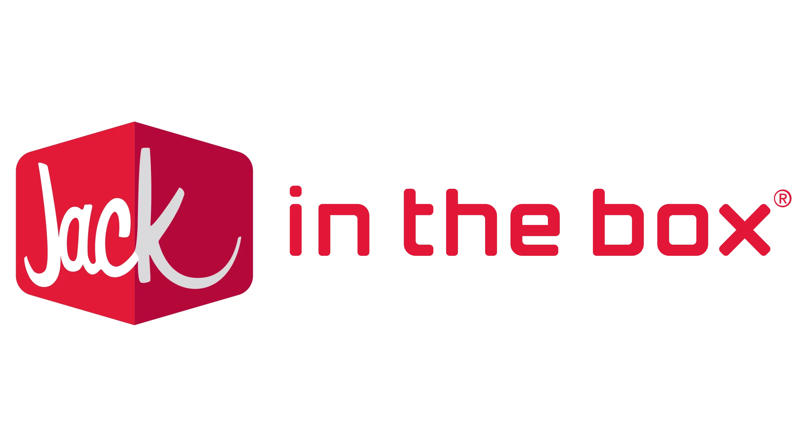
2009 – Present
The current logo represents a remarkable leap into modernity, showcasing a thorough overhaul that resonates with contemporary design aesthetics. At its core, it takes the shape of a medium-sized and wide rhombus, a departure from its previous incarnations. Notably, the rhombus features double-sided triangular protrusions and sleek, streamlined edges.
Its clever use of shading and color sets this emblem apart. The right side is adorned with a deep, captivating dark red. In contrast, the left side is bathed in a vibrant scarlet hue, creating a visual illusion – the corners of a three-dimensional square appear as if they seamlessly blend into two planes of a single geometric figure.
The restaurant’s name is inscribed in a swift and effortless white stroke. Complementing this, the bottom line adopts a bold red hue.
The Story of the Evolution
The evolution of the Jack in the Box logo is not just a visual story—it’s a narrative of a brand’s growth, adaptability, and enduring appeal.
From the classic and cheerful clown face of the ’50s to today’s contemporary and inviting design, the logo has kept pace with customers’ changing tastes and expectations.
It’s a testament to the brand’s commitment to delivering tasty food and a delightful dining experience.
As Jack in the Box continues to innovate and expand its menu, one thing remains constant—the friendly face that greets you from inside the Box, promising a meal that’s always a delight.
Main Design Elements of the Jack in the Box Logo
The Jack in the Box logo is a brilliant fusion of simplicity and playfulness, making it instantly recognizable and iconic. Its design elements create a logo perfectly encapsulates the brand’s promise—a delightful fast-food experience as joyful as discovering a toy in a jack-in-the-box.
Over the years, the focus shifted away from elaborate imagery to emphasize the text, effectively conveying the brand’s name.
This shift towards a more streamlined design was practical and ideal for various applications, from signboards to advertising materials and small merchandise.
The typography employed in Jack in the Box’s fast-food chain logos is a diverse tapestry of styles.
From bubbly and handwritten to gaudy and antique, the fonts span a broad spectrum, many custom-designed to give the brand a unique identity.
In contrast, while not vast in its array of shades, the color palette is striking in its effectiveness. Red and white dominate the palette, symbolizing the brand’s vibrant energy and clean, inviting aesthetic.
This marriage of diverse typefaces and a harmonious color scheme perfectly captures the essence of Jack in the Box’s brand identity.
Lessons from the Jack in the Box Logo
The Jack in the Box logo offers valuable lessons for other brands aiming to create a lasting and impactful visual identity.
First, it showcases the power of simplicity; by distilling its brand essence into a playful clown emerging from a jack-in-the-box, Jack in the Box achieves instant recognition. Second, the clever use of color adds vibrancy and evokes a sense of fun, aligning with the brand’s personality.
Incorporating a memorable character, “Jack,” personifies the brand and creates an emotional connection with customers. Choosing a fun and friendly font for the brand name ensures readability and reinforces the logo’s cheerful vibe.
The Jack in the Box logo demonstrates that a well-designed logo should reflect a brand’s identity and resonate with its audience, making it a source of inspiration for other businesses seeking to leave a lasting mark.


