
When you set out on a new car search, there are many things you look out for – how many seats the vehicle has, what features it comes equipped with, how it handles the road; the list goes on and on. Beyond the car itself, there are also several brands that you search for cars from – Toyota, Jeep, Honda, Kia; the options are endless.
What drives your car deal search are many things. Your family may be loyal to one type of car, you may have had that brand before and had a great experience, or that brand’s logo may be one you recognize.
For today’s article, we are going to look at one of those car brands. Kia is a car brand with a logo that you surely recognize. While you likely look at the logo without second thinking, you probably don’t know the story behind Kia and how its logo came to be.
Throughout the rest of this article, we’ll take a deeper dive into that. Not only will you learn more about this competitive car brand, but you’ll also be able to take away some key lessons from Kia’s logo design that you can implement with your business’ graphics.
Meet Kia

We’ll take a deeper dive into Kia’s evolution in a moment, but if you aren’t familiar with the car brand, let’s provide a brief overview.
Founded in 1944 by Kim Chul Ho in Seoul, South Korea, Kia has grown to be a key player in the competitive automobile industry.

Before entering the automobile industry, Kia started in a different market, bicycles. When Kia launched, Kia’s focus was on creating and selling bicycle parts and steel tubing.
It wasn’t long before Kia revamped their services to create cars and trucks.
Even though Kia was founded and manufactures vehicles in South Korea, the brand services customers all around the world.
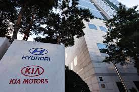
Even today, Kia is the second largest automobile manufacturer in South Korea. The only brand that surpasses them is Hyundai, Kia’s parent company.
The Evolution of Kia

1944: The early days of Kia
Born in 1905, Kim Chul Ho, founded Kia at the age of 39. Before Kia was named “Kia,” Kia was called Kyungsung Precision Industry. Ho founded Kia as a company focused on making bicycle parts and steel tubing, rather than automobiles.
1952: Kia becomes Kia Motors
In choosing the name “Kia,” Ho chose a word that translates to “the rise of Asia,” and a word that was a shortened version of the past company’s name. This new name showcased the brand’s plan for innovation and creativity, all coming out of Asia.
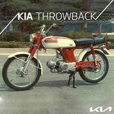
It took time for Kia to learn about the automobile industry and release its first vehicle. Even though its name changed, Kia produced the first Korean bicycle in 1952.
By 1955, Kia’s bicycles were becoming rapidly popular, and this led the company to think about expanding its operations. This led them to produce a scooter in 1957, and a three-wheeled motorcycle in 1961.
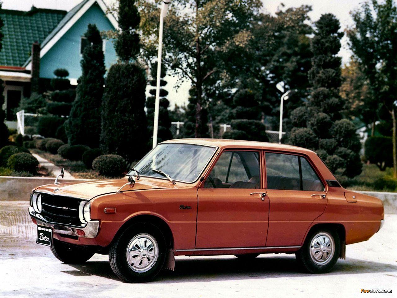
1972: Kia receives licensing to manufacture cars
Once Kia received the green light to manufacture automobiles, Kia set out to build a manufacturing plant for production. This plant was opened in 1973 and was called the Sohari Plant.
1992: Kia expands to the United States
While Kia’s founder passed away before this expansion happened, he undoubtedly would have been ecstatic to see Kia have a global expansion.
1998: Kia merges with Hyundai Motor Company
During the Asian financial crisis, Kia was forced to pivot. This led them to agree to a partnership deal with Hyundai Motor Company.
With this agreement, Hyundai (still) holds a 34% stake in Kia Motors and Kia Motors has stakes in 22 subsidiaries belonging to Hyundai. Hyundai was able to outbid Ford for this partnership, a company that had been interested in Kia since 1986.
Today: Kia continues to be a brand focused on innovation
While competition in the car industry is fierce, Kia has remained competitive. Through the release of new cars all over the world, and with 14 manufacturing plants in 8 countries, Kia has created a global presence.
Roadblocks Along the Way
The first roadblock Kia faced, that we want to highlight, was in 1981. Chun Doo-hwan was a new military dictator who wanted to consolidate the automobile industry. Since Kia had to comply with this order, Kia was forced to temporarily stop the manufacturing of their passenger vehicles and put their focus elsewhere. This was soon after the brand had already begun manufacturing cars, which was certainly a bump in the road for them.
Other roadblocks came later. In 2012, Kia gained some bad press after it was discovered that they inflated their fuel economy numbers in the United States. As a response to this press, Kia reimbursed the car owners that were affected.
Beyond those roadblocks, Kia also dealt with the usual roadblocks that come along with the car industry. For instance, whenever vehicle parts were recalled, Kia would receive negative press and with the market being so competitive, Kia constantly had to be at the forefront of innovation and design to stand out and build brand loyalty.
The Meaning of Kia’s Logo and Kia’s Logo History
Every brand’s story is different. Some keep the same logo for decades, others mix up their logo every few years, and others have a logo that has never been changed. For Kia, not only have they updated their logo through the years, but they have two separate logos.
This may seem like a confusing strategy, but it works for the brand. Rather than having one universal logo, Kia has decided to use one logo for the international market, and a separate logo for their local market in South Korea. The local market logo is much simpler and is only a simple, sleek “K.” For this article, we’ll be focusing on the international Kia logo that we see regularly.
As you read through Kia’s logo evolution below, you’ll notice a few things. Rather than focusing on an array of symbols and colors, Kia’s designers opted to play around with the wordmark. This isn’t to say that the designers neglected using any symbols but rather, they opted to have the focal point be the Kia brand name.
What the designers were aiming to convey with the logo are the pillars that the car brand stood on – speed, creativity, and excellence. While this is just a brief overview, below we’ll take a closer look at each of Kia’s logos over the years.

1944: The first version of the Kia logo
This logo showcases common themes you find with the first logo of many companies – it incorporates many different features and is far more complicated than the brand’s other logos. This first iteration also was when Kia had a different business focus, focusing on bicycle manufacturing and parts. When you remember that, this logo makes sense. It resembles a gear that would be commonly found on a bike with three diamonds around it. Rather than opting for color, Kia kept this logo in black and white to convey professionalism in authority to the industry.

1964: The second version of the Kia logo
Two decades later, Kia transitioned to car manufacturing.
With this shift, the brand needed a logo that could rebrand the company and serve as a placeholder until a more “permanent” logo was designed.
The company decided to go with this simple green emblem. This green circle has a sleek, sharp diagonal line extending from it, resembling the letter “Q,” except upside-down.

1986: The third version of the Kia logo
For a logo that was only supposed to be a placeholder, Kia’s previous logo lasted for another two decades. In 1986, the company rebranded with a new logo that looked significantly different than the last iteration. This logo played around with a new color, blue. The letters were bold, just like the previous emblem was. A final addition worth noting is the blue line at the top of the wordmark, resembling a wave. This symbolizes that like an ocean always drifting along, the Kia brand is always moving forward.
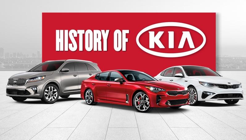
1994: The fourth version of the Kia logo
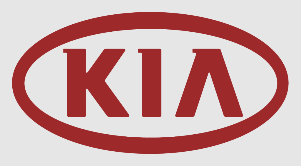
With the arrival of the 90s, Kia decided to rebrand their logo again, this time only electing for minimal changes. This logo was a different color, red, and also incorporated the entire brand name in the word mark. The font was stylized, the lines were thick and bold, and the wordmark was strategically placed inside an oval. Instead of keeping the stylized, youthful elements of the past version, this emblem was cleaner, more professional, and the red color conveyed the passion Kia has for this industry.
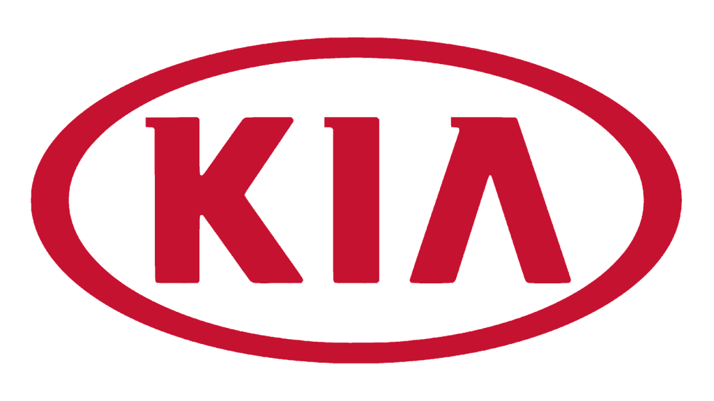
2012: The fifth version of the Kia logo
For the logo iteration, only minimal changes were implemented. The lines were slimmed down and the red was more prominent.
This updated logo design stuck with the brand for a while and helped to build brand recognition and loyalty, not being updated again until recently.

2021: The sixth (and current) version of the Kia logo
In 2021, Kia released a new logo to be the face of the car brand. This logo design shifted away from the design that was a staple of the brand since 1964. Instead of removing red from the logo altogether, this design is often depicted in black but is sometimes depicted in red still. The use of black conveys how Kia has evolved and what it holds for the future. This design provides Kia with a new youthful, futuristic, and fun identity. Instead of the typography used previously, Kia has shifted to a new stylized, unique font, that almost causes the letters to look like they have merged.
Kia’s logo font:
Kia’s logo has not altered much through the years, but what has been the prominent part of the logo is its font. The typography and wordmark are always the focal points of the logo. Like many companies, Kia has a customized sans-serif font that is unique to the brand. The defining characteristic of the font is that it consists of bold, modern, capital letters.
Kia’s logo color:
Kia hasn’t played around with many colors throughout the year with its logo. The official colors of the logo are red, black, and white. With the recent and current design, the brand alternates and chooses where to display the logo in black and white versus red. These color choices are powerful ones conveying strength, sophistication, professionalism, and innovation.
Kia’s logo symbols:
At first glance, you may not associate Kia’s logo with having a symbol, but what the logo elements together form is in fact, a symbol. Every element of the design is strategically placed to create a symbol of passion, energy, innovation, creativity, power, and discovery, which are all pillars of Kia’s business model.
Kia Today

Almost 80 years since Kia was first founded, Kia has grown to be a global competitor in the automobile industry.
In 2019, Kia ended the year with an annual sales revenue of $2.8 million.
The overseas automobile market is an extremely competitive one, but Kia has managed to solidify its rankings as the second-largest car manufacturing company in South Korea. The only company that has surpassed them is Hyundai, Kia’s parent company.
In 2019, Kia was also named one of the top 100 brands in the world by Interbrand and was listed as one of the top 50 car brands in the United States by Car Logo.
Beyond this ranking recognition, Kia has also gained a presence through sponsorship and publicity. For the 2014 FIFA World Cup in Brazil, Kia served as an official sponsor, and also during 2014, Pope Francis was spotted inside a Kia Soul, helping the brand gain international attention.
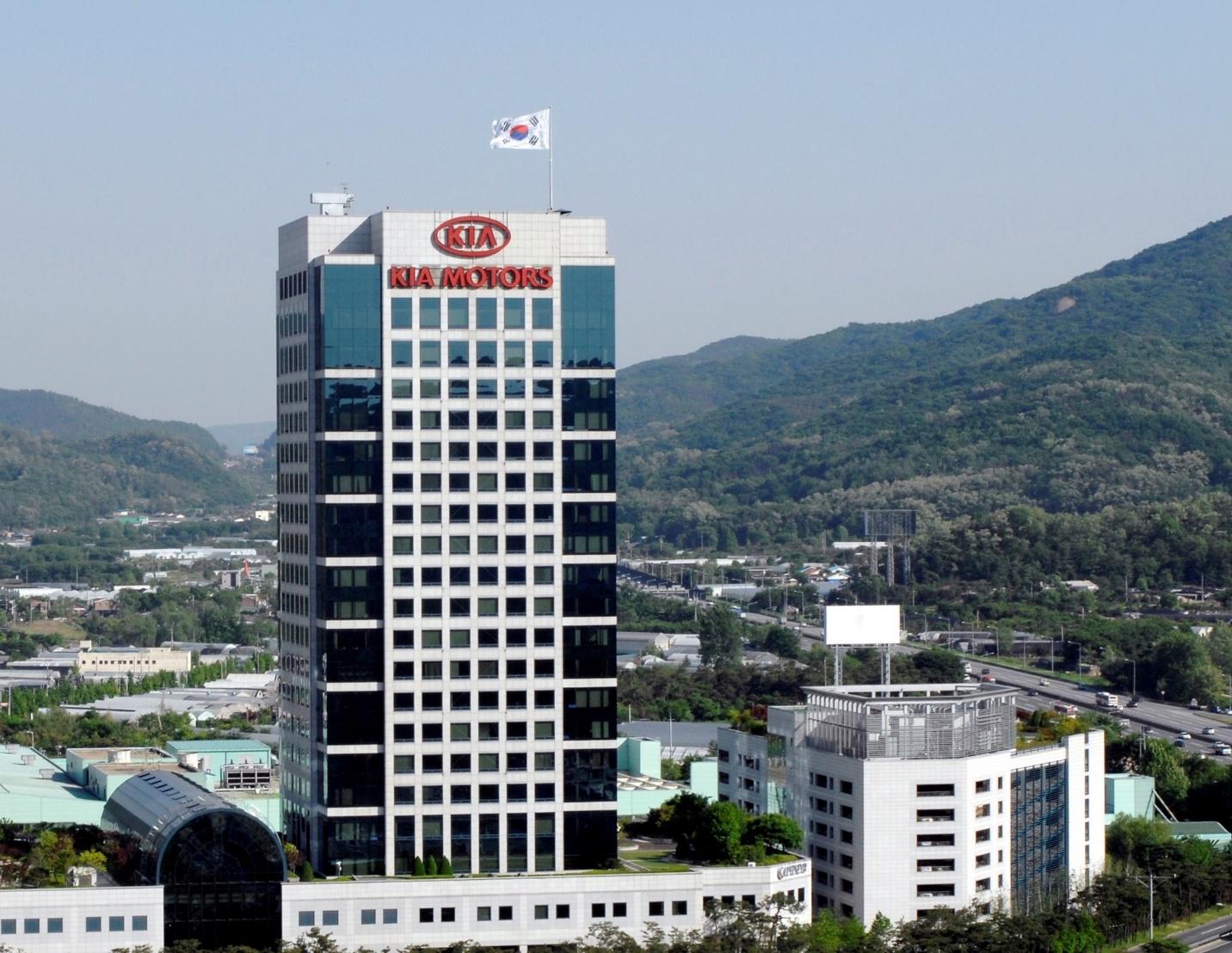
Today Kia still has its headquarters in Seoul, South Korea with 14 manufacturing facilities in 8 different countries, including the United States.
Lessons Learned from Kia
While other car brands have gone through countless logo redesigns, Kia has kept their redesigns minimal, only going through a significant rebranding recently, in 2021. Looking at Kia’s logo evolution, there are a few lessons we can all learn.
The first is to keep your logo consistent with your brand’s mission. Kia’s logo design is intentional and symbolizes how the brand sells globally and is focused on the future and creativity.
Another lesson is about simplicity. Instead of over-complicating the logo with many features, Kia’s design team kept the logo simple and sleek.
The final lesson is around color choice. Kia chose red as its main color to convey the passion that the brand has for this market.


