
Nickelodeon, the renowned entertainment company, has managed to capture the hearts of both young and old audiences alike. The company’s unique and iconic elements have made it a household name, but its signature logo stands out the most.
The emblem has left a lasting impression on all who have seen it, making it a true icon in the entertainment industry.
Nickelodeon, also known as Nick, is an American television channel launched on April 1st, 1979. Initially, the channel aired educational content worldwide without commercials. Nickelodeon is primarily known as a child’s education company, and its logo reflects this branding.
The logo is simple yet effective, with orange lettering on a clean white background and the company name in a simple font. This iconic logo has become incredibly popular globally. The use of color in the logo is simplistic yet effective, and it accurately represents the company’s goal of providing children’s entertainment.
About Nickelodeon
Nickelodeon is an American-based cable television that’s primary focus is children’s programming, with an audience primarily of 2-17-year-olds. Paramount Global runs the entertainment channel through its networks division’s Kids and Family Group.
To say that the company has had a rocky history would be an understatement. It began in late 1977 as a part of QUBE as an early cable television system, initially airing 12 hours a day of educational fare. The company had no commercials on its channel until after rebranding as Nickelodeon, which is the name we associate with today’s famous channel. With the new name came new programming, and the company almost immediately became more successful.
Despite the popularity of its new programming, the company decided it was time for another rebranding in the early 1980s. This was when they decided they would start adding commercials.
Throughout the 1980s, the company rebranded with commercials and opted to promote itself as an entertainment channel for children. This was when Nickelodeon took off for the first time since its creation, the first step toward a bold and strong new channel.
They began airing original cartoons the following decade, and since then, they have continued to be a wonder in the entertainment channel industry.
Just as the company has had this long and rocky history, the Nickelodeon logo also has a twisted history. The logo has had its ups and downs throughout the years, and the logo that we boldly associate with the company today isn’t what the company first started with.
In this article, we’ll review the history of the iconic Nickelodeon logo.
Nickelodeon’s Logo Over Time
The logo itself has also grown and changed over the years. Let’s take an in-depth look at its logo through time.
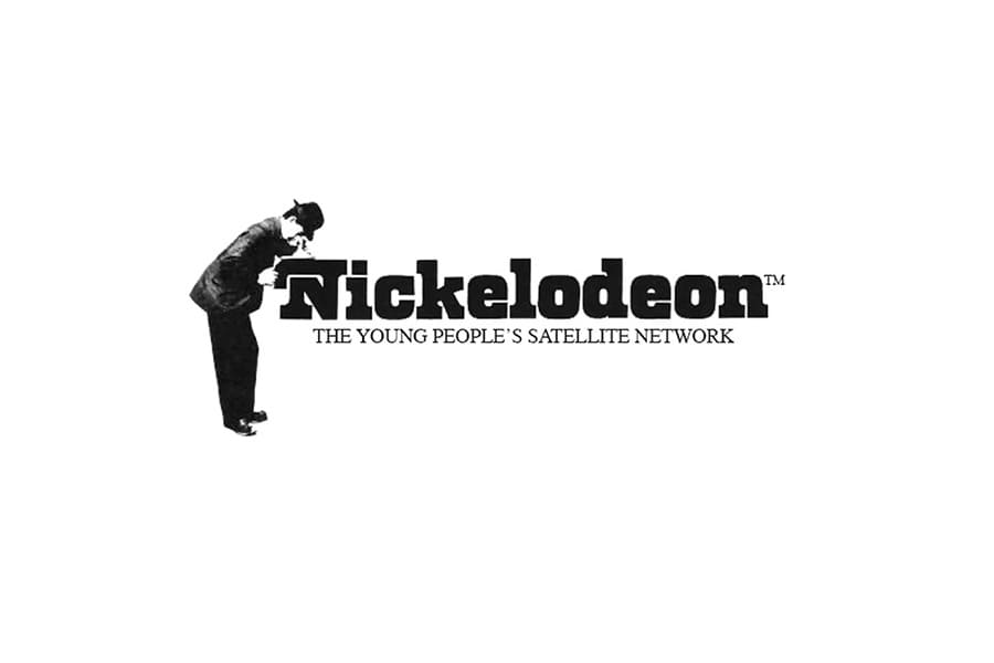
The Original Logo for Nickelodeon (1979)
The company’s first logo was designed the same year the channel began operating under the name Nickelodeon. Although there were other logos before, this was the first one the channel received while officially named Nickelodeon. The original logo was designed in 1979 and only stayed until 1989.
This intriguing and artistic design showed the company name in a classy, black font. It showed a man looking inside the first letter of the company name, which was shown as a projector. The logo was unique yet classy, with everything in black and white. It appeared to be almost a timeless classic, and the company’s tagline, “The Young People’s Satellite Network,” was shown beneath the wordmark, tying everything together perfectly.

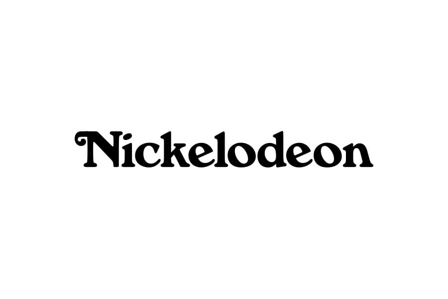
Nickelodeon’s Logo from 1980-1981
In 1980, the network decided to give their logo a makeover.
They went for a simple and elegant wordmark design, removing all logo elements except the company name. The only artistic touch was the curved tail of the N. It was a bold move, but it paid off.
The logo had a well-spoken way about it, even though it was less confident. However, this design only lasted for a year before being replaced by a completely opposite logo.

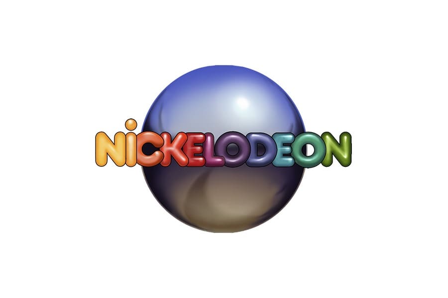
The 1981-1984 Nickelodeon Logo
In 1981 designer Lou Dorfsman created the Nickelodeon logo that the company would use for the following three years. This logo had a few key elements that stood out and combined to create a colorful yet child-friendly logo design.
The design showed the company name, with each name another bright color that stood out on a pinball. This version was memorable, with the three-dimensional pinball and the chunky font that effectively showed what the company was about.
The modern sans-serif typeface offered playful stencils on both letter “Os” in Balloon font. It was stylish and memorable, especially when paired with the success of the channel during that time. Just ask any child of the 80s, and you’ll hear all about their amazing programming and the iconic orange logo.
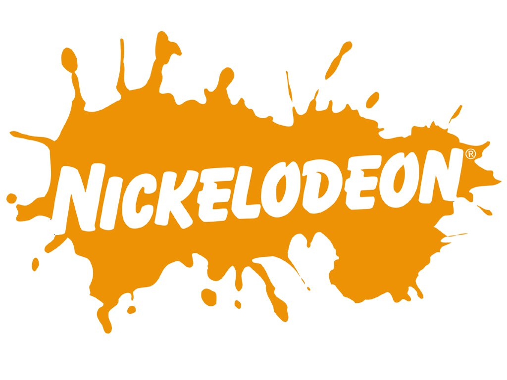
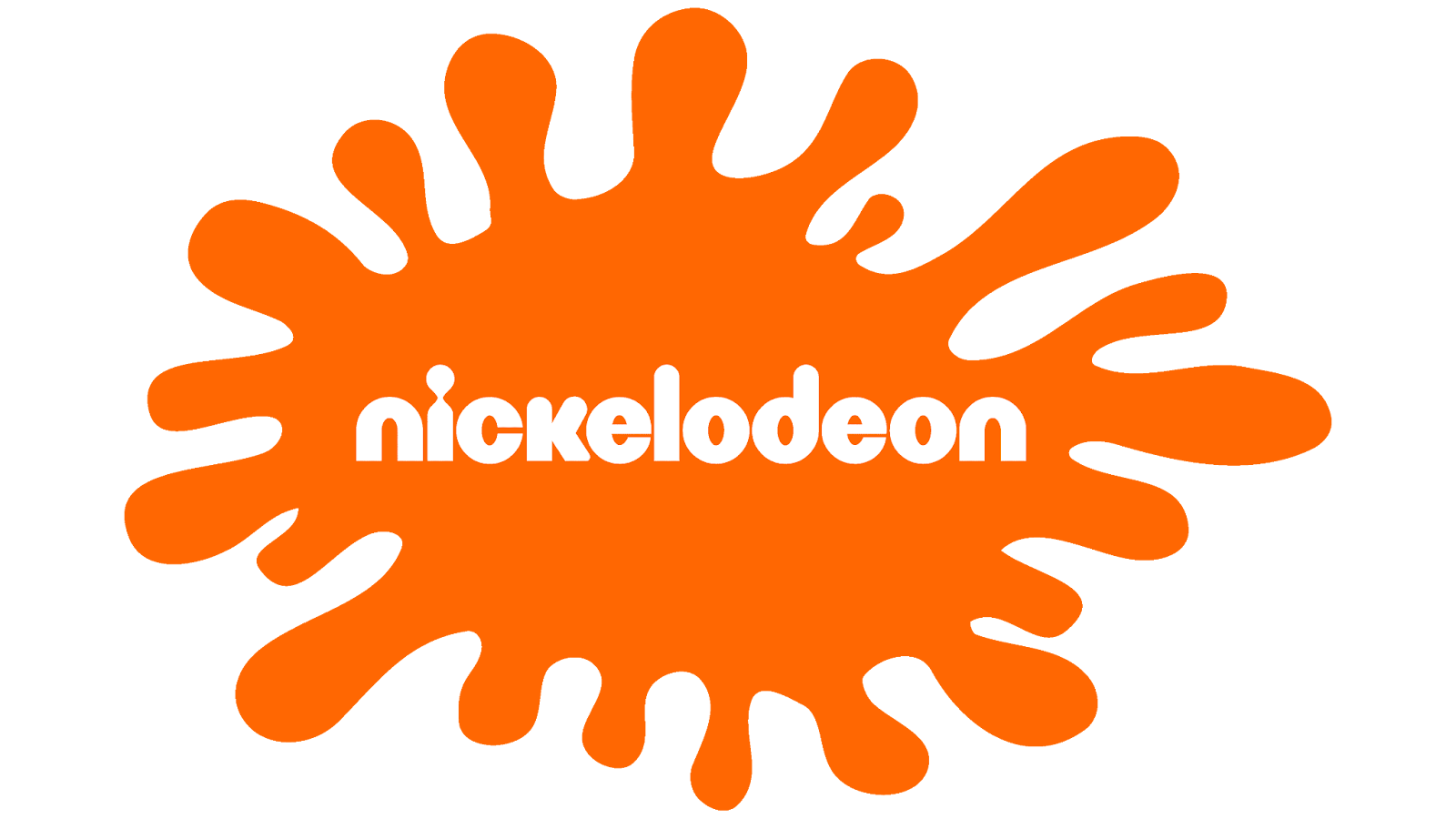
The 1984-2009 Logo for Nickelodeon
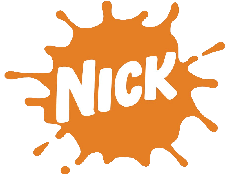
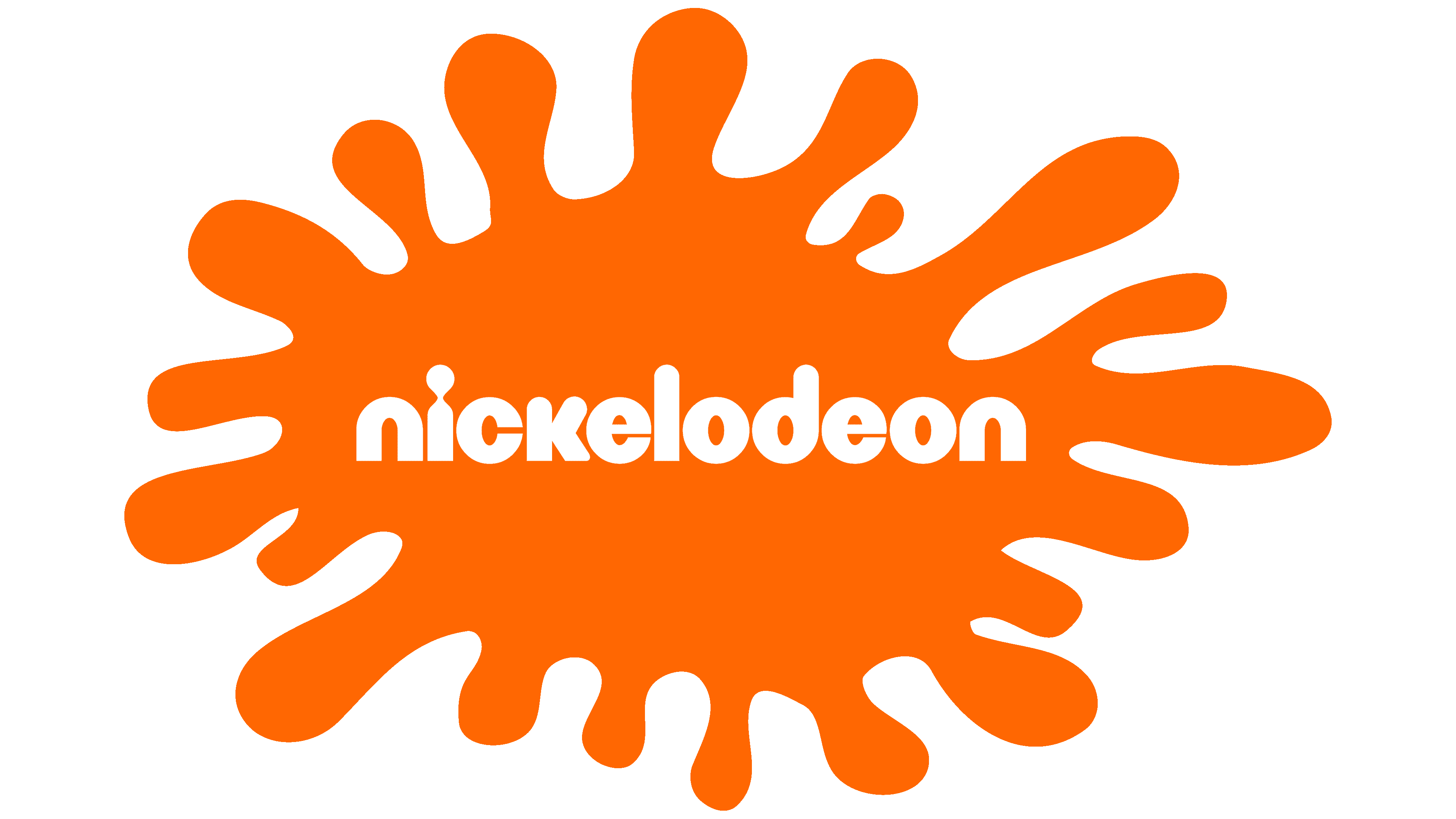
In 1984 Nickelodeon started to take a new turn with its visual identity, finally settling on the color palette they would keep permanently––orange and white. This color palette is happy, instantly creating a smile on those who see it and symbolizing joy. From 1984 to 2009, the company experimented with many different versions of its logo, all using the same signature color scheme. The main logo used during this period is shown above, but there were also many other variations. One of the more popular versions you may have seen used is the orange splash with white lettering. There were many different versions during this time, and the company traded off the different versions before they settled on changing the logo for good in 2009.

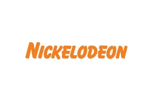
The 2009-Current Nickelodeon Logo
Keeping the same bright and playful color palette but opting to go in a simpler and more child-centered direction, the channel changed the logo in 2009. This logo was designed by Eric Zim, who decided that all the letters would be changed to lowercase.
The lettering was changed dramatically during this redesign, with the letters now appearing friendly and brighter. The one aspect of the design that stands out and where viewers’ eyes are instantly drawn is the ‘I,’ which is almost a keyhole.
The font is unique, with the letters rounded and appearing fun and artistic. This iconic and signature logo is such an essential part of the design that it was voted best, even taking third place in the Brand New Awards 2010.
Key Elements Of The Logo
When we think about the Nickelodeon logo, key and essential elements stand out and make the greatest impression when people see the logo.
One of the aspects is the font that the logo uses. In the most recent logo design still used today, the rounded type looks most similar to Bauhaus 93.
The second aspect is the color scheme that perfectly promotes the logo in all the best aspects. When you see this logo, the detail and the work put in to ensure it was executed perfectly is obvious.
1. The Hat–man:
The hat–man was the key piece of Nickelodeon’s original design and drew the most attention. The man in a black hat and professional attire represented the professionals behind the brand, creating something of quality.
2. The Projector:
The logo with the “hat man” also included the projector itself, created using the letter N. It stood for a kinetoscope, an early type of projector that represented that Nickelodeon was a company about movies/motion pictures.
3. The Globe:
The colorful wordmark of the 80s was accompanied by a shiny globe, which also looked a bit like a pinball. The company wanted it to symbolize its goal to reach children everywhere and provide meaningful educational programming as well as fun.
Nickelodeon Logo Color Scheme
The Nickelodeon logo is instantly recognizable due to its unique and signature color scheme.
The brand consistently uses two main colors, orange and white, which are simple yet elegant.
The white background is present in every version of the logo, adding a touch of cleanliness and simplicity. The bright and happy orange color is iconic to Nickelodeon and has created a firm association with the entertainment channel. This color choice is a signature aspect expected to stay with the brand indefinitely.
Lesson from the Nickelodeon Logo
Be Modest and Memorable:
The Nickelodeon logo is a prime example of how simplicity can be memorable. It’s modern yet respectful, managing to make an impression without being too flashy.
This is a crucial aspect of any logo, and Nickelodeon nailed it. We can all learn from their approach to being modest yet memorable.
The Logo Is Unique and Consistent:
Having a unique and consistent logo is crucial for any brand, and Nickelodeon has certainly nailed it with its iconic logo. It’s not just a simple design; it has unique attributes that make it stand out from the crowd. The channel has made a conscious effort to ensure that its logo is consistently branded across all platforms, which is a smart move. Nickelodeon’s logo is a great example of how a brand can own its uniqueness and stand out from the competition.
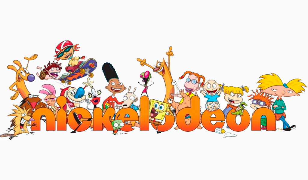
Famous Nickelodeon Cartoons
Nickelodeon has established itself as a prominent player in the world of cartoons. The network has created numerous iconic cartoons that have been loved by both young and old. Over the years, Nickelodeon has produced many famous cartoons that have become known as some of the best cartoons of all time.
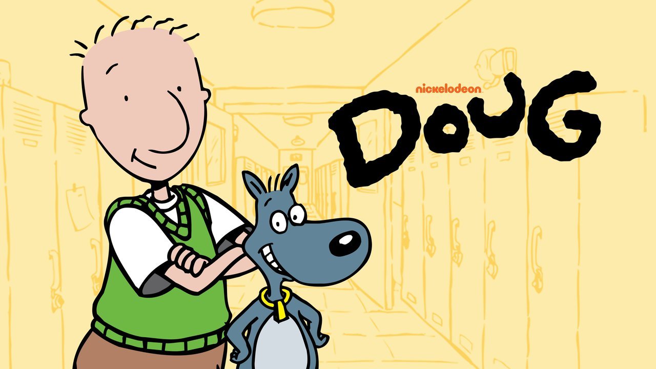
Nickelodeon aired several famous cartoons, including Doug (1991-1994), which featured the superhero fantasies of Doug Funny and his chaotic lifestyle. Another popular cartoon was Hey Arnold (late 90s-early 2000s), showcasing the daily life and adventures of Arnold Shortman and his friends in a big city.
Spongebob SquarePants is arguably the most iconic Nickelodeon cartoon. It has gained popularity not only for its memes but also for its entertainment value for all ages. The show premiered in 1999 and has since become one of the most famous cartoons of all time. Other notable Nickelodeon cartoons include The Adventures of Jimmy Neutron: Boy Genius and Danny Phantom.
HBO’s Quiet on Set and the Dan Schneider Scandal
Nickelodeon’s logo isn’t the only thing about them that had ups and downs. From 1994 to 2019 a man by the name of Dan Schneider created and produced several kid shows for the TV network. His name is now synonymous with the mistreatment of children in Hollywood.
However, he alone didn’t create the toxic environment of filming children’s TV, instead, his continuing to work for the network showed a gross oversight, or worse uncaringness, by Paramount Global (Nickelodeon’s parent company) executives. HBO’s “Quiet On Set: The Dark Side Of Kids TV” was released on March 17th, 2024, and names multiple adults behind the toxic and illegal activities child stars endured. Notably, a sit-down interview with Drake Bell from “Drake and Josh” where he officially states that he was one of Brian Peck’s victims. Brian Peck worked on Nickelodeon as a dialogue coach in the early 2000s until his conviction for “lewd acts with a minor” in 2004.
Dan Schneider on the other hand, made a much quieter exit from Nickelodeon. It wasn’t until many years, and questions, later that the full story came out. Viewers wondered why he left when he was doing so well, they also questioned his seemingly bizarre display of young actor’s feet in his shows. There were rumors he mistreated staff and actors. Paramount Global had started an investigation of Dan and found “no evidence” of sexual misconduct but did have plenty of former coworkers describe him as quick to temper and incredibly mean.
But while the network didn’t find any solid proof of illegal acts, viewers would not be so easily swayed. Jennette McCurdy, possibly better known as Sam on ICarly, was especially vocal about “The Creator” in her memoir of her experience as a child star. She talks of being bribed, inappropriately touched, and encouraged to drink underage all while being controlled by the man she called “terrifying.” She later confirmed that “The Creator” was Dan Schneider.
One thing is for sure, this has marked a closer look into children’s television. Not only what young viewers are being exposed to, but also what the young creators behind hit shows are facing. Recently there have been questions toward multiple kid TV networks on what they are doing to protect the children that bring them in millions and if child actors should even be a thing. While Nickelodeon is in the spotlight for these discussions, they are certainly not the only ones.
Conclusion
Overall, Nickelodeon is a strong television channel that has a unique yet strong history that has earned it the title of one of the best networks in the world. The network has been through a whirlwind to reach the point it is at now and to become known as one of the best networks with the most iconic cartoons adored by thousands.
But it’s easy to say that the network wouldn’t be the strong and iconic company we see today without the memorable logo associated with the company. The logo we see has played a huge part in positive association with the company while displaying what it does and sharing its history. The logo teaches us that it should be modest, memorable, unique, and consistent across all platforms. It should have a personal style that can be reflected wherever it is shown.
The logo has a unique history to reach the point where we see it today. We discussed the company’s history and the logo’s history, including the changes it has gone through to reach its current form.


