

The Complete History of The Subway Logo

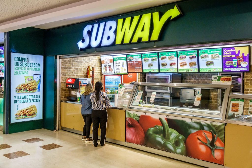
Subway is one of the world’s most famous and recognizable fast-food establishments. It is well known for its wide variety of sandwiches, salads, and other menu items that are made to order. Subway has been around since 1965 and has become one of the largest fast-food chains in the world, with over 44,000 locations in more than 100 countries.
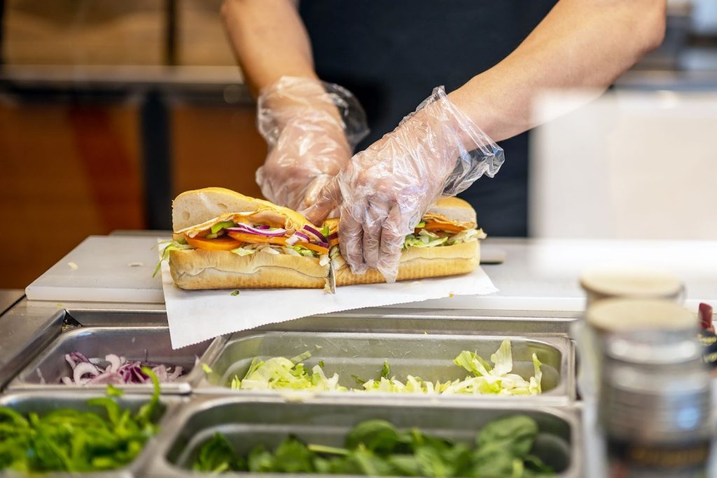
Subway has become popular due to its focus on providing fresh, healthy food options that are customizable to each customer. The company also offers a variety of promotions and discounts, which helps to attract customers.
One of the most significant reasons Subway has become such a well-known fast-food chain is due to its successful marketing and advertisement. Its iconic logo, which consists of distinct colors and shapes, is now easily recognizable and has become a popular piece of illustration.
Without this logo, Subway may not have reached the same success today. However, today’s logo differs from when the company first began. The logo has gone through many changes throughout the years. From its initial logo to its current iconic logo, Subway’s logo has evolved to become the recognizable symbol it is today.
By understanding the history of Subway’s logo, we can gain insight into how the company has developed and grown to become the popular establishment it is today. Continue reading to learn about the history of Subway and see all the logos throughout history until we reach the iconic logo associated with the brand today.
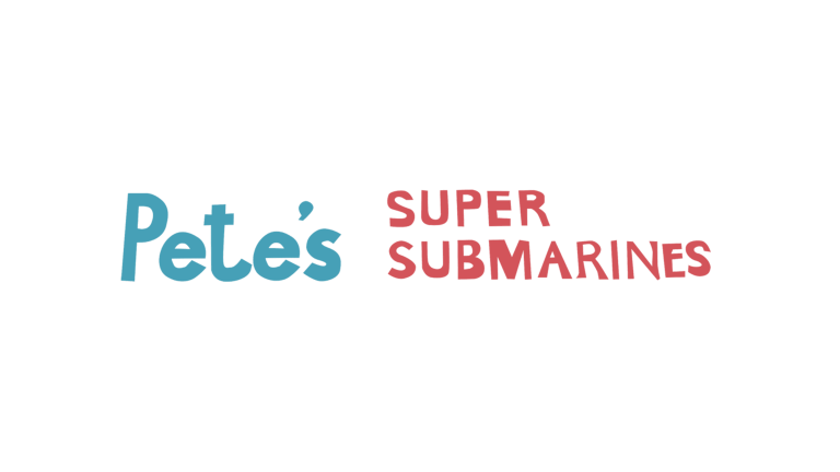
1965––1968: The First Logo
The first Subway logo was a logotype, with the first part of the company name, “Pete’s Super Submarines,” written in blue on the left and the remainder of the letters on the right. It was a simple design, using only words and two colors, blue and red, on a white background. The blue lettering was bold and eye-catching, while the red lettering was smaller and slightly more subdued. The blue and red colors were chosen to represent the ocean and the submarine, respectively, as a nod to the company’s nautical roots. The logo was designed to be easily recognizable and to evoke a sense of adventure and exploration. The Subway logo has since gone through many iterations, but the original design remains a classic reminder of the company’s beginnings.
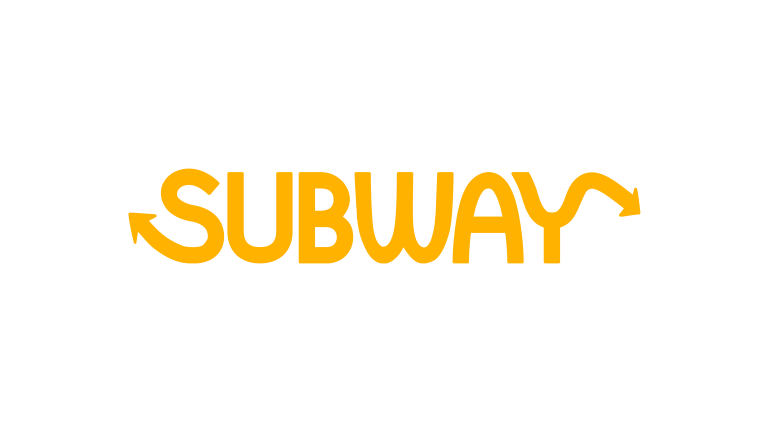
1968––1969: The Yellow Letters
The 1968 Subway logo is a timeless classic that has stood the test of time. The logo features the company name in yellow on a white background, with an arrow shooting up out of the tail of the S and an arrow shooting down off the tail of the Y. The font is unique and powerful, with a distinct look. The design of the logo is simple yet effective and has become a symbol of the Subway brand. The emblem symbolizes Subway’s commitment to providing quality food and service to its customers. The logo has been used in various forms, including on menus, advertisements, and merchandise. The logo is a reminder that Subway is a company that values quality, innovation, and customer service. It symbolizes Subway’s commitment to providing its customers with the best possible experience. The Subway logo is a timeless classic that will continue to be a part of the Subway brand for many years.
1969––2002: A Slight Change
The 1969 Subway logo is a unique and stylish design. It features an extended black circle with the company name inside, two arrows on either side of the company name, and a white background. The company name is split in half, with one half in white and the other in yellow, creating a striking contrast against the black background. This simple yet elegant logo has been used for decades to represent the Subway brand. It is a unique design that stands out and is recognizable to many people. The classic Subway logo is an excellent example of how a logo can be timeless and effective for a long time. It is an excellent representation of the Subway brand and is a great example of a successful logo design.
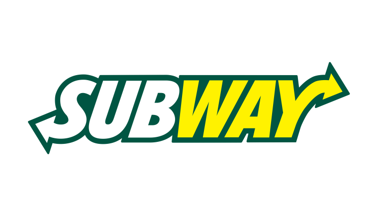
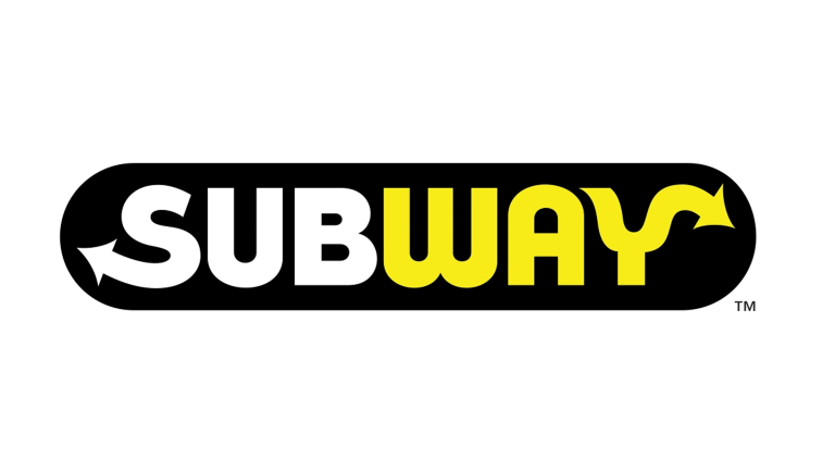
2002––2016: A More Significant Change To The Logo
This next logo featured a yellow and green color palette, with the word “SUB” in a bold, white font and “WAY” in yellow. The “S” in the logo was shaped like an arrow, the same as the previous logo, which was meant to represent the forward-thinking nature of Subway. The arrow was also a reminder of the company’s commitment to providing customers with fresh, healthy food. This logo was used for 14 years, symbolizing Subway’s commitment to quality and convenience. It was a solid visual representation of the Subway brand and helped to create a strong connection between customers and the company. The logo was also used in various marketing campaigns, helping further to solidify the Subway brand in customers’ minds. The Subway logo from 2002 to 2016 was an iconic design that helped to define the company’s identity and create a strong connection with its customers.
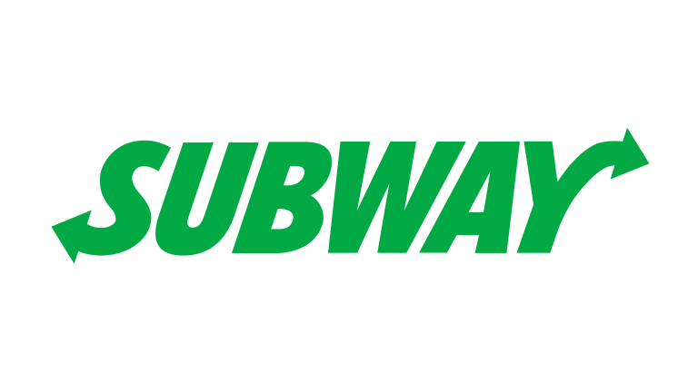
2015––2016: The Logo Is Changed To Green
Subway’s logo from 2015 to 2016 was a modern and minimalistic design. It featured the company name in a bold font, this time the same font and name style except for in green. The logo was designed to be simple and easy to recognize while conveying the company’s message of freshness. The colors used in the logo were green on a white background, which was chosen to represent the freshness of Subway’s food. The logo was also designed to be versatile so that it could be used in various ways, such as on signs, banners, and other promotional materials. The logo was also designed to be recognizable from a distance so that people could quickly identify Subway restaurants. Overall, the logo was a successful design that effectively conveyed the company’s message of freshness and quality.
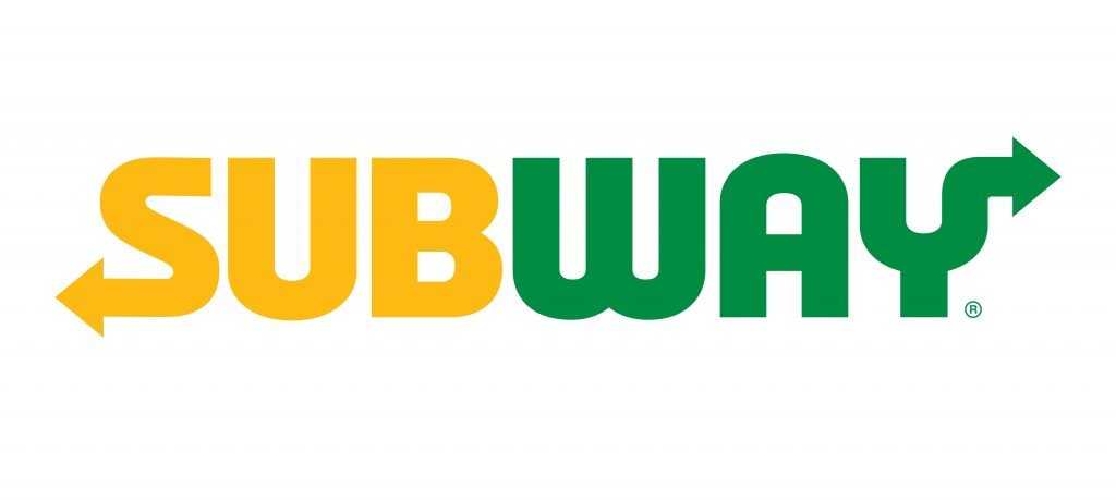
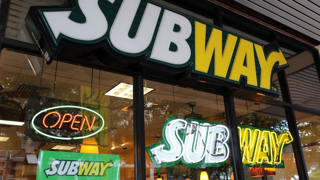
2016––Present: The Logo Today
The Subway logo that is used today is an iconic representation of the company’s brand and identity. It features the company name in half yellow and half green, with the word “Subway” in bold font. The logo is not slanted like the previous ones but is displayed in a straight, upright position. It is situated on a white background, making the logo stand out even more. The yellow and green colors of the logo symbolize the company’s commitment to freshness and health, while the font used is modern and eye-catching. The logo is simple yet effective, and its design reflects the company’s core values. It is a timeless symbol used for many years and will remain integral to the company’s identity.
The Font
The Subway logo font is a custom font created specifically for the company. It is a sans-serif font with a bold and modern look. The font features a unique combination of thick and thin strokes, giving it a distinctive and eye-catching appearance.
The font is also slightly condensed, making it appear more dynamic and energetic. The letterforms are somewhat rounded, giving them a softer and more inviting feeling. The font is also legible, making it easily read from a distance.
The font is an excellent example of how a custom font can create a memorable and recognizable brand identity.
The Colors

The Subway logo is composed of two colors, yellow and green. Yellow is a bright, vibrant hue that stands out and represents the energy and freshness of the Subway brand. The green is a softer, more muted shade that conveys a sense of health and naturalness.
The font used in the Subway logo is a bold sans serif font that is easy to read and conveys a sense of modernity and strength.
The logo also includes a small yellow arrow pointing to the right, a subtle nod to progress and always moving forward.
The Designer

Originally hired to handle marketing, Dick Pilchen was the first Subway employee. However, since the company was small, and he was only 25 at the time, he did everything from filling ice machines to handling banking. As time went on and the small Bridgeport CT company continued to grow, he continued to help build the brand, including designing the original Subway logo and thinking up slogans to market the company.
The Popularity Of The Brand
Subway has become one of the most popular fast-food restaurants in the world. It is estimated that Subway has over 40,000 locations in over 100 countries. This success can be attributed to a few factors, including the high quality of the food, the convenience of the locations, and the recognizable logo. The Subway logo is a simple yet effective design.
The logo is highly recognizable, which is essential for any successful brand. The bright yellow stands out from the crowd and is easily identifiable even from a distance. This helps to create an immediate connection with the brand and makes it easier for customers to remember the logo.
The success of Subway has been mainly due to the combination of a great product, convenient locations, and a recognizable logo. The logo is an integral part of Subway’s success and has helped to make it one of the most popular fast-food restaurants in the world.
The History Of Subway
Subway is a fast-food restaurant chain that has been around since 1965. Fred DeLuca and Peter Buck in Bridgeport, Connecticut, founded it. The two had the idea to open a submarine sandwich shop to help pay for DeLuca’s college tuition.
The first store was called Pete’s Super Submarines and was an instant success. After that, the chain expanded throughout the United States and eventually the world. By 1974, Subway had 16 stores and was the fastest-growing fast-food chain in the world.
Throughout the years, Subway has continued to grow and expand. In the 1980s, the chain began to add new menu items such as salads, wraps, and breakfast sandwiches. By the 1990s, Subway had over 5,000 locations in the United States and over 10,000 locations worldwide. The chain continued to expand, and by the 2000s, Subway had over 20,000 locations worldwide.
Today, Subway is one of the largest fast-food chains in the world, with over 44,000 locations in more than 100 countries. The chain is known for its fresh ingredients and customizable sandwiches, which has helped it become one of the world’s most popular fast food restaurants.
Subway also offers a variety of other menu items, such as salads, wraps, and breakfast sandwiches. The chain has also been praised for its commitment to sustainability, offering vegan and vegetarian options, as well as for its commitment to the community through its various charitable initiatives.
Why Subway Stands Out From Other Fast Food Chains
Subway is a fast food chain that stands out from the rest due to its commitment to providing healthier options and unique branding. Subway offers various sandwiches, salads, and wraps, which can be customized to fit any dietary needs. Additionally, Subway’s sandwiches are made with freshly baked bread, a healthier alternative to the processed buns used by other fast food chains. Subway’s branding is also distinct from other fast-food restaurants.
The company’s logo is a simple, bold typeface that is easily recognizable. The font is used in all of Subway’s marketing materials, from its website to its in-store signage. The font is also used on Subway’s packaging, which helps to create a unified look for the brand. Subway’s commitment to healthier options and its unique branding set it apart from other fast-food chains.
The company’s focus on providing fresh, healthy food and its recognizable branding make it a popular choice for those looking for a quick meal. Subway’s commitment to providing healthier options and its unique branding stand out in the fast food industry.
What Subway Offers
Subway’s menu is customizable; customers can choose from various sauces and condiments to add to their sandwiches.
Subway also offers a loyalty program that rewards customers for their purchases. Customers can earn points for every dollar they spend and redeem them for discounts and free items.
Subway also offers catering services for special events. Customers can order large groups of platters of sandwiches, salads, and wraps. The restaurant is also known for its commitment to sustainability and offers a variety of eco-friendly packaging options. Subway is an excellent option for a quick and delicious meal.